|
Vernon Ah Kee’s work oscillates between beautifully rendered realist drawings and stark, post-conceptual text pieces. Although visually far apart, there are clear correspondences between the two bodies of work. As writer Timothy Morrell has noted, ‘Both mediums are handled with a degree of precision and a restraint that appeals to an old-fashioned love of the perfect line, whether drawn or written’.[1]The artist has made both forms his own, developing in each a distinctive aesthetic that at the same time appears to retreat from individual authorship. The drawings are the epitome of meticulous technique, cool and detached, while the text pieces use clean, sans-serif fonts in plain compositions that are produced with a professional sign-writer. It is of course the content of Ah Kee’s works that gives them their specific charge: pushing against the form, it bubbles beneath his serene surfaces in a complex mixture of fury, poignancy and bleak, black humour.
Ah Kee has only been exhibiting his drawings since 2004, beginning with fantasies of the good, a series of portraits of male family members. The drawings arose from the artist’s research into the Tindale Collection at the South Australian Museum, which contains hundreds of photographs of Aboriginal people taken by anthropologist Norman Tindale between 1930 and the mid 1960s. Individuals are identified by number, not name, and on requesting images of his own family from the collection, Ah Kee received them as cropped portraits that to him resembled mug shots. The layers of institutional violence that this well-meaning act implies inspired Ah Kee to render the images as off-centre drawings, with a focus on the piercing, direct gaze of his subjects. The series has been expanded into portraits of living relatives, each drawn from photographs to maintain the restrained, slightly distant style.
For this exhibition, Ah Kee presents a major new drawing, a triptych featuring an image of his grandfather and two of himself. The artist’s seductive, sensitive draughtsmanship, an index of cultural refinement and aesthetic sophistication, appeals to our desire for beauty and technical prowess, yet he and his grandfather are positioned front- and side-on, their expressions blank, in poses common to images of anthropological subjects and of criminals. Implicit here are both sides of European culture’s coin. As in Ah Kee’s other portraits, the eyes address us directly, forcing us to meet their gaze, and communicating ‘an immeasurable amount of sadness, weariness and suppressed anger’.[2]
Ah Kee’s text works also arrest our vision, using bold arrangements and sardonic wordplay to activate and address the violence embedded in language. The artist refers to his text pieces as ‘signs’, drawing on our natural reading instincts by employing stark black-on-white designs with the strident sloganeering of advertising. Employing puns, in-jokes, and double-entendres, Ah Kee turns the English language, as well as its Australian vernacular, upon itself, isolating words and phrases from their contexts and excavating a racist subtext from the most seemingly innocuous of phrases. He takes palpable delight in words, pulling them apart and playing with their sounds, meanings and associations, encouraging a slipperiness to occur beneath the seemingly didactic nature of the works.
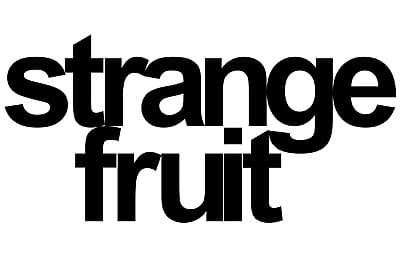
The words in Ah Kee’s signs therefore resist linear readings, ranging from direct references, as in strange fruit (recalling the famous blues song about lynching in the American South), to invented slogans such as i used to go to church like it was religion and strange conjunctions such as paradigmme and privilegeme. Works such as hang ten and race ya strike deep into the heart of Aussie ocker culture, casting a dark shadow over the phraseology of our laid-back, beachside way of life. The artist views the text works as portraits in a sense, drawing on his own experiences and interests to build a kind of fragmented personal narrative. Viewed together with the drawn portraits, which could be seen to address the treatment of bodies as symbols or texts, the signs provide a compelling argument for the place of reflexivity, ambiguity and memory within the rigid regimes of Australia’s race debate.
Russell Storer
[1] Timothy Morrell, Vernon Ah Kee: mythunderstanding, exhibition catalogue, Adelaide: Contemporary Art Centre of South Australia, 2005, unpaginated.
[2] Morrell.
|
 ENLARGE