
Mark Rothko
Learn more1957 # 20 1957
© Kate Rothko Prizel & Christopher Rothko. ARS/Copyright Agency Purchased 1981
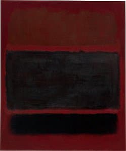
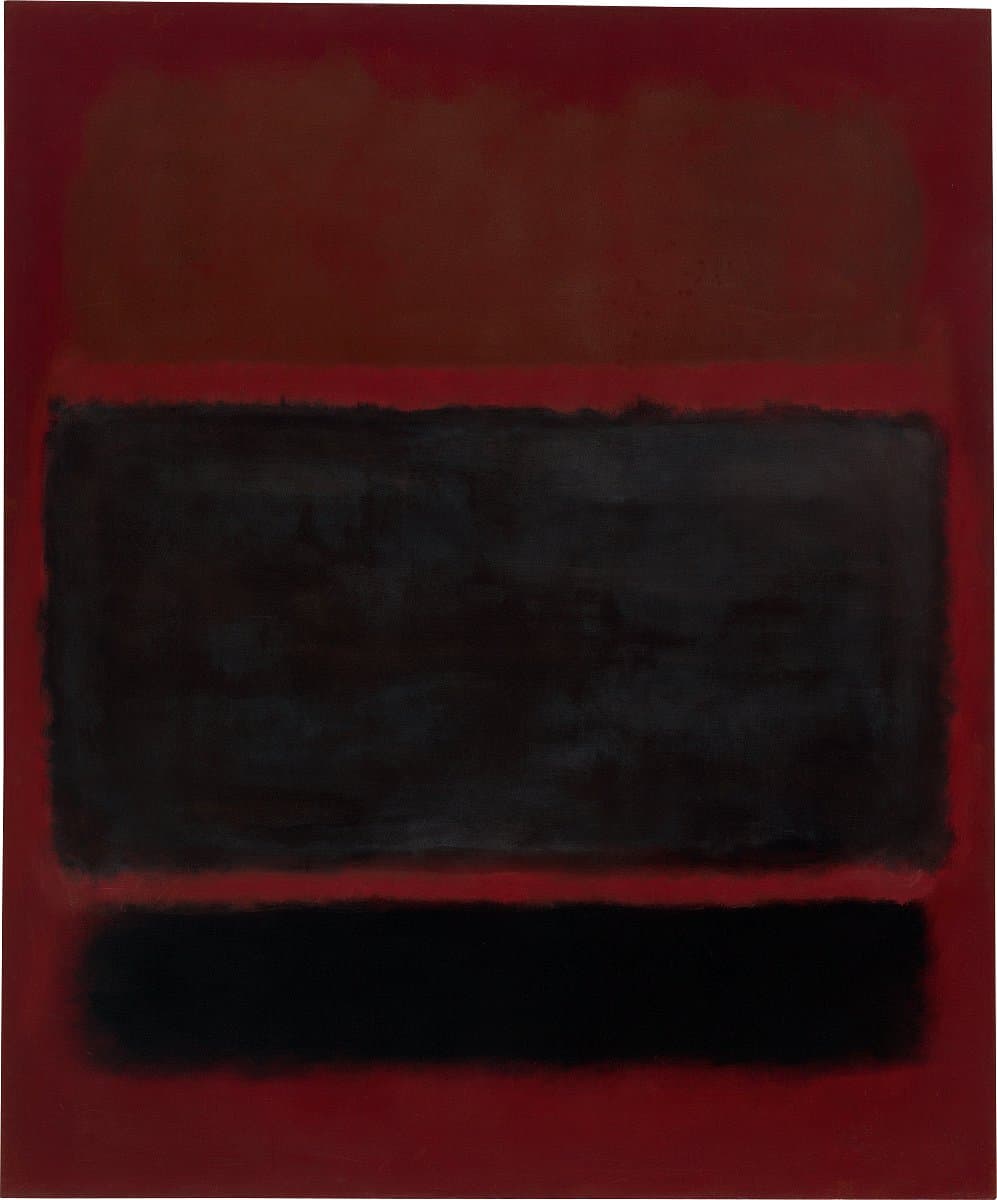
More detail | Permalink1957 # 20 1957 is a canvas characteristic of Mark Rothko’s mature style, composed of soft‑edged blocks of colour that float above each other. Throughout the early 1950s he employed bright colours—reds, yellow, oranges and blues—in harmonious combinations. But in 1957, the year this work was painted, a perceptible shift occurred in Rothko's paintings. Fewer and darker colours were used, giving a sombre expression to his work. Rothko was still painting ‘dramas’, a term he had used to describe the subject of his paintings of the 1940s, using colour as the ‘instrument’. ‘I exclude no emotion from being actual and therefore pertinent,’ he said in 1957. ‘I take the liberty to play on any string of my existence. I might as an artist, be lyrical, grim, maudlin, humorous, tragic.’[1]
At that time, however, Rothko’s paintings reflected a more limited range of mood: among the ‘ingredients’ of his art listed in a lecture he delivered at the Pratt Institute in 1958, was ‘a clear preoccupation with death. All art deals with intimations of mortality’.[2] To Dore Ashton, a regular visitor to his studio at this time, Rothko claimed that ‘he was creating the most violent painting in America’.[3] Ashton interpreted this as referring to the conflict inherent in the association of colours that Rothko conceived of as the symbolic equivalents of emotions. As Rothko believed, ‘a painting is not a picture of an experience; it is an experience’.[4]
As a result, paintings such as 1957 # 20 defy interpretation, and offer instead a completely subjective experience; they elicit an emotional response from the viewer without prescribing what that response should be. The dark, hovering forms on the red background of 1957 # 20 do, however, resonate with restrained violence and menace. The ‘dark’ emotions that permeate 1957 # 20 and other paintings of 1957 were, with certain exceptions, the basis for all the works Rothko painted until he committed suicide little over a decade later.
Michael Lloyd and Michael Desmond[5]
[1] Elaine de Kooning, ‘Kline and Rothko: Two Americans in Action’, Artnews Annual, XXVII, 1958, p 177.
[2] Taken from notes made at a lecture by Rothko at the Pratt Institute, Brooklyn, in 1958, and published by Dore Ashton in The New York Times, 31 October 1958, reprinted in The New York School: The first generation: Paintings of the 1940s and 1950s, Los Angeles County Museum of Art, Los Angeles, 1965, p 142.
[3] Dore Ashton, About Rothko, Oxford University Press, New York, 1983, p 138.
[4] Rothko, quoted in Anna C Chave, Mark Rothko: Subjects in Abstraction, Yale University Press, New Haven and London, 1989, p 172.
[5] Adapted and updated from Michael Lloyd and Michael Desmond, European and American Paintings and Sculptures 1870–1970 in the Australian National Gallery, Australian National Gallery Canberra, 1992, p 250, by Steven Tonkin.
