
Barnett Newman
Learn moreBroken obelisk 1963/67 / 2005
© 2018 The Barnett Newman Foundation, New York/ARS, New York/Copyright Agency The Barnett Newman Foundation
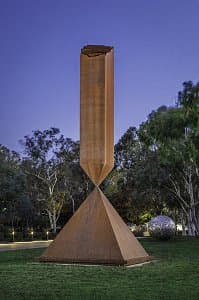
More detail | PermalinkBarnett Newman’s Broken Obelisk 1963/67 is powerfully symbolic and acutely political. The monumental sculpture combines the qualities of ancient forms with the geometry of modern architecture and materials. The genesis of the work is traceable through, and runs parallel to, Newman’s painting practice; it is, moreover, closely entwined with his small but impressive sculptural output. The artist’s first three-dimensional work, Here I 1950, forecasts the emphatic vertically of his forms while his final sculptures, Zim Zum I and Zim Zum II 1969, suggest mystic, all-enveloping spaces that expand beyond human scale towards the architectural.[1] Although Newman himself differentiated between the ‘planar’ and ‘volumetric’ problems of his work, he wanted both his paintings and sculpture to ‘give the onlooker a sense of place, a sense of being there’.[2]
Here I—comprising two slender wooden uprights, set into a mounded square base crate, covered with plaster—was shown at Betty Parsons Gallery, New York, in 1951.[3] In 1962, after several hiatuses he returned to Here I, casting two bronze versions and making adaptions to the base. Ideas for his next sculptures developed quickly. For Here II 1965, made in weathering steel, three uprights of equal height, one thick and two thin, are set on truncated pyramids grouped on a base. Here III 1965–66, combining stainless and weathering steel, likewise suggests a logical progression, as if Newman decided to isolate and enlarge the central section of the preceding work.[4] Because the bases are elevated slightly, Here II and Here III both seem to hover. The emphasis on the relationship between upright form and its base is an idea that finds full articulation in Broken Obelisk, as Armin Zweite astutely observed: ‘An inverted obelisk, its shaft broken, is mounted on a pyramid in such a way that their tips touch and slightly penetrate each other—an upward-moving force meets a downward-sweeping movement, or, to put it another way, a vertical load is supported by an opposing thrust.’[5]
Broken Obelisk seems to have been influenced by several practical concerns. Initially, as Newman’s sketches show, the pyramid was flatter and more squat and the obelisk much thinner, so it appeared more precariously balanced. To develop its dimensions while retaining the teasing connection between the massive forms, he relied on Lippincott, a Connecticut fabricator specialising in working with artists to build large-scale sculpture. The monumentally of the final sculpture is, of course, key, and engineering drawings demonstrate how the pyramid became taller and the relationship between the obelisk and pyramid more elegant, with the two elements meeting in diagonal cross formation serving to highlight the upper broken end of the obelisk. A full-scale model, produced to test the spatial effects, confirmed the final configuration, and a second Broken Obelisk was fabricated. The works were installed in front of the Seagram Building in New York and adjacent to the Corcoran Gallery of Art in Washington in October 1966. Broken Obelisk also developed a memorial quality as demonstrated by the third exemplar installed within the reflecting pool near the Rothko chapel for the Menil Collection in Houston and dedicated to the memory of Martin Luther King. As Newman commented, writing in the year of King’s death, ‘I hope I have transformed its tragic content into a glimpse of the sublime’.[6]
Lucina Ward
[1] Here I (Menil Collection, Houston), Zim Zum I (San Francisco Museum of Modern Art) and Zim Zum II (Kunstsammlung Nordrhein-Westfalen, Dusseldorf).
[2] Newman, as he stated in a 1966 interview with Washington Post critic Andrew Hudson, considered the elements of his practice quite separately: ‘I do not consider my sculpture to be a three-dimensional equivalent of my paintings. I think the problems are altogether different. Painting is a planar art. Sculpture involves for me the problem of volume. But I hope that both the sculpture and the painting give the onlooker a sense of place, a sense of being there’. Barnett Newman, Barnett Newman: Selected writings and interviews, University of California Press, Berkeley, 1992, p 273.
[3] The shaped and amorphous plaster surface of Here I, the edges of the upright elements in particular, prompted parallels between the sculpture and Newman’s painted ‘zips’.
[4] Both Here II 1965 (National Gallery of Canada, Ottawa and Davros Collection, Switzerland) and Here III 1965–66 (Öffentliche Kunstsammlung, Basel and Nasher Sculpture Center, Dallas) were produced with the Treitel-Gratz, a foundry on Long Island.
[5] Armin Zweite, Barnett Newman: Paintings, sculptures, works on paper, Hatje Cantz Publishers, Ostfildern-Ruit, 1999, p 269.
[6] Quoted in Harold Rosenberg, Barnett Newman, Harry N Abrams, New York, 1978, p 77.
Jackson Pollock
Learn moreUntitled c. 1933-39
© Pollock-Krasner Foundation. ARS/Copyright Agency Purchased 1986
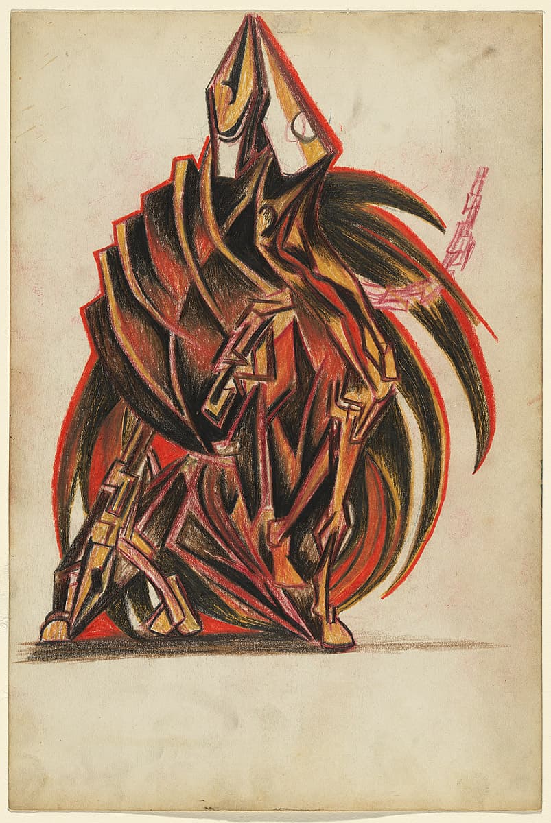
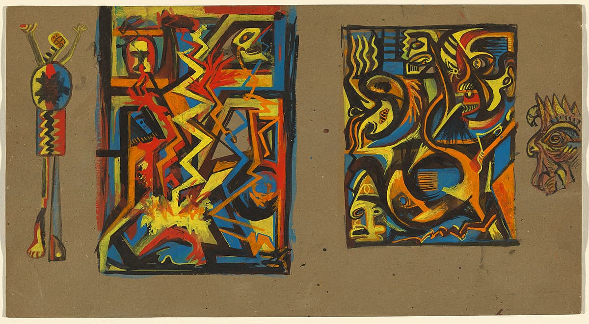
More detail | PermalinkJackson Pollock was a patient of the Jungian psychologist Joseph Henderson: a treatment that coincided with the artist’s growing interest in Surrealism, and a concurrence of events that resulted in a creative outpouring. Between 1938 and 1943, Pollock produced numerous pictographic drawings based on striking symbolic motifs, including a cache of 83 drawings provided to Henderson as material for analytical aids.
Works in the collection show a close association with such ‘psychoanalytic drawings’, both in style and subject matter. Untitled c#1933–39 is a dynamic composition depicted through a faceted, vertebral form. An amalgamated figure displays both horse- and bird-like features; a conjoining of two animals or an animal-human entity that occurs frequently in Pollock’s drawings of this period. In Jungian iconography, animals such as snakes, mandalas and shadows are symbolic referents for life forces such as birth, death, power and failure.
Jaklyn Babington
Jackson Pollock
Learn moreUntitled c.1938-41
© Pollock-Krasner Foundation. ARS/Copyright Agency Purchased 1986
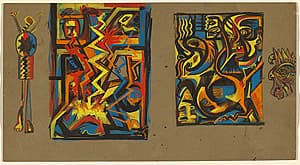
More detail | PermalinkJackson Pollock was a patient of the Jungian psychologist Joseph Henderson: a treatment that coincided with the artist’s growing interest in Surrealism, and a concurrence of events that resulted in a creative outpouring. Between 1938 and 1943, Pollock produced numerous pictographic drawings based on striking symbolic motifs, including a cache of 83 drawings provided to Henderson as material for analytical aids.
Jaklyn Babington
Jackson Pollock
Learn moreUntitled c.1939-42
© Pollock-Krasner Foundation. ARS/Copyright Agency Purchased 1986
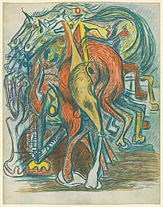
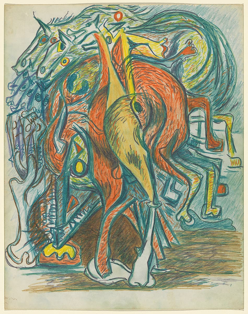
More detail | PermalinkJackson Pollock was a patient of the Jungian psychologist Joseph Henderson: a treatment that coincided with the artist’s growing interest in Surrealism, and a concurrence of events that resulted in a creative outpouring. Between 1938 and 1943, Pollock produced numerous pictographic drawings based on striking symbolic motifs, including a cache of 83 drawings provided to Henderson as material for analytical aids.
Works in the collection show a close association with such ‘psychoanalytic drawings’, both in style and subject matter. In Untitled c#1939–42 the viewer is presented with the rump of a horse, shown in multiple views over several moments in time. The face of a bull appears at the lower left, looking directly at the viewer with a single yellow eye. Its enormous mass appears conjoined with the horse into a condensed, almost vortex-like accumulation of small, short pencil strokes. In the lower left corner, the horse figure dissipates into an array of empty eye sockets and skulls, finally coming to rest on the ground as a single white bone. This drawing, in particular, seems to evoke a life-and-death cycle, something that Pollock often symbolically explored in both his paintings and his drawings.
Jaklyn Babington
Jackson Pollock
Learn moreUntitled 1939-42
© Pollock-Krasner Foundation. ARS/Copyright Agency Purchased 1986
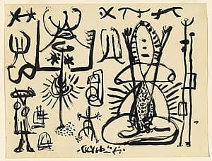
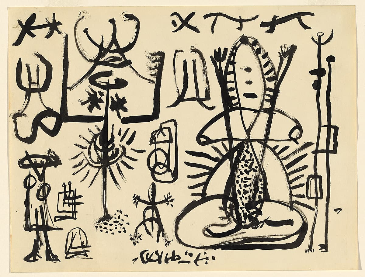
More detail | PermalinkJackson Pollock was a patient of the Jungian psychologist Joseph Henderson: a treatment that coincided with the artist’s growing interest in Surrealism, and a concurrence of events that resulted in a creative outpouring. Between 1938 and 1943, Pollock produced numerous pictographic drawings based on striking symbolic motifs, including a cache of 83 drawings provided to Henderson as material for analytical aids.
Jaklyn Babington
Jackson Pollock
Learn moreUntitled c.1943
© Pollock-Krasner Foundation. ARS/Copyright Agency Purchased 1986
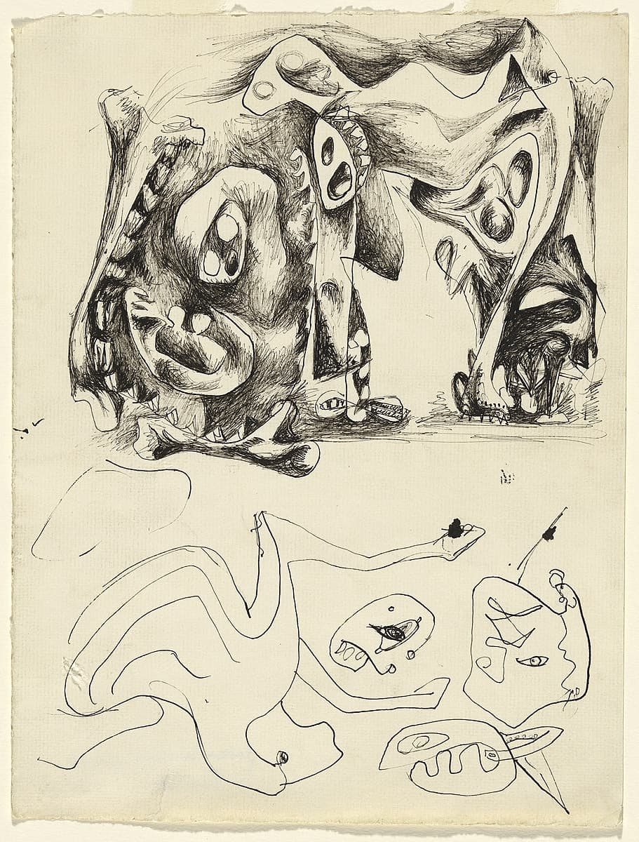
More detail | PermalinkJackson Pollock was a patient of the Jungian psychologist Joseph Henderson: a treatment that coincided with the artist’s growing interest in Surrealism, and a concurrence of events that resulted in a creative outpouring. Between 1938 and 1943, Pollock produced numerous pictographic drawings based on striking symbolic motifs, including a cache of 83 drawings provided to Henderson as material for analytical aids.
The artist’s striking division of the composition Untitled c#1943 into two distinct levels can be interpreted along Jungian lines. The top section—rendered in carefully shaded detail—may represent the ‘personal unconscious’, while the lower section—a loosely formed composition of lines and biomorphic shapes—may be seen to represent the deeper level of Jungian unconscious, the ‘collective unconscious’. It was this deeper level of the psyche from which Pollock and many of the Surrealists wished to draw their expressive imagery. As a collection of lightly executed curvilinear lines and separated organic shapes, the lower half of this work appears to have been created using an automatist technique.
Jaklyn Babington

Louise Bourgeois
Learn moreC.O.Y.O.T.E. 1941-48
© The Easton Foundation. VAGA/Copyright Agency Purchased 1981
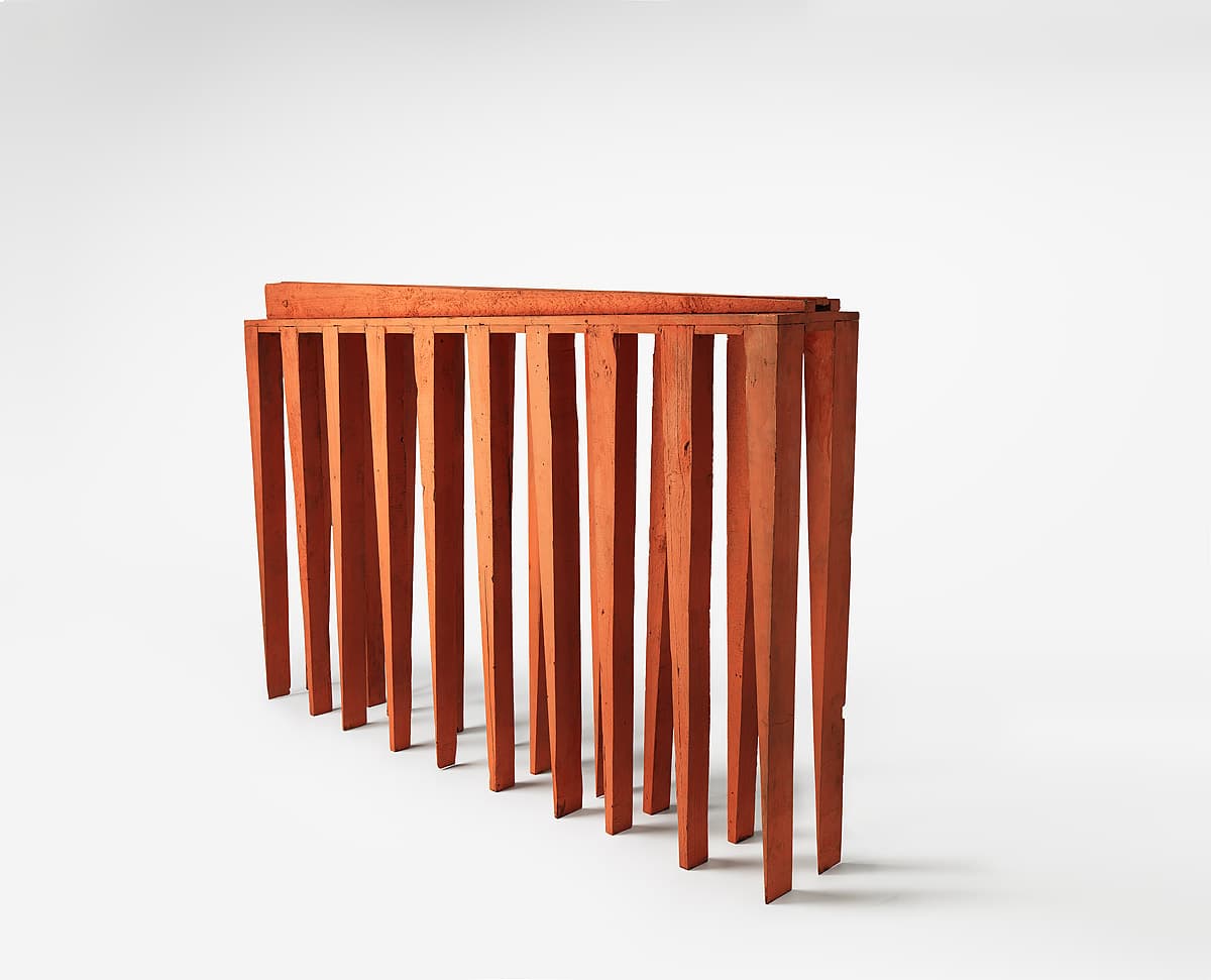
More detail | PermalinkOne of Louise Bourgeois’ earliest major sculptures, C.O.Y.O.T.E. 1941–48, and two related pieces, both titled The blind leading the blind,[i] were begun in 1941 when increased studio space gave her the opportunity to work on a large scale for the first time. This was a turning point in her career, the artist reflected in 1979, ‘because we moved to the so‑called Stuyvesant Folly, which had an immense roof where nobody ever went and I spent my time there. It was very large and I could leave my pieces without being bothered. At this point the size and number of pieces changed.’[ii] Lucy Lippard has pointed out that the combination of human and architectural elements in these sculptures—legs and lintel—can be found in Bourgeois’ earlier works: drawings, paintings and small carved and painted wooden sculptures in which tall, narrow buildings sprout stilts or legs.[iii] When she first arrived in New York from Paris in 1938, Bourgeois recalled being ‘struck by the brownstones, which were a form of habitat I had never seen, and since they were very large and very high and very narrow they reminded me of the human body’.[iv]
Bourgeois herself traced the genesis of C.O.Y.O.T.E. and The blind leading the blind to childhood memories, when she and her brother crouched beneath the kitchen table watching the legs of their parents move back and forth as they prepared a meal.[v] Referring specifically to this work, she said:
It represents an army of legs, two by two, that holds together. Eight pairs of legs. The reason this blind army of legs does not fall, even though the legs are always afraid of falling, since they come to a point, is that they hold on to each other. This is exactly what I felt when I was a child, when I was hiding under the table. My brother was following me like a shadow; I was blind with fear and so was he … [and I concluded that my parents] were not friendly. I decided that the outside was not friendly. And I was afraid, simply afraid. I couldn’t understand their purpose, which was to prepare lunch. I didn’t understand why they were walking around the table. Why would one pair of legs interfere with the other visually, physically? There were their legs and the table’s legs. It really just made me wonder where I fitted in.[vi]
If the form of these sculptures owed something to childhood memories, their title The blind leading the blind—a title that was also originally applied to C.O.Y.O.T.E.—had a very contemporary relevance for Bourgeois. Taken from the New Testament (Matthew 15:14: ‘if the blind lead the blind, both shall fall into the ditch’), the title was chosen for works in which the artist saw ‘catastrophe’, ‘a chain of pain’, ‘people fated to be destroyed together’.[vii] The sculptures were made at the height of the Cold War, at a time when her friends, the artists Marcel Duchamp, Amédée Ozenfant and André Lhote, were under investigation by the House Un-American Activities Committee, suspected of being Communists.
In 1979, in preparation for her exhibition at the Xavier Fourcade Gallery in September, Bourgeois gave a new title to one of The blind leading the blind sculptures, and repainted it, covering the original black and red colour scheme with flesh‑pink paint. The new title, C.O.Y.O.T.E., stands for ‘Call Off Your Old Tired Ethics’ and was taken from a tract written by Bourgeois’ friend Margot Saint James, in which she argued the right of prostitutes to a reasonable workers’ organisation, that is, the right to belong to a union. Bourgeois explained:
The blind leading the blind is a piece that brings me to the feminist cause. Another, which is very close, is C.O.YO.T.E., which was the name of the prostitutes’ group. All they can do is hold on to each other. Individually they couldn’t even stand on their feet, but holding on to each other, they make it. It’s also a comment on failures, on shortcomings, on being disabled. They huddle together, and through their positive attitude toward each other they summon the energy necessary to stand against the world. They conquer fear enough to finally express themselves and be what they are.[viii]
C.O.YO.T.E., in declaring Bourgeois’ allegiance to the collective, suggests both the right to self-determination and a rallying cry for the oppressed everywhere.
Christine Dixon[ix]
[i] The blind leading the blind 1949, Detroit Institute of Arts, at https://www.dia.org/art/collection/object/blind-leading-blind-35229, accessed 16 February 2018, and The blind leading the blind 1941–48, collection of the artist, New York.
[ii] Bourgeois, quoted in Marsha Pels, ‘Louise Bourgeois: A Search for Gravity’, Art International, vol 23, no 7, October 1979, p 51.
[iii] Lucy R Lippard, ‘The blind leading the blind’, Bulletin of the Detroit Institute of Arts, vol 59, no 1, Spring 1981, p 27.
[iv] Corinne Robins, ‘Louise Bourgeois: Primordial Environments’, Arts Magazine, vol 50, no 10, June 1976, pp 81–3.
[v] Kay Larson, ‘Louise Bourgeois: Body language spoken here’, Village Voice, 24–30 September 1980, p 83.
[vi] Donald Kuspit, Bourgeois: an interview with Louise Bourgeois, Vintage Books, New York, 1988, pp 26–7.
[vii] Lippard, p 27.
[viii] Kuspit, pp 70–2.
[ix] Adapted and updated from Michael Lloyd and Michael Desmond, European and American Paintings and Sculptures 1870–1970 in the Australian National Gallery, Australian National Gallery, Canberra, 1992, pp 209–11.
Jackson Pollock
Learn moreUntitled c.1944
© Pollock-Krasner Foundation. ARS/Copyright Agency Purchased 1985
More detail | PermalinkJackson Pollock was a patient of the Jungian psychologist Joseph Henderson: a treatment that coincided with the artist’s growing interest in Surrealism, and a concurrence of events that resulted in a creative outpouring. Between 1938 and 1943, Pollock produced numerous pictographic drawings based on striking symbolic motifs, including a cache of 83 drawings provided to Henderson as material for analytical aids.
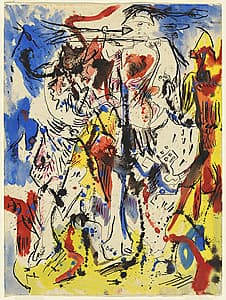
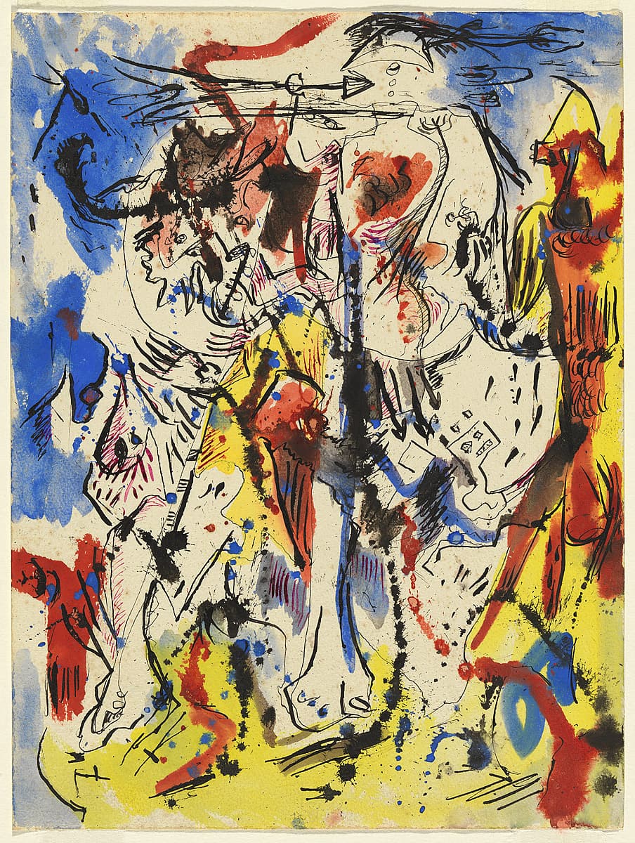
Rendered in a restless, black ink line, a horse and its rider emerges as the central image of the drawing Untitled c#1944. The rider wears a helmet adorned with feathers, or perhaps tassels, while the horse strides from right to left across the picture plane, with stark white forelegs and solid hoofs. The abstract background is a tangle of undefined areas of blue and yellow applied in loosely brushed formations, spiky black ink splashes and erratic red highlights. It is difficult to distinguish the horse and its rider from its heavily worked backdrop—the figurative subject matter is almost completely absorbed by the energetic activity of the background.
From a retrospective viewpoint, we can read Pollock’s use of spatter and drip-like application of ink as an allusion to what was to come in his future work. In this way, Untitled c#1944 displays Pollock’s transition toward a mature style, a style that was to be celebrated for its ‘over-all’ compositional structure and for the triumph of the abstract over the figurative.
Jaklyn Babington
Hans Hofmann
Learn moreUntitled 1943
© Renate, Hans & Maria Hofmann Trust. ARS/Copyright Agency Purchased 1980
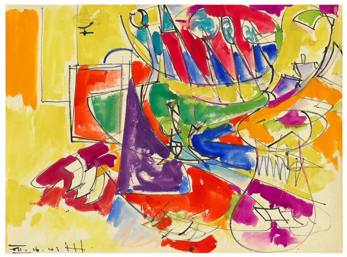
More detail | PermalinkThe brilliant colouring and freely expressive forms of Untitled 1943 disguise the sophistication and development of Hans Hofmann’s style after moving to the United States in 1932. Even more than other emigrés, Hofmann brought with him a vast knowledge of avant-garde styles and practices, evident in his history and friendships in Germany and France in the first decades of the twentieth century. Hofmann studied art in Munich and Paris, where he was acquainted with artists such as Henri Matisse, Pablo Picasso and Georges Braque. Hofmann left Paris just before the outbreak of war in 1914, and stayed in Munich for the duration. There he was a friend of Wassily Kandinsky’s partner Gabriele Münter. After Kandinsky was expelled as an enemy alien and returned to Moscow, Münter asked Hofmann to look after his paintings until they could be retrieved after the war.
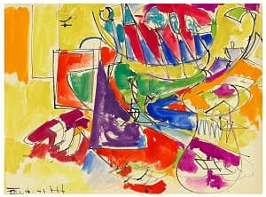
Such exposure to the most important abstract artist of the time, especially his lyrical Compositions and Improvisations, has a legacy in Hofmann’s work that can be seen in Untitled. Sheer energy is released by a large field of yellow watercolour overlaid by dynamic lines of brush and ink. Curved yellow and green shapes swoop from the upper right, and break into an opposing broken path that reaches down into the lower right. The intensity of colour is partially offset by the semi-transparent medium of watercolour, and Hofmann’s artful placement of almost pure blocks of paint side-by-side. Rectangles of orange and red are counterpointed by violet and blue triangles and circles, becoming a whole that forms a powerful, joyously agitated landscape.
Michael Lloyd and Michael Desmond[i]
[i] Adapted and updated from Michael Lloyd and Michael Desmond, European and American Paintings and Sculptures in the Australian National Gallery 1870–1970, Australian National Gallery, Canberra, 1992, pp 306–7, by Christine Dixon.
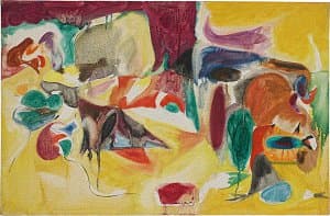

Arshile Gorky
Learn moreUntitled 1944
© Arshile Gorky. ADAGP/Copyright Agency Purchased 1972
More detail | PermalinkUnder the threat of persecution, Arshile Gorky fled Turkish Armenia with other members of his family and arrived in the United States in 1920. After studying at the New School of Design in Boston, he moved to New York and later met John Graham, David Burliuk, Willem de Kooning and Stuart Davis. In 1930 he participated in a group exhibition of young artists at the Museum of Modern Art, New York.
Gorky moved with his wife and children to the home of his parents-in-law at Crooked Run Farm in Hamilton, Virginia in the spring of 1944, where he worked for nine months, producing a large body of drawings that inspired the paintings he made later, in the winter. It is likely that Untitled was painted in November or December of that year, and was based on one of these drawings.
As can also be traced in Mark Rothko’s Untitled watercolour of 1944–46 (see p xx), the influence of European Surrealist painters was being naturalised by the painters of the New York School, including Gorky. Especially influential were paintings by Joan Miró and the Surrealist compositions of Picasso. Gorky’s Untitled owes much to his admiration for Miró, whose works were known in New York from the inaugural exhibition at the Pierre Matisse Gallery in 1931.
Although he employed similarly biomorphic forms, Gorky’s technique is more textural than Miró’s, and much denser in its composition. Untitled, like many of Gorky’s so-called abstract works, remains firmly based on landscape elements—the hills, rocks and trees that make up his observed world—carefully abstracted into their final form. Strong and vigorously worked elements unite with swathes of luminous transparent colour in an interplay of light and dark, warm and cool, and sharp and rounded forms. Despite recurring ambiguities about what are figures and what is ground, the painting strongly hints at a landscape of organic objects in three-dimensional space.
Untitled shows traces of a pencil grid, which indicates that the composition was directly transferred from a drawing. This process was common for Gorky, although it contradicts much of the rhetoric surrounding Surrealism’s automatism. The artist carefully worked out his compositions in advance through drawings, and reused them with different colour schemes and textures; it is clear that the spontaneous influence of the subconscious mind had a limited role in Gorky’s work.
Much knowledge of his technique disappeared after a disastrous fire in 1946 destroyed his studio, thousands of drawings and most of his paintings. Untitled survived because Gorky had already given the painting to André Breton, the spokesman for the Surrealist movement who fled to New York after the Nazi invasion of France. Gorky first met Breton in the winter of 1944, at much the same time that he was working on Untitled. The painting was probably given on the occasion of Gorky’s first exhibition at the Julien Levy Gallery, New York, in March 1945, to which Breton had contributed the catalogue introduction, which was also used as a concluding chapter in the second edition of his book Surrealism and painting.
Michael Lloyd and Michael Desmond[1]
[1] Adapted and updated from Michael Lloyd and Michael Desmond, European and American Paintings and Sculptures 1870–1970 in the Australian National Gallery, Australian National Gallery, Canberra, 1992, pp 214–16, by Christine Dixon.
Joseph Cornell
Learn moreUntitled (Owl box) c.1946-48
© Joseph Cornell. VAGA/Copyright Agency Purchased 1980
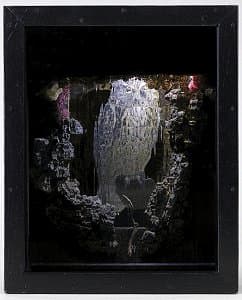
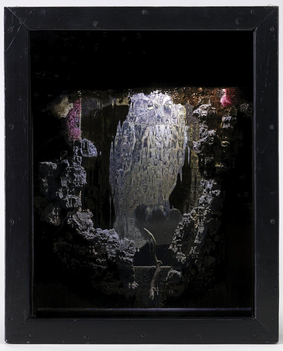
More detail | PermalinkJoseph Cornell was acquainted with many émigré European artists, including a number of Surrealists who settled in or moved through New York. Their ideas inflect his work and his creations were, in turn, influential in introducing these ideas further afield. An avid collector, Cornell scoured Manhattan’s antique bookshops and second-hand stores for paper ephemera and small objects to make his signature glass-fronted boxes. His first box was shown in the Fantastic Art, Dada, Surrealism exhibition at the Museum of Modern Art, New York, in 1936. From his knowledge of European culture, art and literature the reclusive artist, who never travelled beyond New York, created his own microcosms, self-contained worlds in which to explore life hermetically.
Cornell worked on owl boxes from the early 1940s to the mid 50s, keeping track of them in his diaries.[i] While birds were a common feature of his boxes, his owl constructions, such as Untitled (Owl box) c#1946–48, have a particular character, placed in diorama-type settings that he referred to as ‘woodland habitats’ or ‘deep forest interiors’. In this box, a secret world of undergrowth constructed from pieces of dry wood and lichen surrounds the owl—an illustration glued to a plywood backing. Wood dust adhered with glue covers exposed areas of the inner plywood frame, while several streaks of gold paint are dripped onto the bark and the back wall. At the top of the box is a lamp fitting hidden by the frame. The habitat becomes visible only when this lamp is switched on, taking on a soft blue tint from the rippled blue glass pane, against which the eyes of the owl are yellow and bright. The owl appears as if seated in its bower in shimmering distant moonlight.
Lucina Ward[ii]
[i] Several entries record Cornell’s processes; the entry for 15 April 1946, for example, reads: ‘discovery for the owl box in progress a particularly fine example of rotted tree from which a piece of bark and clinging trailing shrubbery branches had fallen. Took off by the handful the wood from outer part of trunk which was in a powder state-lined box that evening …’ Archives of American Art, Smithsonian Institution, Joseph Cornell Papers, diaries, undated and 1930–72 (reel 1059, frame 365). Other owl boxes include Untitled (Owl box) 1945–46, Musée National d’Art Moderne, Paris and Untitled (Owl) c#1948–50, Joseph Cornell Collection, Chicago.
[ii] Adapted and updated from Michael Lloyd and Michael Desmond, European and American paintings and sculptures 1870–1970 in the Australian National Gallery, Australian National Gallery, Canberra, 1992, pp 224–5.

Mark Rothko
Learn moreUntitled 1944-46
© Kate Rothko Prizel & Christopher Rothko. ARS/Copyright Agency Gift of American Friends of the National Gallery of Australia, Inc., New York, NY, USA, made possible with the generous support of Mark Rothko Foundation, 1986
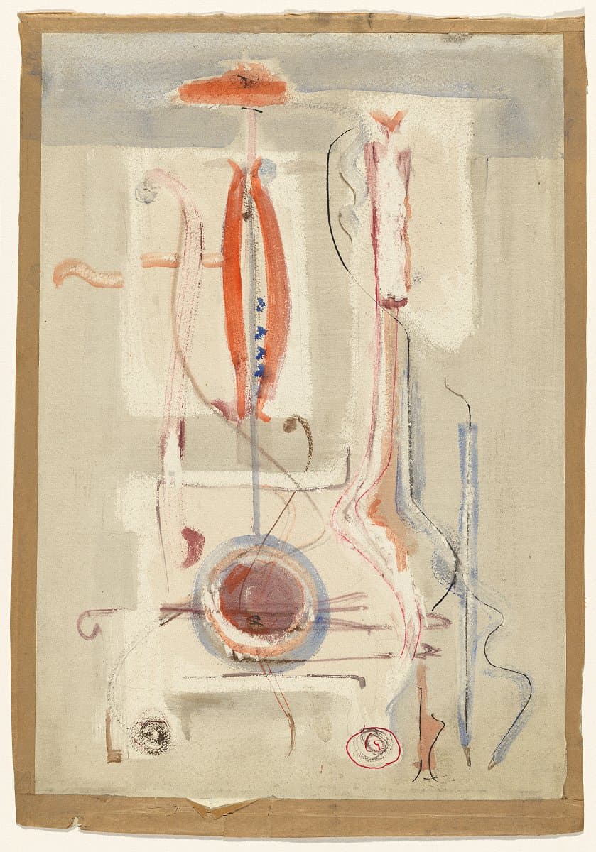
More detail | PermalinkUntitled c#1944–46 is a delicate watercolour, pen, ink and pencil drawing that predates Mark Rothko’s paintings in the NGA collection and is dramatically different in style. Like many Abstract Expressionist painters in New York at the time, Rothko developed an interest in Surrealism, mythology and spiritual symbols before which his early style of broadly-painted realism gave way. This drawing displays a thin, sinuous line that curves from the upper left down to the lower right and another that is centred and vertical. Both scroll-like marks cross a section of repeated horizontal lines in the lower half of the drawing. This arrangement can be recognised as musical notation—the symbols of a staff and clef. Furthermore, the large circular shape in the lower quadrant of the drawing appears as the sound hole in the base of a musical instrument, perhaps a mandolin, with its thin neck standing straight and embellished with strings, blue machine heads and an orange wooden scroll.
As a young man, Rothko had taught himself to play both the mandolin and the piano; throughout his career as a painter, music was a constant source of inspiration and connection to the spiritual. Even the manner in which Rothko titled his paintings, by number or colour, had a distinct relation to musical composition. Although the overall style of the drawing is representational, Rothko has taken special care in his selection of colour, contrasting the orange and blue of his forms against lightly washed, abstract fields that serve as a backdrop. The ghostly shadow along the upper section of the composition is a curious element; this geometric form hints at the rectangular slabs Rothko later established as his signature style.
Michael Lloyd and Michael Desmond[i]
[i] Adapted and updated from Michael Lloyd and Michael Desmond, European and American Paintings and Sculptures 1870–1970 in the Australian National Gallery, Australian National Gallery Canberra, 1992, pp 248–9, by Steven Tonkin and Jaklyn Babington.

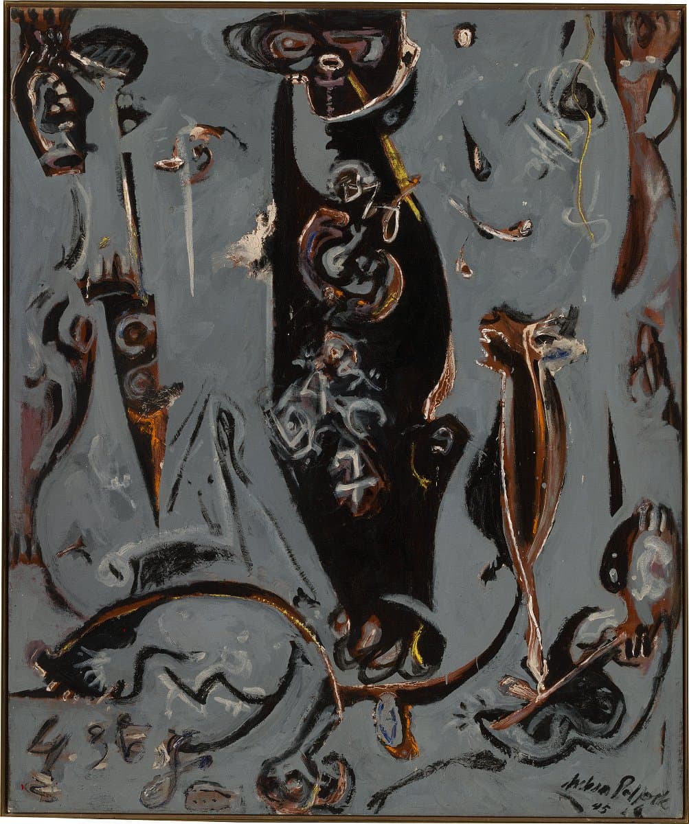
Jackson Pollock
Learn moreTotem lesson 2 1945
© Pollock-Krasner Foundation. ARS/Copyright Agency Purchased 1986
More detail | PermalinkOne of the most influential artists of the Abstract Expressionist movement, Jackson Pollock’s style evolved from his early figurative work of the 1930s to the famous drip paintings of the 1950s. Pollock grew up in the American west and remained deeply interested in the sand painting ceremonies of the Navajo, which is reflected in Totem lesson 2 1945, the second of two paintings with the same title. Totem lesson 1 was completed in October 1944.[1]
The title evokes the contemporary enthusiasm for American Indian art and it has been suggested that the central motif could be a painterly variation of the Sky Father image in a Navajo sand painting illustrated in Indian Art of the United States, the catalogue of an exhibition staged at the Museum of Modern Art, New York, in 1941. Such an image may well have been in the back of Pollock’s mind when he painted Totem lesson 2, however such influences in his work were loose and associational. Pollock said in 1944: ‘Some people find references to American Indian art and calligraphy in parts of my picture. That wasn’t intentional: probably was the result of early memories and enthusiasms.’[2]
Pollock went on to identify his fascination for French art of the twentieth century: ‘I am particularly impressed with their concept of the source of art being the unconscious. This idea interests me more than these specific painters [European émigré artists in America] do, for the two artists I admire most, Picasso and Miró, are still abroad.’[3] Indeed, Totem lesson 2 may register the impact of Surrealism.
In the final analysis, however, such comparisons accentuate the distinctiveness of Pollock’s mode of painting in Totem lesson 2. At first it comprised a large central image painted in oil, occupying most of the picture space. Before the paint was dry Pollock began editing the composition using ordinary grey house paint, paring away the central figure to a hovering spectre surrounded by swirling splinters of the original design. The normal ground‑figure relationship is reversed—the image is literally disclosed in the process of painting. Finally, returning to oil paint, Pollock animated the composition with abstract, expressive notations such as the wriggling yellow line applied directly with the tube in the upper right.
In his review of Pollock’s second solo exhibition at Art of This Century Gallery in 1945—which included both Totem lesson paintings—art critic Clement Greenberg made extraordinary claims for the 32‑year‑old artist:
Jackson Pollock’s second one‑man show at Art of This Century … establishes him, in my opinion, as the strongest painter of his generation and perhaps the greatest one to appear since Miró … Those who find his oils overpowering are advised to approach him through his gouaches, which in trying less to wring every possible ounce of intensity from every square inch of surface achieve greater clarity and are less suffocatingly packed than the oils. Among the latter however, are two—both called Totem lessons—for which I cannot find strong enough words of praise.[4]
Michael Lloyd and Michael Desmond[5]
[1] Francis Valentine O’Connor and Eugene Victor Thaw, Jackson Pollock: A catalogue raisonné of paintings, drawings and other works, 4 vols, Yale University Press, New Haven and London, 1978, vol 1, p 114, cat 121. Totem lesson 1 is signed and dated lower left, ‘10‑44 Jackson Pollock’; held collection Harry W and Mary Margaret Anderson, Atherton, California.
[2] Arts and Architecture (Los Angeles), February 1944, p 14.
[3] As above.
[4] Clement Greenberg, review, Nation, 7 April 1945, p 39.
[5] Adapted and updated from Michael Lloyd and Michael Desmond, European and American Paintings and Sculptures 1870–1970 in the Australian National Gallery, Australian National Gallery, Canberra, 1992, pp 232–5, 243–4 by Anthony White.
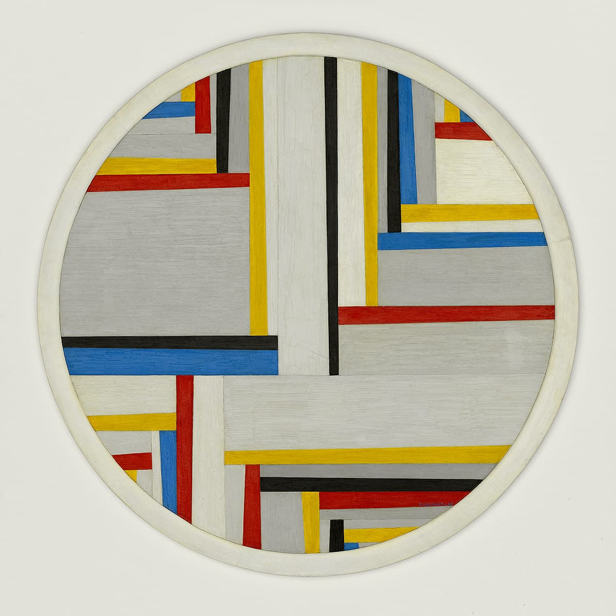
Fritz Glarner
Learn moreRelational painting, tondo no. 4 1946
© 2002 Kunsthaus Zurich. All rights reserved. Purchased 1977
More detail | PermalinkFritz Glarner painted his first tondo in the early 1940s and it became his basic format for over 60 variations painted in the United States. Having studied and worked in both Italy and France, exhibited with the Abstraction-Création group in the 1930s and been influenced by the De Stijl painters and Bauhaus principles, Glarner’s work brings together a range of geometric and spatial principles. His use of the round format for his paintings recalls Renaissance models but here reinvented with an emphatically modern approach. As the artist later explained, the tondo ‘was naturalistic because it could be a sun, a moon, or any symbol because it was concentric and therefore the space around it was undetermined’.[1]
In New York Glarner was closely associated with Piet Mondrian and, while he acknowledged the older artist’s influence, he also made key adjustments. Both artists rely on primary colours but Glarner makes greater use of greys and diagonal forms. As Michael Lloyd and Michael Desmond point out, Glarner replaced the ‘balancing of horizontality and verticality achieved in Mondrian’s painting with interlocking rectangles and wedges that expand outwards towards the edges of the canvas’.[2] In Tondo no. 1 and Tondo no. 2 (both 1945) Glarner combines:
abstract realities and the laws of mathematics and geometry within the canvas: the organization of the image, the relationships between the areas, the intensity of the base colours and grey tones are coordinated [to create] a unity that is independent of the world yet internally functional.[3]
In Tondo no. 3 1945 Glarner sought to overcome this figurative ambiguity by dividing the interior of the tondo into a series of angles, successively reiterated towards the edge of the canvas and, by implication, shaping the space beyond the circumference.[4] These ideas were refined in Relational painting, tondo no. 4, painted the following year. While its colours and overall geometry of make it appear flat, the lattice-like sections imply a layering which, again, suggests recession. Moreover, the use of board—instead of the more traditional canvas—gives the work an object-like form.
Towards the end of 1946, the artist settled on the term ‘relational painting’ as an English equivalent for peinture relative, and subsequently applied the term to earlier paintings, as well as his new work. This term suited, as Lloyd and Desmond observe, ‘the kind of abstract painting he pursued, focused on relating geometric shapes and ground through colour, in ways which would make shape and ground alternate to produce what he called “pumping planes”’.[5] ‘In painting’, Glarner said, ‘form has to lose its specific identity and space has to acquire one by determination.’[6]
Lucina Ward
[1] Dore Ashton, ‘Fritz Glarner’, Art International, vol 7, no 1, January 1963, pp 48–55.
[2] Michael Lloyd and Michael Desmond, European and American Paintings and Sculptures 1870–1970 in the Australian National Gallery, Australian National Gallery, Canberra, 1992, p 246.
[3] Tondo no. 1 1945, Kunsthaus, Zurich, at https://www.google.com/culturalinstitute/beta/asset/relational-painting-tondo-no-1/CAEKErPhRQvmjQ, accessed 16 February 2018. Tondo no. 2 1945, whereabouts unknown.
[4] Tondo no. 3 1945, Collection Lucie Glarner, Locarno.
[5] Lloyd and Desmond, p 246.
[6] ‘What abstract art means to me’, Glarner’s response to a symposium held at the Museum of Modern Art, New York, 5 February 1951, reprinted in the Bulletin of the Museum of Modern Art, vol 18, no 3, Spring 1951, pp 10–11, see also http://www.jstor.org/stable/4058250, accessed 16 February 2018.

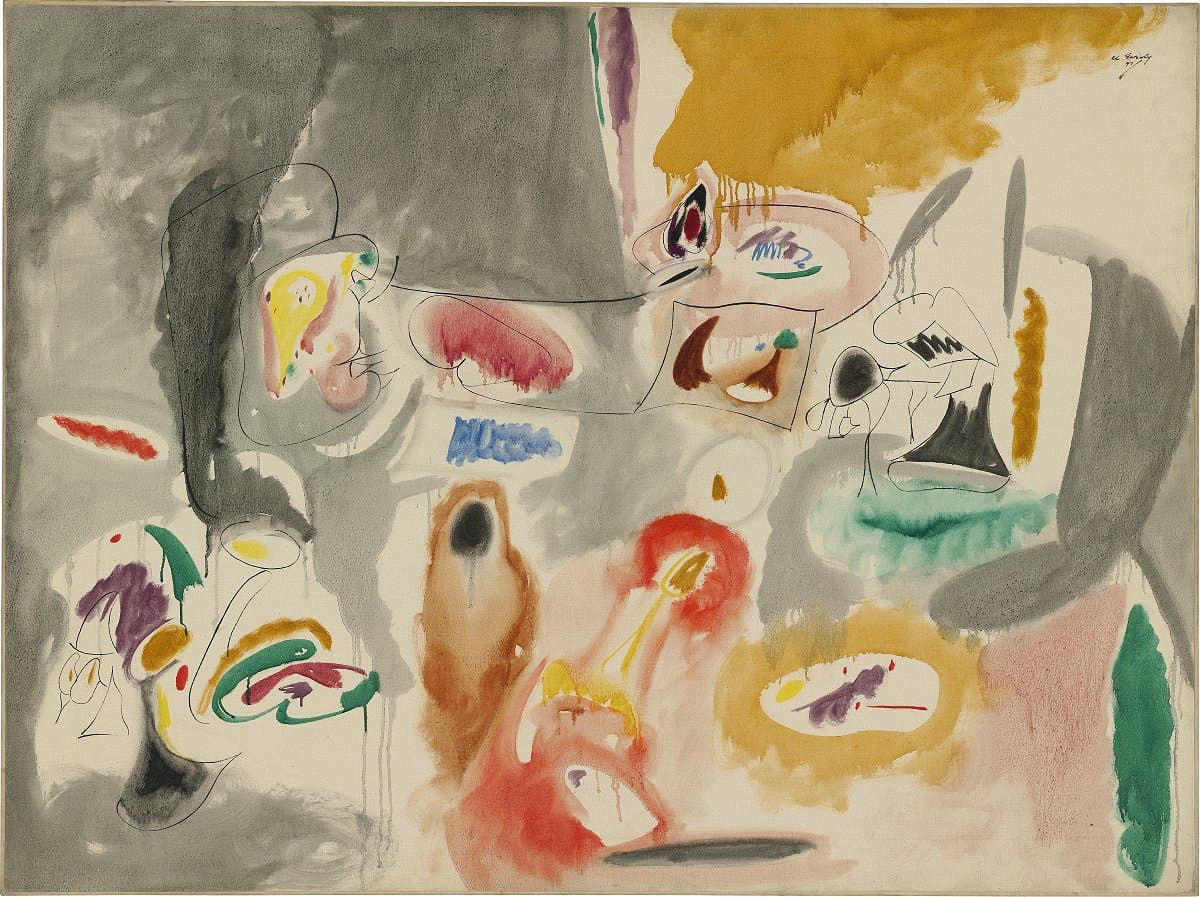
Arshile Gorky
Learn morePlumage landscape 1947
© Arshile Gorky. ADAGP/Copyright Agency Purchased 1973
More detail | PermalinkArshille Gorky’s paintings were invariably preceded by a preliminary drawing. He would select from existing drawings, usually done in the warmer months, to use as the basis for a painting or a number of paintings. The drawing, once transferred to the canvas, served as an armature for his colour. This schema would be interpreted freely and could be worked up in a number of versions, each being a variation on a theme. Two other works completed in 1947 share the same underlying drawing as Plumage landscape: Year after year and Theme for Plumage landscape (call for Virginia).[1]
In Plumage landscape, colour is varied around the common linear structure, thereby allowing individual emphasis and interpretation. The oil paint has been thinned to the consistency of watercolour to produce washes of pure and transparent colour, which preserve the firm black lines of the drawing and maximise the soft organic fluidity of each colour accent. Viridian elements scattered across the picture plane unite the composition. The daring use of tertiary and pastel hues—pinks, ochres, greys—allows the viewer to concentrate on form as well as colour, and emphasises the painting’s high tonality.
Gorky’s titles are usually poetic and evocative rather than descriptive. ‘Plumage landscape’ is a typical creation, conflating the iridescence of birds’ feathers with the idea of moving through a landscape. Ethel Schwabacher, a student of Gorky’s in the mid 1940s, referred to the accents of colour as ‘plumes’ when writing about his work in 1951, and William C Seitz, in a publication of 1962, claimed the term was Gorky’s own.[2] If this is the case, then it may offer some insight into the title of the painting as, literally, a landscape made with aureoles of paint.
Michael Lloyd and Michael Desmond[3]
[1] Respectively, Ex-collection Mr and Mrs Gifford Phillips, New York; and Private collection.
[2] See Ethel Schwabacher’s introduction to Arshile Gorky memorial exhibition, Whitney Museum of American Art, New York, 1951; William C Seitz first claimed that plumes ‘is what Gorky called them’ in the catalogue Arshile Gorky: Paintings, drawings, studies, Museum of Modern Art, New York, Washington Gallery of Modern Art, Washington DC, 1962. This claim reappeared in the text that was reprinted for the catalogue for the exhibition at the Tate Gallery, London, Arshile Gorky: Paintings and drawings, Arts Council, London, 1965. Interestingly, in Seitz’s dissertation of 1955, Abstract Expressionist painting in America, Harvard University Press, Cambridge, Mass., 1983, Seitz attributes the term to Schwabacher.
[3] Adapted and updated from Michael Lloyd and Michael Desmond, European and American Paintings and Sculptures 1870–1970 in the Australian National Gallery, Australian National Gallery Canberra, 1992, p 216, by Christine Dixon.
Joseph Cornell
Learn moreUntitled c.1950
© Joseph Cornell. VAGA/Copyright Agency Purchased 1973
More detail | PermalinkJoseph Cornell was acquainted with many émigré European artists, including a number of Surrealists who settled in or moved through New York. Their ideas inflect his work and his creations were, in turn, influential in introducing these ideas further afield. An avid collector, Cornell scoured Manhattan’s antique bookshops and second-hand stores for paper ephemera and small objects to make his signature glass-fronted boxes. His first box was shown in the Fantastic Art, Dada, Surrealism exhibition at the Museum of Modern Art, New York, in 1936. From his knowledge of European culture, art and literature the reclusive artist, who never travelled beyond New York, created his own microcosms, self-contained worlds in which to explore life hermetically.
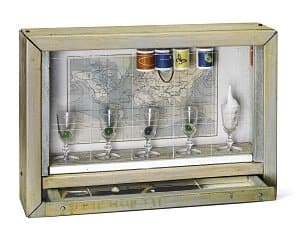
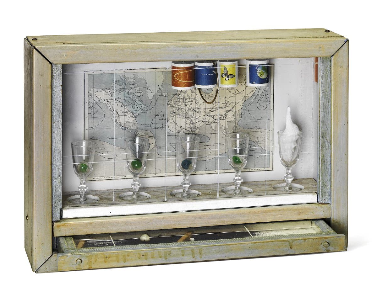
Cornell admired the detail and finish of seventeenth-century Dutch still-life painting, referring to the genre as ‘ultra-graphic microscopic magic’.[1] The same precision and complexity applies to Untitled c#1950 from the Navigation series. The phrase ‘nostalgia of the sea’ occurs frequently in Cornell’s diaries, and was an emotion he hoped to crystallise in his work.[2] Washed with thin blue paint, as if scoured by seawater, the exterior paintwork of this box has a weathered look. An intriguing map occupies the back of the box, areas of which are washed with a light blue watercolour. On the underside of the box’s roof is a section of a German map showing an expanse of the Atlantic Ocean from the Caribbean to the United Kingdom. Cuttings from a guide to astronomy are attached to four suspended wooden cylindrical blocks. Five liqueur glasses stand in hollows cut into the wood at the bottom of the box—four contain a marble, the fifth holds a white spiral shell. The shallow white drawer is covered with a glass pane and contains a sprinkled mass of dark blue powder, metal ball-bearings, shells and strips of cork. Cornell has drawn a thin grid of white paint on the glass covering the drawer, inspired perhaps by the lines of latitude and longitude on the maps.
Lucina Ward[3]
[1] Undated diary entry, Joseph Cornell Papers (reel 1062, frame 878).
[2] See, for example: ‘nostalgia of the sea / we pick up a piece of wood on the seashore / there is infinite legend & romance about flotsam and jetsam—equivalent in mounting to retain this quality / immaculate aspect of something surviving a hundred years’. Joseph Cornell Papers, source material files I (reel 1067, frame 427).
[3] Adapted and updated from Michael Lloyd and Michael Desmond, European and American paintings and sculptures 1870–1970 in the Australian National Gallery, Australian National Gallery, Canberra, 1992, pp 224–5.

Mark Rothko
Learn moreMultiform 1948
© Kate Rothko Prizel & Christopher Rothko. ARS/Copyright Agency Purchased 1981
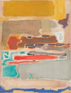
More detail | PermalinkBy 1947 Rothko’s paintings had become completely abstract, his compositions made up of irregular areas of colour. Untitled (Multiform) 1948 is one of a small group of untitled works, collectively known as Multiforms,[i] painted immediately preceding the mature works for which Rothko is best known. In these transitional paintings Rothko abandoned the surrealist-inspired personal myths and classical themes evident in works such as Untitled c#1944–46, moving towards a fully abstract vocabulary. Writing in 1947, he described his paintings as ‘dramas’, but added that the use by postwar artists of figurative subject matter to convey emotions and experiences was no longer practicable: ‘with us the disguise must be complete. The familiar identity of things has to be pulverised in order to destroy the finite associations with which our society increasingly enshrouds every aspect of our environment.’[ii] In Untitled (Multiform) irregular areas of colour contract and expand, project and retract, as the eye roves over the surface; the changes in tone between darker and lighter areas are so gradual that depth within the painting remains indeterminate. The three large rectangular blocks of colour are precursors—from 1949 the artist made these the subject of all subsequent paintings.
Michael Lloyd and Michael Desmond[iii]
[i] The title Multiform does not seem to have been used before Rothko’s death. It appears for the first time in the catalogue for the Rothko exhibition at the 1970 Venice Biennale. It is thought by the staff of the Marlborough Gallery, who prepared this catalogue, that Rothko used the term Multiform generically when referring to his transitional paintings of 1948–49; Bonnie Clearwater, correspondence with the Australian National Gallery, 12 July 1984.
[ii] Mark Rothko, ‘The Romantics were prompted’, Possibilities, no 1, Winter 1947–48, p 84.
[iii] Adapted and updated from Michael Lloyd and Michael Desmond, European and American Paintings and Sculptures 1870–1970 in the Australian National Gallery, Australian National Gallery Canberra, 1992, pp 248–9, by Steven Tonkin and Jaklyn Babington.
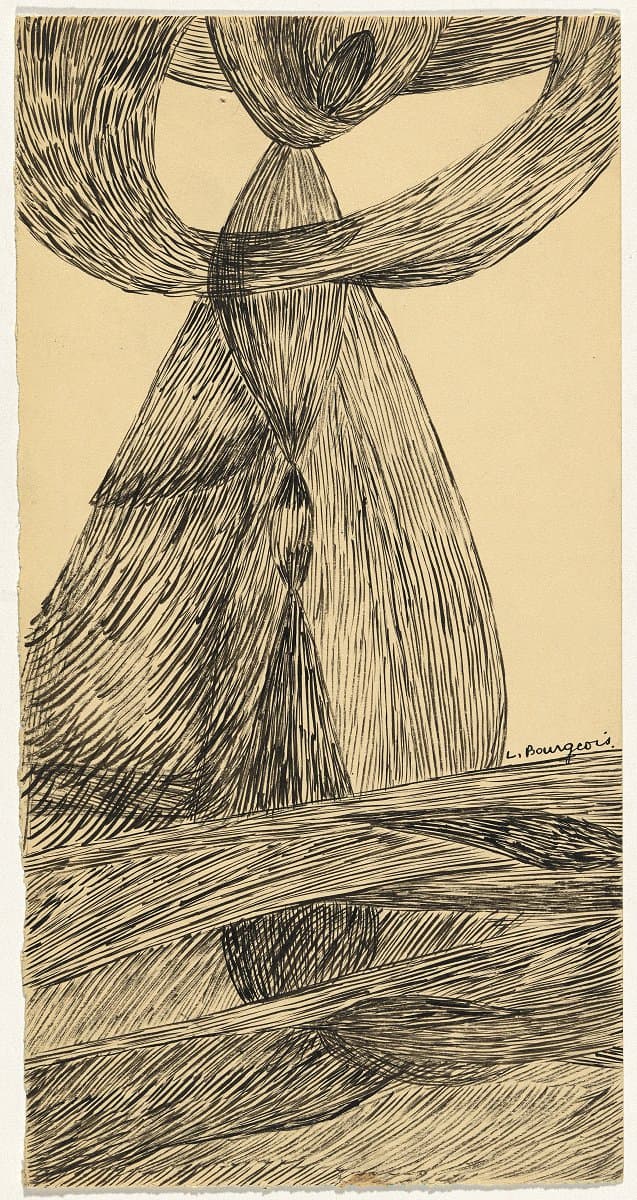
Louise Bourgeois
Learn moreNo title c.1951
© The Easton Foundation. VAGA/Copyright Agency Gift of Linda Quinell 1983
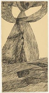
More detail | PermalinkSmall pen and ink drawings dating from the mid 1940s to the early 50s are among the Louise Bourgeois’ most characteristic and important group of works. Depicting fine line drawings widely interpreted as representing strands of long hair or skeins of tapestry yarn—strung loose, knotted and hanging—they are both abstract and autobiographic in nature (Bourgeois wore her hair very long for most of her life). In an exhaustive analysis of the artist’s work, historian Robert Storr suggests that it is with the advent of these drawings that Bourgeois took on her most unique and, arguably, important artistic trait. While always highly articulate in describing her own motivations for making works, these drawings represent the moment when Bourgeois’ art could never again be conclusively interpreted by others as ‘representing any one thing, or class of things’.[i]
Sally Foster
[i] Robert Storr, Intimate geometries: the art and life of Louise Bourgeois, Thames & Hudson, London, 2016, p 112.
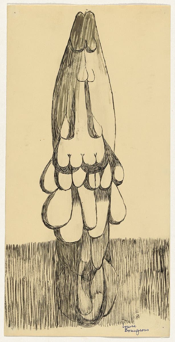
Louise Bourgeois
Learn moreNo title c.1951
© The Easton Foundation. VAGA/Copyright Agency Purchased 1983
More detail | PermalinkSmall pen and ink drawings dating from the mid 1940s to the early 50s are among the Louise Bourgeois’ most characteristic and important group of works. Depicting fine line drawings widely interpreted as representing strands of long hair or skeins of tapestry yarn—strung loose, knotted and hanging—they are both abstract and autobiographic in nature (Bourgeois wore her hair very long for most of her life). In an exhaustive analysis of the artist’s work, historian Robert Storr suggests that it is with the advent of these drawings that Bourgeois took on her most unique and, arguably, important artistic trait. While always highly articulate in describing her own motivations for making works, these drawings represent the moment when Bourgeois’ art could never again be conclusively interpreted by others as ‘representing any one thing, or class of things’.[i]
Sally Foster
[i] Robert Storr, Intimate geometries: the art and life of Louise Bourgeois, Thames & Hudson, London, 2016, p 112.

Willem de Kooning
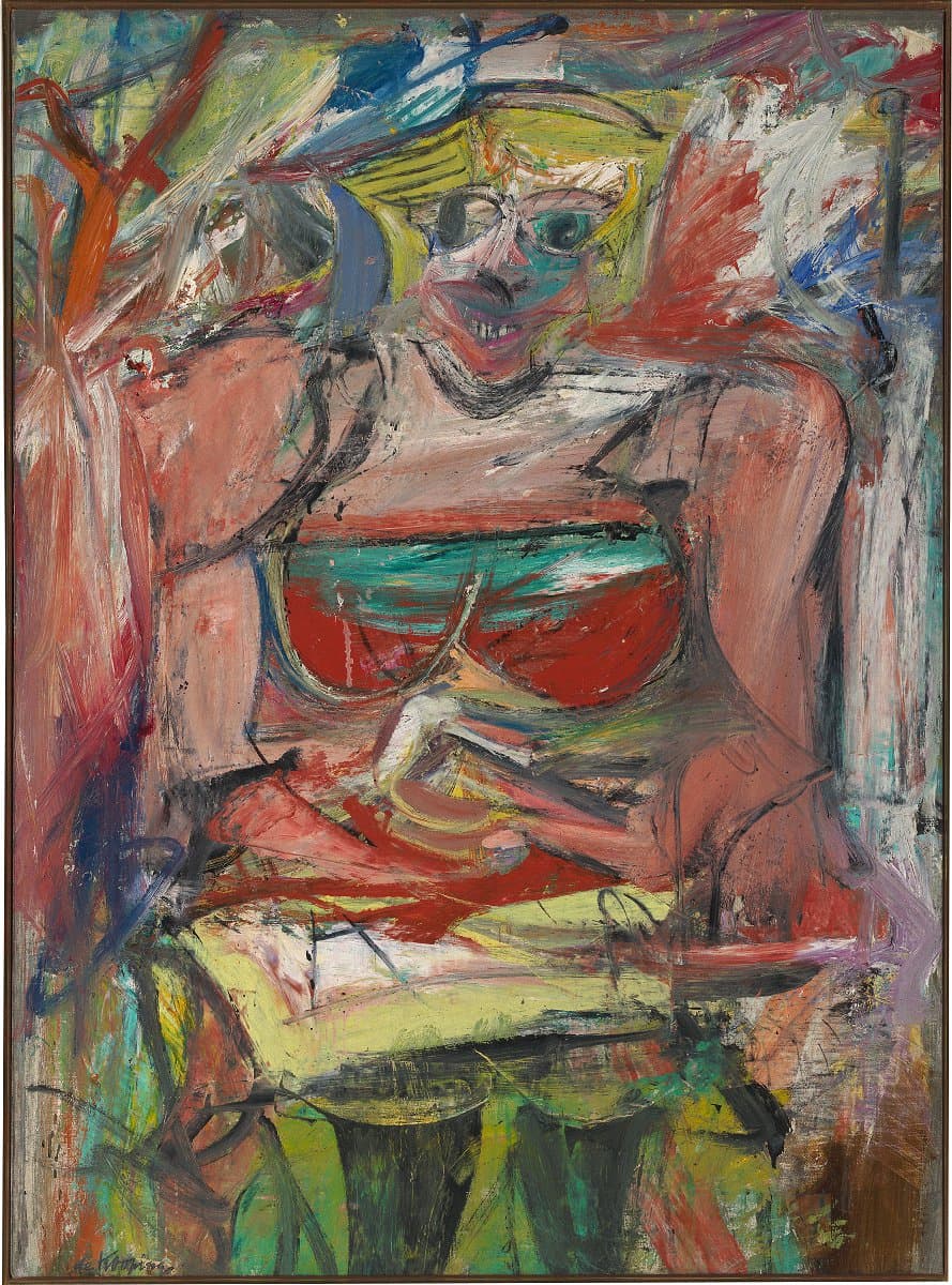
Learn moreWoman V 1952-53
© The Willem de Kooning Foundation, New York. ARS/Copyright Agency Purchased 1974
More detail | PermalinkWillem de Kooning’s first paintings of female figures were made in 1940, some of them inspired by Elaine Fried, who he would later marry.[1] These early works show the contorted poses, folded limbs, clasped hands and, occasionally, exaggerated eyes, mouths and breasts later adopted for his extended series, but are generally more serene, both in paint-handling and in overall mood. Woman V, produced a decade later, personifies the artist’s energy, enthusiasm and, at times, fury for his subject: it seems to encapsulate his comment that flesh is the reason oil paint was invented.[2]
Woman V is the fifth in a series of six paintings depicting three-quarter‑length female figures, either seated or standing, made between 1950 and 1953. The first, Woman I, was begun in June 1950, and repeatedly changed and overpainted by de Kooning, until he abandoned the work in January or February 1952.[3] When art historian Meyer Schapiro saw the painting in the studio, and encouraged the artist to persist, de Kooning’s response was to begin three others: Woman II, Woman III and Woman IV.[4] By the end of June 1952, or perhaps as late as November, with four canvases near completion, de Kooning began Woman V and Woman VI in the autumn and winter of 1952, respectively.[5] The group of six works, exhibited at the Sidney Janis Gallery in March 1953, caused consternation among many artists and critics who felt that de Kooning had betrayed the ideals of abstraction.
Woman V, as John Elderfield observes, takes further the use of bright colour of the earlier works and the dense concentration of paint into rectangular form: it is as if the painting advances and realises the ambitions of the previous women.[6] Because de Kooning anchors the figure to the bottom edge of his composition, all but filling the canvas, the painting’s energy seems compressed. The figure’s square shoulders, her breasts enclosed by her arms, tiny dress and stockinged legs, as well as the agitation of her surroundings, encourage the eye to move around the composition, ‘picking up marginal incident along the way—bodily curves that bend to and from the edges of the canvas; the short, exposed parts of the legs, and the blurry head; and indications of landscape around these features at top and at bottom’.[7]
Various influences for this series have been suggested, both by the artist and several critics, from the Mesopotamian figurines on display at New York’s Metropolitan Museum of Art, to the grinning mouths of ‘pin-up’ girls, images of which de Kooning often cut from magazines and attached to his work.[8] Because Woman V, like the figures of Woman IV and Woman VI, appears to be standing in water Thomas B Hess has proposed a further influence: Rembrandt’s A woman bathing in a stream 1654.[9] Indeed, while working on the Woman series de Kooning commented that the paintings ‘reminded me very much of my childhood being in Holland, near all that water’.[10] Although the hands of Woman V are now clasped together at the waist, they were once arranged at each side in a gesture resembling that of Rembrandt’s painting, where the wading figure holds up her skirt to clear the water.
Lucina Ward
[1] See, for example, Seated woman c#1940, Philadelphia Museum of Art, and later works such as Queen of hearts 1943–46, Hirschhorn Museum and Sculpture Garden, Washington DC.
[2] Marcia Brennan, Modernism’s masculine subjects: Matisse, the New York School, and Post-Painterly Abstraction, MIT Press, Cambridge, 2004, p 72.
[3] The Museum of Modern Art, New York. Rudolph Burckhardt’s and Walter Auerbach’s photographs of Woman I in progress are often reproduced; see, for example, Paul Cummings, Jörn Merkert and Claire Stoullig, Willem de Kooning: Drawings, paintings, sculpture, Whitney Museum of American Art, New York 1983, p 176 and John Elderfield et al, De Kooning: A retrospective, Museum of Modern Art, New York, 2011, p 248.
[4] Woman II 1952 is also at the Museum of Modern Art, New York; Woman III 1952–53, now owned by David Geffen, Los Angeles, was previously part of the collection at the Tehran Museum of Contemporary Art; Woman IV is at the Nelson Gallery–Atkins Museum, Kansas City. De Kooning further explored the theme in an extensive series of drawings and pastels during the summer of 1952.
[5] Carnegie Museum of Art, Pittsburgh. For more detail, see also Michael Lloyd and Michael Desmond, European and American Paintings and Sculptures 1870–1970 in the Australian National Gallery, Australian National Gallery, Canberra, 1992, pp 258–9.
[6] Elderfield et al, p 274.
[7] As above.
[8] Sally Yard, ‘Willem de Kooning’s Women’, in Arts Magazine, vol 53, no 3, November 1978, pp 96–101.
[9] National Gallery, London; although de Kooning had not seen Rembrandt’s painting in the flesh, it was widely reproduced, including in an Artnews article in February 1952 about the cleaning of Old Master paintings. Thomas B Hess, ‘Four pictures by de Kooning at Canberra’, Art and Australia, vol 14, nos 3 & 4, January–April 1977, pp 289–96.
[10] Harold Rosenberg, ‘Interview with Willem de Kooning’, Artnews, vol 71, no 5, September 1972, p 57.
Clyfford Still
Learn more1952-no.2 1952
© The Clyfford Still Estate Purchased 1978
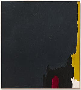
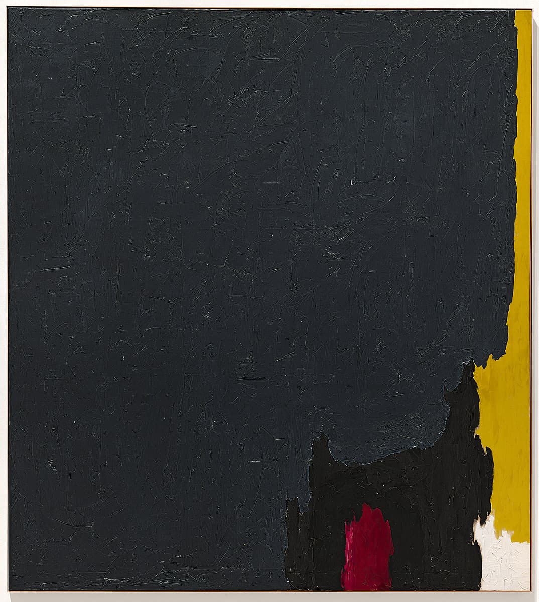
More detail | PermalinkClyfford Still’s association with Mark Rothko and Jackson Pollock, and other prominent artists he met after moving to New York in 1945, led him to become known as an Abstract Expressionist or ‘action painter’, categories of which Still disapproved. More than other members of the New York School, Still attempted to purge his work of literary allusions and overt graphic symbols, preferring to stress the elements of painting—colour, shape, size—and their formal relationships as his subject matter. He frequently denied any connection between the craggy forms in his paintings and the rugged western landscapes of his childhood: ‘I only paint myself, not nature.’[1] Stripped of conventional associations, he hoped the elements in his paintings could be as pure and abstract as musical notes, and indeed he compared his paintings to orchestral compositions.[2]
Still’s bold creation of overlapping irregular fields of colour asserts paint to be the hero of this work. Most of the canvas is covered with a dense, thickly textured veil of steel grey impasto. A leading edge of bright chrome, yellow and white allows the viewer to perceive a way out of the domineering extent of subdued grey. Another note of contrast is provided by inchoate blotches of black and red.
Despite the artist’s denial of any subject or possible narrative, he portrays a grey curtain that descends on and over the contrasting hues, seeming poised to obscure them. Still’s painting, while minimising three-dimensional and pictorial space, is deeply contemplative, sombre and introspective.
The painting was known variously over the years as Gray picture or Gray painting, however even such a mildly descriptive title would not have suited Still’s austere sensibility. ‘My paintings,’ he wrote, ‘have no titles because I do not wish them to be considered illustrations or pictorial puzzles. If made properly visible they speak for themselves.’[3] Patricia Still, the artist’s widow, has confirmed through her husband’s records that the work is correctly titled 1952–no.2 and was painted in 1952.[4] The painting is further identified by the photographic number PH–773, and is the second version of a work painted in New York in 1951. The first painting, PH–1071, which forms part of the artist's estate, was exhibited at the Metropolitan Museum of Art, New York, in 1979.[5] Still often made his own near-replicas of works he regarded as important, before letting them onto the art market, as he distrusted dealers, critics and museums. He wrote in 1972:
Making additional versions is an act I consider necessary when I believe the importance of the idea or breakthrough merits survival on more than one stretch of canvas, especially when it is entrusted to the precarious world of exhibitions or collecting. Although the few replicas I make are usually close to or extensions of the original, each has its special and particular life and is not intended to be just a copy.[6]
Christine Dixon[7]
[1] ‘The fact that I grew up on the prairies has nothing to do with my paintings, what people think they find in them. I paint only myself, not nature,’ from Benjamin Townsend, ‘An interview with Clyfford Still’, in Gallery Notes, Albright-Knox Gallery, vol 24, no 2, Summer 1961, pp 10–16.
[2] Maurice Tuchman, New York School: The first generation, New York Graphic Society, Greenwich, Connecticut, 1965, p 148.
[3] Clyfford Still, quoted from a letter written to the Tate Gallery in 1972, in Ronald Alley, Catalogue of the Tate Gallery’s collection of modern art other than works by British artists, Tate Gallery and Sotheby Parke Bernet, London, 1981, p 710.
[4] Mrs Clyfford Still, correspondence with the Australian National Gallery, 11 August 1983.
[5] John P O’Neill (ed), Clyfford Still, Metropolitan Museum of Art, New York, 1979, cat 20, p 88.
[6] Letter, 20 July 1972, to Hirshhorn Museum and Sculpture Garden, quoted in Neal Benezra, ‘Clyfford Still’s Replicas’, in James T Demetrion, Clyfford Still: Paintings 1944–1960, Hirshhorn Museum and Sculpture Garden, New Haven and London, 2001, pp 88–9, 98, n 12.
[7] Adapted and updated from Michael Lloyd and Michael Desmond, European and American Paintings and Sculptures 1870–1970 in the Australian National Gallery, Australian National Gallery, Canberra, 1992, pp 265–7.
Jackson Pollock
Learn moreBlue poles 1952
© Pollock-Krasner Foundation. ARS/Copyright Agency Purchased 1973
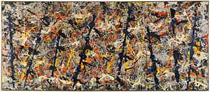
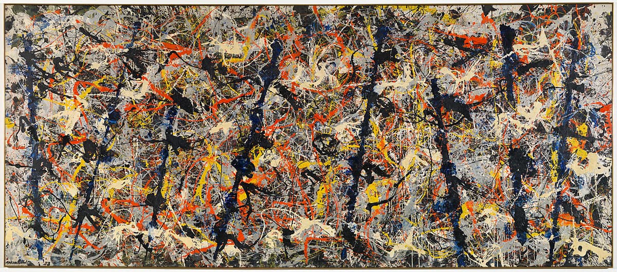
More detail | PermalinkBlue poles 1952 is one of the most famous paintings in the Gallery’s collection. First exhibited at Jackson Pollock’s solo show at Sidney Janis Gallery in 1952, where it was listed as Number 11, 1952,[1] it was later titled by the artist Blue poles.[2]
In 1973 Stanley P Friedman wrote an article in the New York Magazine in which he reported being told by Tony Smith that he and Barnett Newman had painted on the canvas that subsequently became Blue poles.[3] No-one who Friedman interviewed for his article refuted the possibility that Smith or Newman contributed to the early stages of the work. What they all denied emphatically is that these initial exercises contributed in any way to the work that Pollock then built up on the canvas to become Blue poles—any trace of earlier involvement by Smith or Newman was covered over by the painting that Pollock subsequently made on the canvas.
The first layer of paint was applied, as had been customary practice for Pollock since 1947, while the canvas was stretched out on the floor.[4] The earliest visible layer of paint is black, thinning at the edges to a green, which appears to have been formed by the mixing of yellow and black, embedded with fragments of the glass basting tubes that were used to apply the first layers of paint to the canvas. Subsequently the unstretched canvas was tacked to a beam that ran along the wall of the studio; liquid white paint was then applied and allowed to run down.
For Pollock’s next campaign the canvas was returned to the floor. Using his characteristic method of pouring fluid paint in a continuous stream onto the canvas from above, employing sticks, dried brushes and syringes, Pollock built up a web of rhythmic linear accents using yellow, orange and aluminium paints. He then left the canvas to dry. When he next worked on the painting he added in the blue poles, apparently using a ‘2 x 4’ length of timber as a straight edge,[5] creating unusually definite forms in the ‘all‑over’ configuration of the work. Various figurative connotations have been attributed to them—from totems to the swaying masts of tall ships.[6]
Pollock integrated the poles by lacing them into the composition with fine dripped skeins of white, black and blue paint. In this final operation the artist used brushes and rags as well as poured paint. Careful adjustments were made, such as fastidiously painting over a thin white dripped line at the left edge of the canvas in black. In many respects, the approach in Blue poles is similar to Pollock’s earlier works; the painting is built up with successive layers of dripped and poured paint evenly dispersed across the canvas. However, it also differs in a number of important ways, not least of which are the strong vertical elements of the ‘poles’. This departure was both a reprise of a recurrent motif in Pollock’s work and a self-conscious re-evaluation of the painting technique for which he was famous.
Anthony White[7]
[1] Although the date of the painting is definitely 1952, Pollock appears to have mistakenly dated it ‘53’, then painted over the ‘3’ to a ‘2’.
[2] Sidney Janis, correspondence with the National Gallery, 17 January 1986. Pollock himself referred to the painting as Blue poles in a conversation with BH Friedman in 1955, see BH Friedman, Jackson Pollock: Energy made visible, McGraw-Hill, New York, 1972, p xvii.
[3] Stanley P Friedman, ‘Loopholes in “Blue Poles”’, New York Magazine, 29 October 1973, pp 48–51.
[4] The canvas is high‑quality Belgian linen with a commercially oil‑primed ground.
[5] Lee Krasner Pollock recalled seeing this piece of wood near the painting covered with wet blue paint, see Francis Valentine O’Connor and Eugene Victor Thaw, Jackson Pollock: A catalogue raisonné of paintings, drawings and other works, 4 vols, Yale University Press, New Haven and London, 1978, vol 2, p 193.
[6] In his biography of Pollock, Bryan Robertson attributes both connotations to the poles, and also suggests a cruciform and an anchor; see Bryan Robertson, Jackson Pollock, Thames & Hudson, London, Harry N Abrams, New York, 1960, pp 23–4.
[7] Adapted and updated from Michael Lloyd and Michael Desmond, European and American Paintings and Sculptures 1870–1970 in the Australian National Gallery, Australian National Gallery, Canberra, 1992, pp 240–5.
Lee Krasner
Learn moreUntitled 1953
© Lee Krasner. ARS/Copyright Agency Purchased 1983
More detail | PermalinkFrom 1937 until 1940 Lee Krasner attended classes at the Hans Hofmann School of Fine Arts, New York. She joined the American Abstract Artists group in 1940 and exhibited for the first time in their fourth annual exhibition in New York that year. Between the late 1940s and the mid 50s, Krasner’s work went through several experimental and transitional phases. In her painted canvases of the late 1940s, known as the ‘Little pictures’, her surfaces were comprised of small, geometric and hieroglyphic elements applied in thick multicoloured paint. By 1950 Krasner had returned to a semi-figurative mode—a brief yet incongruous manoeuvre that resulted in an unsuccessful exhibition at the Betty Parsons Gallery in 1951.
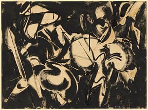
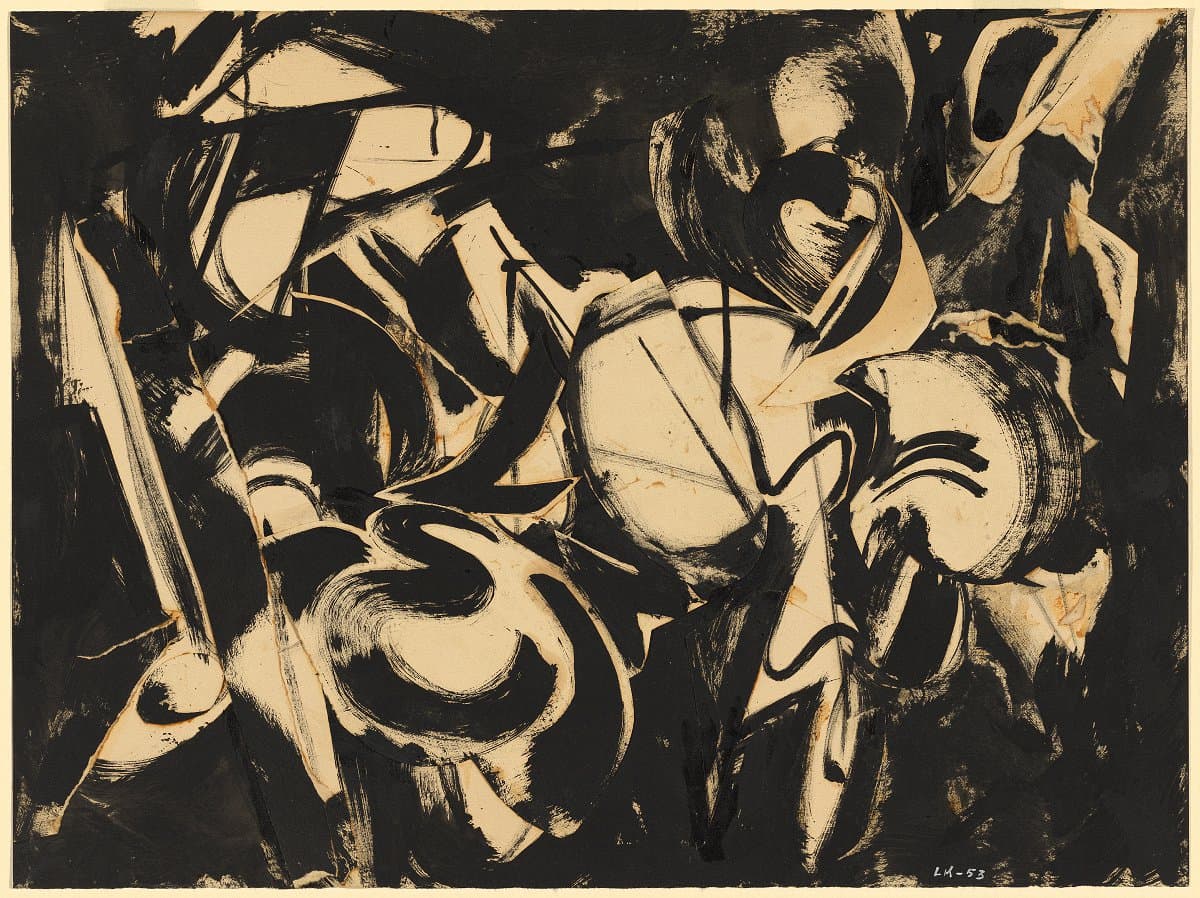
Harnessing this disappointment as impetus for change, Krasner turned to collage and, in stark contrast to her coloured canvases, produced a series of black-and-white works composed of segments of cut paper pasted on top of pre-existing drawings. The artist remembered: ‘In 1953, I started tearing up drawings, which led to collaging, and then I went into some of these canvases that had been sitting there a long time and nothing happening with them and I collaged some of these as well.’[1]
Untitled 1953 reveals a dramatically stripped-back palette and a sophisticated loosening of form. Krasner has allowed space and air to settle within the compositional activity, perhaps as a metaphorical exhale from the intensity of the works of the previous decade. The surface of Untitled is a complex combination of a base drawing executed in black oil paint applied directly onto the paper, over which several recycled pieces have been adhered. The composite surface that results is a tangle of solid black and dry scraped brushstrokes of frenetic drags, pulls and abrupt arcs, periodically sliced into sections by the sharp edges of cut paper.
The collage works of 1953 preceded a sustained period of work in this medium and numerous examples were exhibited, to critical admiration, in 1955 at the Stable Gallery, New York. Looking back on Krasner’s collage work, art critic Clement Greenberg commented that, in employing this technique, Krasner had made a major contribution to the progression of Abstract Expressionism at the time.[2] Collage became a particularly dynamic medium for the artist and she would often return to it in order to reinvigorate her processes after periods of creative pause. Through the destruction and ‘cannibalisation’ of her earlier works, Krasner was not only symbolically breaking with the past, but abruptly forcing herself to take a new direction. Indicative of a successful stylistic modification, the collage works from this period can be seen to inform the canvases that Krasner was to produce over the next few years.
Jaklyn Babington
[1] Letter from the artist, NGA file 78:0059, f 127.
[2] Ellen G Landau, Lee Krasner: A catalogue raisonné, Harry N Abrams, New York, 1995, p 146.
Ad Reinhardt
Learn morePainting 1954-1958 1954-58
© Ad Reinhardt. ARS/Copyright Agency Purchased 1973
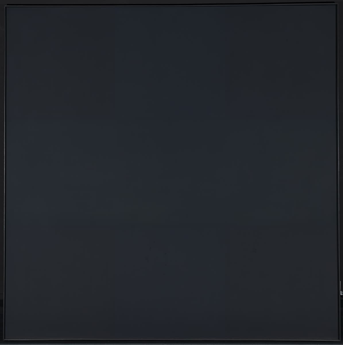
More detail | PermalinkThe development of Ad Reinhardt’s black paintings began in 1948 when he abandoned cursive mark-making for a geometric style. His work became increasingly formalised over the next few years, evolving into rigidly vertical and horizontal shapes in red, blue or green paintings. The trisected composition―which divided the square canvas into nine equal squares―first appeared in 1952. By 1953 Reinhardt's work was predominantly monochromatic and increasingly monotonal and, from 1955, almost exclusively black. The black paintings assumed various shapes, usually tall and narrow, but including square paintings of various sizes such as Painting 1954–58. In 1960 Reinhardt further restricted the format of his work to five-foot square (152.6 x 152.6 cm), maintaining these dimensions for the rest of his life. The severity of the artist’s paintings seems to run parallel to his uncompromising critiques of modern art, published regularly in major art journals at this time. Reinhardt described his black works as the ‘ultimate’ or the ‘last paintings’ possible, and his uncompromising approach was highly influential, especially for Minimalism and conceptual art.[1]
Painting is larger than the size Reinhardt eventually decided was ideal, but the work anticipates the final configuration, a formula the artist described as:
A square ‘neutral, shapeless’ canvas, five feet wide, five feet high, as high as a man, as wide as a man’s outstretched arms ‘not large, not small, sizeless’, trisected ‘no composition’, one horizontal form negating one vertical form 'formless, no top, no bottom, directionless’, three ‘more or less’ dark ‘lightless’ no-contrasting ‘colorless’ colors, brushwork brushed out to remove brushwork, a matte, flat, free-hand painted surface ‘glossless, textureless, non-linear, no hard edge, no soft edge’ which does not reflect its surroundings—a pure, abstract, non-objective, timeless, spaceless, changeless, relationless, disinterested painting—an object that is self-conscious ‘no unconsciousness’ ideal, transcendent, aware of no thing but art ‘absolutely no anti-art’.[2]
The inscription in Reinhardt’s hand on the backing-board of the painting—‘ReinHardt 1954–1958’—is not necessarily a reliable guide to its dating. It was usual for Reinhardt to date his canvases as they left his studio for exhibition, according them the year they were first exhibited rather than the time he actually painted them. Months, even years, might elapse between the completion of a painting and its exhibition. The span dates inscribed by the artist may broadly refer to the completion of the work in that period or to continued work on the painting over that period. However, the extreme sensitivity of the surface of the black paintings (a single fingerprint can mar the entire painting) meant that Reinhardt frequently restored his works after exhibiting them. In repainting the surface he often changed the work and it has been suggested that the span dates indicate ‘that they were executed in two campaigns’.[3] The exhibition history and a second work, the only known painting with dimensions similar to those of Painting, would seem to confirm this dating.[4]
Michael Desmond and Michael Lloyd[5]
[1] Barbara Rose (ed), Art as art: The selected writings of Ad Reinhardt, University of California Press, Berkeley, 1991, p 13.
[2] ‘Autocritique de Reinhardt’, Iris Time, 10 June 1963, Newsletter of Galerie Iris Clert, Paris; reprinted in Rose, pp 82–3.
[3] Yve-Alain Bois, Ad Reinhardt, The Museum of Modern Art, New York, Museum of Contemporary Art, Los Angeles, 1991, np.
[4] To date there is no firm evidence to confirm an earlier exhibition than the showing at Dwan Gallery, Los Angeles, in 1963; moreover, the catalogue checklist for an exhibition at the Jewish Museum, New York, in the winter of 1966–67, prepared with the assistance of the artist, reiterates the 1954–58 date. The other work is Abstract painting, black 1954–56, private collection, Switzerland; see Bois, np.
[5] Adapted and updated from Michael Lloyd and Michael Desmond, European and American Paintings and Sculptures 1870–1970 in the Australian National Gallery, Australian National Gallery, Canberra, 1992, pp 274–6.
Jon Schueler
Learn moreThe first day 1956
© Jon Schueler Estate Gift of Andrew Salvesen 2010
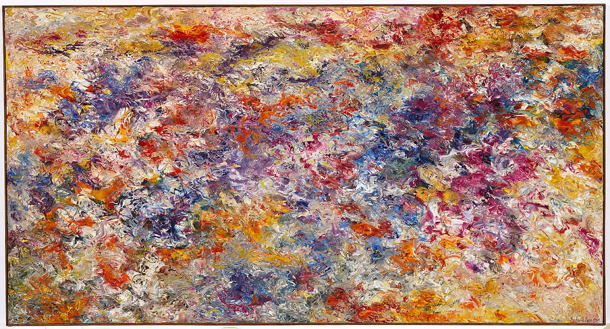
More detail | PermalinkJon Schueler was a highly accomplished painter, although not as well-known as many other Abstract Expressionist artists. After a period in the Air Force, Schueler started painting, studying formally at the California School of Fine Arts under Clyfford Still and Richard Diebenkorn. There he also encountered Ad Reinhardt and Mark Rothko as visiting teachers. Moving to New York in 1951, Schueler met many prominent artists of the New York School, including Franz Kline, Joan Mitchell and Philip Guston.
Schueler was the first artist to have a solo show at the Leo Castelli Gallery in 1957, the year it opened: The first day 1956 was included in this exhibition. Possibly the most ambitious subject ever attempted, the title refers to the creation of the Earth as narrated in the opening verses of the Bible (Genesis 1: 1–5):
1: In the beginning God created the heaven and the earth ... 4: And God saw the light, that it was good: and God divided the light from the darkness. 5: And God called the light Day, and the darkness he called Night. And the evening and the morning were the first day.
Conventional Romantic depictions of the subject, such as that of nineteenth-century British painter John Martin, use deep black and blazing white to show the division of light from darkness. In contrast, Schueler renders the dazzling beauty of light as it is divided into colour. Theories about perception, the chemistry of paint and the meaning of colour become important in his realisation of such a difficult subject.
The immaterial becomes material. Blues and yellows are contrasted with hues of orange, red and purple, all made with myriad small strokes from a palette knife. The technique imbues the paint with a rhythmic, nervous quality so that the colours flicker before our eyes. The first day has rich impasto and the large canvas imparts a joyous effect, which changes according to the distance between the painting and the viewer.
Schueler’s exhibition at the Leo Castelli Gallery appeared to announce a new star in the firmament of the New York School. But, perhaps due to the maturing of the second generation of Abstract Expressionists—Helen Frankenthaler, Barnett Newman, Morris Louis—or the complications of his turbulent private life, Schueler’s increasingly individual trajectory of sky subjects and Turneresque Romanticism placed him outside the circle. The first day anticipates the artist’s development into a modern landscape painter of transcendent scenes.
Christine Dixon
Mark Rothko
Learn more1957 # 20 1957
© Kate Rothko Prizel & Christopher Rothko. ARS/Copyright Agency Purchased 1981
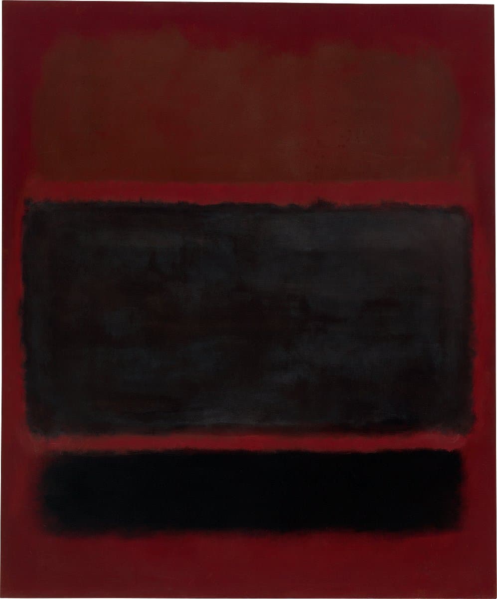
More detail | Permalink1957 # 20 1957 is a canvas characteristic of Mark Rothko’s mature style, composed of soft‑edged blocks of colour that float above each other. Throughout the early 1950s he employed bright colours—reds, yellow, oranges and blues—in harmonious combinations. But in 1957, the year this work was painted, a perceptible shift occurred in Rothko's paintings. Fewer and darker colours were used, giving a sombre expression to his work. Rothko was still painting ‘dramas’, a term he had used to describe the subject of his paintings of the 1940s, using colour as the ‘instrument’. ‘I exclude no emotion from being actual and therefore pertinent,’ he said in 1957. ‘I take the liberty to play on any string of my existence. I might as an artist, be lyrical, grim, maudlin, humorous, tragic.’[1]
At that time, however, Rothko’s paintings reflected a more limited range of mood: among the ‘ingredients’ of his art listed in a lecture he delivered at the Pratt Institute in 1958, was ‘a clear preoccupation with death. All art deals with intimations of mortality’.[2] To Dore Ashton, a regular visitor to his studio at this time, Rothko claimed that ‘he was creating the most violent painting in America’.[3] Ashton interpreted this as referring to the conflict inherent in the association of colours that Rothko conceived of as the symbolic equivalents of emotions. As Rothko believed, ‘a painting is not a picture of an experience; it is an experience’.[4]
As a result, paintings such as 1957 # 20 defy interpretation, and offer instead a completely subjective experience; they elicit an emotional response from the viewer without prescribing what that response should be. The dark, hovering forms on the red background of 1957 # 20 do, however, resonate with restrained violence and menace. The ‘dark’ emotions that permeate 1957 # 20 and other paintings of 1957 were, with certain exceptions, the basis for all the works Rothko painted until he committed suicide little over a decade later.
Michael Lloyd and Michael Desmond[5]
[1] Elaine de Kooning, ‘Kline and Rothko: Two Americans in Action’, Artnews Annual, XXVII, 1958, p 177.
[2] Taken from notes made at a lecture by Rothko at the Pratt Institute, Brooklyn, in 1958, and published by Dore Ashton in The New York Times, 31 October 1958, reprinted in The New York School: The first generation: Paintings of the 1940s and 1950s, Los Angeles County Museum of Art, Los Angeles, 1965, p 142.
[3] Dore Ashton, About Rothko, Oxford University Press, New York, 1983, p 138.
[4] Rothko, quoted in Anna C Chave, Mark Rothko: Subjects in Abstraction, Yale University Press, New Haven and London, 1989, p 172.
[5] Adapted and updated from Michael Lloyd and Michael Desmond, European and American Paintings and Sculptures 1870–1970 in the Australian National Gallery, Australian National Gallery Canberra, 1992, p 250, by Steven Tonkin.

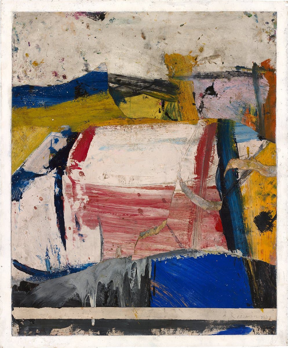
Willem de Kooning
Learn moreJuly 4th 1957
© The Willem de Kooning Foundation, New York. ARS/Copyright Agency Purchased 1972
More detail | PermalinkThe image of woman that had been the primary subject of Willem de Kooning’s paintings from 1950 gradually began to dissolve into the landscape. By 1955, the women had virtually disappeared, subsumed and replaced by gestural abstractions inspired by the forms of the urban landscape. These paintings, typically made with small, tightly-knitted shapes in strong primary colours, teem with horizontal and vertical marks. Those that follow show the shift of interest from city to countryside that climaxed in de Kooning’s decision to move to Springs, East Hampton, in 1961. While still living in New York, de Kooning had taken to painting occasionally in the country, often staying at the home of his brother-in-law, a house that de Kooning eventually purchased himself.[1]
De Kooning’s paintings of 1957, such as July 4th, mark a change from the preceding landscapes in the use of wider brushstrokes and enlarged, clarified areas that convey a sense of open spaces. The notion of rural landscape is suggested by the strong white horizontal band at the bottom of the painting, formed by the removal of tape protecting the white paper support. A number of paintings at this time were named after roadways, and Thomas B Hess has drawn attention to the way this ribbon of white suggests highway, bridge or horizon line.[2] Certainly this parallel may have amused the artist, for he rarely allowed so strong a feature to remain unaltered in his work. No doubt this is also because de Kooning used small paintings on paper as a test bed for new ideas and accidental effects that could be incorporated into larger works. July 4th itself is built from pre-existing work; a single sheet of paper painted in oil paint is overlaid with torn pieces from another crustily painted sheet, then trimmed back to the sheet size.
De Kooning had perfected this collage approach over the previous decade. Often he would overlay sections of his paintings with drawings, incorporating them into the work, or trace areas of a work to use at a later stage. Collage allowed him to test a variety of solutions to painterly problems, each alternative on paper provoking new effects or inspiring further possibilities. De Kooning fully capitalised on the breaks in continuity of the painted surface generated by the addition or subsequent removal of collaged elements. The white strip produced by the removal of masking tape at the bottom of July 4th is a crude but startling example of this. Adding elements of an existing painting on paper on the upper half of the work produces dramatic elisions that break up the image to create new structures. Photographs of the artist in 1959 show similar painted fragments tacked together in a happy arrangement on the studio wall. July 4th initially had the sculptural facility of this loose construction, but was flattened and glued down by Elaine de Kooning to facilitate mounting and framing.[3] Like other paintings titled with calendar references made during the 1950s, the title refers to the date of completion.
Michael Lloyd and Michael Desmond[4]
[1] De Kooning‘s brother-in-law, Peter Fried, had moved to Springs in 1955.
[2] Thomas B Hess, ‘Four pictures by de Kooning at Canberra’, Art and Australia, vol 14, nos 3/4, January–April 1977, pp 289–96.
[3] As above, p 295.
[4] Adapted and updated from Michael Lloyd and Michael Desmond, European and American Paintings and Sculptures 1870–1970 in the Australian National Gallery, Australian National Gallery, Canberra, 1992, pp 260–2.

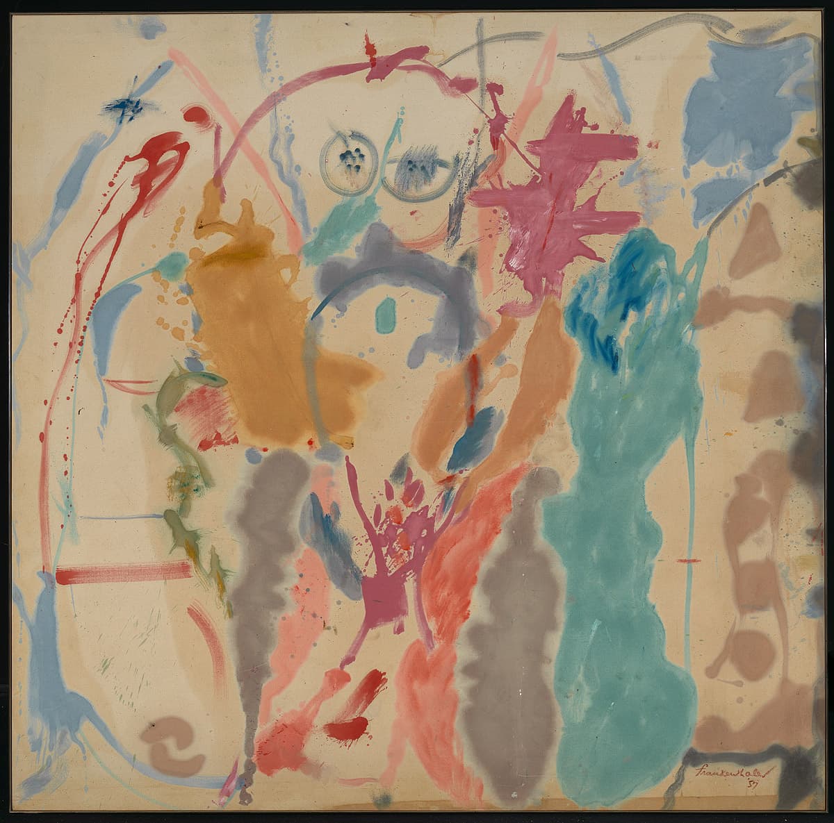
Helen Frankenthaler
Learn moreOther generations 1957
© Helen Frankenthaler Purchased 1973
More detail | PermalinkBorn in New York City, Helen Frankenthaler studied briefly with Mexican muralist Rufino Tamayo before enrolling at Bennington College, Vermont, in 1946. In 1950 she met critic Clement Greenberg who introduced her to many artists of the New York School, including Jackson Pollock and Willem de Kooning. Following a trip to Nova Scotia in Canada in 1952, during which she made many watercolour sketches, Frankenthaler began to apply diluted oil paint directly onto unprimed canvas, exploiting colour in open, lyrical compositions. This ‘staining’ technique is seen in Other generations, painted in 1957. In a statement the same year, Frankenthaler described her approach:
I often start a canvas on the floor (stretched or unstretched) then work on it on the wall ... I use sized and primed canvas or unsized cotton duck. My medium is a combination of turpentine, tube paint and enamel. I use brushes or a palette knife but I often shake or toss the paint off the brush—rather than apply it—or use my shoe or hand, controlling and changing the accidental with specific ideas.[1]
Other generations is one of a series of paintings from the autumn of 1957 that can be distinguished from Frankenthaler’s dense expressionist landscapes of 1955 and 1956 by their larger scale, open composition and gestural freedom. Vestigial images seem to surface in a number of these later paintings, for example, Jacob’s ladder 1957 and Nude 1958.[2] In this work a female torso appears to materialise in the upper centre of the painting. To a suggestion that this image may have prompted the title Other generations, the artist replied:
Titles are a problem! I often fear that they are used too easily as a ‘handle’; leading to an emphasis on the literary and/or subjective interpretation in lieu of an aesthetic one … in the case of Other Generations I myself would tend to minimise yet recognise your ‘association with a full female torso’. One might project or decipher some kind of figure‑shape(s). More important, different carefully‑placed, various‑sized color shapes seem to ‘spawn’ or regenerate each other on the canvas surface; colored lines and forms, working in a negative/positive relationship, that create space.[3]
The usual assumption that male artists pioneer techniques and ideas, to be followed by female artists later, is tested by Frankenthaler’s pouring of paint onto unprimed canvas. This was a breakthrough for the second generation of Abstract Expressionists and served to reinforce the importance of the almost blank or white support, which now seemed almost equally privileged alongside the painted mark. Another gender issue arises in the title of the work, raising the issue of ‘female’ subject matter. But here the references to a female figure, and the artist’s commentary on it, are undercut by the understanding that Frankenthaler is generating images, which may multiply themselves like other life forms.
Michael Lloyd and Michael Desmond[4]
[1] Helen Frankenthaler, ‘New talent in the US: Helen Frankenthaler’, Art in America, vol 45, no 1, March 1957, p 29.
[2] Respectively, collection of the artist; The Museum of Modern Art, New York, gift of Hyam N Glickstein.
[3] Helen Frankenthaler, correspondence with the National Gallery of Australia, 29 November 1988, NGA file 72/2699.
[4] Adapted and updated from European and American paintings and sculptures 1870–1970 in the Australian National Gallery, Australian National Gallery, Canberra, 1992, pp 290–1, by Christine Dixon.
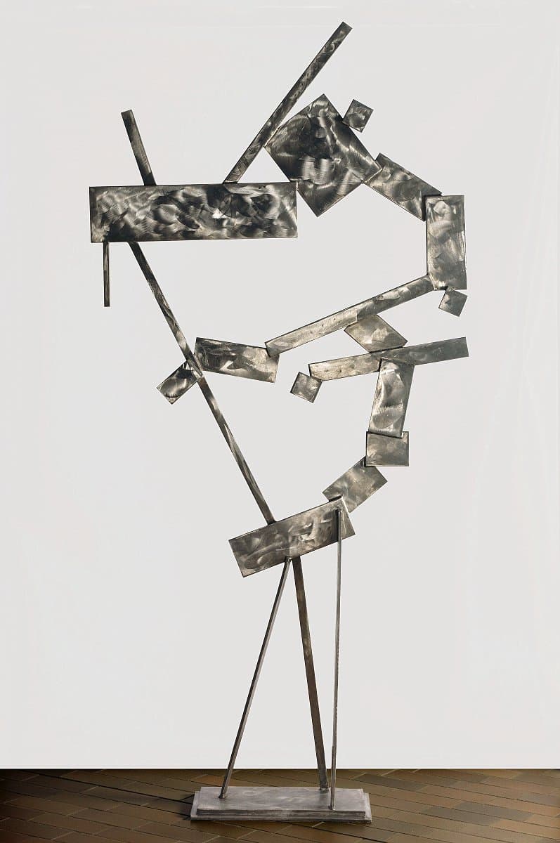
David Smith
Learn more25 planes 1958
© David Smith. VAGA/Copyright Agency Purchased 1978
More detail | PermalinkDavid Smith’s works, the earliest welded steel sculptures made in the United States, reveal his background training as an artist and in the trades: he is the sculptor who drew with metal.[1] From the late 1940s, as he ‘thinned the traditional mass of sculpture’, Smith ‘opened his work to the world around it, using space as his “canvas”’.[2] A scholarship, awarded by the Guggenheim Foundation in 1950 and 1951, allowed Smith to focus more exclusively on his sculpture, and he began to work in series at this time, many designed to be displayed outdoors. The Unities, finished in June 1962, were followed by Voltri; they, as well as the following Cubis series, some of his best-known works, also feature ‘scumbled’ stainless steel surfaces designed to glint in the light.
25 planes 1958 is the fourth work in Unities, a series of at least 11 closely-related sculptures fabricated in stainless steel, characteristically consisting of rectangular planes composed in a very ‘two-dimensional’ arrangement.[3] In a special edition of the magazine Arts devoted to Smith, the artist stated that he began the Unities series in 1957, conceiving the stainless steel pieces for ‘bright light, preferably for the sun, to develop the illusion of surface and depth’.[4] Identified by the number of planes in the work,[5] 25 planes is an array of flat metal shapes welded together around two hollow spaces, radiating up and out from the long and thin props that hold them aloft. It’s as if the shapes are frozen in time ‘after an explosion in a moment of transitional instability, the tiny thin strip hanging on the other side being an unpromising counterweight’.[6]
It seems likely that Smith’s adoption of stainless steel as a medium in 1957 determined the basic characteristics of the group. The stainless steel was much harder to cut than the metal he had used previously, so he ordered pre-cut plates in an assortment of basic geometric shapes from his suppliers, Ryerson Steel Fabricators. This restriction provided the simple repertoire of squares and rectangles used in the Unities. Cautious with the new material, Smith would lay out the elements on a flat surface to determine the final arrangement, then weld them together. The arc welder used to join the metal plates left a deposit that had then to be ground away, a fact that may have encouraged the artist to make a feature of the circular scouring of the surface of the planes. When 25 planes is lit, the scouring of the stainless steel planes creates a myriad of reflective scribbles and scuff-marks across the surface of the planes, highlights that alter when the light shifts or the viewer moves even slightly, creating as Smith desired, ‘the illusion of surface and depth’.[7] The surface treatment of 25 planes emphasises the role of drawing in the artist’s working process, both as preparation for work in three dimensions or as means of ‘loosening’ the hand, or indeed as ‘sometimes what sculpture is, sometimes what it can never be’.[8]
Lucina Ward[9]
[1] Before moving to New York in 1926, Smith had studied at Ohio University and worked in the Studebaker factory in South Bend, Indiana; ‘David Smith – the sculptor who drew with metal’, at http://au.phaidon.com/agenda/art/articles/2013/february/15/david-smith-the-sculptor-who-drew-with-metal/, accessed 6 April 2018.
[2] Joan Pachner, David Smith, Phaidon Press, London, 2013, p 55.
[3] Others from this series include: Sentinel II 1957, Hirshhorn Museum and Sculpture Garden, Washington, DC; Fifteen planes 1958, Seattle Art Museum; and Two box structure 1961, Philadelphia Museum of Art.
[4] David Smith, ‘Notes on my work’, Arts, vol 34, no 5, February 1960, p 44.
[5] David Smith, interview with Katherine Kuh in The artist's voice: Talks with seventeen artists, Harper and Row, New York, 1962.
[6] ‘David Smith: 25 planes 1958’ in Ron Radford (ed), Collection highlights, National Gallery of Australia, Canberra, 2014, p 338.
[7] Smith, ‘Notes on my work’, p 44.
[8] Carmen Giménez et al, David Smith: A centennial, Guggenheim Museum, New York, 2006, p 408.
[9] Adapted and updated from Michael Lloyd and Michael Desmond, European and American Paintings and Sculptures 1870–1970 in the Australian National Gallery, Australian National Gallery Canberra, 1992, pp 295–7, by Steven Tonkin and Lucina Ward.
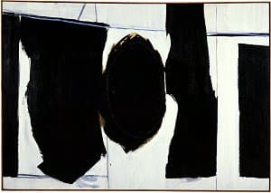
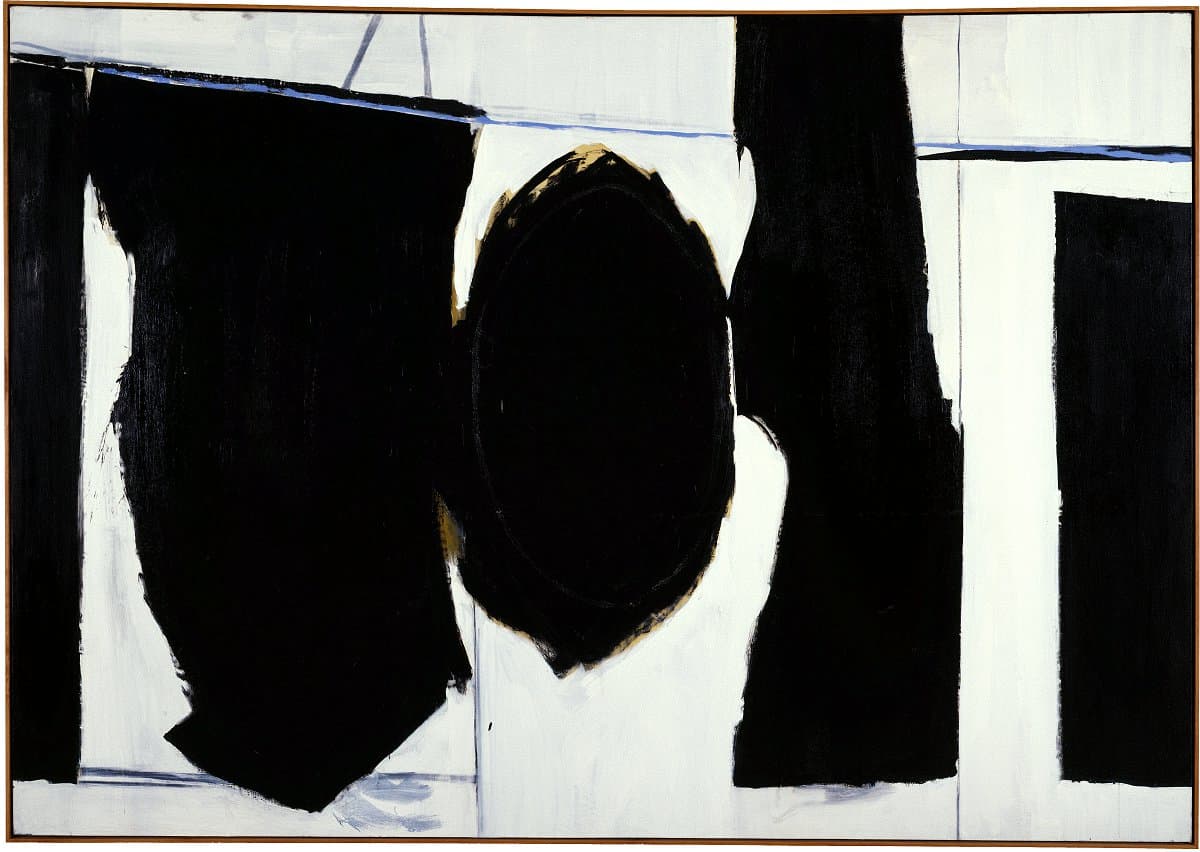
Robert Motherwell
Learn moreElegy to the Spanish Republic 1958
© Dedalus Foundation, Inc. VAGA/Copyright Agency Purchased with the assistance of American Friends of the National Gallery of Australia Inc., New York, NY, made possible with the generous support of The Dedalus Foundation and the Foundation of the National Gallery of Australia 1994
More detail | PermalinkRobert Motherwell played a significant role in the development of postwar American art, and is often regarded as a bridge between European ideas and the New York School. Through his association with the exiled Surrealists, Motherwell came to envisage a way forward for American art that embraced ideas from this movement, such as ‘automatism’, meaning that imagery should be spontaneous and not premeditated. This is apparent in Elegies to the Spanish Republic, the collective title used by Motherwell from the early 1950s to describe a body of work that occupied him for over 40 years. Numbering more than 170 works, of which the Gallery’s Elegy to the Spanish Republic 1958 is indicative, the Elegies mark one of Motherwell’s major contributions to twentieth-century art. As he later commented:
Making an Elegy is like building a temple, an altar, a ritual place … Unlike the rest of my work, the Elegies are, for the most part, public statements. The Elegies reflect the internationalist in me, interested in the historical forces of the twentieth century, with strong feelings about the conflicting forces in it …[1]
The recurring motif that defines the Elegies to the Spanish Republic first appeared in a 1948 black and white pen and ink drawing.[2] This, and the other works that followed, may be seen as Motherwell’s attempt to find a ‘visual equivalent’ to the poetry of Federico García Lorca with its universal themes of life and death.[3] As Motherwell reworked the elegy motif, he expanded the boundaries of its meaning. It became, as Joan Banach explains, ‘a vehicle for representing various rituals of mourning, charged by the unbounded potential and power he recognized in García Lorca’s poetic conception of pena negra or literally, “black grief.”’[4] For Motherwell, black had an eloquent and talismanic power. In Elegy to the Spanish Republic, the black forms march across the canvas, the traces of ochre underpainting evident around the central oval and the single, sky-blue horizon line the only concessions to colour.
By the late 1950s Motherwell had completed more than 50 Elegies. In the spring of 1958 he married painter Helen Frankenthaler and, during the summer, they rented a villa in St Jean-de-Luz, France, near the Spanish border. It was the first time that Motherwell had visited Spain and, in the ensuing period of frenetic activity in Europe he painted his Iberia series. Elegy to the Spanish Republic, which is uncharacteristically unnumbered, was probably painted in the second half of that year, after the artist returned from Europe, perhaps with a renewed commitment to the series.
Elegy to the Spanish Republic is particularly interesting because it is one of the first of the Elegies in which the artist used Magna rather than oil paint.[5] This brand of acrylic paint was known for its high concentration of pigment, meaning it retained an intensity of colour even when thinned. A new formula of Magna, introduced in 1958, had a consistency closer to that of oil paint, which may have encouraged Motherwell to try the medium. The painting thus marks the beginning of a new phase, in which the artist explored the subtleties of a new medium within the established imagery of the Elegies. Motherwell kept this Elegy to the Spanish Republic in his studio until his death.
Steven Tonkin
[1] Quoted in Jack D Flam, ‘With Robert Motherwell’, in Robert Motherwell, Abbeville Press, New York, 1983, p 22.
[2] Motherwell drew the image to illustrate a poem by writer and critic Harold Rosenberg in the second (and unpublished) issue of the periodical Possibilities. HH Arnason, ‘Robert Motherwell: The years 1948 to 1965’, Art International, vol 10, no 4, 20 April 1966, p 25.
[3] As Arnason commented, Lorca’s poetry rekindled Motherwell’s youthful idealism and passion for the cause of the Spanish Republic whose demise had a significant impact on Motherwell’s generation; see HH Arnason, Robert Motherwell, Harry N Abrams, New York, 1982, 2nd and revised ed, p 30.
[4] See Joan Banach, ‘Annotated catalogue’, in Motherwell, Fundació Antoni Tàpies, Barcelona, 1996, p 94; this observation was made about Motherwell’s early Elegy series painting Catalonia 1951, held in The Saint Louis Art Museum, Missouri.
[5] Magna acrylic paint was invented by Leonard Bocour and was the brand with which a number of major American artists experimented in the late 1950s.
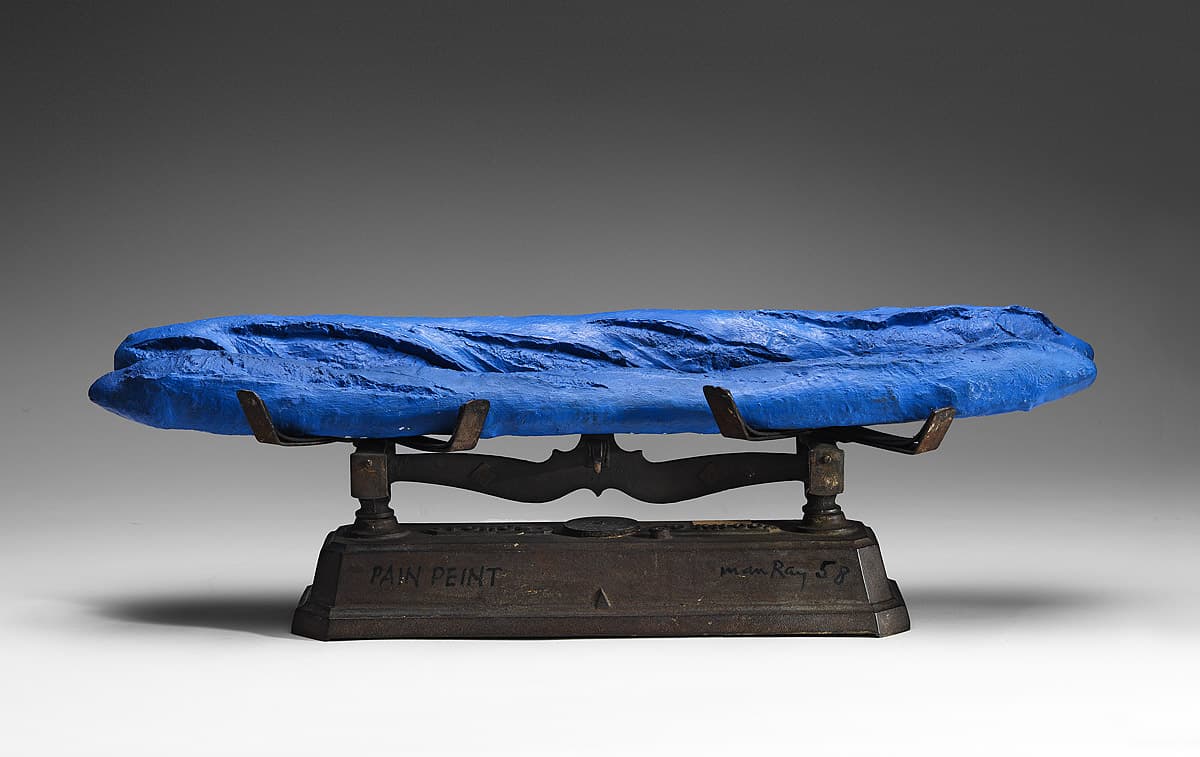
Man Ray
Learn morePain peint [Blue bread: favourite food for bluebirds] 1958
© Man Ray. ARS/Copyright Agency Purchased 1977
More detail | PermalinkConfusingly, a number of works by Man Ray are titled Pain peint (‘painted bread’). This is the first, made in 1958, and consists of two blue loaves of bread on a set of scales, the kind once common in grocery shops.[1] The loaves, lying as they do across both baskets, frustrate the scales’ balance. A second version of the work, made in 1960 for Cordier and Ekstrom, New York, carries three loaves in its panniers. The same title is also applied to single loaves of blue-coloured bread made by Man Ray in small editions either in polyurethane or plaster as required.[2] When Man Ray first made Pain peint in 1958 he used stale loaves of bread and simply covered them with blue paint but according to the artist, ‘mice ate through the paint and the stale baguette’, thus the loaves of this work are replacements made in plaster in 1964.[3]
Man Ray, who lived most of his life in Paris, worked and exhibited with many of the European Dadaists, and showed in the first Surrealist’s exhibition at Galerie Pierre in 1925. The impact of his collaborations with Marcel Duchamp, dating back to 1915 in New York, are readily apparent in his use of everyday objects, playful humour and element of surprise. Man Ray counted Gift 1921, a flat iron transformed with a row of nails, as his first Parisian Dada object and it remains his best-known work: just as Pain peint makes the weighing of substances impossible, the perverse and provocative Gift threatens destruction instead of pressed clothes.[4] A later work, Pain doré 1960 (‘golden bread’ or Pandora), likewise plays on words but this time uses an Italian-style bread.[5] Man Ray’s work, like that of many of his fellow Surrealists, was immensely influential both in Europe and internationally, especially in the inter-war and post-Second World War period when many artists sought refuge in the United States and elsewhere.
Although Man Ray claimed, around the time of moving to Paris in 1921, that his French was limited, or at least not sufficient to follow the more involved conversations of his peers, his enjoyment of the language is readily apparent in his work: he also identified Pain peint as ‘an onomatopoeic representation of the firemen’s motor-horns’ or a child’s imitation of that noise.[6] Because of the play on homophones in the French title, Man Ray did not want it literally translated for English catalogues or books. He therefore gave it the alternative English title and subtitle Blue bread: Favourite food for blue birds. One wonders what might be the effect of eating this ‘blue’ bread, either for mice or birds.
Lucina Ward[7]
[1] The first loaf is inscribed underneath ‘pain peint 59 / lere serie replique 1/4’ and the second loaf is inscribed ‘pain peint / lere serie replique — 2/4’.
[2] A series of single blue loaves was made in 1960 in painted polyurethane in an edition of nine. Another group was produced in 1964, in painted plaster in an edition of four, and yet another in 1966, again in polyurethane and an edition of nine. See http://www.sothebys.com/en/auctions/ecatalogue/2016/modernites-de-rodin-a-soulages-pf1716/lot.41.html, accessed 5 April 2018.
[3] Sanche de Gramont, ‘Remember Dada—Man Ray at 80’, New York Times Magazine, 6 September 1970, pp 6–7, 25–34.
[4] The original Gift disappeared in 1921. Man Ray remade it in 1952, 1958 and 1963, before he authorised the edition of nine in 1970, published by Luciano Anselmino for Galeria Il Fauno, Turin. The NGA’s Gift (1992.1587) is the prototype for this edition, and is marked ‘essai’ or proof on the handle.
[5] FIX NOTE: rf also sothebys.com, accessed 5 April 2018.
[6] Arturo Schwarz, Man Ray: The rigour of imagination, Thames and Hudson, London, 1977, p 199; rf also ‘You see when I painted a local bread blue, the idea of a title came to me almost immediately and almost automatically: in French “pain peint” painted bread, because it sounds also like the kids running down the street after a fire engine and imitating the sound of the sirens: “pain–pain–pain–pain–pain–pain”, you know.’ (Man Ray, BBC televised interview, 1972).
[7] Adapted and updated from Michael Lloyd and Michael Desmond, European and American paintings and sculptures 1870–1970 in the Australian National Gallery, Australian National Gallery, Canberra, 1992, pp 142–3.
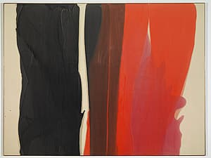

Morris Louis
Learn moreDalet zayin 1959
© 1959 Morris Louis Purchased 1974
More detail | PermalinkThe introduction of Morris Louis and Kenneth Noland to painter Helen Frankenthaler in 1953, arranged by art critic Clement Greenberg, is an event written into Modernist folklore. Seeing Frankenthaler’s soak-stained paintings prompted Louis to destroy almost all his earlier work and began anew: it was the catalyst for him to develop the ‘staining’ technique with which his work is synonymous.[1] Dalet zayin 1959 is one of a group of paintings known as Veils begun in 1954, when Louis was experimenting with staining unprimed canvas; he produced another 130 paintings in the series between 1957 and 1960. The exact dating of the Veils paintings within this sequence is problematic, as most were not dated by the artist and remained unstretched and unexhibited.[2] Famously private, Louis left no photographs of himself at work, and there were no witnesses to his technique.
In Dalet zayin the areas of black, brown, orange and pink seem to spill out, in layers, across the horizontal axis of the canvas. The painting is a fine example of the watercolour-like effects achieved by Louis. The use of Magna, a formula of acrylic developed from the early 1940s by paint manufacturer Leonard Bocour, which Louis thinned with turpentine, is crucial to the effects.[3] Until 1947 he worked with oils—in a broad, impasto style reminiscent of Jackson Pollock, Willem de Kooning and other first generation Abstract Expressionists—before turning to acrylic, originally on primed linen. He worked in the dining room of his suburban Washington DC home, and there, in a space that measured 4.27 x 2.74 metres, invented a technique of staining his canvases, which were much bigger than the room. Louis draped his canvases over a support and manipulated the paint so that it ran down the canvas in veils or stripes, sometimes touching or overlapping, sometimes separate. Another painting of the following year, Nexus II 1960, marks, as the title suggests, a connection or link, in this case the transition between his two major series, Veils and Unfurled.[4] The earlier, multicoloured central waves of paint of Dalet zayin become divided in Nexus II into two plain fields of colour pushed to the sides or, indeed, divided at centre.
Louis expressed little interest in the titles of his works, at least from 1954 onwards. The paintings—he produced 600 in the last eight years of his short life—were only given titles when it became necessary, for example when a work left the studio for an exhibition.[5] Most were therefore named posthumously. After his sudden and premature death in 1962, the Veils were titled with transliterations of names of the letters of the Hebrew alphabet, with the paintings titled arbitrarily, in order of being stretched. The title Dalet zayin combines the fourth and seventh letters of the Hebrew alphabet. In the decades following, Louis’ distinctive staining style, his blurred arcs and stripes would be transformed into rigorous angles by the Minimalist artists.
Michael Lloyd and Michael Desmond[6]
[1] Morris Louis destroyed more than 300 unsatisfactory earlier works; see Diane Upright Headley, Morris Louis: the complete paintings; a catalogue raisonne, Abrams, New York, 1985, pp 49–58; see also http://morrislouis.org/morrislouis/page/technique_of_morris_louis, accessed 15 February 2018.
[2] Diane Upright Headley has dated the beginning of the second Veils series on the basis of a letter from Louis to Greenberg, which mentions that a Veil painting had been shown to a potential client in the spring of 1958. As this painting, Untitled 1958 (collection Mrs H Gates Lloyd, Haverford, Pennsylvania) is a fully developed work, it is likely that it was preceded by earlier trials; see Diane Upright Headley, ‘In addition to the veils’, Art in America, vol 66, no 1, January–February 1978, pp 84–94, cf p 88.
[3] The extreme thinning of paint has been estimated to reach a ratio of 28 or 29 parts of turpentine and resin to one of paint; Upright Headley, Morris Louis, p 58, n 9.
[4] Nexus II 1960, National Gallery of Australia, Bequest of Marcella Louis Brenner, the artist’s widow, 2010.
[5] Even in the case of those works titled for exhibition, it seems most of the titles were suggested by Greenberg; see Upright Headley, Morris Louis, p 37. The generic title Veils was coined by William Rubin: letter to the editor, Artforum, vol 9, no 7, March 1971, p 78.
[6] Adapted and updated from European and American paintings and sculptures 1870–1970 in the Australian National Gallery, Australian National Gallery, Canberra, 1992, pp 300–2, by Steven Tonkin and Christine Dixon.
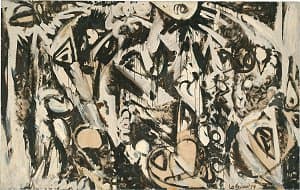
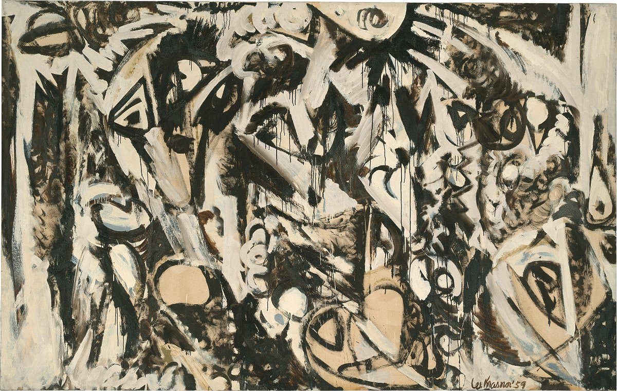
Lee Krasner
Learn moreCool white 1959
© Lee Krasner. ARS/Copyright Agency Purchased 1978
More detail | PermalinkLee Krasner’s reputation as a colourist was established early in her career. Cool white 1959, by contrast, has a sombre palette restricted to umber and white. It was painted during a difficult time for the artist, who was still coping with her grief over the 1956 death of her husband Jackson Pollock, and having difficulties with the Pollock Estate. In addition, her mother died in 1959 and an exhibition scheduled by Clement Greenberg for French and Company was cancelled.[1] Of her 1959 paintings, Krasner recalled:
I painted a great many of them because I couldn’t sleep nights. I got tired of fighting insomnia and tried to paint instead. And I realized that if I was going to work at night I would have to knock out color altogether, because I couldn’t deal with color except in daylight.[2]
Krasner began Cool white, and others from the Umber and white series, in East Hampton in 1959 and continued the series until 1962.[3] The development of The gate 1959, one of the first paintings, is recorded in photographs by Halley Erskine that show how the artist began with a biomorphic sketch, and document her progression on the work until she decided its final form.[4] The extreme monochrome palette of The gate and its explosive brushwork project a rawness and intensity which, as Ellen Laudau points out, was unprecedented in her oeuvre to date.[5] When Cool white and The gate, along with others from the series, were shown at the Howard Wise Gallery, New York, in 1960 and 1962, the energy and sheer physicality of the works was much remarked. Commentators then, as now, also noted the close connections—in size, gesture and composition—to Pollock’s work, and the ways in which Krasner seemingly took it upon herself to ‘continue’ his achievements.[6]
Cool white is dotted with staring eyes, an image that is consistent within her whole body of work.[7] Although previously suspicious of Jungian ideas of self-knowledge, Krasner allowed herself, in the process of making these works, to delve further into her identity. As she later told Cindy Nemser, ‘My painting is so biographical, if anyone can take the trouble to read it.’[8] Laudau summarised the impact of Cool white and other works from the series:
By using these pictures as vehicles to express the ongoing, and to all appearances death-defying, continuity of her tempestuous relationship with Pollock, Krasner exposed in a particularly poignant way the deeply personal roots of her artistic impulse. In the process, she produced a dramatic set of canvases whose mythic, explosive quality vividly projects her turmoil and inner rage.[9]
If the colour of these paintings was sombre, their execution was anything but subdued. As Barbara Rose observes:
No grid of compartments confines the raging energies that animate the brush loaded with thick paint, now slapped or dragged across the canvas, leaving a trail of flaring drips and sputtering comet‑like flashes of paint. The all-over images and glazed transparencies of these works suggest wind‑whipped storms or glacial events.[10]
Towards the end of the series, Krasner began to introduce a small amount of reddish-maroon and, when she started to work again in natural light, her boisterous re-adoption of colour signalled new beginnings and new concerns.
Michael Lloyd and Michael Desmond[11]
[1] Cindy Nemser, ‘A conversation with Lee Krasner’, Arts Magazine, vol 47, no 6, April 1973, pp 43–8.
[2] Richard Howard, ‘A conversation with Lee Krasner’, Lee Krasner Paintings 1959–1962, Pace Gallery, New York, 1979, p [3].
[3] The series was also called ‘Ahab-coloured’ after Krasner and Pollock’s brown poodle, who was Krasner’s constant companion at the time; Richard Howard, Krasner’s dealer, and his friend Sanford Friedman assisted the artist in choosing many of the titles of the paintings.
[4] Private collection; for one of Erskine’s photographs, dated to July–August 1959, see Ellen G Landau, Lee Krasner: A catalogue raisonné, Harry N Abrams, New York, 1995, fig 29, p 314.
[5] As above, p 181.
[6] As above, p 182.
[7] Most dramatically in Night watch 1960, private collection, where ‘the eyes’ are scattered across the entire canvas.
[8] Cindy Nemser, ‘The indomitable Lee Krasner’, Feminist Art Journal, Vol 4, no 1, Spring 1975, p 5.
[9] Laudau, p 182.
[10] Barbara Rose, Lee Krasner: A retrospective, Museum of Modern Art, New York, 1983, p 122.
[11] Adapted and updated from Michael Lloyd and Michael Desmond, European and American paintings and sculptures 1870–1970 in the Australian National Gallery, Australian National Gallery, Canberra, 1992, pp 298–9, by Lucina Ward.
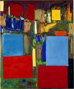

Hans Hofmann
Learn morePre-dawn 1960
© Renate, Hans & Maria Hofmann Trust. ARS/Copyright Agency Purchased 1976
More detail | PermalinkThe smooth blocks of vivid colour that appear in Pre‑dawn 1960 are characteristic of Hofmann’s paintings after 1958, the year he closed his New York art school.[i] Irving Sandler has suggested that ‘Hofmann may have derived the idea of using rectangles in his painting from one of his teaching techniques: attaching pieces of construction paper to the canvases of his students’.[ii] André Emmerich has confirmed that ‘Hofmann used sheets of commercial Color‑Aid paper to plot out the “slabs” in his paintings and we have in fact examples of used Color‑Aid in the files and portfolios left by the artist’.[iii] A circular form cut-out of Color‑Aid paper, of the same diameter as the orb that appears in Pre‑dawn and in related paintings such as Nirvana 1963 and Rising moon 1965, was also found among Hofmann’s papers.[iv]
In Pre‑dawn the contrast between the smooth, brightly-coloured rectangles and the surrounding darker relief‑like congestion of paint sets up the sort of spatial tension or ‘push‑and‑pull’ effect by which Hofmann urged his students to synchronise their development of form and colour. This pictorial grammar, with its idea of the picture plane as something inviolable, was especially appealing to critics wishing to defend abstract painting. For Hofmann, however, the push‑and‑pull tension of his paintings was a way of translating into specifically pictorial terms the underlying force–counterforce dynamic he perceived in nature. This is clearly reflected in Pre‑dawn, not only in its lyrical title, but in the way it is composed. Like a conventional landscape, the weight of the painting remains at the bottom, while the red disk, a specific reference to sun or moon, floats above.
Michael Lloyd and Michael Desmond[v]
[i] Hofmann opened the Hans Hofmann School of Fine Arts in New York in 1934. Prior to this he had an art school in Munich, Schule für Moderne Kunst, from 1915–32.
[ii] Irving Sandler, The triumph of American painting: A history of Abstract Expressionism, Harper and Row, New York, 1970, p 147, note 5.
[iii] André Emmerich, correspondence with the Australian National Gallery, 19 February 1985.
[iv] Cynthia Goodman, Hans Hofmann, Abbeville Press, New York, 1986, p 103. Nirvana 1963 and Rising moon 1965 are both private collection.
[v] Adapted and updated from Michael Lloyd and Michael Desmond, European and American Paintings and Sculptures in the Australian National Gallery 1870–1970, Australian National Gallery, Canberra, 1992, pp 306–7, by Christine Dixon.

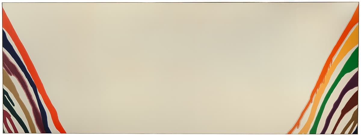
Morris Louis
Learn moreBeta nu 1960
© 1960 Morris Louis Purchased 1972
More detail | PermalinkBeta nu 1960 is one of the largest Unfurleds, the series of paintings Morris Louis considers to be his most ambitious works.[1] He began the series in the summer of 1960, and finished early in 1961, following the earlier Veils and a series of experimental groups—the Florals, Columns, Omegas and Japanese banners—painted during the winter of 1959–60. Beta nu is one of his most striking works. The quality and combination of colours that cascade in from the left and right provide the initial attraction. The sheer expanse of white is startling. But it is only in the presence of the painting that its true monumentality and awe-inspiring nature may be felt: the sensation of being surrounded, the possibility of falling into a void of nothingness. As Christine Dixon observes, the bodily resonance set up by the large canvases is one of the extraordinary effects of encountering Louis’ paintings in reality, as opposed to seeing small reproductions.[2]
In the six to eight months that Louis worked on the Unfurled series, he produced over 120 paintings, of which he destroyed approximately 40 because the blue colours were not fast.[3] The Unfurleds, characterised by irregular rivulets of colour running diagonally from each side of the canvas leaving a blank centre, fall into two types: those with four or five broad bands of colour independent of each other, and those with 10 or more narrow bands that sometimes overlap. It is likely that the former type, of which Beta nu is an example, were painted earlier. The height of the paintings in the Unfurled series is similar, and governed by the standard-sized bolts of canvas that Louis used. Much variation occurs in the width, however, as he attempted to discover how great the blank central area could be while still retaining the tension between the two extremities, and going so far, according to John Elderfield, as to court failure.[4] Beta nu, moreover, was produced in a domestic-sized space. As Edward Hanfling points out, it is difficult to imagine Louis’ process as he poured a new formula of Magna paint onto the ends of the seven-metre length unsized and unprimed cotton duck canvas, handling the weight of the material while controlling the flow of the turpentine-thinned paint.[5]
It is almost as if [Beta nu] has been wrought from a single multi-coloured cord of many strands—as if the artist has tugged this from both sides, pulling it apart to form two banks of loose threads. There is the feeling of unravelling, of a push towards disunity.[6]
Like the Veils, the Unfurleds were titled posthumously, with letters from the Greek alphabet used to identify the series. This method had a precedent in two Unfurleds titled Alpha and Delta by Louis himself for the 1960 exhibition at Bennington College, Vermont. The title Beta nu combines the second and twelfth letters of the Greek alphabet.
Michael Lloyd and Michael Desmond[7]
[1] Morris Louis’ appraisal of the Unfurleds was reported by Clement Greenberg to Michael Fried, see Michael Fried, Morris Louis, Harry N Abrams, New York, 1970, p 32.
[2] Christine Dixon, ‘Morris Louis, Nexus II’, Artonview, no 64, Summer 2010–11, p 46.
[3] Kenworth Moffett, ‘Morris Louis: Omegas and Unfurleds’, Artforum, vol 8, no 9, May 1970, pp 45, 46 n 3.
[4] John Elderfield, writing in the catalogue for Louis’ exhibition at Hayward Gallery, London; see Morris Louis, Arts Council, London, 1974, p 57.
[5] Edward Hanfling, ‘Morris Louis in Australia and New Zealand’, The Burlington Magazine, vol 151, no 1281, December 2009, pp 830–5, at p 830.
[6] As above, p 831.
[7] Adapted and updated from Michael Lloyd and Michael Desmond, European and American paintings and sculptures 1870–1970 in the Australian National Gallery, Australian National Gallery, Canberra, 1992, pp 300–2, by Steven Tonkin and Lucina Ward.

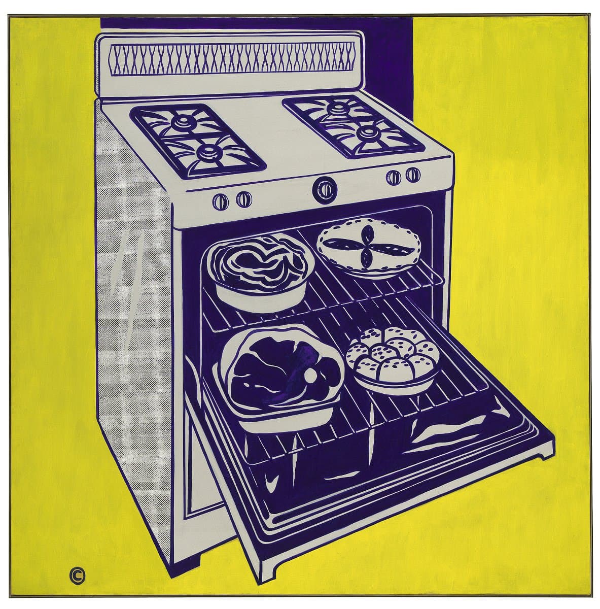
Roy Lichtenstein
Learn moreKitchen range 1961-62
© Estate of Roy Lichtenstein/Copyright Agency Purchased 1978
More detail | PermalinkIn the summer of 1961 Roy Lichtenstein abandoned his earlier Abstract Expressionist style and began to use commercial art as the subject matter of his painting. Kitchen range, painted in the winter of 1961–62, was among the first of these works. Its source was probably an advertisement: the painting mischievously retains the copyright symbol located in the lower left-hand corner, and the Ben Day dots used by printers to reproduce tone. The dots in Kitchen range and other early works were laboriously reproduced by hand, and only later by mechanical means. Lichtenstein stated that it was his intention to follow the original commercial reproduction as closely as possible: ‘The closer my work is to the original the more threatening and critical the content.’[1]
The colours of Kitchen range, limited to yellow and blue, are typical of the restricted palette of the early works. Lichtenstein explained in a 1971 interview that he was ‘looking for the most contrast’:
Each colour had a certain character to me: the yellow was acid, and a colour that seemed to contrast as much as possible with it was a blue that was almost violet … I got some of these colours from supermarket packaging. I would look at package labels to see what colours had the most impact on one another. The idea of contrast seemed to be what advertising was into in this case. An advertisement is so intensely impersonal![2]
The overall quality of the yellow background in Kitchen range, with only the block of blue to suggest a door or edge of the wall, also highlights the patterns and general busyness of the appliance, its components and contents. The stove’s ‘jaunty’ angle provides dynamism to the composition while emphasising the food items presented and projecting from its interior. The pattern of the apple pie is reprised in the hobs above, while the organic forms of the leg of ham contrast with the linear racks.
The placement of the image on a neutral ground—a composition the artist described as ‘anti-Cubist’[3]—is repeated in other works of 1961–63. The square format of Kitchen range complements the object’s geometry, while the central placement of the smaller appliance in Roto-broil 1961 emphasises its more baroque curves.[4] Elsewhere Lichtenstein varies the dimensions of his canvases to enhance the form of his chosen object: in Washing machine 1961,[5] for example, a more rectangular format draws attention to the angles and upper surface of the top-loader, while Cherry pie 1961, Golf ball 1962 and Hot dog with mustard 1963 are likewise closely cropped to complement the item depicted.[6] Through consistent means, and using only a small number of variants to depict food and other consumer goods of postwar America, Lichtenstein suggests the mass production and affluence of the period.
Lucina Ward[7]
[1] John Coplans, ‘An Interview with Roy Lichtenstein’, Artforum, vol 2, no 4, October 1963, p 31.
[2] Diane Waldman, Roy Lichtenstein, Thames and Hudson, London, 1971, p 26.
[3] ‘You pick an object and put it on a blank ground. I was interested in non-Cubist composition. The idea is contrary to the major direction of art since the early Renaissance which has more and more symbolised the integration of “figure” and “ground”.’ John Coplans, ‘Talking with Roy Lichtenstein’, Artforum, vol 5, no 9, May 1967, pp 34–9; see also Phyllis Tuchman, ‘Pop! Interviews with George Segal, Andy Warhol, Roy Lichtenstein, James Rosenquist and Robert Indiana’, Artnews, vol 73, no 5, May 1974, pp 24–9.
[4] Museum of Contemporary Art, Tehran.
[5] Yale University Art Gallery, Connecticut, at https://artgallery.yale.edu/collections/objects/60636, accessed 3 April 2018.
[6] Cherry pie 1961, ex collection Sydney and Frances Lewis, Richmond; at auction Christie’s New York, November 2010, at http://www.christies.com/lotfinder/Lot/roy-lichtenstein-cherry-pie-5371728-details.aspx, accessed 3 April 2018; Golf ball 1962, private collection; Hot dog with mustard 1963, Aaron I Fleischman.
[7] Adapted and updated from Michael Lloyd and Michael Desmond, European and American paintings and sculptures 1870–1970 in the Australian National Gallery, Australian National Gallery, Canberra, 1992, pp 316–18.


Robert Morris
Learn moreSlab (platform) 1962 / 73
© Robert Morris. ARS/Copyright Agency Purchased 1979
More detail | PermalinkRobert Morris, one of the foremost American Minimalist artists, is best known for his geometric plywood sculptures. In December 1964, for his solo show at Green Gallery, New York, Morris exhibited a series of sculptures that were startlingly architectural in effect. Placed directly on the floor, across the corners of the space or suspended from the ceiling, these large, geometric, plywood forms were painted grey to have limited visual appeal and were, as Donald Judd commented at the time, ‘only barely present’.[1] Untitled (Corner beam), for example, was installed above a doorway and diagonally reached between two walls like a lintel, while Untitled (Corner piece) was set into the corner. These interconnected ‘units’ were, as Michael Desmond and Christine Dixon observe, ‘austere to the point of being aggressively abstract, and were plainly sculpture—architectural, yet distinct from architecture’.[2]
Slab (platform) had been exhibited in a group exhibition at Green Gallery in mid 1962, and again in Morris’ solo show in October–November 1963. Slab (cloud) was part of the 1964 show. Although the two works were not initially displayed as a pair, the artist saw them ‘existing in combination’ and now prefers for them to be shown together.[3] In volume and mass Slab (platform) and Slab (cloud) are, essentially, the same piece but the placement of each work impacts on perception. For the 1962 exhibition Morris had placed the square form directly on the floor so that it was seen from above, its legs causing the structure to appear slightly suspended. In 1964 the now-solid form hung much higher—and in conjunction with Untitled (Table), Untitled (Corner beam), Untitled (Floor beam), Untitled (Corner piece) and Untitled (Boiler)—to animate a section of the gallery.[4] By rethinking the object’s placement the artist emphasised how this affected the viewers’ experience of three-dimensional space, forcing them to negotiate the works and the space available to view the works. His use of mirrors in subsequent works allowed his cubes and other objects to seemingly merge into the floor or surroundings and become almost invisible.
Slab (platform) and Slab (cloud) were fabricated in metal in 1973. Morris also considered making a series of slabs:
The 1973 versions may be slightly different from the first ones built, not only in material (first ones were plywood) but dimensions. I think there was a few inches difference in thickness. There could have been a very long series of these slabs (maybe not as many as Brancusi’s Birds), each with a slightly different dimension, distance from the floor, shade of gray, etc. In fact I made several versions of each slab in plywood for various shows—it was easier to make these on the spot than ship them. But these have all been destroyed. The [National Gallery of Australia’s] are the only ones that now exist so far as I know: manifestations of a long but unrealised series.[5]
In 2016 the six components—along with another originally intended for installation in the 1964 show—were acquired and refabricated under the artist’s supervision for the Dia Art Foundation, Beacon, New York. Another version of Untitled (Corner piece) at the Guggenheim is refabricated in plywood each time it is exhibited. Together with Slab (platform) and Slab (cloud), these works mark one of the earliest and most important events in the history of Minimalism.
Lucina Ward
[1] Donald Judd, ‘Hartford,’ Arts Magazine 38, no 6, March 1964, and reprinted in Donald Judd: Complete writings 1959–1975, Press of the Novia Scotia College of Art and Design, Halifax, New York University Press, New York, 1975, p 117.
[2] Michael Desmond and Christine Dixon, 1968, National Gallery of Australia, Canberra, 1995, p 55.
[3] As the artist explained, ‘I am not as insistent on this as I am with [other works] … But it was at a certain point in time (exactly when I cannot remember) that the two works became a pair and I have wanted them shown that way ever since.’ Robert Morris, correspondence of 14 December 1985 with the National Gallery of Australia, NGA file 82/0639, f 78.
[4] For the various painted plywood works, see the Dia Art Foundation, New York, and the Panza Collection at Solomon R Guggenheim Museum, New York. ‘Robert Morris, Hanging slab (cloud)’, in Daniel Marzona and Uta Grosenick (ed), Minimal art, Taschen, Köln, 2004, p 78.
[5] Morris, NGA file 82/0639, f 78. Although another metal version of Slab (platform) is documented in Robert Morris, Tate Gallery, London, 1971, p 35—captioned: ‘Slab 1962 and 1968, painted steel, 96 x 96 x 8 [inches] (reconstruction: first version in plywood)’ and credited to Leo Castelli Gallery, New York—the artist commented in May 1986 that he recalled ‘making only two permanent slabs in metal: one hanging, one on the floor’. Moreover, Leo Castelli Gallery, advised that while records indicate the steel version of Slab, 1962/68 in the Tate catalogue did indeed exist, ‘unfortunately, we cannot tell you who has it now.’ (NGA file 82/0639, f 85 and 86).

Robert Morris
Learn moreSlab (cloud) 1962 / 73
© Robert Morris. ARS/Copyright Agency Purchased 1979
More detail | PermalinkRobert Morris, one of the foremost American Minimalist artists, is best known for his geometric plywood sculptures. In December 1964, for his solo show at Green Gallery, New York, Morris exhibited a series of sculptures that were startlingly architectural in effect. Placed directly on the floor, across the corners of the space or suspended from the ceiling, these large, geometric, plywood forms were painted grey to have limited visual appeal and were, as Donald Judd commented at the time, ‘only barely present’.[1] Untitled (Corner beam), for example, was installed above a doorway and diagonally reached between two walls like a lintel, while Untitled (Corner piece) was set into the corner. These interconnected ‘units’ were, as Michael Desmond and Christine Dixon observe, ‘austere to the point of being aggressively abstract, and were plainly sculpture—architectural, yet distinct from architecture’.[2]
Slab (platform) had been exhibited in a group exhibition at Green Gallery in mid 1962, and again in Morris’ solo show in October–November 1963. Slab (cloud) was part of the 1964 show. Although the two works were not initially displayed as a pair, the artist saw them ‘existing in combination’ and now prefers for them to be shown together.[3] In volume and mass Slab (platform) and Slab (cloud) are, essentially, the same piece but the placement of each work impacts on perception. For the 1962 exhibition Morris had placed the square form directly on the floor so that it was seen from above, its legs causing the structure to appear slightly suspended. In 1964 the now-solid form hung much higher—and in conjunction with Untitled (Table), Untitled (Corner beam), Untitled (Floor beam), Untitled (Corner piece) and Untitled (Boiler)—to animate a section of the gallery.[4] By rethinking the object’s placement the artist emphasised how this affected the viewers’ experience of three-dimensional space, forcing them to negotiate the works and the space available to view the works. His use of mirrors in subsequent works allowed his cubes and other objects to seemingly merge into the floor or surroundings and become almost invisible.
Slab (platform) and Slab (cloud) were fabricated in metal in 1973. Morris also considered making a series of slabs:
The 1973 versions may be slightly different from the first ones built, not only in material (first ones were plywood) but dimensions. I think there was a few inches difference in thickness. There could have been a very long series of these slabs (maybe not as many as Brancusi’s Birds), each with a slightly different dimension, distance from the floor, shade of gray, etc. In fact I made several versions of each slab in plywood for various shows—it was easier to make these on the spot than ship them. But these have all been destroyed. The [National Gallery of Australia’s] are the only ones that now exist so far as I know: manifestations of a long but unrealised series.[5]
In 2016 the six components—along with another originally intended for installation in the 1964 show—were acquired and refabricated under the artist’s supervision for the Dia Art Foundation, Beacon, New York. Another version of Untitled (Corner piece) at the Guggenheim is refabricated in plywood each time it is exhibited. Together with Slab (platform) and Slab (cloud), these works mark one of the earliest and most important events in the history of Minimalism.
Lucina Ward
[1] Donald Judd, ‘Hartford,’ Arts Magazine 38, no 6, March 1964, and reprinted in Donald Judd: Complete writings 1959–1975, Press of the Novia Scotia College of Art and Design, Halifax, New York University Press, New York, 1975, p 117.
[2] Michael Desmond and Christine Dixon, 1968, National Gallery of Australia, Canberra, 1995, p 55.
[3] As the artist explained, ‘I am not as insistent on this as I am with [other works] … But it was at a certain point in time (exactly when I cannot remember) that the two works became a pair and I have wanted them shown that way ever since.’ Robert Morris, correspondence of 14 December 1985 with the National Gallery of Australia, NGA file 82/0639, f 78.
[4] For the various painted plywood works, see the Dia Art Foundation, New York, and the Panza Collection at Solomon R Guggenheim Museum, New York. ‘Robert Morris, Hanging slab (cloud)’, in Daniel Marzona and Uta Grosenick (ed), Minimal art, Taschen, Köln, 2004, p 78.
[5] Morris, NGA file 82/0639, f 78. Although another metal version of Slab (platform) is documented in Robert Morris, Tate Gallery, London, 1971, p 35—captioned: ‘Slab 1962 and 1968, painted steel, 96 x 96 x 8 [inches] (reconstruction: first version in plywood)’ and credited to Leo Castelli Gallery, New York—the artist commented in May 1986 that he recalled ‘making only two permanent slabs in metal: one hanging, one on the floor’. Moreover, Leo Castelli Gallery, advised that while records indicate the steel version of Slab, 1962/68 in the Tate catalogue did indeed exist, ‘unfortunately, we cannot tell you who has it now.’ (NGA file 82/0639, f 85 and 86).

Claes Oldenburg
Learn moreLeopard chair 1963
© Claes Oldenburg and Coosje Van Bruggen Purchased 1978
More detail | PermalinkClaes Oldenburg was born in Stockholm, Sweden, but grew up in Chicago. He moved to New York in 1956 and became friendly with Allan Kaprow, Jim Dine, Red Grooms, Arthur Segel and others. In 1959–60 Oldenburg was sculpting with papier-maché and in 1961 he began making plaster replicas of items of food and cheap clothing, which he exhibited as The Store at the Martha Jackson Gallery, New York. He established the Ray Gun Theater at his studio in 1962, which became an important venue for performance art. Soft props created for performances led to his large-scale soft sculptures of stuffed canvas exhibited at the Green Gallery in 1962.
At the end of the summer of 1963, Oldenburg left New York for California to prepare an exhibition at the Dwan Gallery in Los Angeles in October that year. He rented a former bank building on the main street of the beachside suburb of Venice, and worked there until April 1964. Leopard chair 1963 was one of the first works he completed in his Venice studio and was included in this exhibition. Oldenburg wrote in 1966:
LA is many things and many things to many people. To me it is the paradise of industrialism. LA has the atmosphere (my selected part of it) of the consumer, of the home, the elegant neat result, like the frankfurter in its nonremembered distance from the slaughterhouse.[1]
Vinyl, and in particular the vinyl imitation of animal skins first used in Leopard chair, became Oldenburg’s preferred medium in Los Angeles. Leopard chair is also the first work for which Oldenburg enlisted the assistance of commercial manufacturers to produce a clean ‘machine style’ finish.[2] It initiated a series of furniture pieces that the artist collectively called The Home.
Leopard chair is the prototype of the furniture that appears in Oldenburg's most ambitious project on this theme, the recreation of an entire motel bedroom on which the artist worked in Venice in November and December 1963. It was installed as Bedroom ensemble at the Sidney Janis Gallery in January 1964, in the exhibition Four Environments by Four New Realists (the other three installations were by Dine, James Rosenquist and Segal).
Leopard chair also anticipates the furniture in Oldenburg’s Bedroom ensemble in its angular construction. The chair is rhomboidal in shape, translating into physical fact the shape the chair would assume if rendered illusionistically on a two‑dimensional surface according to the laws of perspective. Oldenburg has called it ‘upholstering perspective’. This teasing of the convention was prompted by newspaper advertisements the artist saw in the Los Angeles Times and clipped into his notebooks, showing furniture in exaggerated foreshortening to accentuate its streamlined appearance.[3] Leopard chair consists of four separate parts and a cushion that slot together to form the chair. It can, however, be rearranged―if less neatly―in different ways to recall the billboards of Los Angeles that face in all directions.[4]
Michael Lloyd and Michael Desmond[5]
[1] Oldenburg, quoted in Barbara Rose, Claes Oldenburg, Museum of Modern Art, New York, 1970, p 193.
[2] The manufacturer’s label is still glued to the bottom of the chair: ‘Associated UPH & MFG. Co, 312 VENICE WAY, VENICE CALIF’, guaranteeing the construction of the chair from ‘ALL NEW MATERIAL / CONSISTING OF / BODY: romeo fome’.
[3] Oldenburg, correspondence of 19 May 1986 with the National Gallery of Australia, NGA file 82/0670, enclosing photocopies of notebook pages of the period, filled with such newspaper clippings of furniture advertisements.
[4] See photograph of the Leopard chair rearranged in Coosje van Bruggen, Claes Oldenburg: Mouse Museum/Ray Gun Wing, Museum Ludwig, Cologne, 1979, p 52, fig b.
[5] Adapted and updated from Michael Lloyd and Michael Desmond, European and American paintings and sculptures 1870–1970 in the Australian National Gallery, Australian National Gallery, Canberra, 1992, p 325.
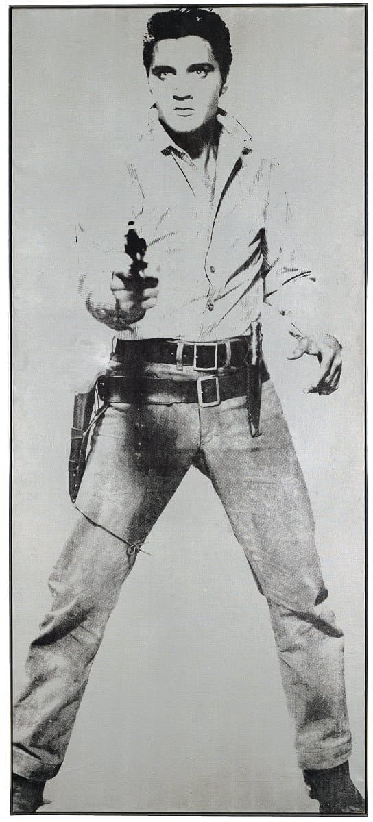
Andy Warhol
Learn moreElvis 1963
© The Andy Warhol Foundation for the Visual Arts, Inc./ARS. © Elvis Presley Enterprises Inc. Licensed by Copyright Agency Purchased 1973
More detail | PermalinkElvis 1963 is one of a series of screenprinted canvases produced by Andy Warhol of the popular American singer Elvis Presley. Warhol’s first forays into screenprinting were prompted by the ‘beautiful face’ and death of Marilyn Monroe in August 1962; at this time he also used headshots of actors and films stars such as Troy Donahue and Warren Beatty, as well as repeat copies of Presley’s head. Of his process, Warhol later recalled:
the rubber‑stamp method I’d been using to repeat images suddenly seemed too homemade; I wanted something stronger that gave more of an assembly‑line effect. With silkscreening you pick a photograph, blow it up, transfer it in glue onto silk, and then roll ink across it so the ink goes through the silk but not through the glue. That way you get the same image, slightly different each time. It all sounds so simple—quick and chancy. I was thrilled with it.[1]
In 1963 Warhol established a studio in an abandoned fire station in East 87th Street and hired Gerald Malanga, a young poet, to assist him with his screenprinting. He began work on a head of film star Elizabeth Taylor and a full‑length portrait of Presley. The image of Elvis was taken from a publicity still for the film Flaming Star (1960, Twentieth Century Fox). His new studio, according to Warhol:
was pretty scary. You literally had to hopscotch over holes in the floor. And the roof leaked. But we didn’t really notice all that much, we were busy getting the Elvises and the Liz Taylor silkscreens ready to ship out to California [for his exhibition at Ferus Gallery, Los Angeles]. One night that summer there was a terrible thunderstorm and when I came in the next morning, the Elvises were sopping wet—I had to do them all over again.[2]
The image was screenprinted 28 times in black paint onto a roll of silver‑painted canvas in various combinations—singly, superimposed doubly and triply, and in pairs.[3] This whole roll of printed canvas was sent off to the Ferus Gallery with a set of stretchers, all of the same height but three different widths. In the absence of instructions from Warhol, Irving Blum of Ferus Gallery matched the stretchers to the images, producing five single images (including the NGA’s Elvis), six superimposed images and two diptychs of paired images—one panel of each diptych having additional colour to the screened images. When Warhol visited Los Angeles to attend the opening of his exhibition he described the thrill of seeing:
the Elvises in the front room and the Lizes in the back. Very few people on the [west] Coast knew or cared about contemporary art, and the press for my show wasn’t too good. I always have to laugh, though, when I think of how Hollywood called Pop Art a put‑on! Hollywood?? I mean when you look at the kind of movies they were making then—those were supposed to be real???[4]
This was a busy period with the artist’s first two solo exhibitions on the west and east coasts. In 1962 Warhol had shown his Campbell’s soup can paintings at the Ferus Gallery and this exhibition—along with his first at the Stable Gallery, New York, in which the soup cans featured along with images of Coke bottles, Marilyn Monroe and Elvis Presley—prompted much criticism of the artist and Pop tendencies more generally.[5] Elvis also shows the signs of an extreme reaction: on the left hand side, just visible through subsequent repairs, is the damage from a penknife attack in 1963.[6]
Michael Lloyd and Michael Desmond[7]
[1] Andy Warhol and Pat Hackett, POPism: The Warhol ’60s, Harcourt Brace Jovanovich, New York and London, 1980, p 22.
[2] As above, p 27.
[3] Gerald Malanga, who assisted with the production of the Elvis series, notes that: ‘On the Elvis Presley silkscreens the image slightly imposed over itself, maybe three or four times. That was an idea I picked up from a photographic process and introduced to Andy. Cecil Beaton had done something like that in one of his early photograph books—a kind of trick stop‑motion effect,’ in Jean Stein with George Plimpton, Edie: An American biography, Alfred A Knopf, New York, 1982, p 206.
[4] Warhol and Hackett, p 42.
[5] It was also included in The New Realists exhibition at the Sidney Janis Gallery, New York.
[6] In 1963, according its former owner Jan van der Marck, ‘it was attacked with a penknife by a maniac at the Castelli Gallery and subsequently restored’. Correspondence of 10 December 1973 with the National Gallery of Australia, NGA file 72/0195.
[7] Adapted and updated from Michael Lloyd and Michael Desmond, European and American paintings and sculptures 1870–1970 in the Australian National Gallery, Australian National Gallery, Canberra, 1992, pp 326–8, by Lucina Ward.
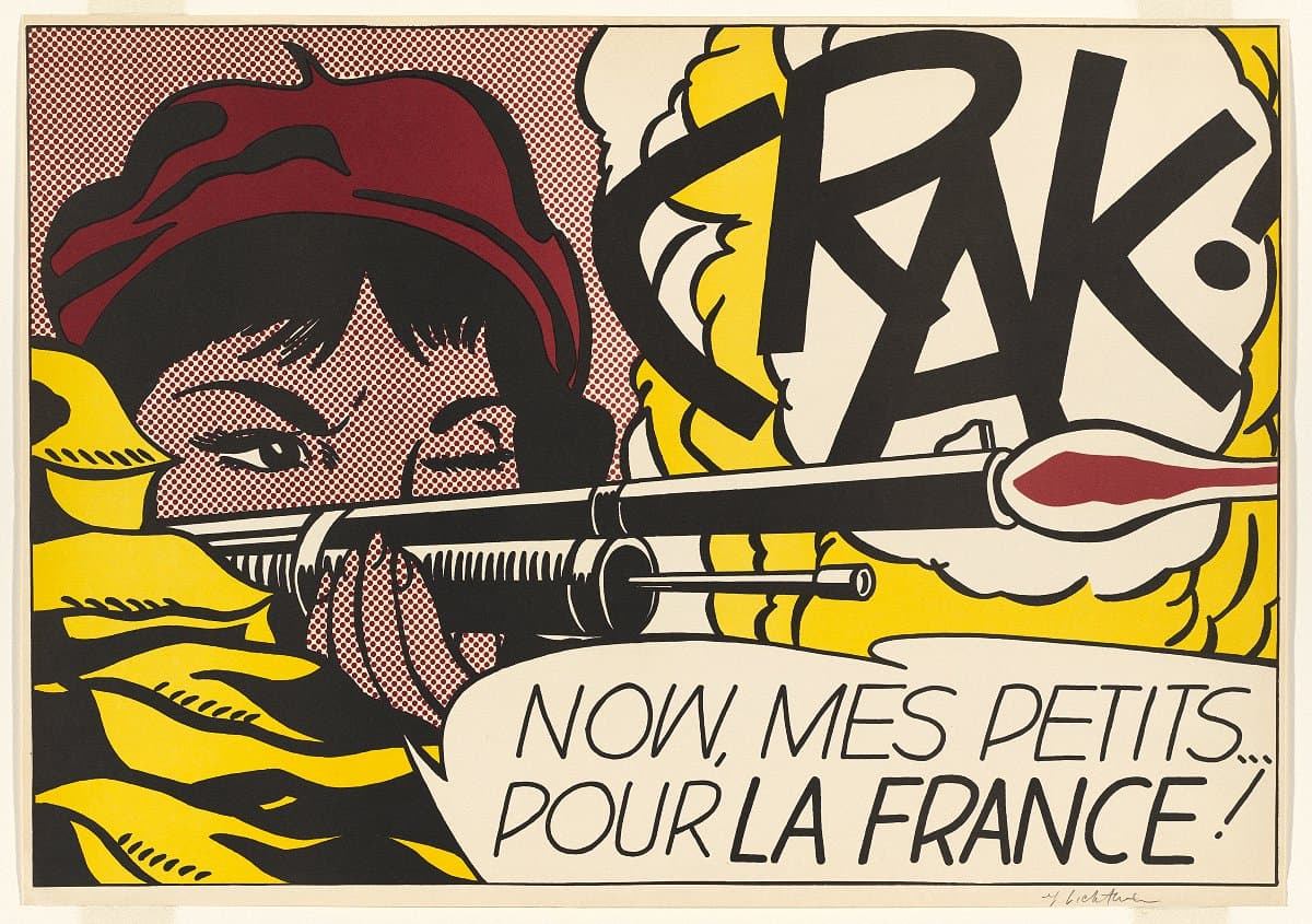
Roy Lichtenstein
Learn moreCrak! 1963-64
© Estate of Roy Lichtenstein/Copyright Agency Purchased 1996
More detail | PermalinkMaking prints was always an important, interconnected part of Roy Lichtenstein’s art practice. As an art student he hand-printed woodcuts, lithographs and etchings; during the 1960s he designed commercially-produced screenprints and offset lithographs as promotional ephemera; and for over 30 years he worked across all print mediums on technically complex and visually sophisticated projects at master printer Kenneth Tyler’s workshops.
Lichtenstein’s exhibitions at Leo Castelli Gallery, New York from 1962–67 propelled the artist to fame. With the content and themes of his work at this time appropriated from print advertisements and pulpy comic books, it was fitting he concurrently used commercial printing methods to create invitations and posters that were themselves conceived as ‘cheap prints’, often sold for $5 or $10 at exhibition openings.[1] Crak! 1963–64 and Shipboard girl 1965 were both created for this purpose and are characteristic of the instantly recognisable themes, motifs and iconography that Lichtenstein built his reputation on in this era. In compositions unmistakably sourced from the pages of romance and war comics, the long-lashed ladies of the two prints are suspended in decontextualised moments of narrative climax, rendered in strong black outlines that are filled in with flat blocks of colour and areas of Lichtenstein’s signature overblown Ben Day dots. Crak! is notably one of very few of his war-themed compositions to depict a female subject.[2] Undeterred in the face of danger, the patriotic paratrooper maintains cool composure despite the dramatic blast of her shotgun, the intensity of which is made visible in graphic, onomatopoeic text.
These commercially-printed works replicate the stylised renditions of popular print iconography that are seen in Lichtenstein’s paintings, but here in his prints the artist’s own distinct visual language is translated through the method of production that they refer to. It is somewhat ironic, then, that when Lichtenstein’s designs were fed back through commercial printing machines, they did not simply duplicate the original source material—the work is distinctively the artist’s own.
The characteristic visual elements of the popular printed material that Lichtenstein adopted and adapted were often by-products of quick and economical tricks of the printing process, including dots that blur together the limited range of printing inks to create tertiary colour tones, and thick black outlines that were overprinted to conceal the misalignment of the different layers of ink. Lichtenstein simplified such elements even further to reduce the composition to its most graphically striking forms. By meticulously resizing and positioning every dot, and restricting his palette to the three primary colours and black, he created his own style that refers to rather than repeats the source material. This could even be understood as turning the practices of commercial artists—converting real-world subject matter into a simplified graphic language—inward on the popular art form itself.
Alice Desmond
[1] Jaklyn Babington, Roy Lichtenstein: Pop remix, National Gallery of Australia, Canberra, 2012, p 29.
[2] As above, p 31.
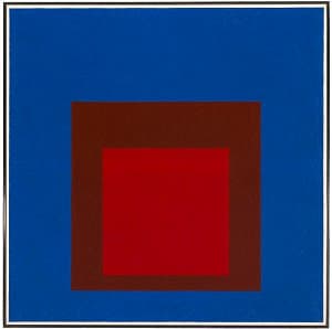
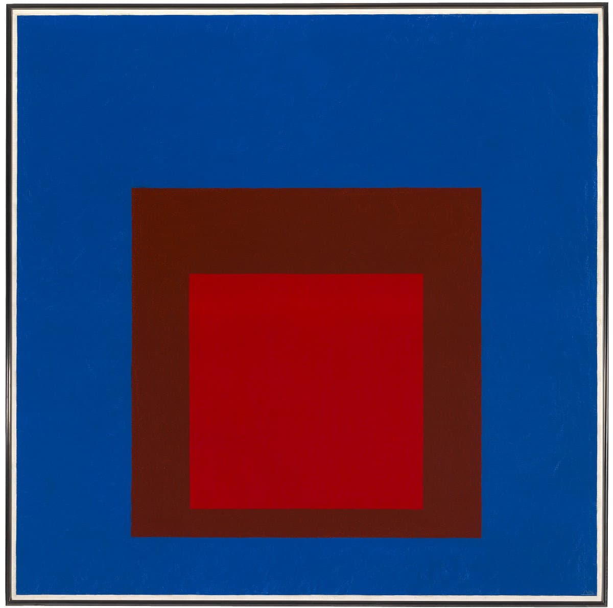
Josef Albers
Learn moreHomage to the square: On an early sky 1964
© The Josef and Anni Albers Foundation. VG Bild-Kunst/Copyright Agency Purchased 1981
More detail | PermalinkJosef Albers was born in Germany in 1888. After training and working as a primary school teacher, and attending art schools in Berlin, Essen and Munich, he studied and later taught at the Bauhaus in Weimar. Albers went on to become a full professor at the Bauhaus when it moved to Dessau in 1925 until it closed in 1933 due to Nazi repression, at which point he accepted an invitation to teach at Black Mountain College, North Carolina. Albers became an American citizen in 1939.
From the summer of 1949, Albers worked on a series of paintings in which he explored the interaction of colours in a regular format, seeking to demonstrate that colour is an entirely relative phenomenon: it changes constantly according to its juxtaposition and relationship with other colours. According to Albers:
In order to use color effectively it is necessary to recognize that color deceives continually … the same color evokes innumerable readings. Instead of mechanically applying or merely implying laws and rules of color harmony, distinct color effects are produced—through recognition of the interaction of color.[1]
Called Homage to the square, the series preoccupied him for the remainder of his career until his death in 1976. Each of the paintings in the series is based on an arrangement of squares stacked one inside the other, evenly placed on a horizontal axis and disposed with a bias to the bottom of the composition on the vertical axis. Four different formats exist, each with either three or four nested squares in slightly different configurations.
Albers produced works in this series by first making small colour sketches, which he then enlarged to a painting of 60.9 x 60.9 cm, 76.2 x 76.2 cm or 96 x 96 cm to see how the change in scale affected the interaction of the colours. These studies, according to Albers, were then observed at intervals, sometimes over a period of years, to detect possible improvements before being enlarged to their final format of 101.6 cm or 122.2 cm,[2] the largest Masonite square available and the size of Homage to the square: On an early sky 1964. In this work, the contrasts of colour are unusually intense, the light red of the middle square barely mediating between the incandescent cadmium red of the internal square and the expanse of cerulean blue. Albers subtitled his works infrequently and then only after they were completed. Yet such subtitles as On an early sky, with its naturalistic and poetic connotations, reveal Albers’ sense of the lyrical power of colour, distancing him from the more formal experiments of the Minimalists with whom he is often now associated as a precursor.
Michael Desmond and Michael Lloyd[3]
[1] Josef Albers, Interaction of colour, Yale University Press, New Haven, 1975, p 1.
[2] Josef Albers, correspondence with the Tate Gallery, 16 May 1966, cited in Ronald Alley, The catalogue of the Tate Gallery’s collection of modern art other than works by British artists, Tate Gallery, London, 1981, p 5.
[3] Adapted and updated from Michael Lloyd and Michael Desmond, European and American paintings and sculptures 1870–1970 in the Australian National Gallery, Australian National Gallery, Canberra, 1992, pp 280–3, by Christine Dixon.

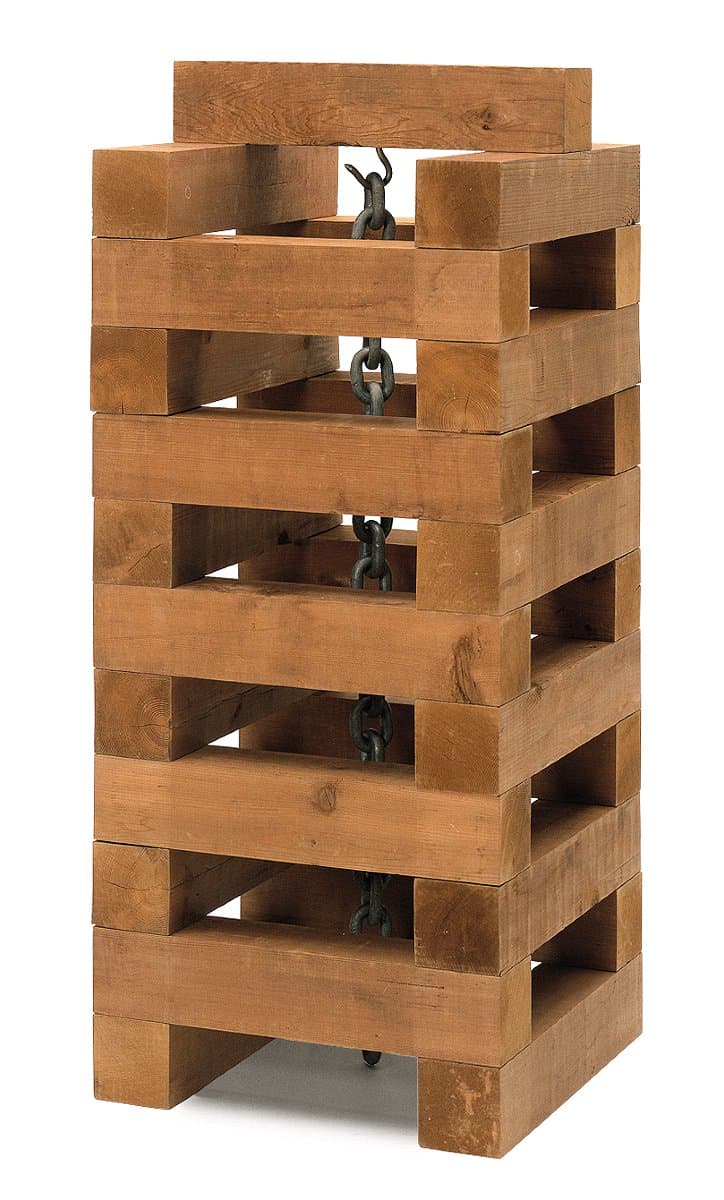
Carl Andre
Learn moreChain well 1964
© Carl Andre. VAGA/Copyright Agency Purchased 1979
More detail | PermalinkSince the 1960s Carl Andre has been recognised as a principal exponent of Minimalism, along with artists such as Donald Judd, Dan Flavin, Sol LeWitt and Robert Morris. Born in Massachusetts in 1935, after his studies he travelled to England and France, returning to serve in the army from 1955–56. He moved to New York in 1957 and in 1958 worked briefly in the studio of painter Frank Stella, where he made his first large sculptures in wood scavenged from neighbourhood building sites.
In 1960 Andre made a number of drawings for sculptures, which he called the Elements series, proposing to construct them from standardised wooden blocks in simple, regular configurations. Due to a lack of funds he could not realise the works, but his intention to use modular units in repetitive arrangements with theoretically endless possible variations was an approach that remained fundamental to his later work.
Andre was included, along with Judd, Morris and others, in a group exhibition in New York in 1965. He built a work, Well 1964/1970, using 28 heavy wooden beams stacked to create a solid wall over two metres high around an internal space. Well was dismantled partway through the exhibition due to the weight exerted on the gallery floor, however the beams were rearranged into another work that spread out the weight distribution, a three-tiered zigzag wall-like arrangement placed across the floor, exemplifying the modular quality of Andre’s work.
Also in 1965 Andre held his first solo exhibition, which included three large, although lightweight, works built from white Styrofoam beams in similar arrangements to the works built in wood. He also included a number of smaller pieces, described as ‘more practical objects’ by one critic[1], including Chain well 1964. It is almost unique among Andre’s work of this period in its combination of two seemingly disparate elements, principally the addition of a second material—the metal chain suspended through the centre of the stacked wooden blocks. It is now known that Andre was dissatisfied with Chain well, considering the chain an extraneous element, a pictorial feature that contaminates the essential process and resulting structure of the work.[2]
Many of Andre’s sculptures in the early 1960s were dismantled or destroyed after being exhibited and now exist only as later reconstructions. Chain well is one of the few works from this period to exist in its ‘original’ state, as the collector and museum director Larry Aldrich acquired it directly from the exhibition.[3] It is conceivable, given the artist’s later dissatisfaction with the piece, that had the work been destroyed after the show, it might never have been remade.
Michael Lloyd and Michael Desmond[4]
[1] Lucy Lippard, ‘New York letter’, Art International, vol 9, no 6, 20 September 1965, p 58.
[2] See James Meyer, Minimalism: Art and polemics in the sixties, Yale University Press, New Haven and London, 2001, pp 132, 293 n 61.
[3] Meyer suggests that Chain well was given to Larry Aldrich by Andre in return for sponsoring his first solo exhibition; see Meyer, p 129.
[4] Adapted and updated from Michael Lloyd and Michael Desmond, European and American paintings and sculptures 1870–1970 in the Australian National Gallery, Australian National Gallery, Canberra, 1992, pp 332–3, by Steven Tonkin.
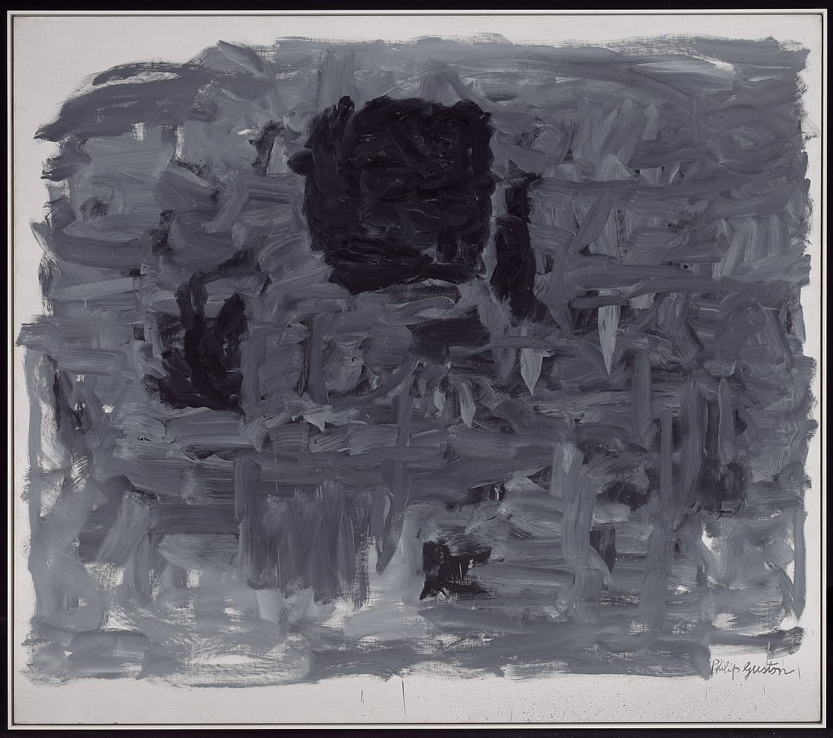
Philip Guston
Learn moreProspects 1964
Gift of American Friends of the National Gallery of Australia, Inc., New York, NY, USA, made possible with the generous support of Musa Guston 1992
More detail | PermalinkIn 1950, following his return to New York from a year travelling in Italy, Philip Guston became immersed in the fervour of the art scene and was an active member of the ‘Eighth Street Club’, which included artists such as Robert Motherwell and Mark Rothko. He had a mid-career retrospective at the Solomon R Guggenheim Museum, New York, in 1962 and four years later a second major survey was held at the Jewish Museum, New York, at which Prospects 1964 was shown. The exhibition brought together almost 40 paintings completed between 1960 and 1965, and was conspicuous in its austerity. During the 1960s the artist gradually expunged colour from his palette, and for Prospects he limited his palette to black and shades of grey only. Guston explained his approach:
I use white and black pigment; white pigment is used to erase the black I don’t want and becomes grey. Working with these restricted means as I do now, other things open up which are unpredictable, such as atmosphere, light, illusion—elements which do seem relevant to the image but have nothing to do with color.[1]
Robert Storr observed that by 1962 the struggle between figure and ground in Guston’s work had been resolved in the separation of the two.[2] In his paintings of the mid 1960s, forms stand out against the background and usually occupy the centre of the canvas, as is the case with the principal squarish form and subsidiary fragments ‘grouped’ in Prospects.[3] While the black elements are pronounced, the intertwining of Guston’s brushstrokes means that these features never fully disengage from the grey; they are distinguishable yet still grounded in the weave of the brushstrokes. The title suggests that at this time the artist was contemplating the direction his work would take in the future. While there may appear to be a uniformity to his output, particularly in 1964 and 1965, his titles, which use words such as ‘portrait’ or ‘head’, hint at a personification of the forms. Although not yet necessarily recognisable as ‘images’, the titles allude to Guston’s thoughts.
Reviews of Guston’s 1966 exhibition were mixed, not surprising given the shifting artistic climate in New York.[4] When Prospects was first shown at the National Gallery of Australia in 1994, Michael Desmond observed that the painting marked ‘a crisis point in Guston’s career’:
This is part of the evolutionary moment between 1962 and 1968 in which he questioned the meaning and content of his work. The dark forms on grey background in this painting are coalescing into images, almost in spite of the artist … ‘doubt has form’.[5]
Between the end of 1965 and late 1967, Guston stopped painting, concentrating instead on drawing as a means of solving the problems he faced as an artist. When he returned to painting, he entered a new phase in his work.
Steven Tonkin
[1] William Berkson, ‘Dialogue with Philip Guston, November 1, 1964’, Art and literature: An international review 7, Winter 1965, p 56.
[2] Robert Storr, Philip Guston, Abbeville Press, New York, 1986, pp 42–3.
[3] These identifiable features are reduced even further to a single black form characterised by short brushstrokes in Air II 1965, Yale University Art Gallery, New Haven.
[4] Only two months after his exhibition at the Jewish Museum, Primary structures opened at the same venue, and later that year the seminal exhibition Systemic painting was held at the Solomon R Guggenheim Museum, both heralding the concerns of a new generation of artists; see discussions in Dore Ashton, Yes, but … a critical study of Philip Guston, The Viking Press, New York, 1976, pp 133–5; Storr, p 43.
[5] Michael Desmond, ‘Rehanging the galleries: The return of modern art’, National Gallery News, March–April 1994, p 7.

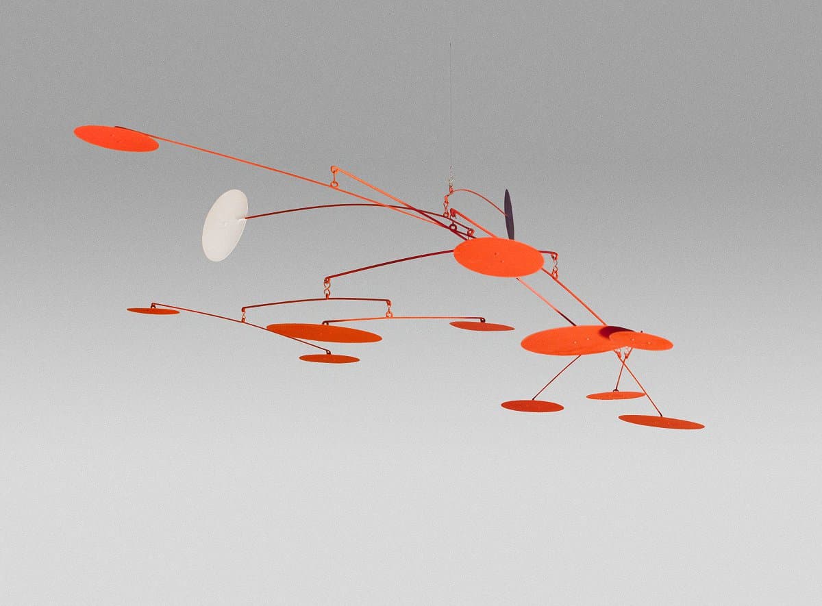
Alexander Calder
Learn moreNight and day 1964
© Calder Foundation, New York/Copyright Agency Purchased 1978
More detail | PermalinkWhy must art be static? You look at an abstraction, sculptured or painted, an entirely exciting arrangement of planes, spheres, nuclei, entirely without meaning. It would be perfect but it is always still. The next step is sculpture in motion.[1]
Alexander Calder’s Night and day 1964 is one of a group of sculptures with moving elements, called ‘mobiles’. These works combine the artist’s interests in abstraction, physics, engineering and astronomy with his intrinsic sense of playfulness. Trained in mechanical engineering and applied kinetics, Calder first exhibited his mobile works at the Galerie Vignon, Paris, in 1932. The term ‘mobile’ was coined by fellow artist Marcel Duchamp: meaning not only something that moves, but in French also ‘motive’. The first mobiles were motorised, but later Calder adapted the construction to allow free-floating movement, simply powered by air currents: ‘Each element able to move, to stir, to oscillate, to come and go in its relationships with the other elements in its universe.’[2]
The colour and composition of Piet Mondrian’s abstract paintings inspired the mobiles. Describing his own use of colour, Calder noted: ‘I have chiefly limited myself to the use of black and white as being the most disparate colours. Red is the colour most opposed to these ...’[3] Night and day consists of 10 flat red discs hanging horizontally from a series of loosely connected cross bars, with two additional vertical discs—one black and one white—facing each other. This combination is found not only in Night and day, but in many other closely associated works.[4]
Despite the intrinsic abstraction of his mobiles, Calder acknowledged the influences of astronomy on his practice:
the underlying sense of form in my work has been the system of the Universe ... the idea of detached bodies floating in space, of different sizes and densities, perhaps of different colours … and some at rest, while others move in peculiar manners, seems to me the ideal source of form.[5]
In addition, the artist has described an experience in 1922 where he woke to ‘the beginning of a fiery red sunrise on one side and the moon looking like a silver coin on the other … it left me with a lasting impression of the solar system’.[6] This not only influenced the wider series but has particular relevance to Night and day, with the white and black facing discs representing the celestial dualities of the title.
Simeran Maxwell
[1] Alexander Calder, ‘Objects to art being static, so he keeps it in motion’, New York World-Telegram, 11 June 1932.
[2] Achim Borchardt-Hume (ed), Alexander Calder: performing sculpture, Tate Publishing, London, 2015, p 219.
[3] Jean Lipman, Calder's universe, Viking Press, New York, 1976, p 33.
[4] Similarly constructed and scaled, Black, white, and ten red 1957 (National Gallery of Art, Washington DC) can be seen as a precursor to the more evocatively titled Night and day.
[5] Alexander Calder, ‘What Abstract Art means to me?’, in Museum of Modern Art Bulletin, vol 18, no 3, Spring 1951, p 8.
[6] Alexander Calder, Calder: An autobiography with pictures, Pantheon Books, New York, 1966, pp 54–5.

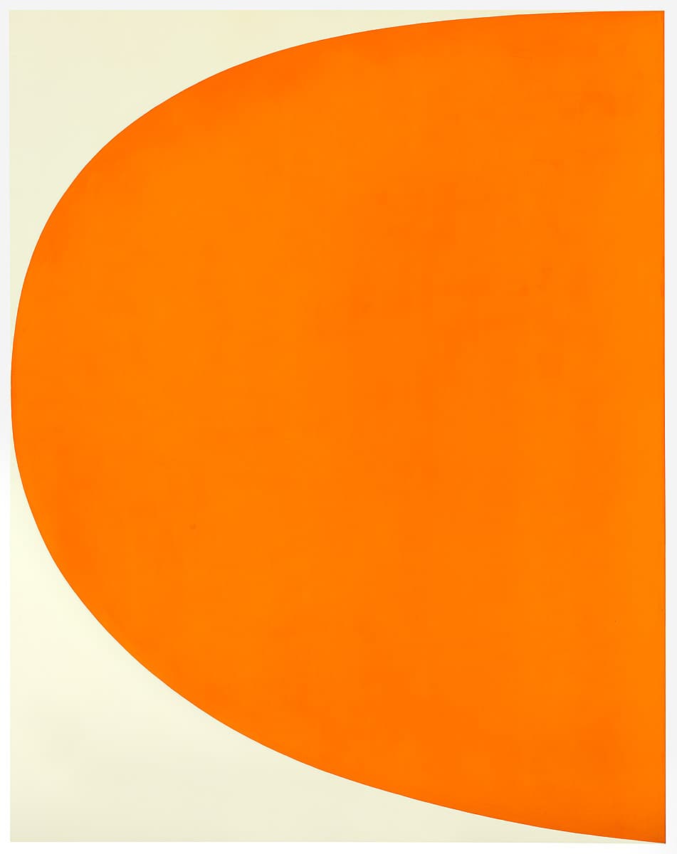
Ellsworth Kelly
Learn moreOrange Curve 1964-65
© Ellsworth Kelly Purchased 1977
More detail | PermalinkEllsworth Kelly’s studies in Paris between 1948 and 1954 put him in contact with a number of established European artists whose example was influential in the direction of his work. These included Jean Arp, Constantin Brancusi and Georges Vantongerloo, the painter-sculptor and founding member of the De Stijl group. During this period Kelly defined the basic ingredients for a boldly-coloured, geometric abstraction that would be more fully developed on his return to the United States.
Referring to the work he did from 1954–65, Kelly stated that ‘the salient feature of my painting at that time was a large curved form that squeezed the ground to the edge of the canvas’.[1] This is an apt description of Orange curve 1964–65 with its swelling orange-coloured egg shape encroaching into the subtly off-white field of the rectangular support.[2] The interaction of this assertive form against the ground evident in Orange curve is indicative of a number of Kelly’s paintings completed around this time. Each variation, for example the closely-related Orange green 1964,[3] employs one or two often curvilinear forms of different sizes and proportions. The paintings are limited to one or two colours, so as to explore the interaction between these forms and the space around the forms―the fundamental figure/ground relationship. Kelly conscientiously investigated the impact of change in the many variations of these ‘simple’ compositions, before his return in 1965 to multi-panel, monochrome and shaped canvases.[4]
Michael Lloyd and Michael Desmond[5]
[1] Quoted in ‘Ellsworth Kelly’, in Colin Naylor (ed), Contemporary artists, St James Press, Chicago, 1989, pp 485–6.
[2] Orange curve 1964–65 is signed and dated verso upper right, in ballpoint pen, ‘EK 1963’; however the artist has advised the NGA that the correct dating of the work is 1964–65 and the inscription is incorrect. Margo H Leavin, correspondence with the Gallery, 12 June 1985. The artist advised the NGA in July 2003 that he wished the title to be changed to Orange curve, to correspond with other similar paintings from the same period; see NGA file 81/0943, f 93.
[3] Private collection, New York.
[4] See, for example, Blue green yellow orange red 1966, Guggenheim Museum, New York, exhibited in Systemic painting at the Guggenheim in 1966.
[5] Adapted and updated from European and American Paintings and Sculptures 1870–1970 in the Australian National Gallery, Australian National Gallery, Canberra, 1992, p 348, by Steven Tonkin and Lucina Ward.
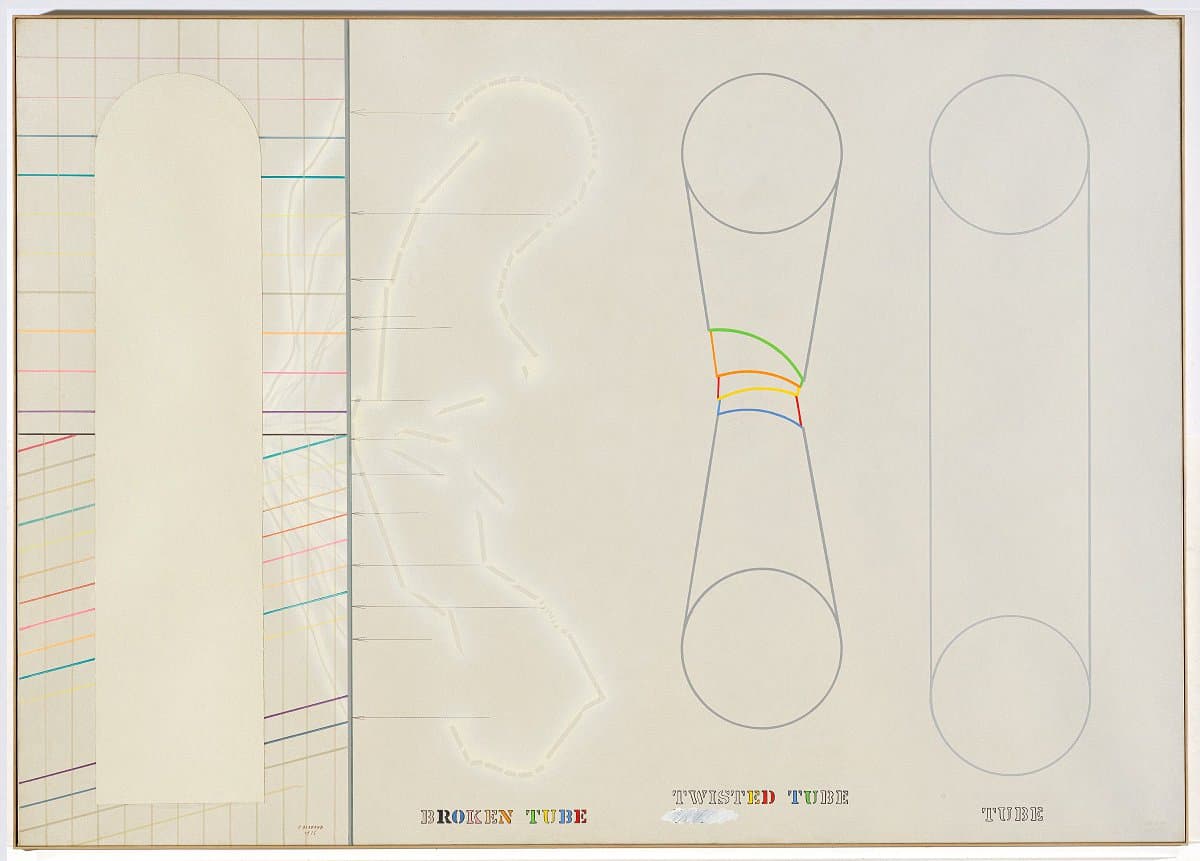
Arakawa
Learn moreTubes 1965
© Estate of Madeline Gins Purchased 1978
More detail | PermalinkArakawa’s early flirtations with angura, or ‘underground’, activities and performances in Tokyo established the foundation for the paintings he made after moving to New York in 1961. His anti-art and antisocial gestures mark a symbolic severance with traditional forms of art and an affirmation of the new. Arakawa’s work incorporates words and schematic images, playing off the ambiguities between verbal and visual languages. His pioneering investigation of language anticipated many of the concerns of Conceptual art in the late 1960s.
Before Arakawa left Japan he completed two diagram‑like works that announced the direction his art was to take in the United States. Describing their origins, he said: ‘Personal things were distressing me. With the diagrams I wanted to map my mental state.’[1] Over the course of the decade this mapping progressed, his work taking on the appearance of visual representations of scientific inquiries, with graphs, charts and diagrams documenting all manner of observation and movement, even including a blueprint for the interaction of ingredients in sweet and sour pork in the print Recipe (Taste it) 1968.[2] The cool and analytical appearance characteristic of Arakawa’s mature work is not surprising given that he studied medicine and mathematics at Tokyo University before making art.
Arakawa continued to identify pictorial equivalents for an idea or ‘mental state’ in the first pieces he made in New York, especially the Bottomless series, begun in 1963. These works typically depicted a square form diminishing in perspective, much like a funnel with an interior mapped by endlessly subdividing grids. According to Madeline Gins, an American poet and Arakawa’s wife, these images represent ‘the thinking field ... which as far as we know ... is itself bottomless ... through which a volume of thought may pass’.[3] The metaphor was extended and refined with the images of diagrammatic tubes that also began to appear in 1963. Tubes 1965 is one of the earlier paintings featuring the motif, which appears in a number of his works of the mid 1960s and again in the 1970s, when it developed further, radiating lines out across the picture plane from a central axis.[4] Broken, twisted or intact, these open‑ended structures were intended ‘as visualisations of thought passages, and as such representations of some behaviour or aspect of the thinking field’.[5]
Tubes was begun in New York in 1964 and completed in 1965. The painting is, however, signed and dated twice—in the lower right as 1965 and as 1975 in the lower left: ‘I was anticipating and incorporating the “Thickness” of a decade,’ explained the artist.[6] In 1978 the painting was damaged in transit, torn in the middle of the blank test‑tube shape on the left. Tubes was returned to Arakawa in New York where he repaired it by collaging onto the damaged area a new piece of canvas in the same test‑tube shape but slightly larger than the original. Arakawa saw this as restoration rather than as a reworking of the painting.
Michael Desmond[7]
[1] Paul Gardner, ‘Arakawa: I am looking for a new definition of perfection’, Artnews, vol 79, no 5, May 1980, pp 60–5.
[2] Silkscreen edition of 60, including one held in the collection of the Walker Art Centre, Minneapolis.
[3] Madeline H Gins, ‘Arakawa’s intention (to point, to pinpoint, to model)’, in Arakawa, Städtische Kunsthalle, Düsseldorf, 1977, p 14.
[4] Koji Takahashi, ‘Introduction: Forming space’,, in Constructing the perceiver, Arakawa: Experimental works, National Museum of Modern Art, Tokyo, 1991, p 306.
[5] Gins, p 14.
[6] Shusaku Arakawa, correspondence of 18 May 1982 with the National Gallery of Australia, NGA file 81/0138.
[7] Adapted and updated from Michael Lloyd and Michael Desmond, European and American Paintings and Sculptures 1870–1970 in the Australian National Gallery, Australian National Gallery, Canberra, 1992, pp 350–2 and Michael Desmond, ‘Arakawa Shusaku’, in Michael Brand (ed), Traditions of Asian Art: traced through the collection of the National Gallery of Australia, National Gallery of Australia, Canberra, 1995, pp 88, 95, by Bronwyn Campbell.
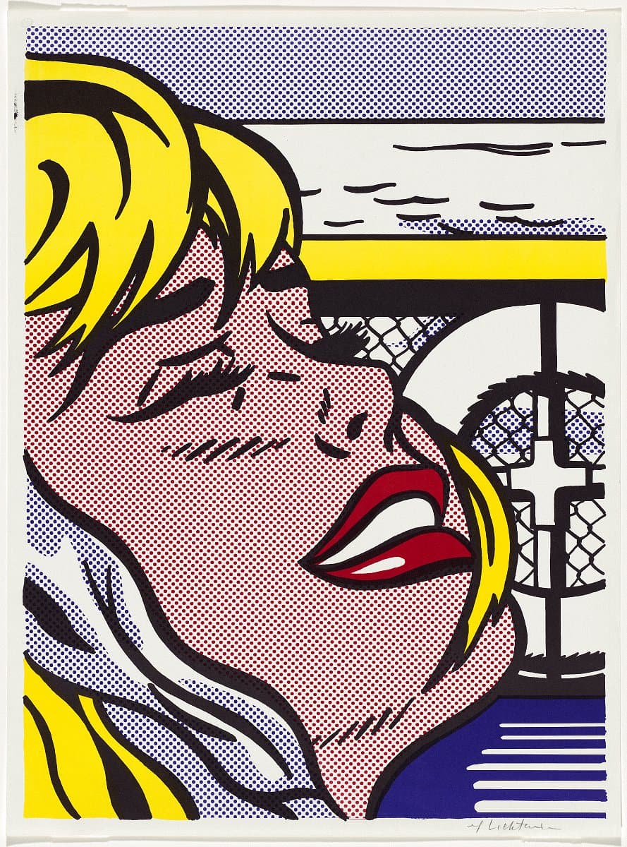
Roy Lichtenstein
Learn moreShipboard girl 1965
© Estate of Roy Lichtenstein/Copyright Agency Felix Man Collection, Special Government Grant 1972
More detail | PermalinkMaking prints was always an important, interconnected part of Roy Lichtenstein’s art practice. As an art student he hand-printed woodcuts, lithographs and etchings; during the 1960s he designed commercially-produced screenprints and offset lithographs as promotional ephemera; and for over 30 years he worked across all print mediums on technically complex and visually sophisticated projects at master printer Kenneth Tyler’s workshops.
Lichtenstein’s exhibitions at Leo Castelli Gallery, New York from 1962–67 propelled the artist to fame. With the content and themes of his work at this time appropriated from print advertisements and pulpy comic books, it was fitting he concurrently used commercial printing methods to create invitations and posters that were themselves conceived as ‘cheap prints’, often sold for $5 or $10 at exhibition openings.[1] Shipboard girl 1965 and Crak! 1963–64 were both created for this purpose and are characteristic of the instantly recognisable themes, motifs and iconography that Lichtenstein built his reputation on in this era. In compositions unmistakably sourced from the pages of romance and war comics, the long-lashed ladies of the two prints are suspended in decontextualised moments of narrative climax, rendered in strong black outlines that are filled in with flat blocks of colour and areas of Lichtenstein’s signature overblown Ben Day dots. Shipboard girl’s anguished blonde is one among many of Lichtenstein’s beautiful damsels in distress.
These commercially-printed works replicate the stylised renditions of popular print iconography that are seen in Lichtenstein’s paintings, but here in his prints the artist’s own distinct visual language is translated through the method of production that they refer to. It is somewhat ironic, then, that when Lichtenstein’s designs were fed back through commercial printing machines, they did not simply duplicate the original source material—the work is distinctively the artist’s own.
The characteristic visual elements of the popular printed material that Lichtenstein adopted and adapted were often by-products of quick and economical tricks of the printing process, including dots that blur together the limited range of printing inks to create tertiary colour tones, and thick black outlines that were overprinted to conceal the misalignment of the different layers of ink. Lichtenstein simplified such elements even further to reduce the composition to its most graphically striking forms. By meticulously resizing and positioning every dot, and restricting his palette to the three primary colours and black, he created his own style that refers to rather than repeats the source material. This could even be understood as turning the practices of commercial artists—converting real-world subject matter into a simplified graphic language—inward on the popular art form itself.
Alice Desmond
[1] Jaklyn Babington, Roy Lichtenstein: Pop remix, National Gallery of Australia, Canberra, 2012, p 29.
Jo Baer
Learn moreUntitled (vertical flanking diptych - red) 1966-74
Purchased 1973
More detail | PermalinkJo Baer studied biology and art at the University of Washington, Seattle, before moving to New York in 1960. There she met Sol LeWitt and Donald Judd, becoming a key participant in Minimalism and developing her signature, reductive and hard-edge style of painting. This work was first exhibited at Documenta IV in Kassel in 1968, as Untitled (diptych) and dated 1967. In 1974, not long after the diptych was acquired by the Gallery, the artist changed the title to Untitled (vertical flanking diptych—red) and the date to 1966–74, thus locating it within a whole series of works.
Baer’s basic format for this series was well established by 1966. Each painting, or panel if the work was composite, was articulated by three colours: usually an expansive white central field, a uniform black band placed at the outer edge of the canvas, with a thin line of colour either running through the black band or striped between the black border and the lighter centre. In 1966 Baer also began to use diptych and triptych groupings, arranging them in various configurations: laid horizontally and ‘stacked’ on the wall one above the other, or hung vertically in a more ‘traditional’ arrangement flanking each other. Years later Baer described her motivation for the works:
When I was working as a minimalist painter in the 60s and 70s I used the diptych form as an iterating device, which is to say that saying something twice or more can reinforce what is meant (or for the viewer, practice makes perfect). Chasing ‘essences’, I became interested in the differences between the singular, the doubled and the many, whereupon I came to realize that single paintings objectified the unique, doubled identical ones spoke of entity, and three or more under or within one rubric implied sets, series and continuums ad-infinitum. These concepts served me well as simple thumb-rules for much of that body of work.[1]
Serial experimentation within a limited format was a typical strategy of Minimalist painters during the 1960s, and Baer was a vocal advocate of painting’s viability, particularly against the polemical criticism levelled at the medium by Judd and Robert Morris. In 1967 Morris argued that painting had become ‘antique’ as a result of its inherent and ‘inescapable illusionism’ and the divisiveness of the experience it elicited in the viewer.[2] Baer responded to this criticism both publicly and privately. In a letter published in Artforum, she asserted the primacy of painting as a radical art form, arguing that its qualities of ‘objectness’ could be as non-referential and specific on a flat plane as ‘objects’ made in three dimensions.[3]
Likewise, in private correspondence with Morris, Baer made a general claim that encapsulates her importance as both an artist and theorist of Minimalism, and resonates specifically in her Untitled (vertical flanking diptych—red):
A painting is an object which has an emphatic frontal surface. On such a surface, I paint a black band which does not recede, a colour band which does not obtrude, a white square or rectangle which does not move back or forth, to or fro, or up or down … Every part is painted and contiguous to its neighbour: no part is above or below any other part. There is no hierarchy. There is no ambiguity. There is no illusion. There is no space or interval (time). Some ‘antique’.[4]
Michael Lloyd and Michael Desmond[5]
[1] Jo Baer, ‘The Diptych’, in Jo Baer: Paintings 1960–1998, Stedelijk Museum, Amsterdam, 1999, p 26.
[2] Robert Morris, ‘Notes on sculpture, Part 3: Notes and nonsequitors’, Artforum, vol 5, no 10, June 1967, p 25.
[3] Jo Baer in, ‘Letters’, Artforum, vol 6, no 1, September 1967, pp 5–6.
[4] Baer, in correspondence with Morris, 29 July 1967, reprinted in ‘Annotated biography’, in Jo Baer: Paintings 1960–1998, p 40.
[5] Adapted and updated from Michael Lloyd and Michael Desmond, European and American paintings and sculptures 1870–1970 in the Australian National Gallery, Australian National Gallery, Canberra, 1992, pp 378–9, by Steven Tonkin.
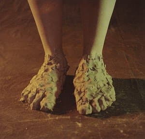

Bruce Nauman
Learn moreFeet of clay 1966-70
Purchased 1978
More detail | PermalinkBruce Nauman started using photography around 1966, in part following his experience that year of the work of the American-born Surrealist photographer Man Ray at the LA County Museum of Art.[1] Eleven color photographs 1966–67, released by New York gallerist Leo Castelli in 1970,[2] brought wide critical and public attention and represented a radical rearticulation of photography as an ‘artistic’ medium and a source of meaning. It is one of the first instances of an artist engaging with the opportunities offered by colour photography, which until the early 1970s remained the province of commercial and snapshot photography.
Taking the appearance of documentary photographs, the works depict either an action or an ephemeral ‘sculpture’ created by Nauman in his studio, each involving a pun or word game. Nauman has said of the photographs:
I suppose I might have made them as paintings if I had been able to make paintings at the time … Perhaps if I had been a good enough painter I could have made realistic paintings. I don’t know, it just seemed easier to make the works as photographs.[3]
It seems that, in this instance, Nauman’s interest in colour photography was in its capacity to ‘realistically’ (and readily) convey the subject. All the same, the works have come to assume great significance in the history of photography. Indeed, the series was a harbinger of sorts for much of the great American and European photography of the 1970s, when for the first time artists began to use colour processes in a critical and sustained way.
Shaune Lakin
[1] Raphaël Pirenne, ‘Eleven color photographs: Nauman, Man Ray and Wittgenstein: the scepticism of the medium’, in Raphaël Pirenne and Alexander Streitberger (eds), Heterogeneous objects: Intermedia and photography after Modernism, Leuven University Press, Leuven, 2013, p 39.
[2] The photographs had been exhibited individually and as a group, under the title Untitled (Set of eleven color photographs); Pirenne and Streitberger, pp 33–57. The pictures were actually taken by the San Francisco based photographer Jack Fulton; Laurence Sillars, ‘Bruce Nauman: keeping busy’, in Laurence Sillars (ed), Bruce Nauman: make me think me, Tate, Liverpool, 2006, p 21.
[3] Bruce Nauman, interview with Willoughby Sharp (1970), reprinted in Robert C Morgan (ed), Bruce Nauman, Johns Hopkins University Press, Baltimore, 2002, p 241.


Louise Bourgeois
Learn moreVallee de la riviere sans berge [Valley of the limitless river] c.1968-86
© The Easton Foundation. VAGA/Copyright Agency Purchased 1988
More detail | PermalinkAt the time of its acquisition in 1989, Vallee de la Rivière sans berge [Valley of the limitless river] c#1968–86 constituted the most ambitious known drawing by Louise Bourgeois. A vividly coloured composition extending over four large sheets of paper, the work is exceptional in that it not only foretold aspects of the style of a number of younger contemporary artists working in New York in the 1970s and 80s, but in that its abstract forms—known as cumuls—are among the most characteristic ‘signature’ motifs of Bourgeois’ repertoire.[i] The cumuls, the name of which alludes to cumulous cloud formations, first appeared in Bourgeois’ marble sculptures from 1967.
Following an extended period of deep introspection and intensive psychoanalysis, Bourgeois began making works in the early 1960s that were markedly different in form and style from the angular rigidity typical of early masterpieces such as C.O.Y.O.T.E. 1941–48. Suggesting the topographical undulations of rolling hills, biomorphic forms or the anthropomorphic contours of breasts as much as cloud-filled skies, for Bourgeois the cumuls denoted fecundity—defined as an abundance of both biological and intellectual fertility. Similarly, the river running through the image, which might literally be identified as the Bièvre River that flowed through the garden of the Bourgeois family house and tapestry business in Antony near Paris and in which coloured tapestry yarns were washed, is engendered by the artist and leads to many possible autobiographic and metaphoric interpretations. Implying an inexhaustible process of germination and growth, the forms in Vallee de la Rivière sans berge mapped the unfolding progression of Bourgeois’ own artistic process, while also alluding to her lifelong compulsion to endlessly dwell on compelling memories from her childhood.
Sally Foster
[i] See ‘Abstracted emotions’ in Deborah Wye, Louise Bourgeois: an unfolding portrait: prints, books and the creative process, Museum of Modern Art, New York, 2017, pp 63–5.
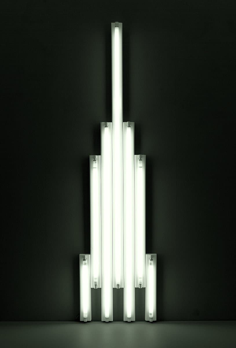
Dan Flavin
Learn moremonument to V. Tatlin 1966-69
© Dan Flavin. ARS/Copyright Agency Purchased 1978
More detail | PermalinkDan Flavin first began using electric lights in his work in 1961, and by 1963 was making works using fluorescent light exclusively. His monument to V. Tatlin 1966–69 is one of a series of sculptures using standard‑length fluorescent tubes. There are 39 variations within the series, each in an edition of five; all use varying standard-sized white fluorescent light tubes set adjacent to each other, arranged in different configurations, most often vertically, as well as horizontally and diagonally.[1] The series memorialises artist and revolutionary Vladimir Tatlin, ‘who dreamed of art as science [and] stands, a vibrantly aspiring order, in lieu of his last glider which never left the ground’.[2] Flavin admired Tatlin as an ‘unassuming, artist-engineer’ who desired the unity of art and technology, away from the confines of art institutions that separate art from ‘daily concerns’.[3] The American artist’s interest was prompted by a book on Russian avant-garde art by the dancer and art historian Camilla Gray Prokofiev.[4]
The use of the term ‘monument’ in the title―which alludes to Tatlin’s most ambitious, though never realised, architectural project, Monument to the Third International 1921―is intended as ironic; the fragile fluorescent tubes present an antithesis to the solidity and perceived permanence of bronze or stone traditionally used in monumental sculpture. To emphasise this point Flavin insisted that ‘monument’ use lowercase letters. His ‘monument’ is, moreover, human in scale and domestic in references. As Jeremy Gilbert-Rolfe points out, fluorescent tubes are constructed to architectural conventions which are, in turn, derived from the height of an average person.[5] Flavin’s use of this form of light, once familiar and mass-produced but now increasingly rare, is an instance of obsolete technology. Fluorescent light―produced by an electrical charge through the gas and mercury contained within the tube, and its fluorescence on the phosphor-coating on the inner surface of the glass―and the tubes are short-lived. Flavin enjoyed the humour of making temporary monuments: as he commented, these monuments only ‘survive as long as the light system is useful [approximately] 2,100 hours’.[6]
From four ‘feet’ monument to V. Tatlin thrusts upward, like a rocket or an elegant Art Deco skyscraper highlighted against the sky. When considered in sequence, the configuration of tubes in some monuments suggests an element of flight, almost as if the form might start on its vertical trajectory. Others in the group collapse on the floor, attach themselves to edges of walls or cluster in corners. Monument 1 for V. Tatlin 1964 and monument 7 for V. Tatlin 1964–65 were the first to be fabricated; others were assembled as the opportunity to exhibit presented.[7] The dating of each work refers to both the original conception in diagrammatic form and subsequent material realisation. Hence, in the case of monument to V. Tatlin 1966–69, a sketch of 1966 marks the basis for this configuration, which was fabricated in 1969. Flavin produced at least 20 sketches for the monument to V. Tatlin series between 1964 and 1970, although he claimed never to have counted the designs, and continued to produce variants until 1990.[8] The monuments to V. Tatlin remain some of his best-known works.
Michael Lloyd and Michael Desmond[9]
[1] Dia Art Foundation, New York, holds the complete [22 of the] set of monuments: see https://www.diaart.org/collection/collection/keyword/flavin%20monument%20for%20tatlin/page/2#flavin-dan-monument-for-v-tatlin-1966-1980-013, accessed 22 February 2018. Other examples include: monument 1 for V. Tatlin 1964, Museum of Modern Art, New York; monument to V. Tatlin 1966, Philadelphia Museum of Art; and monument for V. Tatlin 1969, San Francisco Museum of Modern Art.
[2] Dan Flavin, ‘The artists say’, Art Voices, vol 4, Summer 1965, p 72.
[3] Letter from Dan Flavin to Ronald Alley, dated 12 April 1972, quoted in The Tate Gallery’s collection of modern art other than works by British artists, Tate Gallery and Sotheby Parke Bernet, London, 1981, p 219.
[4] Camilla Gray, The great experiment: Russian art 1863–1922, Thames & Hudson, London, 1962. rf also letter, 12 April 1972: mention of Gray?
[5] Jeremy Gilbert-Rolfe, ‘Space and speed in Flavin, Minimalism, Pop art and Mondrian’, in Jeffrey S Weiss and Briony Fer (eds), Dan Flavin: New light, Yale University Press, New Haven and National Gallery of Art, Washington, 2006, pp 82–107, at p 99.
[6] Quoted in Michael Govan, ‘Irony and light’, in Dan Flavin: A retrospective, Dia Art Foundation, New York, National Gallery of Art, Washington, and Yale University Press, New Haven, 2007, pp 19–108, at p 45.
[7] monument 7 for V. Tatlin 1964–65 was shown at the University of Pennsylvania’s Institute of Contemporary Art in May 1965.
[8] As Flavin explained, ‘I've never counted the designs. Perhaps, I will not draw more ... I believe that there is one diagram for 1965, one for 1966, none in 1967 and so forth. The last, at present, is of 1970.’ Quoted at tate.org, accessed 22 February 2018.
[9] Adapted and updated from Michael Lloyd and Michael Desmond, European and American Paintings and Sculptures in the Australian National Gallery 1870–1970, Australian National Gallery, Canberra, 1992, pp 358–60, by Steven Tonkin and Lucina Ward.

Claes Oldenburg
Learn moreProposed colossal monument for Piccadilly Circus, London: Fork cutting slice of cake 1966
© Claes Oldenburg and Coosje Van Bruggen Purchased 1983
More detail | PermalinkIn 1965 Claes Oldenburg began designing the first of his public monuments, which essentially convert ordinary objects to a huge scale, as in Proposed colossal monument for Piccadilly Circus, London: Fork cutting slice of cake 1966. Unlike the actual intersection in London’s West End—which at the time was alive with neon signs in the manner of Times Square in New York—the only flash of colour in the drawing is the cake, a looming mass of jam-filled Victoria sponge towering over grey buildings and completely blocking one approach. A massive fork fills another street, downturned, about to scoop away the load of cake it has sheared off. Creating havoc with his proposed public monuments appears to have tickled Oldenburg; his sombre-sounding memorial titled Proposed monument for the intersection of Canal Street and Broadway, N.Y.C. -- Block of concrete with the names of war heroes 1965 is in fact a colossal multi-story traffic impediment that entirely fills the junction.[i] The gravitas implied by his use of the term ‘monument’ is upended by the absurdity of Oldenburg’s inflated subjects. The artist again honoured Piccadilly Circus the following year by a proposal for a cluster of immense lipsticks.[ii]
Bronwyn Campbell, Brooke Babington and Emilie Owens
[i] Museum of Modern Art, New York, at https://www.moma.org/collection/works/86957, accessed 5 April 2018.
[ii] Lipsticks in Piccadilly Circus, London 1966, Tate, London, at http://www.tate.org.uk/art/artworks/oldenburg-lipsticks-in-piccadilly-circus-london-t01694, accessed 5 April 2018.

Bruce Nauman
Learn moreThe true artist helps the world by revealing mystic truths (Window or wall sign) 1967
© Bruce Nauman. ARS/Copyright Agency Purchased 1978
More detail | PermalinkThe true artist helps the world by revealing mystic truths (Window or wall sign) was made in the winter of 1966–67 at a time when Bruce Nauman had established his studio in a disused grocery store in San Francisco. The work was designed for a large shop window at the front of the studio, rather like the neon advertising signs that hung in the shopfronts nearby, although with quite a different message.[1] Referring to the conception of Window or wall sign, Nauman stated:
I had the idea that I could make art that would kind of disappear—an art that was supposed to not quite look like art. In that case, you wouldn’t really notice it until you paid attention. Then, when you read it, you would have to think about it ... The most difficult thing about the whole piece for me was the statement. It was a kind of test—like when you say something out loud to see if you believe it. Once written down, I could see that the statement, ‘The true artist helps the world by revealing mystic truths’ was on the one hand a totally silly idea and yet, on the other hand, I believed it. It’s true and it’s not true at the same time. It depends on how you interpret it and how seriously you take yourself. For me it’s still a very strong thought.[2]
Nauman’s use of neon, a commercially-produced, non-art material associated with motels, bars or advertising, seems to counteract his lofty statement. The dualism of his ideas is enhanced by the colour, form and structure of the work. At a distance the red spiral reads as the number six while the dense, more elaborate blue lettering provides a counterpoint: the strength of the numeric graphic sign is thrown into relief by the twists, turns and rhythm of the cursive shapes. Moreover, the message and promise to reveal ‘mystic truths’ is likewise complemented by the spiral form, a symbol often interpreted as the notion of journey, growth and evolution. Indeed, Joan Simon has linked Nauman’s interest in solving or revealing ‘impossible’ problems to his training as a mathematician.[3] Elsewhere, such as Eleven color photographs 1966–67 (see p xx) he composes images that undermine the idea of words as a means of communication, treating ‘linguistic fragments and material issues as interchangeable’.[4]
The success of Nauman’s first New York exhibition at Leo Castelli Gallery in early 1968 prompted Castelli to suggest that works by the artist using fluorescent tubing should be issued in small editions; Nauman authorised Window or wall sign to be produced in an edition of three.[5] The idea that an artist should advertise or promote his ability to see beyond everyday matters, and then distribute ‘evidence’ of this faculty in the form of an elegantly scripted, coloured sign seems at once self-evident and wryly humorous. Nauman continued to work with text and neon, most intensely in the 1980s, and Window or wall sign remains one of his most enduring and influential works.
Lucina Ward[6]
[1] At this time Nauman produced a transparent Mylar window shade imprinted ‘The true artist is an amazing luminous fountain’, which also appeared behind the plate‑glass window of the shopfront. Location?
[2] Brenda Richardson, Bruce Nauman: Neons, Baltimore Museum of Art, Maryland, 1982, p 20.
[3] Joan Simon, ‘Breaking the silence: An interview with Bruce Nauman, 1988 (January, 1987)’, in Janet Kraynak (ed), Please pay attention please: Bruce Nauman’s words: Writings and interviews, MIT Press, Cambridge, Massachusetts, 2005, pp 317–38, at p 323.
[4] As above, p 317.
[5] Others from the edition are in the Rijksmuseum Kröller‑Müller, Otterlo; Museum für Gegenwartskunst, Basel; and Philadelphia Museum of Art.
[6] Adapted and updated from Michael Lloyd and Michael Desmond, European and American Paintings and Sculptures 1870–1970 in the Australian National Gallery, Australian National Gallery, Canberra, 1992, p 372.

Bruce Nauman
Learn moreCoffee thrown away because it was too cold 1967
Purchased 1978
More detail | PermalinkBruce Nauman started using photography around 1966, in part following his experience that year of the work of the American-born Surrealist photographer Man Ray at the LA County Museum of Art.[1] Eleven color photographs 1966–67, released by New York gallerist Leo Castelli in 1970,[2] brought wide critical and public attention and represented a radical rearticulation of photography as an ‘artistic’ medium and a source of meaning. It is one of the first instances of an artist engaging with the opportunities offered by colour photography, which until the early 1970s remained the province of commercial and snapshot photography.
Taking the appearance of documentary photographs, the works depict either an action or an ephemeral ‘sculpture’ created by Nauman in his studio, each involving a pun or word game. Nauman has said of the photographs:
I suppose I might have made them as paintings if I had been able to make paintings at the time … Perhaps if I had been a good enough painter I could have made realistic paintings. I don’t know, it just seemed easier to make the works as photographs.[3]
It seems that, in this instance, Nauman’s interest in colour photography was in its capacity to ‘realistically’ (and readily) convey the subject. All the same, the works have come to assume great significance in the history of photography. Indeed, the series was a harbinger of sorts for much of the great American and European photography of the 1970s, when for the first time artists began to use colour processes in a critical and sustained way.
Shaune Lakin
[1] Raphaël Pirenne, ‘Eleven color photographs: Nauman, Man Ray and Wittgenstein: the scepticism of the medium’, in Raphaël Pirenne and Alexander Streitberger (eds), Heterogeneous objects: Intermedia and photography after Modernism, Leuven University Press, Leuven, 2013, p 39.
[2] The photographs had been exhibited individually and as a group, under the title Untitled (Set of eleven color photographs); Pirenne and Streitberger, pp 33–57. The pictures were actually taken by the San Francisco based photographer Jack Fulton; Laurence Sillars, ‘Bruce Nauman: keeping busy’, in Laurence Sillars (ed), Bruce Nauman: make me think me, Tate, Liverpool, 2006, p 21.
[3] Bruce Nauman, interview with Willoughby Sharp (1970), reprinted in Robert C Morgan (ed), Bruce Nauman, Johns Hopkins University Press, Baltimore, 2002, p 241.

Bruce Nauman
Learn moreEating my words 1967
© Bruce Nauman. ARS/Copyright Agency Purchased 1978
More detail | PermalinkBruce Nauman started using photography around 1966, in part following his experience that year of the work of the American-born Surrealist photographer Man Ray at the LA County Museum of Art.[1] Eleven color photographs 1966–67, released by New York gallerist Leo Castelli in 1970,[2] brought wide critical and public attention and represented a radical rearticulation of photography as an ‘artistic’ medium and a source of meaning. It is one of the first instances of an artist engaging with the opportunities offered by colour photography, which until the early 1970s remained the province of commercial and snapshot photography.
Taking the appearance of documentary photographs, the works depict either an action or an ephemeral ‘sculpture’ created by Nauman in his studio, each involving a pun or word game. Nauman has said of the photographs:
I suppose I might have made them as paintings if I had been able to make paintings at the time … Perhaps if I had been a good enough painter I could have made realistic paintings. I don’t know, it just seemed easier to make the works as photographs.[3]
It seems that, in this instance, Nauman’s interest in colour photography was in its capacity to ‘realistically’ (and readily) convey the subject. All the same, the works have come to assume great significance in the history of photography. Indeed, the series was a harbinger of sorts for much of the great American and European photography of the 1970s, when for the first time artists began to use colour processes in a critical and sustained way.
Shaune Lakin
[1] Raphaël Pirenne, ‘Eleven color photographs: Nauman, Man Ray and Wittgenstein: the scepticism of the medium’, in Raphaël Pirenne and Alexander Streitberger (eds), Heterogeneous objects: Intermedia and photography after Modernism, Leuven University Press, Leuven, 2013, p 39.
[2] The photographs had been exhibited individually and as a group, under the title Untitled (Set of eleven color photographs); Pirenne and Streitberger, pp 33–57. The pictures were actually taken by the San Francisco based photographer Jack Fulton; Laurence Sillars, ‘Bruce Nauman: keeping busy’, in Laurence Sillars (ed), Bruce Nauman: make me think me, Tate, Liverpool, 2006, p 21.
[3] Bruce Nauman, interview with Willoughby Sharp (1970), reprinted in Robert C Morgan (ed), Bruce Nauman, Johns Hopkins University Press, Baltimore, 2002, p 241.

Andy Warhol
Learn moreElectric chair 1967
© The Andy Warhol Foundation for the Visual Arts, Inc./ARS. Licensed by Copyright Agency Purchased 1977
More detail | PermalinkAndy Warhol first used the image of the electric chair in his Death and disaster series, a loose group of works that occupied him from 1962–65. The artist noted that it was Henry Geldzahler, a curator at the Metropolitan Museum of Art, New York, who:
gave me the idea to start the Death and Disaster series. We were both having lunch one day in the summer [of 1962] … and he laid the Daily News out on the table. The headline was ‘129 DIE IN JET’, and that’s what started me on the death series—the Car Crashes, the Disasters, the Electric Chairs …[1]
As well as wrecked cars and electric chairs, the Death and disaster series pictures suicides, the atomic bomb, civil rights protests and people ‘unwittingly poisoned by contaminated tuna-fish’.[2] These deliberately shocking, grainy images sourced from headlines and newspapers are made deadpan through repetition, colour and surface. The image of the death chamber and ‘Old sparky’—the chair at Sing-Sing prison in Ossining, New York—is after a January 1953 press photograph announcing the execution of Julius and Ethel Rosenberg, who were convicted of espionage for conspiring to sell nuclear secrets to the Soviet Union.[3] Three groups of paintings resulted in 1963, 1965 and 1967. The first series of Electric chairs uses repeated images of the empty room, including the ‘silence’ sign above the door at right.
When Warhol’s Electric chairs had their debut at the Sonnabend Gallery, Paris, in 1964 they were interpreted as a sardonic comment about the sinister side of the American dream, as Philip Brophy has observed:
If Warhol is about America, then the electric chair is the seat of American culture. Like a transmogrified porch rocking chair, this fusion of Gothic American folk and maverick industrial inventiveness declares its own ingenuity as applied to the act of killing ... Most importantly, the emptied tonality of the image through Warhol’s unperturbed importation filters out all humanist distortion to allow the image to deeply resonate ... the image becomes death in order to demonstrate death.[4]
In 1967, in preparation for his retrospective at the Moderna Museet, Stockholm, the following year, Warhol re-used the image of a single chair, this time more tightly cropped, for a series of 14 paintings in different colour combinations.[5] The single image was used again for Warhol’s portfolio of 10 screenprints published by Bruno Bischofberger, Zurich, in 1971.
Lucina Ward[6]
[1] Andy Warhol and Pat Hackett, POPism: The Warhol ’60s, Harcourt Brace Jovanovich, New York and London, 1980, p 75.
[2] See, for example, 129 die in jet (Plane crash) 1962, Museum Ludwig, Cologne.
[3] News wire service dated 13 January 1953; see http://hyperallergic.com/wp-content/uploads/2016/06/warhol-electric-chairs-Photograph-Sing-Sing-Death-Chamber.jpg, accessed 5 April 2018.
[4] Philip Brophy, ‘Die Warhol die’, in Andy Warhol, Queensland Art Gallery, Brisbane, 2007, p 73.
[5] 40 works in total christies.com, accessed 5 April 2018.
[6] Adapted and updated from Michael Lloyd and Michael Desmond, European and American paintings and sculptures 1870–1970 in the Australian National Gallery, Australian National Gallery, Canberra, 1992, pp 328–30.
Yoko Ono
Learn moreFluxus wallpaper; after Film No. 4, 1967 c. 1973
Gift of Alan R Dodge and Gilbert Silverman 1993
More detail | PermalinkYoko Ono’s script for her third film FILM NO. 4 1966 reads, ‘String bottoms together in place of signatures for petition for peace’.[1] It was made in her New York apartment in 1966 and featured the bare bottoms of 15 people, mostly friends—artists and composers, and possibly Anthony Cox, her husband at the time, and Ono herself. It showed the bottoms rhythmically moving as the participants walked on a circular treadmill. A second iteration was made in London in 1967 featuring 365 bottoms (one for each day of the year, though the cast was more like 100) and accompanied by a soundtrack of the participants and Ono talking about the project—with a bit of giggling—making clear, as curator Chrissie Iles has written, that these films were social, not erotic, events.[2] Despite this, and testament to the transgressive nature of the work—as getting nude was symbolic of the social revolution put forward by Ono and her generation—it was banned by the UK censors before being granted an X rating and screened in cinemas.
The year FILM NO. 4 was originally made was a big one for Ono. She took part in the landmark Destruction in Art Symposium in London in September 1966 and her subsequent exhibition at Indica Gallery in November cemented her reputation internationally as a leading avant-garde artist. The original first FILM NO. 4 FOUR was actually called Fluxfilm no 16. Fluxus was a loosely tied together group of artists, poets, filmmakers, composers and musicians working across country boundaries and media. Ono came to be associated with Fluxus though her practice also predated her involvement. She has continued to work broadly across media, sculptural and performative work, through to voice, music and the conceptual. The overarching intention of the works is that she seeks always to involve and empower the audience, to jolt it out of a passive complacency.
Ono felt that the film was as much about movement and ‘a certain beat’ as it was about bottoms—‘the closest thing to the heartbeat’. Its radical political intent is clear, a protest against war, through irreverent humour, ‘an aimless petition signed by people with their anuses’.[3] In 1973 George Maciunas, founding member of Fluxus and its central co-ordinator, re-imagined the motif as wallpaper, using a still from the first film and replicating the rhythmic movement of the original through repetition. The bottom lithographs were available as part of the publication Fluxpack 3 (1973–75), which consisted of works on paper and vinyl in poster tubes.[4] Part of Fluxus’ manifesto was to promote art as democratic and, in an anti-art-establishment strategy, Fluxus art was sold in Fluxshops in New York and across Europe, and later California and Japan. Visitors to the shops could buy cheap multiples made en masse, often by Maciunus himself.
Anne O’Hehir
[1] Madeline Bocaro, ‘Getting to the bottom of Yoko Ono’s Film – No, FOUR’, at https://madelinex.blogspot.com/2016/07/getting-to-bottom-of-yoko-onos-film-no.html, accessed 2 February 2018, and subsequent statements by Ono.
[2] Chrissie Ilse, ‘Frame by frame: the films of Yoko Ono’, Yoko Ono: To the light, Serpentine Gallery, London, p 62.
[3] Ono quoted in Bocaro, np.
[4] Gwen Allen, Artists’ magazines: An alternative space for art, MIT Press, Massachusetts, 2011, p 261. The bottom lithographs were miscredited to French artist Ben Vautier. Fluxpack 3 consisted of multiples by Ono and four other Fluxus artists.

Bruce Nauman
Learn moreUntitled 1967
Purchased 1978
More detail | PermalinkBruce Nauman started using photography around 1966, in part following his experience that year of the work of the American-born Surrealist photographer Man Ray at the LA County Museum of Art.[1] Eleven color photographs 1966–67, released by New York gallerist Leo Castelli in 1970,[2] brought wide critical and public attention and represented a radical rearticulation of photography as an ‘artistic’ medium and a source of meaning. It is one of the first instances of an artist engaging with the opportunities offered by colour photography, which until the early 1970s remained the province of commercial and snapshot photography.
Taking the appearance of documentary photographs, the works depict either an action or an ephemeral ‘sculpture’ created by Nauman in his studio, each involving a pun or word game. Nauman has said of the photographs:
I suppose I might have made them as paintings if I had been able to make paintings at the time … Perhaps if I had been a good enough painter I could have made realistic paintings. I don’t know, it just seemed easier to make the works as photographs.[3]
It seems that, in this instance, Nauman’s interest in colour photography was in its capacity to ‘realistically’ (and readily) convey the subject. All the same, the works have come to assume great significance in the history of photography. Indeed, the series was a harbinger of sorts for much of the great American and European photography of the 1970s, when for the first time artists began to use colour processes in a critical and sustained way.
Shaune Lakin
[1] Raphaël Pirenne, ‘Eleven color photographs: Nauman, Man Ray and Wittgenstein: the scepticism of the medium’, in Raphaël Pirenne and Alexander Streitberger (eds), Heterogeneous objects: Intermedia and photography after Modernism, Leuven University Press, Leuven, 2013, p 39.
[2] The photographs had been exhibited individually and as a group, under the title Untitled (Set of eleven color photographs); Pirenne and Streitberger, pp 33–57. The pictures were actually taken by the San Francisco based photographer Jack Fulton; Laurence Sillars, ‘Bruce Nauman: keeping busy’, in Laurence Sillars (ed), Bruce Nauman: make me think me, Tate, Liverpool, 2006, p 21.
[3] Bruce Nauman, interview with Willoughby Sharp (1970), reprinted in Robert C Morgan (ed), Bruce Nauman, Johns Hopkins University Press, Baltimore, 2002, p 241.
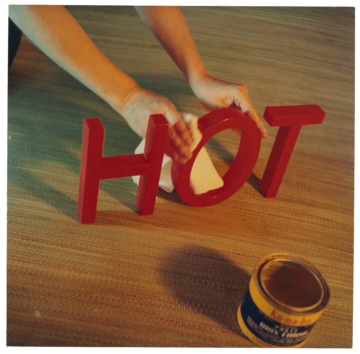
Bruce Nauman
Learn moreWaxing hot 1967
© Bruce Nauman. ARS/Copyright Agency Purchased 1978
More detail | PermalinkBruce Nauman started using photography around 1966, in part following his experience that year of the work of the American-born Surrealist photographer Man Ray at the LA County Museum of Art.[1] Eleven color photographs 1966–67, released by New York gallerist Leo Castelli in 1970,[2] brought wide critical and public attention and represented a radical rearticulation of photography as an ‘artistic’ medium and a source of meaning. It is one of the first instances of an artist engaging with the opportunities offered by colour photography, which until the early 1970s remained the province of commercial and snapshot photography.
Taking the appearance of documentary photographs, the works depict either an action or an ephemeral ‘sculpture’ created by Nauman in his studio, each involving a pun or word game. Nauman has said of the photographs:
I suppose I might have made them as paintings if I had been able to make paintings at the time … Perhaps if I had been a good enough painter I could have made realistic paintings. I don’t know, it just seemed easier to make the works as photographs.[3]
It seems that, in this instance, Nauman’s interest in colour photography was in its capacity to ‘realistically’ (and readily) convey the subject. All the same, the works have come to assume great significance in the history of photography. Indeed, the series was a harbinger of sorts for much of the great American and European photography of the 1970s, when for the first time artists began to use colour processes in a critical and sustained way.
Shaune Lakin
[1] Raphaël Pirenne, ‘Eleven color photographs: Nauman, Man Ray and Wittgenstein: the scepticism of the medium’, in Raphaël Pirenne and Alexander Streitberger (eds), Heterogeneous objects: Intermedia and photography after Modernism, Leuven University Press, Leuven, 2013, p 39.
[2] The photographs had been exhibited individually and as a group, under the title Untitled (Set of eleven color photographs); Pirenne and Streitberger, pp 33–57. The pictures were actually taken by the San Francisco based photographer Jack Fulton; Laurence Sillars, ‘Bruce Nauman: keeping busy’, in Laurence Sillars (ed), Bruce Nauman: make me think me, Tate, Liverpool, 2006, p 21.
[3] Bruce Nauman, interview with Willoughby Sharp (1970), reprinted in Robert C Morgan (ed), Bruce Nauman, Johns Hopkins University Press, Baltimore, 2002, p 241.
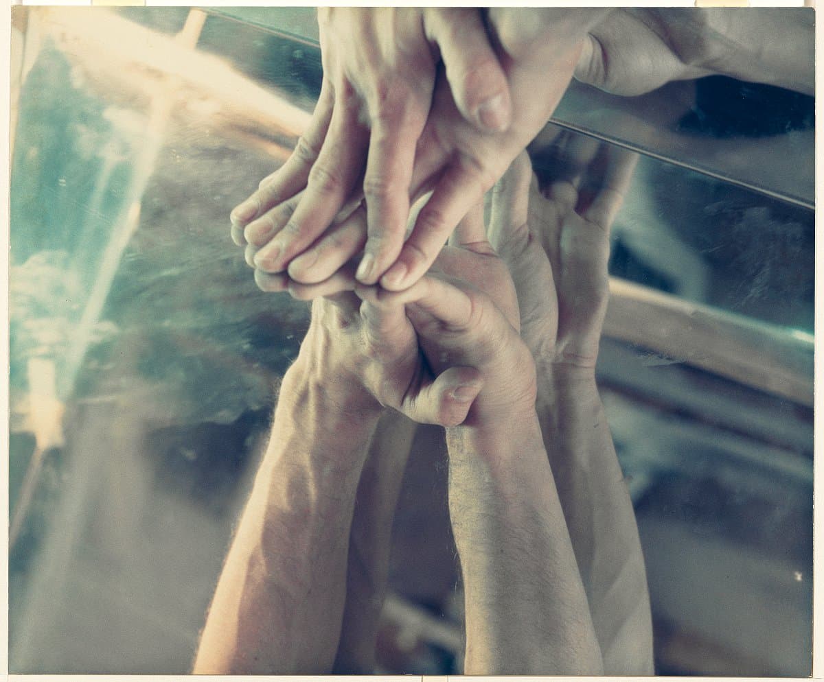
Bruce Nauman
Learn moreFinger trick with two mirrors 1967
© Bruce Nauman. ARS/Copyright Agency Purchased 1978
More detail | PermalinkBruce Nauman started using photography around 1966, in part following his experience that year of the work of the American-born Surrealist photographer Man Ray at the LA County Museum of Art.[1] Eleven color photographs 1966–67, released by New York gallerist Leo Castelli in 1970,[2] brought wide critical and public attention and represented a radical rearticulation of photography as an ‘artistic’ medium and a source of meaning. It is one of the first instances of an artist engaging with the opportunities offered by colour photography, which until the early 1970s remained the province of commercial and snapshot photography.
Taking the appearance of documentary photographs, the works depict either an action or an ephemeral ‘sculpture’ created by Nauman in his studio, each involving a pun or word game. Nauman has said of the photographs:
I suppose I might have made them as paintings if I had been able to make paintings at the time … Perhaps if I had been a good enough painter I could have made realistic paintings. I don’t know, it just seemed easier to make the works as photographs.[3]
It seems that, in this instance, Nauman’s interest in colour photography was in its capacity to ‘realistically’ (and readily) convey the subject. All the same, the works have come to assume great significance in the history of photography. Indeed, the series was a harbinger of sorts for much of the great American and European photography of the 1970s, when for the first time artists began to use colour processes in a critical and sustained way.
Shaune Lakin
[1] Raphaël Pirenne, ‘Eleven color photographs: Nauman, Man Ray and Wittgenstein: the scepticism of the medium’, in Raphaël Pirenne and Alexander Streitberger (eds), Heterogeneous objects: Intermedia and photography after Modernism, Leuven University Press, Leuven, 2013, p 39.
[2] The photographs had been exhibited individually and as a group, under the title Untitled (Set of eleven color photographs); Pirenne and Streitberger, pp 33–57. The pictures were actually taken by the San Francisco based photographer Jack Fulton; Laurence Sillars, ‘Bruce Nauman: keeping busy’, in Laurence Sillars (ed), Bruce Nauman: make me think me, Tate, Liverpool, 2006, p 21.
[3] Bruce Nauman, interview with Willoughby Sharp (1970), reprinted in Robert C Morgan (ed), Bruce Nauman, Johns Hopkins University Press, Baltimore, 2002, p 241.
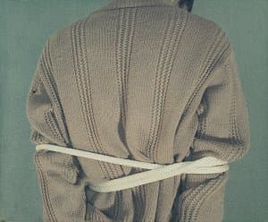
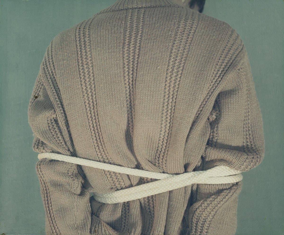
Bruce Nauman
Learn moreBound to fail 1967
Purchased 1978
More detail | PermalinkBruce Nauman started using photography around 1966, in part following his experience that year of the work of the American-born Surrealist photographer Man Ray at the LA County Museum of Art.[1] Eleven color photographs 1966–67, released by New York gallerist Leo Castelli in 1970,[2] brought wide critical and public attention and represented a radical rearticulation of photography as an ‘artistic’ medium and a source of meaning. It is one of the first instances of an artist engaging with the opportunities offered by colour photography, which until the early 1970s remained the province of commercial and snapshot photography.
Taking the appearance of documentary photographs, the works depict either an action or an ephemeral ‘sculpture’ created by Nauman in his studio, each involving a pun or word game. Nauman has said of the photographs:
I suppose I might have made them as paintings if I had been able to make paintings at the time … Perhaps if I had been a good enough painter I could have made realistic paintings. I don’t know, it just seemed easier to make the works as photographs.[3]
It seems that, in this instance, Nauman’s interest in colour photography was in its capacity to ‘realistically’ (and readily) convey the subject. All the same, the works have come to assume great significance in the history of photography. Indeed, the series was a harbinger of sorts for much of the great American and European photography of the 1970s, when for the first time artists began to use colour processes in a critical and sustained way.
Shaune Lakin
[1] Raphaël Pirenne, ‘Eleven color photographs: Nauman, Man Ray and Wittgenstein: the scepticism of the medium’, in Raphaël Pirenne and Alexander Streitberger (eds), Heterogeneous objects: Intermedia and photography after Modernism, Leuven University Press, Leuven, 2013, p 39.
[2] The photographs had been exhibited individually and as a group, under the title Untitled (Set of eleven color photographs); Pirenne and Streitberger, pp 33–57. The pictures were actually taken by the San Francisco based photographer Jack Fulton; Laurence Sillars, ‘Bruce Nauman: keeping busy’, in Laurence Sillars (ed), Bruce Nauman: make me think me, Tate, Liverpool, 2006, p 21.
[3] Bruce Nauman, interview with Willoughby Sharp (1970), reprinted in Robert C Morgan (ed), Bruce Nauman, Johns Hopkins University Press, Baltimore, 2002, p 241.
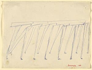
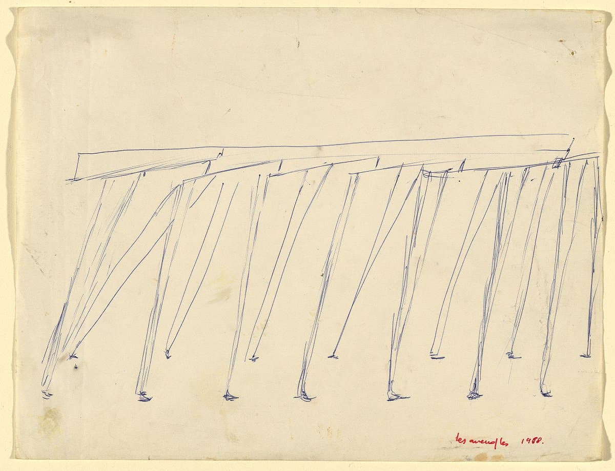
Louise Bourgeois
Learn moreLes aveugles [The blind] 1968
© The Easton Foundation. VAGA/Copyright Agency Purchased 1981
More detail | PermalinkLouise Bourgeois traced the genesis of two of her earliest major works, C.O.Y.O.T.E. and The blind leading the blind, to childhood memories, when she and her brother crouched beneath the kitchen table watching the legs of their parents move back and forth as they prepared a meal.[i] Referring specifically to this work, she said:
It represents an army of legs, two by two, that holds together. Eight pairs of legs. The reason this blind army of legs does not fall, even though the legs are always afraid of falling, since they come to a point, is that they hold on to each other. This is exactly what I felt when I was a child, when I was hiding under the table. My brother was following me like a shadow; I was blind with fear and so was he … [and I concluded that my parents] were not friendly. I decided that the outside was not friendly. And I was afraid, simply afraid. I couldn’t understand their purpose, which was to prepare lunch. I didn’t understand why they were walking around the table. Why would one pair of legs interfere with the other visually, physically? There were their legs and the table’s legs. It really just made me wonder where I fitted in.[ii]
If the form of these sculptures owed something to childhood memories, their title The blind leading the blind—a title that was also originally applied to C.O.Y.O.T.E.—had a very contemporary relevance for Bourgeois. Taken from the New Testament (Matthew 15:14: ‘if the blind lead the blind, both shall fall into the ditch’), the title was chosen for works in which the artist saw ‘catastrophe’, ‘a chain of pain’, ‘people fated to be destroyed together’.[iii] The sculptures were made at the height of the Cold War, at a time when her friends, the artists Marcel Duchamp, Amédée Ozenfant and André Lhote, were under investigation by the House Un-American Activities Committee, suspected of being Communists.
Two ballpoint pen sketches on the theme of The blind leading the blind, both dating to 1968, suggest the evolution of the artist’s thinking. One of them, inscribed ‘les aveugles leading the / aveugles’, is composed of a series of mannequin-type legs with ‘beams’ to join them in pairs. The second drawing, The blind, retains the seven pairs of legs, but this time Bourgeois’ ‘army’ appears rather more militaristic.
Christine Dixon[iv]
[i] Kay Larson, ‘Louise Bourgeois: Body language spoken here’, Village Voice, 24–30 September 1980, p 83.
[ii] Donald Kuspit, Bourgeois: an interview with Louise Bourgeois, Vintage Books, New York, 1988, pp 26–7.
[iii] Lippard, p 27.
[iv] Adapted and updated from Michael Lloyd and Michael Desmond, European and American Paintings and Sculptures 1870–1970 in the Australian National Gallery, Australian National Gallery, Canberra, 1992, pp 209–11.
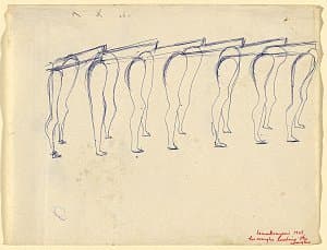
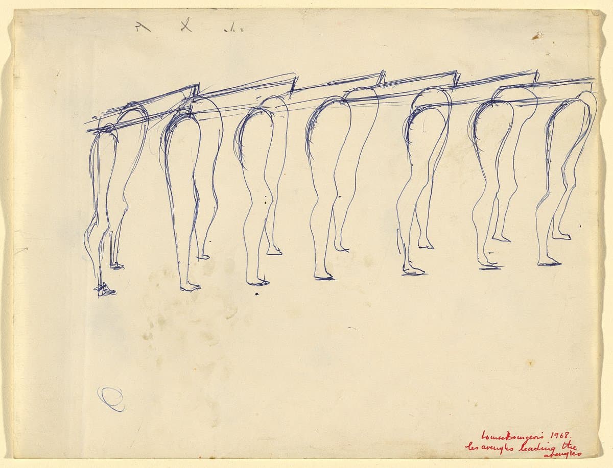
Louise Bourgeois
Learn moreLes aveugles leading the aveugles [The blind leading the blind] 1968
© The Easton Foundation. VAGA/Copyright Agency Purchased 1981
More detail | PermalinkLouise Bourgeois traced the genesis of two of her earliest major works, C.O.Y.O.T.E. and The blind leading the blind, to childhood memories, when she and her brother crouched beneath the kitchen table watching the legs of their parents move back and forth as they prepared a meal.[i] Referring specifically to this work, she said:
It represents an army of legs, two by two, that holds together. Eight pairs of legs. The reason this blind army of legs does not fall, even though the legs are always afraid of falling, since they come to a point, is that they hold on to each other. This is exactly what I felt when I was a child, when I was hiding under the table. My brother was following me like a shadow; I was blind with fear and so was he … [and I concluded that my parents] were not friendly. I decided that the outside was not friendly. And I was afraid, simply afraid. I couldn’t understand their purpose, which was to prepare lunch. I didn’t understand why they were walking around the table. Why would one pair of legs interfere with the other visually, physically? There were their legs and the table’s legs. It really just made me wonder where I fitted in.[ii]
If the form of these sculptures owed something to childhood memories, their title The blind leading the blind—a title that was also originally applied to C.O.Y.O.T.E.—had a very contemporary relevance for Bourgeois. Taken from the New Testament (Matthew 15:14: ‘if the blind lead the blind, both shall fall into the ditch’), the title was chosen for works in which the artist saw ‘catastrophe’, ‘a chain of pain’, ‘people fated to be destroyed together’.[iii] The sculptures were made at the height of the Cold War, at a time when her friends, the artists Marcel Duchamp, Amédée Ozenfant and André Lhote, were under investigation by the House Un-American Activities Committee, suspected of being Communists.
Two ballpoint pen sketches on the theme of The blind leading the blind, both dating to 1968, suggest the evolution of the artist’s thinking. One of them, inscribed ‘les aveugles leading the / aveugles’, is composed of a series of mannequin-type legs with ‘beams’ to join them in pairs. The second drawing, The blind, retains the seven pairs of legs, but this time Bourgeois’ ‘army’ appears rather more militaristic.
Christine Dixon[iv]
[i] Kay Larson, ‘Louise Bourgeois: Body language spoken here’, Village Voice, 24–30 September 1980, p 83.
[ii] Donald Kuspit, Bourgeois: an interview with Louise Bourgeois, Vintage Books, New York, 1988, pp 26–7.
[iii] Lippard, p 27.
[iv] Adapted and updated from Michael Lloyd and Michael Desmond, European and American Paintings and Sculptures 1870–1970 in the Australian National Gallery, Australian National Gallery, Canberra, 1992, pp 209–11.
Andy Warhol
Learn moreCampbell's Soup I 1968
© The Andy Warhol Foundation for the Visual Arts, Inc./ARS. Licensed by Copyright Agency The Poynton Bequest 2006
More detail | PermalinkThe series Campbell Soup I 1968 represents an important contribution by Andy Warhol to Pop art. In this group of 10 colour screenprints Warhol takes something that is commonplace and sets it in a fine art context—the ever-present humble can of condensed Campbell’s soup (something his mother fed him as a child, and which the artist continued to have for lunch). In the postwar baby boom era, the Campbell’s brand had targeted a housewife’s social aspirations, taking its product from the merely tasty to tasteful. Warhol’s subject combined a mixed message of the deadpan and social mobility in an art context.[1] The surprise effect of a subject for art that is familiar and uninspiring has its origins in the earlier Dada movement and works such as Marcel Duchamp’s ready-made Fountain 1917, where he placed a urinal in a gallery and gave it a new title. As Pop art emerged as a style in the United States from the late 1950s, it was also termed ‘Neo-Dada’ by some early commentators.
After Warhol’s initial openness about coming from the commercial art world, he found this background impeded his acceptance as a serious artist. He approached the Leo Castelli Gallery in New York with the hope that this newly established venue might include him in the stable of young emerging artists. Warhol was dismayed to learn of Roy Lichtenstein’s comic strip subject matter—something Warhol himself began painting about a year before Lichtenstein. Castelli rebuffed his overtures because of the similarity and his view that Warhol’s work was lifeless and cold in comparison.
Frustrated by his rejection, a distraught Warhol turned to Campbell’s soup cans as a suitable subject for his art. He lamented that ‘It’s too late for the cartoons. I’ve got to do something that will have a lot of impact, that will be different from Lichtenstein and Rosenquist’.[2] Warhol asked his friend and gallery director Muriel Latow what subject he should choose (as he often did with friends and colleagues) and she proposed that, along with money, he should choose a subject, ‘that everybody sees every day, that everybody recognises … like a can of soup’.[3] In 1962, Warhol painted his Campbell’s soup cans, which astonished the art world—gaining instant notoriety when shown at Irving Blum’s Ferus Gallery in Los Angeles, where 32 soup varieties were displayed on a shelf to mimic their origins.
Warhol continued to develop this theme and made many versions including this group of 10 prints produced during 1968, with different soup flavours drawn from the original 32. The repetitive nature of his compositions suggests an art of the assembly line. Warhol’s expressed ideal, in fact, was to make use of the mass production technique of screenprinting to create his imagery. This series is at the same time banal, acerbic, yet mesmerising.
Jane Kinsman
1
[1] For further discussion on Warhol’s approach to brands and the status of Campbell’s soup see Anthony E Grudin, Warhol’s working class: Pop Art and egalitarianism, The University of Chicago Press, Chicago and London, 2017, pp 76, 97–9.
[2] Muriel Latow, quoted in Victor Bockris, Warhol, Frederick Muller, London, 1989, p 143.
[3] As above.

Keith Sonnier
Learn moreUntitled 1969
© Keith Sonnier. ARS/Copyright Agency Purchased 1976
More detail | PermalinkKeith Sonnier trained as a painter but subsequently created three-dimensional works using materials such as latex, plastic, wire mesh, glass and fabric. Rather than using traditional fine art media he experimented with materials created for industrial and commercial purposes, and in 1968 he found a medium that allowed him to draw with light: neon tubes. The use of light itself to create art became popular in the 1960s and was, in many ways, a natural choice for an artist who as a child was transfixed by lit billboards looming through the Louisiana fog and settled in New York, the light-saturated city that ‘never sleeps’.[1]
Untitled 1969 consists of two upright, but rakishly tilted, and two roughly horizontal neon lights. These are arranged over, under and between two large, round sheets of glass that lean against the wall. The elements are unified by a loose web of black electrical cord that draws the composition together. Unlike his contemporaries, Sonnier ‘draws’ with light. He uses a commercially-oriented technology to create surprisingly organic compositions; not formally arranging fluorescent tubes like Dan Flavin, nor creating apparently hard forms out of light as James Turrell was at the time, nor writing with it like Bruce Nauman, although some of Sonnier’s works do have a calligraphic flavour.
There are two layers to the sculpture: the hard forms of the glass sheets, lights and cords; and the aura of coloured light that emanates from and reflects off it. A viewer can see where the work starts, but its edges are blurred, contained only by physical barriers such as walls, or a more powerful source of light. This has the effect of recruiting viewers themselves, who are drawn into the work, bathed in its light and reflected in the glass sheets.
Untitled is an early work from Sonnier’s Ba-O-Ba Series of works made from neon tubes and sheets of glass. Beginning as props for video works, the Ba-O-Bas have been revisited by the artist for decades, including Ba-O-Ba Berlin 2002 and Ba-O-Ba Lever House 2009 in New York, both of which use neon lights and existing glass architecture to create immersive experiences. In 1998 Sonnier described how when he started working on the series he had recently been to Haiti, and was fascinated to find that the Creole language of the Haitians was very similar to the Louisiana Creole with which he had grown up: BA-O-BA ‘is a corruption of a Haitian term … basically about moonlight on the skin. It’s a very romantic, erotic sort of thing’.[2]
Such a sensual and evocative term seems at odds with Sonnier’s abstraction, as well as his medium; light has a purity about it and its use seems an extension of the impetus that drove artists like Mark Rothko to explore the use of colour and the reactions of the senses, without conceptual guidance from representational forms or suggestive titles. Poetic allusions notwithstanding, in the end the viewer is left to bathe in the moonlight alone, and to draw his or her own conclusions.
Bronwyn Campbell
[1] Calvin Harlan, ‘Keith Sonnier: an interview’, Parachute, March 1977, p 28; Keith Sonnier, Richard Shiff, Pace Gallery and PaceWildenstein, Keith Sonnier: Elysian plain + early works, Pace Gallery, New York, 2014, pp 12–13; and http://www.hallartfoundation.org/exhibition/keith-sonnier/information, accessed 9 March 2018.
[2] Linda Yablonsky and Robert T Buck, Keith Sonnier: Sculpture 1966–1998, Marlborough, New York, 1999, p 47.

Eva Hesse
Learn moreContingent 1969
© The Estate of Eva Hesse, Courtesy Hauser & Wirth Purchased 1973
More detail | PermalinkEva Hesse and her family escaped from Hamburg, fleeing the Nazi regime, and arrived in New York in 1939. Initially trained as a painter—she studied with Josef Albers at Yale University—Hesse began to make sculpture in 1962. Late in the summer of 1967 she also started to experiment with latex and, by 1968, was moving back and forth between it and her other favoured material, fibreglass. She was attracted to the neutral colour of latex, and its liquidity, finding it as responsive as papier-maché. Fibreglass, by contrast, is less yielding and in Hesse’s hands the combination the two substances often creates a distinct tension.
Contingent 1970 is made of eight banner-like elements that hang from the ceiling. Each component is a large rectangular stretch of latex-covered cheesecloth embedded at each end in a translucent field of fibreglass. They appear as ‘skins lifted off the surface of a painting’, magically suspended in mid-air, a merging of light, colour and gravity.[1] Contingent blurs the boundaries between painting and sculpture; it is, in the artist’s terminology, a ‘non-work’ which exists as a ‘hung painting in another material than painting’.[2] By virtue of its hybrid form, Contingent, more than any of Hesse’s other works, successfully synthesises the qualities of both disciplines.
In Contingent Hesse uses the heavier fibreglass attachments to pull taut the fragile latex midsections, playing off the way the different materials absorb and transmit light. This imparts a ‘palpable tension’, exaggerated by the ‘poignant contrast of the ephemeral and enduring qualities of the two materials’. [3] In several other large-scale works using latex, Hesse used an infrastructure of mesh or a backing of canvas, often pushing her materials to their limits.[4] She was well aware that latex decays―and loses the very qualities that she so valued―and knew of the discolouration and brittleness of fibreglass. Even though she admitted to feeling a little guilty that her works would not last, the qualities of latex were too appealing, seemingly irresistible.
Contingent is one of the last major works made by Hesse before her death in May 1970, aged 34. Although she had planned at least nine irregular sheets of rubberised cheesecloth and fibreglass, she and her assistants ran out of latex.[5] The individual differences between the banners pleased the artist, and she commented on the ‘divergency’ from one piece to the next, and the way in which they are geometric but not.[6] Hesse was working on Contingent when she collapsed in April 1969; she was admitted to New York Hospital and operated on for a brain tumour.
The work’s title suggests its positioning between painting and sculpture, and the interdependence of the materials, but also the marshalling of forces and their direction towards an event that is likely but not inevitable. The circumstances of its making, the inevitability of its decay and a title that implies dynamism and uncertainty all imbue Contingent with a strength that is implicit in the work, as well as an elegiac quality overlaid from the artist’s life.
Lucina Ward
[1] Bill Barrette, Eva Hesse: Sculpture, catalogue raisonne, Timken Publishers, New York, 1989, p 226.
[2] For the artist’s statements see Lucy Lippard, Eva Hesse, New York University Press, New York, 1976, p 131, and Cindy Nemser, Art talk: Conversations with 12 women artists, Charles Scribner’s Sons, New York, 1975, p 223.
[3] Barrette, p 226.
[4] For Aught 1968 (University of California, Berkeley) Hesse made four rectangular envelope-like units of latex on canvas, and stuffed them with polyethylene sheeting, rope and other materials, including metal grommets. In the monumental Expanded expansion 1969 (Solomon R Guggenheim Museum, New York) she coated cheesecloth with rubber and used reinforced fibreglass poles for structure and to prop up the drapes. By the time of the chaotic, web-like Right after 1969 (Milwaukee Art Museum), made of resin cast over fibreglass cord and wire hooks, Hesse’s work was remarkable for its almost complete lack of structure and its ethereal qualities.
[5] Barrette, p 226. It is thought that Hesse would have selected from the panels.
[6] Nemser, pp 220–1.

Philip Guston
Learn moreCity 1969
Purchased 1980
More detail | PermalinkAfter the delicate, painterly abstractions that had characterised Phillip Guston’s art since the early 1950s and made him one of the leading figures of Abstract Expressionism, the raw figurative paintings exhibited at the Marlborough Gallery, New York, in October 1970 came as a shock, not altogether welcomed by art critics. As Guston later reflected on the reception to the show, ‘It was as though I had left the Church’, and ‘I was excommunicated for a while’.[i]
In retrospect, the affinities between the late figurative paintings and his previous work are as apparent as their novelty; the inflected, creamy paint surface of his abstract paintings remains undiminished and his images re-invoke themes from his figurative paintings of the 1930s and 40s. The hooded figures that appear in the drawing City 1969 and Bad habits recall his early 1930s paintings of the Ku Klux Klan, as does the image of flagellation in the latter.[ii] Guston spoke of the relationship between his recent and earlier work in a way that illuminates Bad habits and City, describing how his involvement in radical politics, as a youth, informed his work:
In 1967–68 I became very disturbed by the [Vietnam] war and the demonstrations. They became my subject matter and I was flooded by a memory. When I was about 17 or 18, I had done a whole series of paintings about the Ku Klux Klan, which was very powerful in Los Angeles at that time … In the new series of ‘hoods’ my attempt was really not to illustrate, to do pictures of the KKK, as I had done earlier. The idea of evil fascinated me, and rather like Isaac Babel who had joined the Cossacks, lived with them and written stories about them, I almost tried to imagine that I was living with the Klan. What would it be like to be evil? To plan and plot. Then I started conceiving an imaginary city being overtaken by the Klan. I was like a movie director. I couldn’t wait, I had hundreds of pictures in mind and when I left the studio I would make notes to myself, memos, ‘Put them all around the table, eating, drinking beer’. Ideas and feelings kept coming so fast; I couldn't stop, I was sitting on the crest of a wave.[iii]
Commenting on his return to figurative painting, Guston explained that after his show at the Jewish Museum in 1966, which included paintings such as Prospects 1964, he knew that wanted to deal with ‘concrete objects’. As he further explained, the visible world is ‘abstract and mysterious enough [and] I don’t think one needs to depart from it in order to make art’.[iv] Although initially disparaged by critics, Guston’s late works can be seen as a precursor to the revival of expressive figurative painting in the 1980s and are now often considered his most significant contribution to twentieth-century American art. The hooded characters gradually dispersed, replaced by, as Dore Ashton observed, a disembodied ‘naked eye’, which, along with images of a hand holding a cigarette or paintbrush, are the clearest statements of the artist’s ‘self’.[v]
Michael Lloyd and Michael Desmond[vi]
[i] Philip Guston, quoted from a lecture at the University of Minnesota, March 1978, in ‘Philip Guston Talking’, Renée McKee (ed), Philip Guston: the late works, International Cultural Corporation of Australia, Sydney, 1984, p 56.
[ii] A whip can be seen in Guston’s first painting of the Ku Klux Klan, Conspirators c#1930 (whereabouts unknown). Flagellation was also the subject of Guston’s favourite work of art, Piero della Francesca’s The Flagellation of Christ c#1455–65, Ducal Palace, Urbino.
[iii] Philip Guston, in a lecture at the University of Minnesota, March 1978; quoted in McKee, p 55.
[iv] Philip Guston, quoted in McKee, pp 54–5.
[v] Dore Ashton, Yes, but … a critical study of Philip Guston, The Viking Press, New York, 1976, p 173.
[vi] Adapted and updated from Michael Lloyd and Michael Desmond, European and American Paintings and Sculptures 1870–1970 in the Australian National Gallery, Australian National Gallery, Canberra, 1992 by Steven Tonkin.
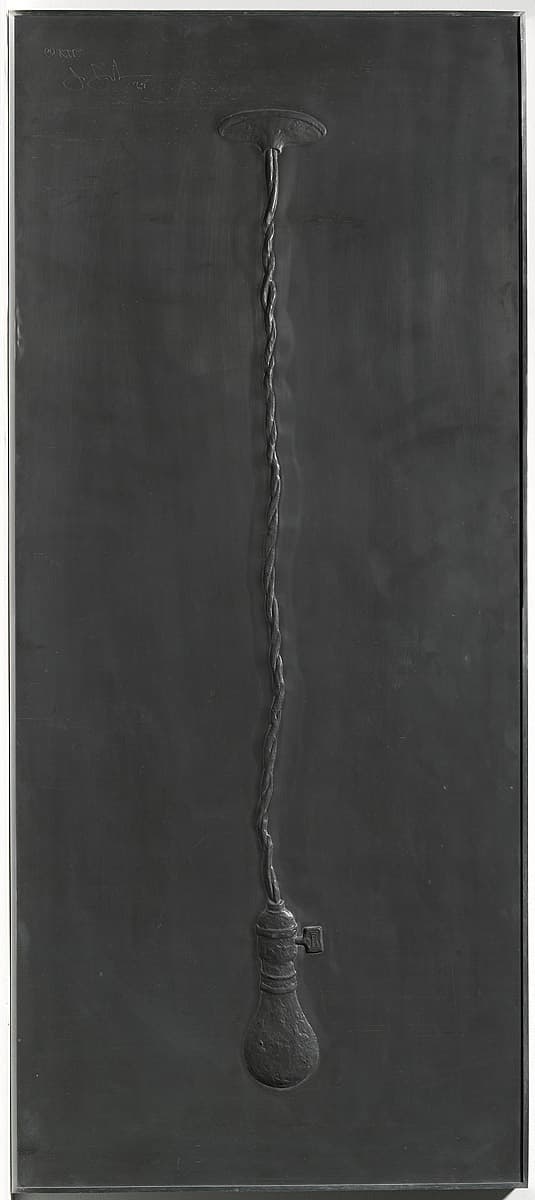
Jasper Johns
Learn moreLight bulb; from Lead relief series 1969
© Jasper Johns. VAGA/Copyright Agency Purchased 1973
More detail | PermalinkAt a time when the emotionally-charged paintings of Abstract Expressionism dominated the American avant-garde, Jasper Johns began to reframe everyday objects and symbols as valid subjects for fine art. Drawing influence from the traditions of Dada—particularly the absurdist humour and use of ready-made subject matter—his work was identified with the Neo-Dada movement and became a foundation for American Pop art.
Johns was interested in the idea of reproducibility and he constantly appropriated his own work, returning to motifs time and again across different media. The Lead relief series 1969–70 reconstructs some of his most iconic and recurrent motifs—the American flag, a lightbulb and numerals—in editions of embossed lead sheets.
Alice Desmond
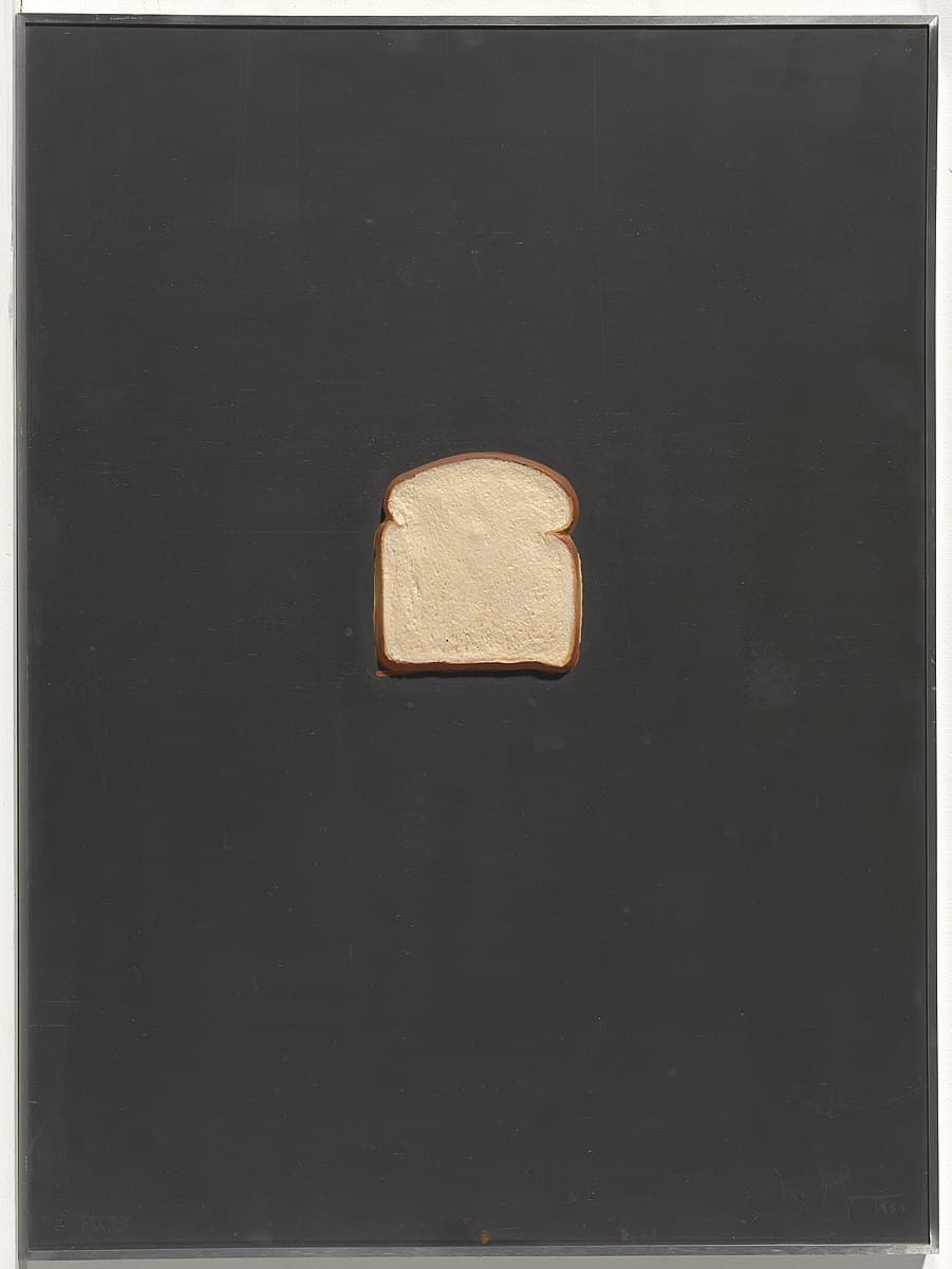
Jasper Johns
Learn moreBread; from Lead relief series 1969
© Jasper Johns. VAGA/Copyright Agency Purchased 1973
More detail | PermalinkAt a time when the emotionally-charged paintings of Abstract Expressionism dominated the American avant-garde, Jasper Johns began to reframe everyday objects and symbols as valid subjects for fine art. Drawing influence from the traditions of Dada—particularly the absurdist humour and use of ready-made subject matter—his work was identified with the Neo-Dada movement and became a foundation for American Pop art.
Johns was interested in the idea of reproducibility and he constantly appropriated his own work, returning to motifs time and again across different media. The Lead relief series 1969–70 reconstructs some of his most iconic and recurrent motifs—the American flag, a lightbulb and numerals—in editions of embossed lead sheets. The other three reliefs in the set also revisit earlier ideas and works. Bread is inspired by a humorous recollection that Johns had of being asked if an impressed area in one of his paintings was caused by pushing a slice of bread into its surface.
Alice Desmond
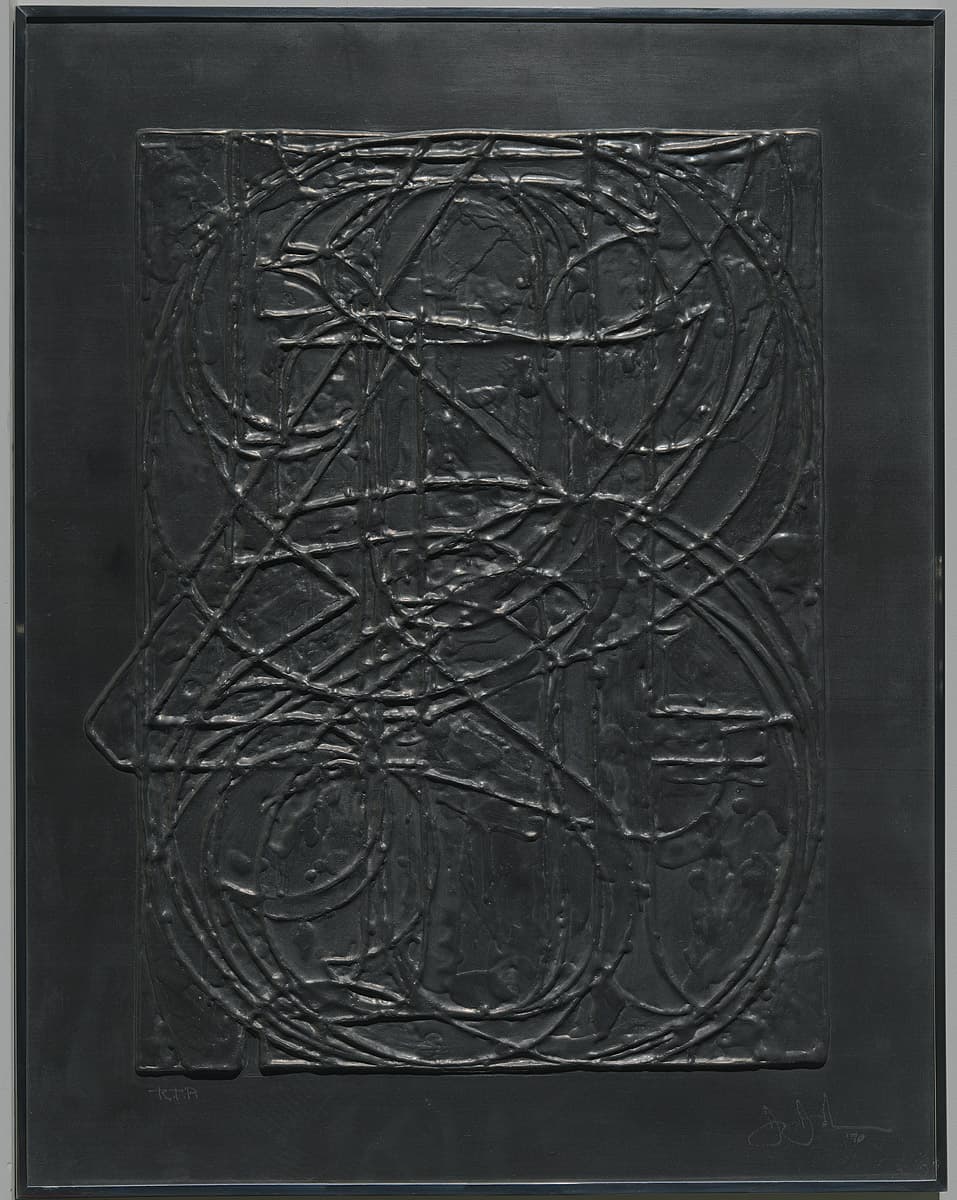
Jasper Johns
Learn moreNumerals; from Lead relief series 1969
© Jasper Johns. VAGA/Copyright Agency Purchased 1973
More detail | PermalinkAt a time when the emotionally-charged paintings of Abstract Expressionism dominated the American avant-garde, Jasper Johns began to reframe everyday objects and symbols as valid subjects for fine art. Drawing influence from the traditions of Dada—particularly the absurdist humour and use of ready-made subject matter—his work was identified with the Neo-Dada movement and became a foundation for American Pop art.
Johns was interested in the idea of reproducibility and he constantly appropriated his own work, returning to motifs time and again across different media. The Lead relief series 1969–70 reconstructs some of his most iconic and recurrent motifs—the American flag, a lightbulb and numerals—in editions of embossed lead sheets.
Alice Desmond
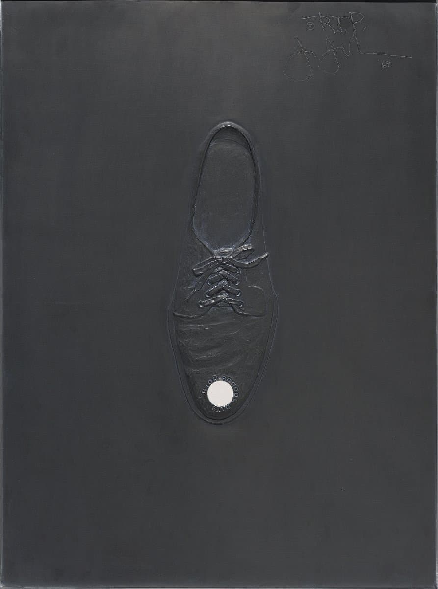
Jasper Johns
Learn moreHigh school days; from Lead relief series 1969
© Jasper Johns. VAGA/Copyright Agency Purchased 1973
More detail | PermalinkAt a time when the emotionally-charged paintings of Abstract Expressionism dominated the American avant-garde, Jasper Johns began to reframe everyday objects and symbols as valid subjects for fine art. Drawing influence from the traditions of Dada—particularly the absurdist humour and use of ready-made subject matter—his work was identified with the Neo-Dada movement and became a foundation for American Pop art.
Johns was interested in the idea of reproducibility and he constantly appropriated his own work, returning to motifs time and again across different media. The Lead relief series 1969–70 reconstructs some of his most iconic and recurrent motifs—the American flag, a lightbulb and numerals—in editions of embossed lead sheets. The other three reliefs in the set also revisit earlier ideas and works. The High school days relief reminisces on a brazen adolescent fantasy that Johns had mused on in notebooks and realised as a sculpture in 1964. The subject of the work—a shoe with a mirror affixed to its toe—is envisioned as a contraption for looking up girls’ dresses.[i]
Alice Desmond
[i] Alan Solomon, Jasper Johns: Lead reliefs, Gemini GEL, 1969, np.
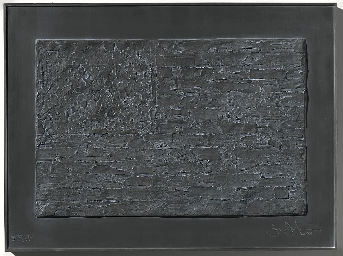
Jasper Johns
Learn moreFlag; from Lead relief series 1969
© Jasper Johns. VAGA/Copyright Agency Purchased 1973
More detail | PermalinkAt a time when the emotionally-charged paintings of Abstract Expressionism dominated the American avant-garde, Jasper Johns began to reframe everyday objects and symbols as valid subjects for fine art. Drawing influence from the traditions of Dada—particularly the absurdist humour and use of ready-made subject matter—his work was identified with the Neo-Dada movement and became a foundation for American Pop art.
Johns was interested in the idea of reproducibility and he constantly appropriated his own work, returning to motifs time and again across different media. The Lead relief series 1969–70 reconstructs some of his most iconic and recurrent motifs—the American flag, a lightbulb and numerals—in editions of embossed lead sheets.
Alice Desmond
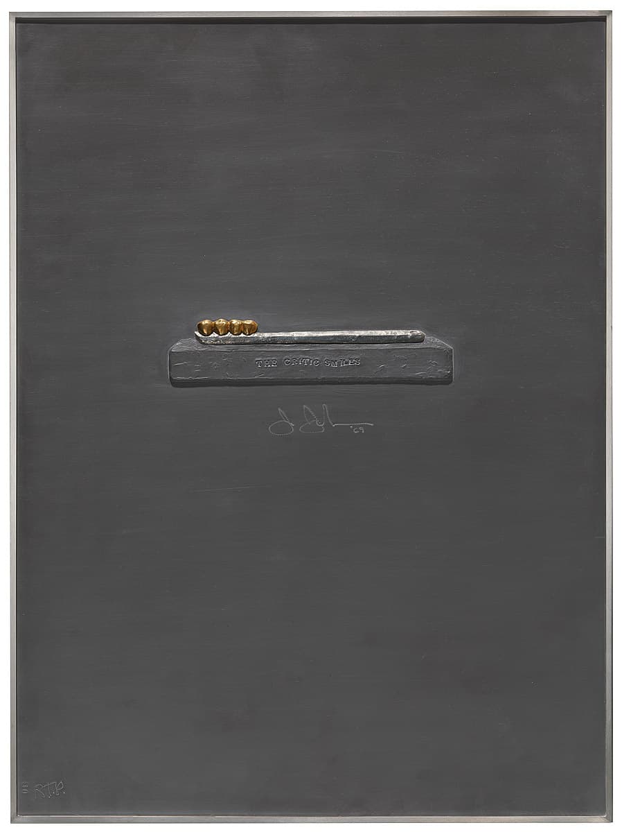
Jasper Johns
Learn moreThe critic smiles; from Lead relief series 1969
© Jasper Johns. VAGA/Copyright Agency Purchased 1973
More detail | PermalinkAt a time when the emotionally-charged paintings of Abstract Expressionism dominated the American avant-garde, Jasper Johns began to reframe everyday objects and symbols as valid subjects for fine art. Drawing influence from the traditions of Dada—particularly the absurdist humour and use of ready-made subject matter—his work was identified with the Neo-Dada movement and became a foundation for American Pop art.
Johns was interested in the idea of reproducibility and he constantly appropriated his own work, returning to motifs time and again across different media. The Lead relief series 1969–70 reconstructs some of his most iconic and recurrent motifs—the American flag, a lightbulb and numerals—in editions of embossed lead sheets. The other three reliefs in the set also revisit earlier ideas and works. Composed of a toothbrush with teeth in place of bristles, The critic smiles returns to the subject of the artist’s 1959 sculpture of the same title,[i] which was intended as a sardonic response to art critics who had given him bad reviews:
I had the idea that in society the approval of the critic was a kind of cleansing police action. When the critic smiles it’s a lopsided smile with hidden meanings. And of course a smile involves baring the teeth. The critic is keeping a certain order, which is why it is like a police function.[ii]
Alice Desmond
[i] Collection of the artist.
[ii] Jasper Johns, quoted in Jane Kinsman The art of collaboration: The big Americans, National Gallery of Australia, 2002, p 20.
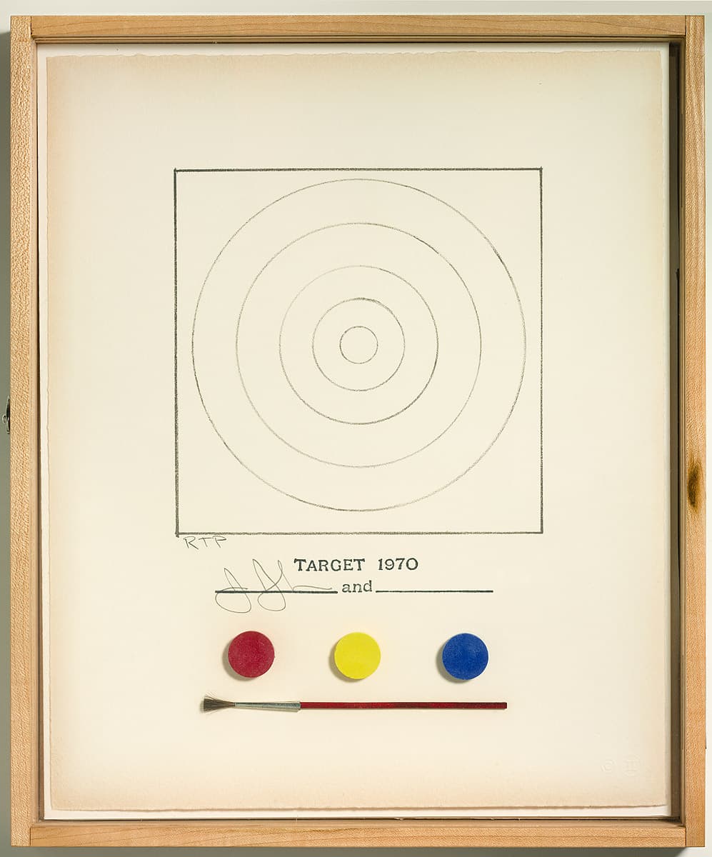
Jasper Johns
Learn moreTarget 1970
© Jasper Johns. VAGA/Copyright Agency Purchased 1973
More detail | PermalinkAt a time when the emotionally-charged paintings of Abstract Expressionism dominated the American avant-garde, Jasper Johns began to reframe everyday objects and symbols as valid subjects for fine art. Drawing influence from the traditions of Dada—particularly the absurdist humour and use of ready-made subject matter—his work was identified with the Neo-Dada movement and became a foundation for American Pop art.
Targets—specifically targets composed of five concentric circles in alternating rings of blue and yellow, on a red background—are another motif repeated in Johns’ paintings and prints. Target 1971 seems to present a colouring-in activity with a target template, paints and paintbrush. In this witty work the punchline is hard to place. To accept it as a genuine invitation to physically add in the colours would surely be to miss the point and destroy the pristine work of art. Maybe we are meant to let our minds do the work and see colour in the blank spaces? But perhaps the joke is on artworld consumers who, paralysed by fears of failing to ‘get’ the meaning of this contemporary art object or concerns about ruining the artwork (or worse, its resale value), take the idea of ‘art’ too seriously and rebuff a genuine opportunity to collaborate.[i] The relationship between artist, object and viewer was an ongoing preoccupation for Johns and by literally compelling the audience to participate—whether in thought, action or both—he highlights the role that the viewer necessarily plays in constructing a work of art’s meaning.
Alice Desmond
[i] This template and colouring pads were also issued with the catalogue for the Museum of Modern Art’s exhibition Technics and creativity: Selections from Gemini G.E.L. in 1971, which was published in an edition of 22,500. The accompanying catalogue Technics and creativity: Gemini G.E.L., Museum of Modern Art, New York, 1971 literally ‘invites you to collaborate with Jasper Johns in creating your own version of his Target’.

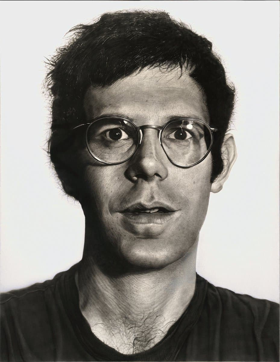
Chuck Close
Learn moreBob 1970
© Chuck Close Purchased 1975
More detail | PermalinkChuck Close’s approach to the human face has radically changed the definition of portraiture. In his early paintings he methodically and carefully reconfigured the face in a process of formal analysis, resulting in startling and detailed images. Bob 1970 is one of a series of eight large black-and-white portraits painted between November 1967 and April 1970. Bob immediately preceded Keith 1970, the last of the black-and-white series, after which Close began to use colour in his paintings.[1] Like all the black-and-white heads, Bob is painted from gridded photographs onto a heavily gessoed ground, using black paint applied with an airbrush to build up the dark tones and minimalise expressive gesture. White paint is used occasionally for the highlights, though more often the black pigment is scraped back using a razorblade or an electric eraser.
The subject is one of Close’s friends, Robert Israel, a New York based opera designer, who later recalled that although he wanted to be invited to pose, he didn’t feel it was appropriate to ask:
Chuck’s decision of who he would paint had to do not only with whether you were a friend, but with the topology of your face. And I didn’t really think it was my business to ask him if I could pose. But eventually he did ask me and Joe Zucker to pose and I recall that it was on Memorial Day that Joe and I went to a photographic studio where Chuck set up a box camera and took our pictures.[2]
Close’s sitters are frequently posed with a neutral expression. Some of his portraits can be likened to oversized passport photos, though the large scale of the paintings balances the impersonal effect and forces us to consider the individuality of the sitter. The artist does not attempt to capture his personal relationship with the subject. During the painting of Bob Close remembers this incident:
I had taken a break and was walking back into the studio. Looking at the painting, I realised that a highlight in one of the eyes was too bright. And I said, ‘Damn it, now I'm going to have to take his glasses off’. But when I realised what I had said, I pivoted on my heel and walked out leaving the lights on, the compressor on and the airbrushes full of paint. When you start believing in your own illusion, you’re in serious trouble.[3]
At much the same time he was working on the painting Bob, Close made a film portrait of Israel, Slow pan/Bob 1970 (16mm, black and white, 10 minutes), in which the slowly-moving camera minutely scrutinised areas of the sitter’s face. He used the photograph for the painting Bob again in 1973, when he made a series of four pencil and ink drawings.[4] The artist counted on photography to provide visual data that eliminated the distortion of direct vision. He used consistent photographic parameters, controlling the depth and focus of each exposure. However, this did not place him directly within the scope of Photorealism, which incorporates a concern with the vernacular iconography of mid-century America.[5] Close complicates and analyses the relationship between photography and painting. In his quest for pictorial exactitude he goes so far as to erase his hand from his art, thus removing the author from the picture.
Michael Lloyd and Michael Desmond[6]
[1] Close began Bob in the last months of 1969 and finished it at the beginning of 1970; see William Dyckes, ‘The photo as subject: The paintings and drawings of Chuck Close’, Arts Magazine, vol 48, no 5, February 1974, p 31. Keith 1970, Saint Louis Art Museum, Missouri.
[2] Lisa Lyons and Martin Friedman, Close portraits, Walker Art Center, Minneapolis, 1980, p 65.
[3] As above.
[4] Bob no.I/54 1973; Bob no.II/616 1973; Bob no.III/2464 1973; Bob no.IV/9856 1973, collection Mr and Mrs Paul Gotskind, Chicago.
[5] Robert Storr, ‘Chuck Close: Angles of refraction’, Chuck Close, The Museum of Modern Art, New York, 1998, p 40.
[6] Adapted and updated from Michael Lloyd and Michael Desmond, European and American Paintings and Sculptures in the Australian National Gallery 1870–1970, Australian National Gallery, Canberra, 1992, p 410, by Madeleine McClelland.

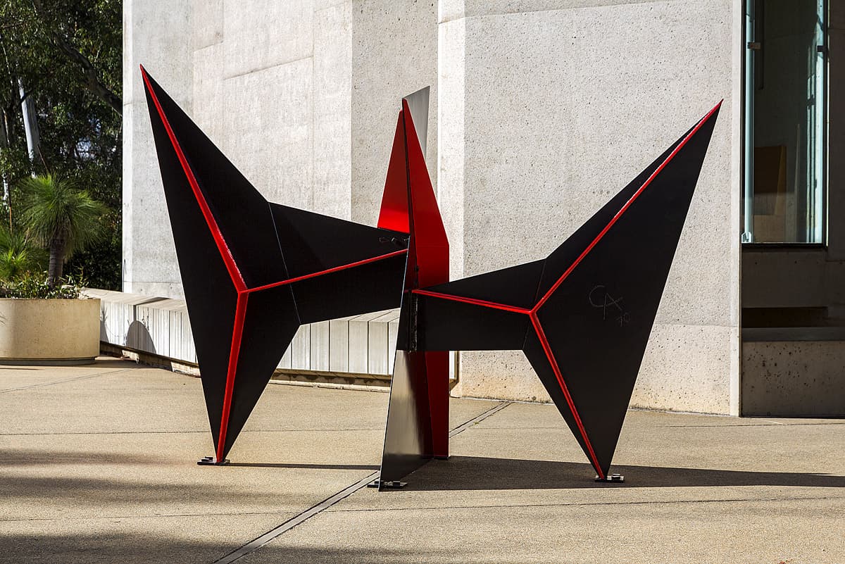
Alexander Calder
Learn moreLa Bobine [Bobbin] 1970
© Calder Foundation, New York/Copyright Agency Purchased 1972
More detail | PermalinkDuring the last two decades of his life Alexander Calder devoted much of his time to increasingly monumental outdoor sculptures. In opposition to his smaller and kinetic mobiles, works like La Bobine 1970 are known as ‘stabiles’. This term was coined by artist Jean Arp in 1932 to describe Calder’s sculptures that were made to be stationary and sit directly on the ground.[1] These works increased in size as the artist was commissioned to create them as large architectural installations in both America and Europe. Unlike more traditional public sculpture, Calder’s stabiles dominate the area they sit in, often so large that people are forced to walk under them, thereby interacting with the work rather than simply appreciating it from afar.
Eventually the sculptures became so big that it was no longer possible for the artist himself to construct them in his studio. Describing his working process in 1969, Calder noted how he perfected the visual effect in maquette form before it was enlarged to the desired size by metal-work specialists. Small tweaks were added by the artist before the final bracing was again done by the manufacturer.[2] La Bobine was fabricated by Etablissements Biémont in Tours, located near Calder’s studio at Saché, France. Many of the stabiles were shipped in flat-pack form and installed according to the artist’s numbered and colour-coded instructions. As well as being a helpful way to transport these monumental works, it also allowed them to be sent to their owners in a way that avoided customs issues.[3]
Like many of his later major works La Bobine was painted in familiar black and red, which accentuates the structure of the sculpture. The bright coloured edges pop out against the black, creating two turbine-like shapes, one on either side of the central axis. Describing his use of red in this way, Calder said: ‘It’s really just for differentiation, but I love red so much that I almost want to paint everything red. I often wish I’d been a fauve in 1905.’[4] As an American artist who worked between his home country and France for much of his career, Calder’s titles often relied on variations and anomalies in translation between French and English. La Bobine literally translates as ‘spool’ or ‘bobbin’, but may also refer to a grotesque figure.
Simeran Maxwell
[1] Jean Lipman, Calder's Universe, Viking Press, New York, 1976, p 305.
[2] As above, pp 305–6.
[3] See ‘Who is Alexander Calder?’, at http://www.tate.org.uk/art/artists/alexander-calder-848/who-is-alexander-calder, accessed 14 February 2018.
[4] Calder in Katharine Kuh, The artist’s voice: Talks with seventeen artists, Harper & Row, New York, 1962, p 41.

Philip Guston
Learn moreBad habits 1970
Purchased 1980
More detail | PermalinkBad habits 1970 was included in the first exhibition of Phillip Guston’s late figurative paintings held at the Marlborough Gallery, New York, in October 1970. After the delicate, painterly abstractions that had characterised his art since the early 1950s and made him one of the leading figures of Abstract Expressionism, the raw figurative paintings of the Marlborough exhibition came as a shock, not altogether welcomed by art critics. As Guston later reflected on the reception to the show, ‘It was as though I had left the Church’, and ‘I was excommunicated for a while’.[i]
In retrospect, the affinities between the late figurative paintings and his previous work are as apparent as their novelty; the inflected, creamy paint surface of his abstract paintings remains undiminished and his images re-invoke themes from his figurative paintings of the 1930s and 40s. The hooded figures that appear in the drawing City 1969 and Bad habits recall his early 1930s paintings of the Ku Klux Klan, as does the image of flagellation in the latter.[ii] Guston spoke of the relationship between his recent and earlier work in a way that illuminates Bad habits and City, describing how his involvement in radical politics, as a youth, informed his work:
In 1967–68 I became very disturbed by the [Vietnam] war and the demonstrations. They became my subject matter and I was flooded by a memory. When I was about 17 or 18, I had done a whole series of paintings about the Ku Klux Klan, which was very powerful in Los Angeles at that time … In the new series of ‘hoods’ my attempt was really not to illustrate, to do pictures of the KKK, as I had done earlier. The idea of evil fascinated me, and rather like Isaac Babel who had joined the Cossacks, lived with them and written stories about them, I almost tried to imagine that I was living with the Klan. What would it be like to be evil? To plan and plot. Then I started conceiving an imaginary city being overtaken by the Klan. I was like a movie director. I couldn’t wait, I had hundreds of pictures in mind and when I left the studio I would make notes to myself, memos, ‘Put them all around the table, eating, drinking beer’. Ideas and feelings kept coming so fast; I couldn't stop, I was sitting on the crest of a wave.[iii]
Commenting on his return to figurative painting, Guston explained that after his show at the Jewish Museum in 1966, which included paintings such as Prospects 1964, he knew that wanted to deal with ‘concrete objects’. As he further explained, the visible world is ‘abstract and mysterious enough [and] I don’t think one needs to depart from it in order to make art’.[iv] Although initially disparaged by critics, Guston’s late works can be seen as a precursor to the revival of expressive figurative painting in the 1980s and are now often considered his most significant contribution to twentieth-century American art. The hooded characters gradually dispersed, replaced by, as Dore Ashton observed, a disembodied ‘naked eye’, which, along with images of a hand holding a cigarette or paintbrush, are the clearest statements of the artist’s ‘self’.[v]
Michael Lloyd and Michael Desmond[vi]
[i] Philip Guston, quoted from a lecture at the University of Minnesota, March 1978, in ‘Philip Guston Talking’, Renée McKee (ed), Philip Guston: the late works, International Cultural Corporation of Australia, Sydney, 1984, p 56.
[ii] A whip can be seen in Guston’s first painting of the Ku Klux Klan, Conspirators c#1930 (whereabouts unknown). Flagellation was also the subject of Guston’s favourite work of art, Piero della Francesca’s The Flagellation of Christ c#1455–65, Ducal Palace, Urbino.
[iii] Philip Guston, in a lecture at the University of Minnesota, March 1978; quoted in McKee, p 55.
[iv] Philip Guston, quoted in McKee, pp 54–5.
[v] Dore Ashton, Yes, but … a critical study of Philip Guston, The Viking Press, New York, 1976, p 173.
[vi] Adapted and updated from Michael Lloyd and Michael Desmond, European and American Paintings and Sculptures 1870–1970 in the Australian National Gallery, Australian National Gallery, Canberra, 1992 by Steven Tonkin.

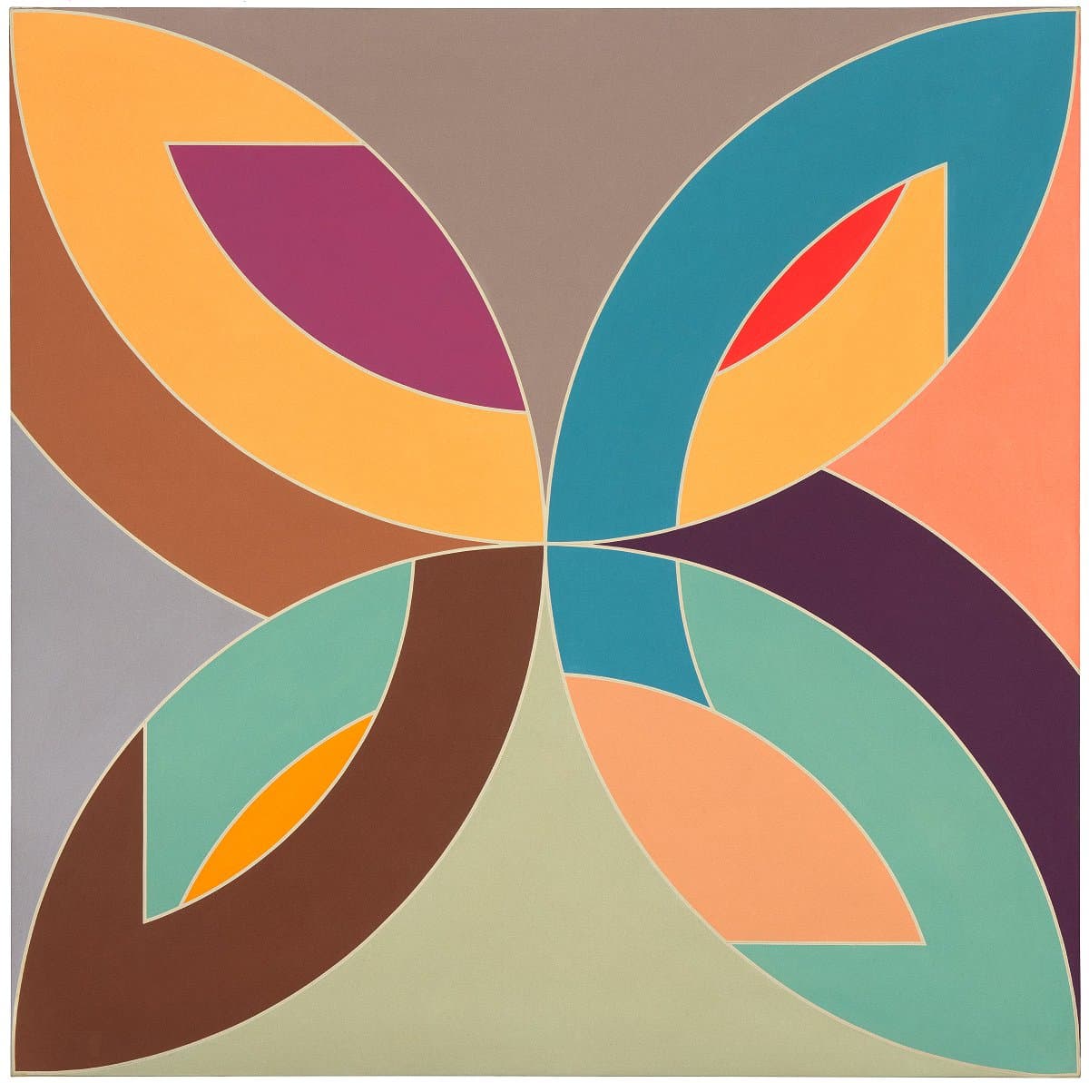
Frank Stella
Learn moreFlin Flon 1970
© Frank Stella. ARS/Copyright Agency Purchased through the NGA Foundation with the assistance of Terrey and Anne Arcus and Penelope and Harry Seidler 2002
More detail | PermalinkLike many young artists in postwar America, Frank Stella was initially smitten with Abstract Expressionism. Unlike other young artists, though, he achieved almost instant notoriety soon after graduating when, in 1959, he astonished the art world with the sombre, pure forms of his Black paintings. Departing from the strict rectilinear compositions of these famous works, in Flin Flon 1970 Stella explored the lyrical possibilities of circular form and luminous colour while retaining the control and austerity of his earlier work.
Flin Flon is a 2.7-metre-square canvas painted in polymer and fluorescent paint. It is part of the Flin Flon series of paintings, named after the Canadian town of Flin Flon in Manitoba. The related Saskatoon paintings are named after the Saskatchewan city across the provincial border from Flin Flon. These works were produced while Stella was teaching at the Emma Lake workshop at the University of Saskatchewan, Regina. At the time, Stella had been working on the shaped canvases of his closely-related Protractor series but, as he had no access to the specially produced supports while in Canada, he modified the format to fit onto a square canvas.
The composition is broadly divided into four semicircular arcs that form a geometric flower motif. The vaulting arcs and related bands are based on the semicircular outline of a protractor and are interlaced in such a way that the distinction between foreground and background begins to break down. The effect is to create a perplexing variety of coloured formations that seem to evolve continually before the viewer’s eyes. Robert Rosenblum has written of this group of works:
Like clover leaf intersections contracted within the frame of a pictorial kaleidoscope, these restless arcs strain their boundaries, exchanging positions in depth, brusquely switching roles of visual priority, pressing inward and outward, forward and backward for completion of their fragmentary shapes and abruptly interrupted energies.[1]
The artist achieved this visual complexity within a composition that is perfectly integrated as an aesthetic whole.
Stella drew on a number of different sources in creating this painting. He was deeply influenced at the time by his study of Islamic art, having travelled to the Middle East in 1963. Other sources for Flin Flon can be traced to the artist’s interest in Hiberno-Saxon illumination. In an early essay written while at Princeton, Stella compared Jackson Pollock’s looping drip patterns to the interweaving motifs in these illustrated manuscripts from the seventh and eighth centuries, and Rosenblum has explicitly compared this period of Stella’s work to what he calls the ‘expansive and open proliferations’ of the illuminated manuscript Book of Kells.[2]
Stella himself has cited the work of Henri Matisse in relation to this period of his work. In 1970 he commented: ‘I would like to combine the abandon and indulgence of Matisse’s Dance with the overall strength and sheer formal inspiration of a picture like his Moroccans.’[3] The comparison between Flin Flon and Matisse is compelling. As in the work of the French painter, the colour of Stella’s work is rich and sumptuous, there is a strong ornamental motif structuring the composition, and the arabesque lines convey a dynamic sense of movement.
Anthony White
[1] Robert Rosenblum, Frank Stella, Penguin New Art Series no 1, Penguin Books, Harmondsworth, 1971, p 51.
[2] As above, pp 48–9.
[3] Quoted in William S Rubin, Frank Stella, Museum of Modern Art, New York, 1970, p 149.
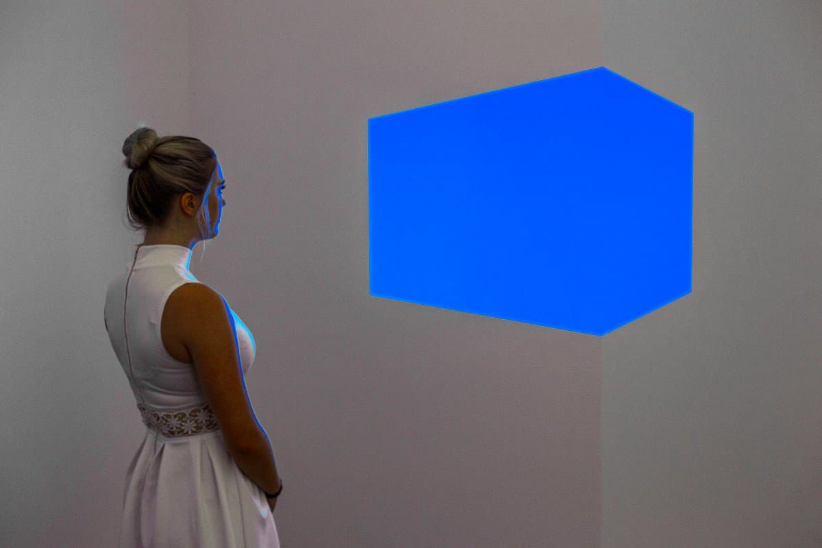
James Turrell
Learn moreShanta II (blue) 1970
Purchased 2014
More detail | PermalinkJames Turrell creates art with light, space and perception. In November 1966 he rented a studio in the Mendota Hotel building in Santa Monica, Los Angeles, and began working with the interior spaces, discovering, in the process, a ‘universe of possibilities’ and ‘ideas for a lifetime’s work’.[1] In sealing off the rooms and constructing walls and apertures to control the light entering the spaces, Turrell built ‘containers’ for light and in doing so experimented with different light effects. Cool, metallic and machine-like, Shanta II (blue) 1970 is from the body of work created at this time. Afrum 1966, a related work and the artist’s first Cross-corner projection, used a modified slide projector to persuade viewers that they were seeing a white cube of light levitating in the space.[2] Works in subsequent series show how Turrell’s concepts developed in new ways as he built more complex structures. By virtue of its carefully crafted form and ‘plumbed’ light Shanta II (blue) demonstrates the astonishing range and compelling possibilities created from variants of the simple principles of the Cross-corner construction series.
Turrell is best known for his life work, the Roden Crater. For the past four decades he has been creating a naked-eye observatory in an extinct cinder-core volcano on the edge of the Painted Desert in Arizona, a project that gathers together all types of his work and is one of the most extraordinary examples of Land art conceived in recent time. When complete, visitors to Roden Crater will experience specially calculated views of the sun and moon, and rare astronomical events. Some of these experiences, like the Gallery’s Skyspace, Within without 2010, are created to be viewed at a specific time of day, or rely on the alignment of celestial events. Others, like the Cross-corner projections or Cross-corner constructions, function at any time of the day. Whether he uses the sun, fluorescent tubes, neon, LEDs or the effects of contrast on paper, Turrell shows us the impact of light and the strengths and limitations of the human eye. Like all his work, Shanta II (blue) depends on experience, the process of seeing and the physical act of being present in the space. When there, we may wonder how the blue shape hovers in space, without perceiving the means of its construction.
Created with colour, Shanta II (blue) is linked to its projected, drawn and aquatinted versions.[3] The qualities of the shape are subtly changed through the various iterations. Shanta (white) 1967, for example, shows the cube from a different viewpoint, while in Afrum (white) 1967 it appears pushed against the wall. Shanta II (blue) looks less like an elongated cube and more as if it projects from the right-hand wall of the space. Despite the fact that the angled walls that form the aperture are readily apparent, the eye brings the blue-lit object forward to hover at the centre of the room. Like a Skyspace, where the oculus overhead makes the sky appear brighter and more painterly, the aperture focuses the viewer’s attention. As Nancy Spector points out, Turrell’s light works ‘give form to perception’.[4]
Lucina Ward
[1] Conversation between James Turrell and Craig Adcock, September 1986; see Adcock, ‘Light and space at the Mendota Hotel: The early work of James Turrell,’ Arts Magazine, vol 61, no 7, March 1987, pp 48–55; many other details about the Mendota Hotel period (1966–74) are sourced from this article, Adcock’s chapter in James Turrell: The art of light and space, University of California Press, Berkeley, 1990, pp 85–113, and David Anfam and James Turrell, James Turrell: Projection works 1966–69, Albion Gallery, London, 2004.
[2] Los Angeles County Museum of Art, see https://collections.lacma.org/node/215590, accessed 27 March 2018.
[3] Shanta (white) 1967 is part of the collection at the Whitney Museum of Art, New York; the red, pink, white, violet and pale blue versions, all 1968, are distributed through various private collections in the United States and Great Britain.
[4] Nancy Spector, James Turrell Afrum I (White) online catalogue entry, Guggenheim Museum, New York at http://www.guggenheim.org/new-york/collections/collection-online/artwork/4084, accessed 27 March 2018.
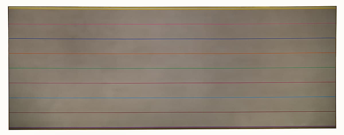
Kenneth Noland
Learn moreOakum 1970
© Kenneth Noland. VAGA/Copyright Agency Purchased 1973
More detail | PermalinkKenneth Noland had his first solo exhibition at the Galerie Raymond Creuze, Paris, in 1949, after moving there to study with sculptor Ossip Zadkine in 1948. Noland returned to the United States soon afterwards, settling in Washington DC and teaching at the Institute of Contemporary Art. While teaching evening classes at the Washington Workshop Center of the Arts in 1952 Noland met Morris Louis. The two artists visited New York in 1953 and were impressed by the stain techniques developed by Helen Frankenthaler, and both Noland and Louis began applying these after they returned to Washington.
In 1958 Noland began working on his ‘targets’, paintings based on concentric rings of colour. During the early 1960s he participated in a number of important group exhibitions that brought together artists working in a style of hard-edge and stained colour-field abstraction. Noland also made sculptures and was a prolific printmaker.
Between 1967 and 1970 Noland worked on a body of horizontally-striped rectangular paintings, completing over 200 of them.[1] He began using this format earlier, while still exploring the variations in his series of diamond-shaped canvases from 1964–67. These early horizontal striped paintings were long and thin, loosely painted with the brush. By the time this type of painting became Noland’s main concern, in 1967, he took on assistants for the first time and began using masking tape to give precision to the stripes. The usual procedure was to staple a length of canvas to the floor, paint the stripes using tape to guide the edges of each line, then crop the canvas to an appropriate size. By 1967 the paintings had become wider; often the stripes were arranged around bare canvas. The colours were varied in the early stripes but tended to be restricted in the works after 1968.
Made in 1970 in the artist's studio at South Shaftsbury, Vermont, Oakum was one of the last of this series of paintings. In an interview in 1971 Noland mentioned that he liked ‘that edge between water and land’,[2] something that plants the notion of landscape into his horizontal stripe paintings; the title Oakum refers to the compound of loose fibre made of old rope used in caulking the planking of boats.
Michael Lloyd and Michael Desmond[3]
[1] Kenworth Moffett, Kenneth Noland, Harry N Abrams, New York, 1977, p 72.
[2] From an interview with Kenneth Noland by Paul Cummings, 1971, quoted in part in Diane Waldman, Kenneth Noland: A retrospective, Solomon R Guggenheim Museum, New York, 1977, p 33.
[3] Adapted and updated from Michael Lloyd and Michael Desmond, European and American Paintings and Sculptures 1870–1970 in the Australian National Gallery, Australian National Gallery, Canberra, 1992, p 422, by Steven Tonkin.
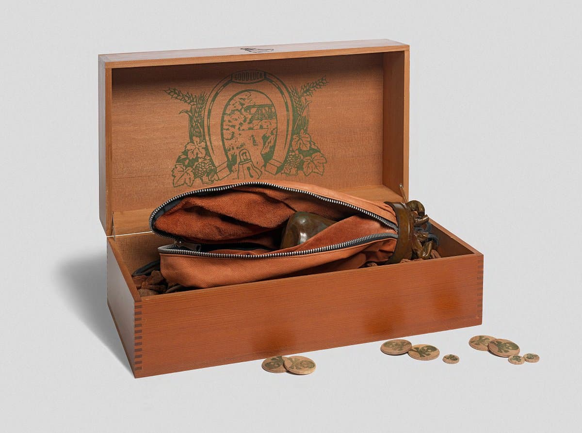
Claes Oldenburg
Learn moreDouble-nose / purse / punching bag / ashtray 1970
© Claes Oldenburg and Coosje Van Bruggen Purchased 1973
More detail | PermalinkBrimming with absurdity, Oldenburg’s Double‑nose / purse / punching bag / ashtray 1970 consists of a wooden box that opens to reveal a punching bag nesting in a pile of woodchips, sprinkled with what appears at first glance to be pirate currency. A zipper serves to transform the punching bag into a purse, which opens to reveal a bronze cast of conjoined noses. The inside of the box’s lid is printed with an idyllic view glimpsed through a horseshoe arch surrounded by harvest grains and hops. The punching bag was specially fabricated based on a model created by the artist, the top gathered into the base of a bronze ashtray full of stubbed-out cigarettes. There is a lock design burned on the outside of the box where a keyhole might usually appear, and at the base of the horseshoe; on close inspection the oddly-bulging lock is reminiscent of a nose.
Oldenburg’s sketchbooks often contain drawings and notes that make connections between seemingly unconnected objects, such as ‘skyscraper-scissors’, or a slice of pie that morphs into a typewriter.[i] The box contains a tiny, deerskin-bound book that promises to unlock the mystery of this three-dimensional riddle, offering a peek into the workings of the artist’s mind. It reveals that he envisaged gigantic noses as the entrances to freeway tunnels in the manner of the Proposed monuments, and weaves a string of anecdotes and reminiscences together to form an explanation of sorts for the work. Envisaged as a woman’s purse containing a heavy cast nose that serves as both an amulet and a weapon against muggers, it also recalls La Bonne Aventure 1937 and other paintings by Rene Magritte featuring disembodied noses.[ii] A driving force in the completion of the work was its association with the humble ice bag, the cap of which has morphed into the brimming ashtray.
Bronwyn Campbell, Brooke Babington and Emilie Owens
[i] Discussed in Julian Rose’s ‘Objects in the cluttered field: Claes Oldenburg’s Proposed Monuments’, in October, Spring 2012, pp 113–38.
[ii] Collection unknown, sold at Sotheby’s, London, 2013, at artnet.com, accessed 5 April 2018.
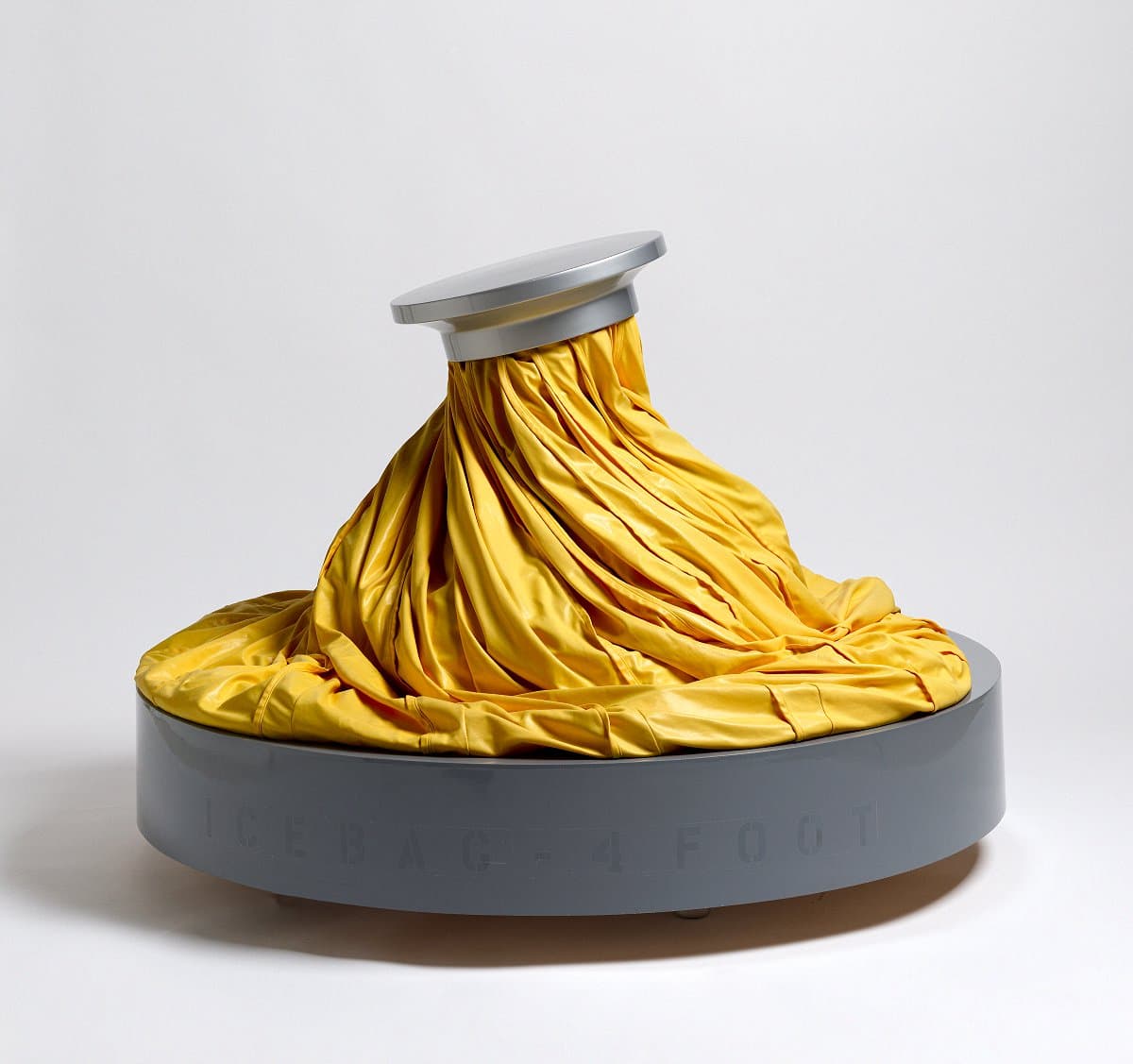
Claes Oldenburg
Learn moreIce bag - scale B 1971
© Claes Oldenburg and Coosje Van Bruggen Purchased 1975
More detail | PermalinkOldenburg’s art has always been preoccupied with the ordinary, and his subjects are consistently taken from his immediate surroundings. This practice of elevating humble, everyday objects to the realm of high art has its origins in the Surrealist obsession with the objet trouvé, or found object, the readymade tradition set in train by Marcel Duchamp. In Icebag—scale B 1971 the Surrealists’ absurdist disregard for scale and functionality is married to a Pop art fixation on consumerism. Forfeiting functionality for style, the utilitarian object becomes an ideal, reversing the original Modernist dictum that form must follow function; here, function follows form. With works such as Icebag—scale B, Oldenburg was at the forefront of the avant-garde sculpture that transformed art in the 1960s. Soft sculpture was Oldenburg’s preferred medium and he is widely credited as the catalyst for the movement, evolving as they did out of the soft, oversized props he created for performances at his Ray Gun Theater in New York in the early 1960s.
‘I am for an art … that does something other than sit on its ass in a museum,’ stated Oldenburg in 1961.[i] With the production of his mechanised Icebags in 1971 this desire was realised. Icebag—scale B moves almost imperceptibly in the exhibition space, slowly winding and undulating this way and that, creating the rather eerie sensation that it is following one around the room. The soft, amorphous folds of bright yellow nylon lend the object an organic feel as it gently, almost reassuringly, ‘breathes’.
Icebag—scale B is a variant of Oldenburg’s first mechanised sculpture, Giant icebag, which he created for the 1970 World’s Fair in Osaka, Japan. Harnessing technology to realise the desired movement, Oldenburg was able ‘to take something which is formidable in its complexity, and make it do some very foolish thing—I sort of like the idea that all this time and effort was spent on the Icebag’.[ii] The creation of this very complex work was the result of a collaboration between Oldenburg, Gemini GEL and Krofft Enterprises over 14 months. Although the Icebags are identical, each of the 25 examples in the edition was individually assembled and fitted with the specially designed hydraulic system that regulates inflation and deflation. For Oldenburg, who is particularly concerned with ‘movement and the conversion of states’,[iii] the resultant works were well worth the long process.
Oldenburg’s soft sculptures―mechanised or not―never simply ‘sit on their asses’. Fashioned from malleable materials, and ranging in size from miniature to mammoth, the works take on their own life and exist in a constant state of flux. In Icebag—scale B this idea is taken to its extreme: distending and deflating like a lung, the object goes beyond its utility as a therapeutic aid, to become an uncanny extension of the body itself.
Bronwyn Campbell, Brooke Babington and Emilie Owens
[i] The artist, 1961, cited in Charles Harrison and Paul Wood (eds), Art in theory, 1900–2000: An anthology of changing ideas, Blackwell Publishing, New York, 2005, p 744.
[ii] The artist, 1971, quoted in Claes Oldenburg, Claes Oldenburg: an anthology, Guggenheim and National Gallery of Art, New York and Washington, 1995, p 323.
[iii] The artist, quoted at http://www.tate.org.uk/art/artworks/oldenburg-screwarch-bridge-state-ii-p77106, accessed 5 April 2018.
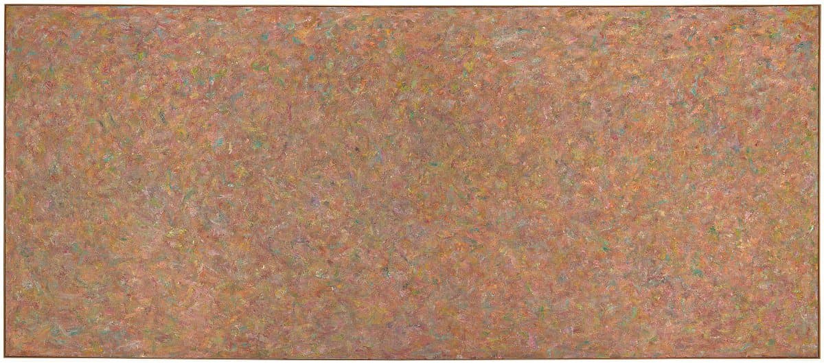
Milton Resnick
Learn morePink fire 1971
© Milton Resnick, Courtesy Robert Miller Gallery, New York. Purchased 1973
More detail | PermalinkMilton Resnick migrated with his family to the United States from Ukraine in 1922. He attended the American Artists’ School in New York in the mid 1930s, where he established a long-lasting friendship with Willem de Kooning. After serving with the US Army during the Second World War, Resnick lived in Paris from 1946–48 before returning to New York. He was a founding member of the informal Eighth Street Club, which included Philip Guston, Robert Motherwell, Franz Kline and Mark Rothko. During the early 1950s he exhibited in a number of group shows, although it was not until 1955, at the age of 38, that he held his first solo exhibition in New York at the Poindexter Gallery. Despite his earlier affiliations, this led some critics and writers to categorise the artist as a ‘second generation’ Abstract Expressionist. Resnick rejected this label and vehemently asserted his independence from the New York ‘art scene’.[1]
His work underwent a series of shifts in the late 1950s and early 60s: applying paint in shorter dabs gave his works a dappled effect and more ‘overall’ composition.[2] Resnick’s move to a huge loft studio in 1959 allowed him to work on increasingly monumental canvases, a feature that characterised much of his most significant work of the ensuing decades. From the mid 1960s until the early 70s, he deliberately removed himself from New York.[3]
Pink fire 1971 is from Resnick’s period in self-imposed exile. As the title suggests, a field of pink radiates from the painting, sending ripples across the gallery wall and engulfing the viewer. The frame of the work seems an arbitrary boundary. As Linda Cathcart observes, a painting is only a ‘fragment’ of an artist’s ‘vision’.[4] Within Resnick’s work there is, moreover, a converse relationship between size and the artist’s concentrated application of pigment. As the works become more expansive―Pink fire, for example, is over two metres high and five metres wide―it is the tiniest details that give them their dynamic ebb and flow across the surface. In this work there are no brushstrokes of ‘pure’ colour, but rather a multitude of marbled microcosms composed of pink, yellow, orange, blue-green and dark-red oil paint. As Carter Ratcliff observed in a review of Resnick’s 1972 show at the Max Hutchinson Gallery:
They are heavily, repeatedly brushed, but with a focus of attention so intense it precipitates an endlessness in local incident. A painting … will have an overall tonality … This will be played off against a full range of color, most of it submerged by over-painting. This gives a visual meaning to the thickness of his paint surface: gesture and vision are joined. It also gives the surfaces an ambiguity: they could be considered thin in relation to the amount of color they contain and reveal.[5]
Resnick described himself as a servant to paint, rather than its master.[6] He worked in a strictly non-figurative mode until the 1990s and throughout his career remained committed to the impulses that drove a generation of American painters. Pink fire remains one of the artist’s most exquisite paintings and, like his oeuvre generally, deserves to be better known.[7]
Steven Tonkin
[1] As Resnick stated in 1962: ‘I am not the follower of Monet. I am not an admirer or follower of De Kooning. I am not an action painter. I am not an abstract expressionist. I am not younger than anybody or older. I will not take my hat off to any other living artist or dead in all the world.’ Allen S Weller, Art: USA: Now, Viking, New York, 1962, mp 83 in retort to his labelling and criticism by Thomas B Hess: see, for example, ‘Reviews and previews: Milton Resnick’, Art News, vol 54, no 8, December 1955, p 51.
[2] He abandoned the ‘aggressive’ brushstrokes that distinguish paintings such as Low gate 1957 (Whitney Museums of American Art, New York), moving to a more lyrical and flickering use of the brush with a ‘naturalistic’ palette as in Tilt to the land 1959 (private collection). While this encouraged critics to allude to the late work of Monet, and to label Resnick as a contemporary Abstract Impressionist, the artist likewise denied these associations with the landscape; see Linda L Cathcart, Milton Resnick–Paintings 1945–1985, Contemporary Arts Museum, Houston, 1985, p 1.
[3] Resnick accepted a post as a visiting professor of painting at the University of Wisconsin, Madison (1966–67), then a residency with the Roswell Museum and Art Center in south-eastern New Mexico (1970–71) where he executed his landmark Roswell series.
[4] Cathcart, p 9.
[5] Carter Ratcliff, ‘New York letter’, Art International, vol 26, no 6, Summer 1972, p 74.
[6] See Milton Resnick, ‘Statement’, in Cathcart, p 73. For the artist’s other comments on making art, see ‘Out of the picture: A miscellany, Milton Resnick and the New York School’, unpublished ms by Geoffrey Dorfman, in Milton Resnick: A new decade, Max Hutchinson Gallery, New York, 1982, p [1].
[7] See, for example, the artist’s first retrospective in New York, at Milton Resnick and Pat Passlof Foundation, New York; Hilarie M Sheets, ‘Milton Resnick gets his due on New York’s Lower East Side’, New York Times, 1 March 2018, at https://www.nytimes.com/2018/03/01/arts/milton-resnick-art-foundation.html, accessed 27 March 2018.
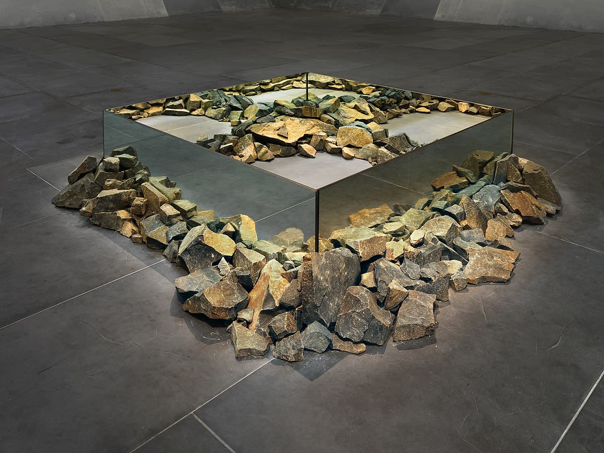
Robert Smithson
Learn moreRocks and mirror square II 1971
© Robert Smithson. VAGA/Copyright Agency Purchased 1977
More detail | PermalinkOriginally a painter, Robert Smithson became known as a sculptor from 1964 and was seminal to the development of Land or Earth art. While Richard Serra and other sculptors of the second generation of Minimal artists were trying to avoid anything of a pictorial nature in their work, Smithson also wanted to counter the appropriation of art by museums, art historians and curators, as well as commercial galleries. He worked on projects in the ‘real’ world of mines and quarries, his Sites, and used portable elements and perhaps diagrams and photographs for his gallery or Non-site pieces (implying out-of-sight).
The juxtaposition of nature and human construction reappears in one of Smithson’s Non-site works, Rocks and mirror square II 1971. The concept is simple: four low walls of mirrors on the floor are made into a square, with rocks of basalt buttressing the sides inside and out. Such simple elements set off a number of reverberations in the contested arena of sculpture after Minimalism. These include the vacant centre of the work where the floor shows through, the square format echoing Ad Reinhardt’s famous Black paintings of similar dimensions,[i] and the artificial/natural dichotomy of the materials. In Rocks and mirror square II the artist incorporates basalt rocks gathered in the countryside near Patterson, New Jersey[ii] with manufactured elements such as flooring material, back-to-back rectangular mirrors, even the reflections of visitors’ feet, as part of the installation.
Michael Desmond, Christine Dixon and Bronwyn Campbell
[i] Robert Hobbs et al, Robert Smithson: Sculpture, Cornell University Press, Ithaca NY, 1981, pp 139–40.
[ii] According to John Weber, the rocks were collected by Smithson in August 1971. Correspondence with the National Gallery of Australia, NGA file 76/511 f.8.
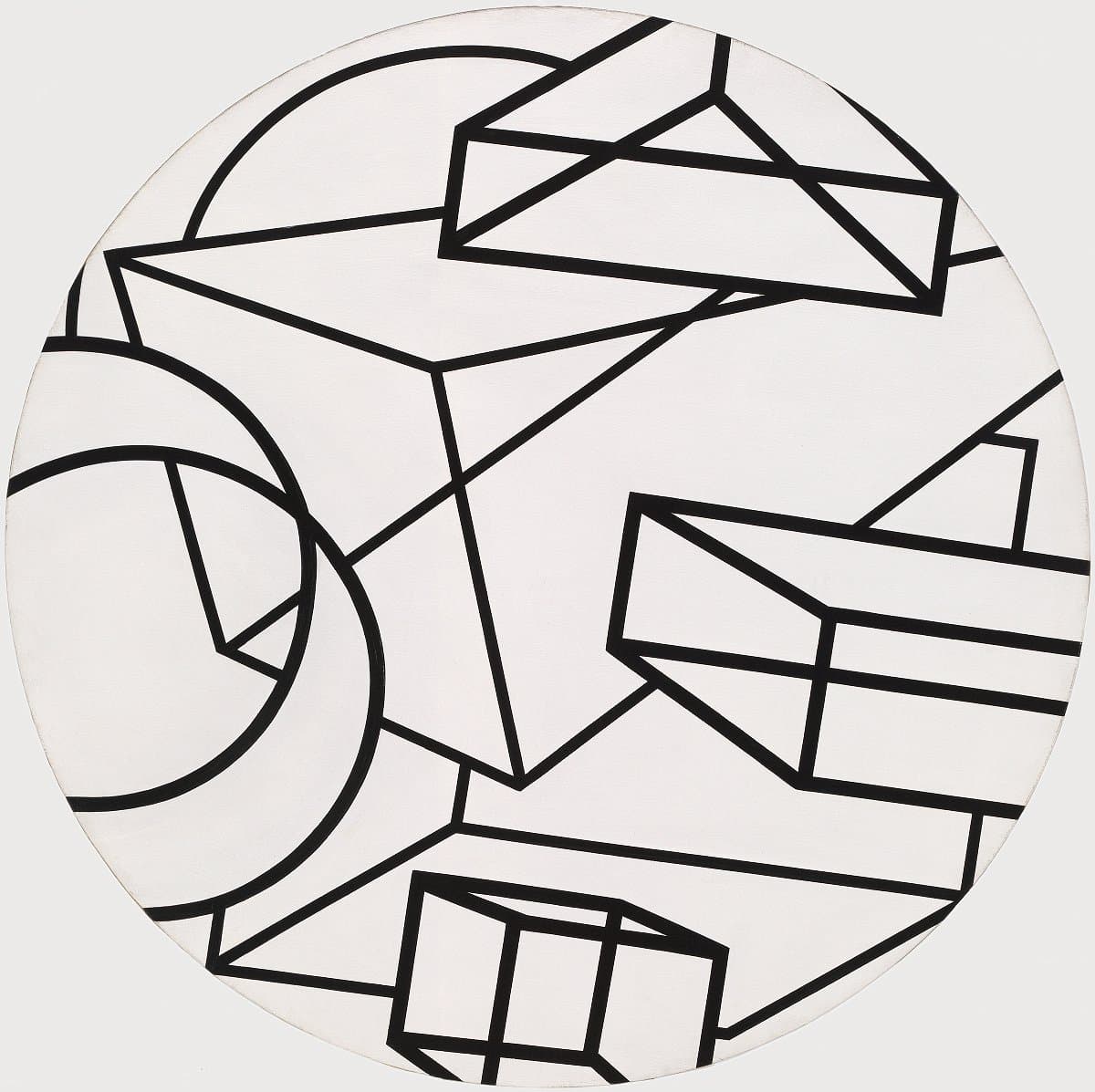
Al Held
Learn moreSkywatch II 1971
© Al Held. VAGA/Copyright Agency Purchased 1973
More detail | PermalinkAl Held, like so many artists of his generation, was heavily influenced by Abstract Expressionism. In the 1950s he worked in a gestural manner but then began to introduce geometric shapes with clean edges and flat colour. These elements became the hallmarks of his mature style, which gained him critical acclaim from the 1960s onwards.
Skywatch II 1971 belongs to a distinctive phase of Held’s career during which he developed a vocabulary of lines, outlined shapes and transparent forms that conjure a series of spatial ambiguities within the picture. In his monograph on the artist, Irving Sandler labelled these works ‘ambistructural’ abstractions,[1] suggestive of the way the transparent ‘structures’ appear to project and recede from the picture surface in a constant state of flux. Another feature of Held’s paintings during this period was that he worked exclusively in black and white; first black lines on a white background as in Skywatch II, later white lines on a black background. Held instigated this reductive palette in 1967 as he felt that colour was superfluous to his investigations and would make no more than a decorative addition.
Skywatch II, along with a slightly smaller companion painting, Skywatch I 1972[2], are painted on circular canvases, making them unique in Held’s oeuvre. In Skywatch II the rectangular and triangular prisms seem to float within an illusionary and implausible space, while the circular, nearly cylindrical forms echo the shape of the painting. The relationship established between the internal elements and the canvas support seems to concede the painting’s status as an object, giving an almost sculptural quality.
Paintings exhibited in the artist’s solo show at the André Emmerich Gallery, New York, in 1972 presented challenges to the major preoccupations of American painting during the 1960s. This is evident in the different interpretative approaches taken by critics in response to the exhibition. Sandler commented:
The spatial ambiguity (more than the suggested volumes and voids) serves to completely disintegrate the picture plane─by eliminating fixed reference points in relation to which the components might be measured. Thus Held creates a total illusionism; his painting is essentially an indeterminate, deep hollowing and billowing space in which geometric elements float freely.[3]
In another review, Kenneth Baker attempted to reconcile Held’s illusionistic spaces with the modernist preoccupation with the flatness of the picture surface, concluding:
The most interesting thing about the pictures may be that they are organized in such a way as constantly to call attention to the common existence of the picture plane and the literal surface. What one realises after a while is that the transparency of the ‘open’ figures is the transparency of the picture plane. And in these paintings that transparency always connects with an ambiguity which affirms the opacity of the literal surface as the ultimate condition which makes every pictorial incident possible.[4]
While the works of the Skywatch series are the artist’s only ‘shaped’ canvases, the motifs within these paintings, particularly the overlapping double-circle in the lower-left quadrant of Skywatch II and the oblique ring in Skywatch I, are visual devices often used by Held throughout the 1970s.
Steven Tonkin
[1] Irving Sandler, Al Held, Hudson Hills Press, New York, 1984, p 65; Sandler identified ‘distinct’ phases in Held’s oeuvre, labelling the artist’s preceding paintings from the late 1950s as ‘pigment paintings’ and his work of the early to mid 1960s as ‘concrete abstractions’.
[2] Akron Art Museum, Ohio.
[3] Irving Sandler, ‘Al Held at Emmerich, Philip Pearlstein at Frumkin’, Art in America, vol 60, no 5, September–October 1972, p 114.
[4] Kenneth Baker, ‘Al Held, Emmerich Galleries, uptown and downtown’, Artforum, vol 10, no 10, June 1972, p 87.
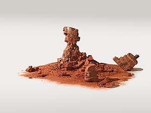
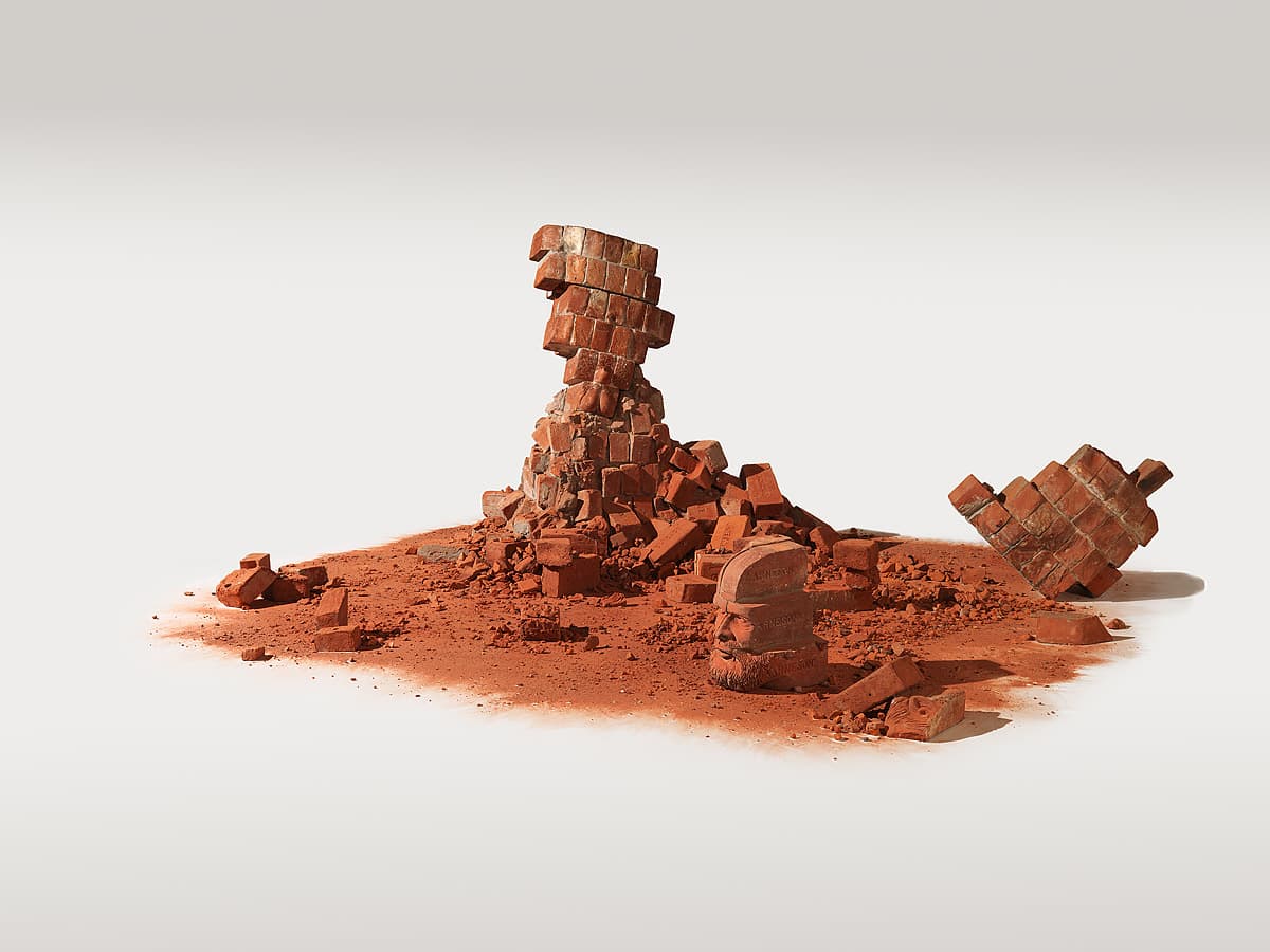
Robert Arneson
Learn moreFragment of Western civilization 1972
© Robert Arneson. VAGA/Copyright Agency Purchased 1978
More detail | PermalinkDuring the 1970s Robert Arneson worked mainly in portraiture, creating witty, larger-than-life likenesses of himself, his friends and the artists he admired. Fragment of Western civilization 1972 is not only the largest and most elaborate of the 18 self-portraits completed in 1971–72, it establishes his paradoxical relationship with tradition. The modular terracotta sculpture also articulates Arneson’s approach to caricature: the humour is layered and underpinned by an irreverent and satirical intelligence. Indeed humour, and specifically self-deprecation, are an important part of the artist’s creative process.
Fragment of Western civilization relates to another work of the same year, Classical exposure 1972, as well as a later work, Temple of fatal laffs 1989.[1] In the earlier work the artist is shown as a classical herm, with both genitals and feet emerging from the column, smoking a cigar. In the latter, his disembodied and misshapen head, mouth wide in an expression of pain, topples to the side of a fluted column. Fragment of Western civilization, by contrast, is intended to rest directly onto the floor. Initially the work appears to be a pile of building debris, or part of brick wall, but on closer inspection a fragmented relief self-portrait is revealed.
Bricks have a rich history as a fundamental component of Western cultures, and are important to the legacy of ceramics. There is a suggestion of archaeological excavations, of the Parthenon friezes and Greek sculpture generally, as well as Romantic visions of history and civilisations in decline. These references to the past are an important aspect of Fragment of Western civilization, but imitating tradition was not Arneson’s sole intention:
I had been doing series of bricks for years and there was a concept there of building an edifice that would be of laminated bricks in my likeness. When I got halfway through Fragment, I decided that I ought to bring in the hoards of conquerors to dispose of the edifice. There’s the yin and yang in that—you build an edifice and then you knock it down.[2]
The form of the work has been radically altered. By making a sculpture and then partially destroying it, Arneson has also changed the meaning of the work, and this process is emblematic of his attitude to tradition. Although such iconoclasm stems from his determination to overcome the view of ceramics as a decorative, intellectually impoverished and non-critical medium, it is also linked to a Funk irreverence for conventional standards of taste. The overt sexuality and scatology in Arneson’s work originated in the mid 1960s and, like Marcel Duchamp’s readymades or Claes Oldenburg’s soft sculptures, is calculated to surprise and shock.[3]
Arneson’s description of Classical exposure as ‘A portrait of the artist exhibiting himself’[4] applies equally to Fragment of Western civilization. However, the exposure here is of a larger kind: in attempting to surmount his ‘burdensome’ heritage as a ceramicist, Arneson helped to redefine the medium as one suitable for sculpture. He also laid siege to the idea of the artist as a creative hero: not only has his edifice to himself and tradition been demolished, it suffers the inevitable indignity of being covered in graffiti.[5]
Lucina Ward
[1] Classical exposure 1972, Daniel Fendrick Family Collection; Temple of fatal laffs 1989, Contemporary Museum, Honolulu.
[2] Quoted in Civilizations, John Michael Kohler Arts Center, Sheboygan, Wisconsin, 1977, p 12; Neal Benezra, Robert Arneson: A retrospective, Des Moines Art Center, Iowa, 1985, p 38.
[3] Arneson’s most extreme works from this period—the John series 1963–65, which includes penile handles, red clitoral drains, ceramic pustules and excrement in generous quantities—were the ceramic equivalent of Duchamp’s Fountain 1917 or Oldenburg’s Soft toilet 1966.
[4] Mady Jones, An interview with Robert Arneson, Archives of American Art, Smithsonian Institution, California Oral History Project, August 1981, p 99.
[5] Incised into each brick is ‘Arneson’ (most frequently) or ‘Robert’, ‘Arnie’, ‘Bobby’ or ‘Bob’, date incised upper centre of left side of head section ‘1972’, other bricks incised variously ‘Ceramist’, ‘Clay’, ‘Brick’, ‘Benicia’, ‘9-4-1930’, ‘Fuck’, ‘Fire’, ‘Earth’, ‘Trick’, ‘Prick’, ‘Art works’, ‘Funk’, ‘Virgo’, ‘Museum’, ‘Chicago’, incised on side of one brick ‘I was born on / September 4 1930 / at 4.28 a.m. in / Benicia California’.

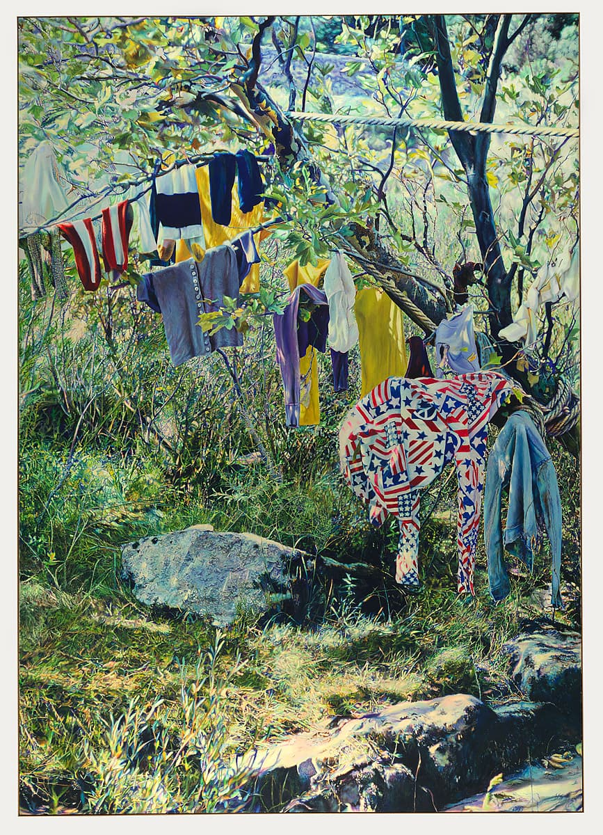
Franz Gertsch
Learn moreSaint Guilhem 1972
Purchased 1973
More detail | PermalinkIn Saint Guilhem 1972 Franz Gertsch approaches his subject with a precision typical of his photorealist contemporaries in the United States and elsewhere. The painting, while depicting a light-filled landscape of the Mediterranean region, portrays objects and imagery that suggest broader, even internationalist, concerns. Clothes hang on the tree’s makeshift rungs: a bedraggled denim jacket, a shirt with the stars and stripes of the US flag, alongside white underpants, stripy red socks and brightly coloured t-shirts. A heavy guy rope, secured firmly to the main bough of the tree, strains along the line of the lower limb, rounds it near the top, and disappears from view in a taut, almost horizontal line. Perhaps this rope is part of a camp beyond the frame. In another large seascape of the same year we see children playing in the waves, almost as if they are the figures who will soon hang their clothes to dry.[1] As curator Myra McIntyre writes:
The rhetoric of liberty and boundlessness hanging in the natural landscape suggests cultural hegemony, but also the freedom that was not only a lifestyle, but also an important artistic goal for Gertsch and his Swiss contemporaries in the early 1970s.[2]
For Gertsch reality means both a pictorial and a conceptual challenge.[3] Initially influenced by Pop art, he made his first series of realist works in 1969. Like many of his contemporaries he photographed his subjects and used his images, projected as slides onto his canvas, as a guide during the painting process (see also Audrey Flack cat. XX). Most early works concentrate on single and group portraits, often closely cropped, with art-historical and candid camera references. Close friends and illustrations in magazines provided his starting points, then figures such as the Swiss curator, artist and art historian Harald Szeemann; indeed, like Warhol, some of Gertsch’s sitters became very well-known especially in the artworld.[4] The zenith of the series of portraits was the last of five large paintings of American performance poet and singer, Patti Smith V 1979.[5] The size of his canvases also increased at this time.
The Saint Guilhem of the title was an eighth-century monk who gave his name a monastery in the Gellone valley, near the place represented in Gertsch’s painting.[6] The light and landscape in the Saint Guilhem scene appear larger than life. As McIntyre also observes, the entire surface of the painting is blanketed in a tangle of twigs, leaves, grasses and rocks, with glimpses of the background of recurring foliage and rocks beyond the frame. The pattern and surface of the sturdy tree bough that enters the picture frame at right, branching into two and forming the substance of the ‘clothesline,’ contrast with the colours and geometry of the clothes. The light on the large regular rocks in the foreground and at lower right is high-keyed, while the running water that forms the work’s final diagonal is seemingly out of focus, just like a photograph.[7] After 1980 Gertsch’s work became even more monumental as he produced large portraits, occupying the entire canvas, in which pictorial conventions dissolve into pattern.[8]
Lucina Ward
[1] Saintes Maries de la Mer III 1972, Lentos Kunstmuseum, Linz. Jean-Christophe Ammann, in his note on the Saint Guilhem painting, goes further, stating that these are the clothes of the young people in the artist’s best known painting, Medici 1971/72 (Ludwig Forum für Internationale Kunst, Aachen); see Franz Gertsch, Kunsthaus, Zurich, 1980, p 12. See also Marina makes up Luciano 1975 (Museum Ludwig, Cologne) where she wears the same shirt patterned with stars and stripes.
[2] Unpublished manuscript by Myra McIntyre, 2003, np.
[3] Biography on Museum Franz Gertsch website, at http://www.museum-franzgertsch.ch/en/franz-gertsch/biografie/, accessed 28 March 2018.
[4] Harald Szeemann 1970, Centraal Museum, Utrecht. See, for example, Luciano Castelli I 1971 among many other paintings of the Swiss artist and musician as a young man; refer also catalogue raisonnée section in Franz Gertsch, 1980, pp 89–93 and http://www.museum-franzgertsch.ch/en/franz-gertsch/die-werke, accessed 28 March 2018.
[5] Patti Smith V 1979, Kunstmuseum, Bern.
[6] Guilhem was the grandson of Charles Martel, the Duke of Aquitaine, and one of the chosen knights of Emperor Charlemagne.
[7] McIntyre, np.
[8] Gertsch also applied his photographic technique to lithographic prints, and to smaller gouaches and watercolours, eventually turning, in 1986, to wood engravings; by 1989 he had married technique and subject in large landscape prints of haunting monochromatic photographic quality. Gertsch’s privately-funded, eponymous museum in Burgdorf, Switzerland opened in October 2002.
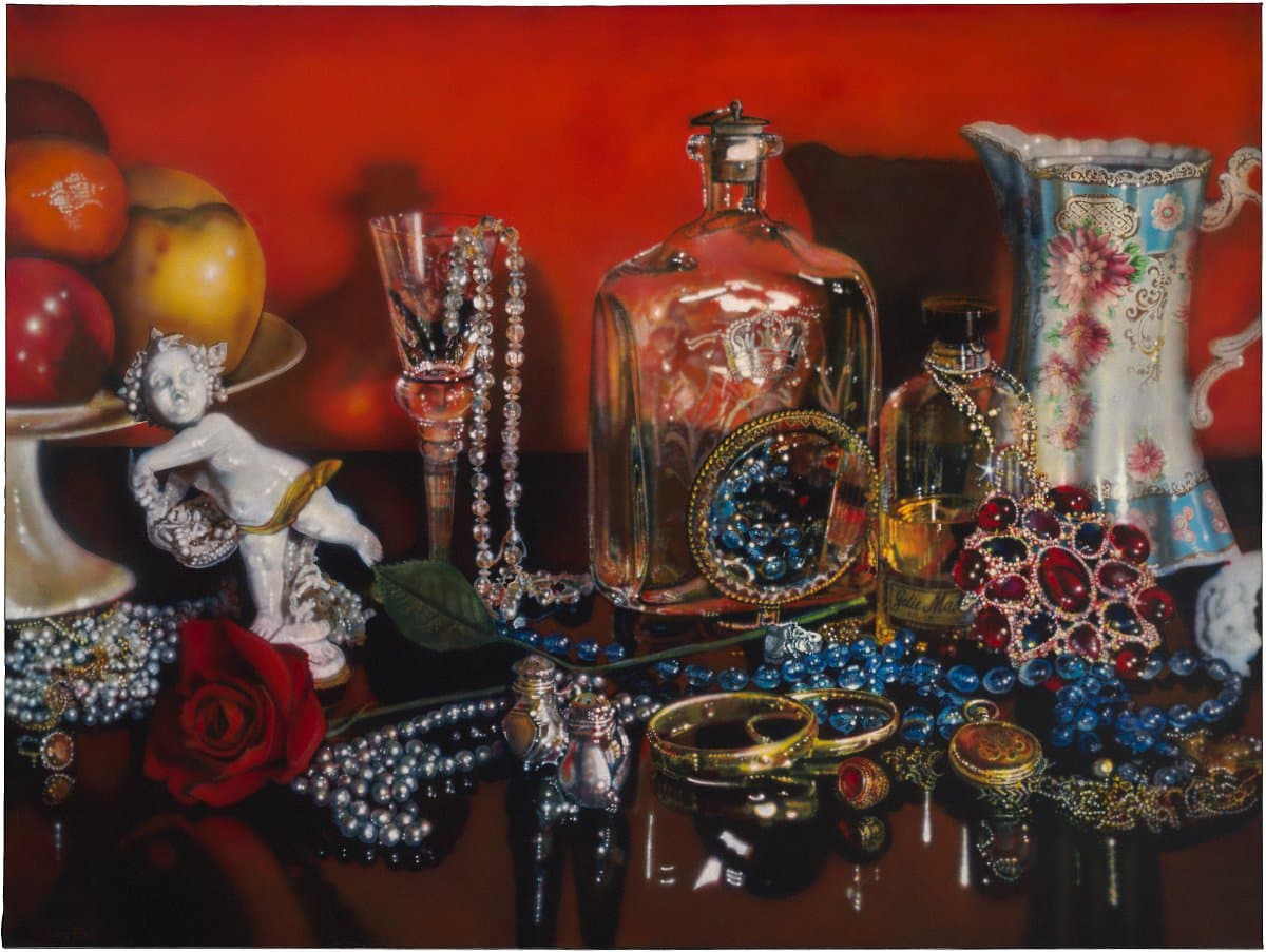
Audrey Flack
Learn moreJolie madame [Pretty woman] 1973
© Audrey Flack Purchased 1978
More detail | PermalinkAudrey Flack sets up the still lifes for her paintings in much the same way as a Dutch seventeenth-century painter, carefully arranging and balancing the objects until she achieves a rigorous unity of composition. Using complex and highly-controlled lighting she takes as many as 150 photographs before selecting those suitable to create a painting. As soon as the still life arrangement is suitably documented, the artist dismantles it, a process ensuring that the images, rather than the objects themselves, form the basis of her paintings. The selected photograph is projected onto the canvas, thus achieving the correct scale and eliminating the need for preliminary drawing or sketches leading up to the finished work. Flack then uses an air brush to work over the image with films of colour.
Jolie madame 1973 presents the world as seen through the camera lens. The slight blurring of some objects refers directly to the painting’s origins in a blown-up photograph. Flack acknowledged her modus operandi as early as 1964 and, although many other Photorealists apply similar aids, her admission of working directly from slides and colour prints revived controversies about the role of secondary source material. In the early 1970s she drew on photographs from her own family album and then magazine photographs of public figures. Later, in series such as Gray border 1974–75 and Vanitas 1976–77, Flack manipulated stereotypes of art and femininity.[1] Although identified as a Photorealist, the artist associates the movement with cool, tough, masculine symbols and positions herself as separate to it. Indeed, Flack rejects the ‘male approach to painting’, preferring instead to concentrate on images that represent an intimate, often female view of the world. She admits a personal involvement with her paintings and the objects portrayed within.
Jolie madame is one of the first paintings in which Flack examined the ‘time-binding potential’ of objects and elaborated the formal possibilities of still life on a monumental scale.[2] This large, baroque painting assaults the senses with its lush, opulent surface and warm, sensuous tones, the halos of glazed-on colour. The lack of hierarchy in the objects portrayed, the shallow depth of field and elements such as the use of highlights across the painting, including the jewellery in the foreground that seemingly merges with its reflections, combine to give the work an abstract quality, despite its pictorial subject matter. Jolie madame may be easily ‘read’—as with the label on the perfume bottle that gives the work its title—but is not readily scrutinised. Flack had created all-over compositions from multiple objects in 1972–73—including close-ups of sundaes, cakes and tarts—before reverting to complex still lifes.[3] By placing a profusion of her own objects in an intimate setting, and by declaring her involvement with them, Flack creates in Jolie madame an exuberant and entirely joyous affirmation of her own personal, and female, existence.
Lucina Ward[4]
[1] See, for example, Katherine Hauser, ‘Audrey Flack’s still lifes: Between femininity and feminism’, Woman's Art Journal, vol 22 no 2, Autumn 2001/Winter 2002, pp 26–30, at http://www.jstor.org/stable/1358899, accessed 11 April 2018.
[2] Lawrence Alloway, ‘Introduction’, in Audrey Flack on painting, Harry N Abrams, New York, 1981, pp 26–7.
[3] In subject matter, scale and composition, Jolie madame is related to? works such as Chanel 1974 (collection Mrs Morton G Neumann, Chicago) and Grey border series such as Buddha 1975 (Saint Louis Art Museum) and Leonardo’s lady 1975 (Museum of Modern Art, New York).
[4] See also Kay Vernon, ‘Audrey Flack’, Genesis of a Gallery part 2: A touring exhibition from the collection of the Australian National Gallery, Australian National Gallery, Canberra, 1978, p 79.
Lucas Samaras
Learn morePhoto-transformation 10/29/73 1973
© Lucas Samaras, Courtesy Pace Wildenstein Purchased 1975
More detail | Permalink
Lucas Samaras
Learn morePhoto-transformation 9/19/73 1973
© Lucas Samaras, Courtesy Pace Wildenstein Purchased 1975
More detail | Permalink
Lucas Samaras
Learn morePhoto-transformation 10/22/73 1973
© Lucas Samaras, Courtesy Pace Wildenstein Purchased 1975
More detail | Permalink
Lucas Samaras
Learn morePhoto-transformation 11/11/73 1973
© Lucas Samaras, Courtesy Pace Wildenstein Purchased 1975
More detail | PermalinkIn 1973, New York based Lucas Samaras, along with a number of other artists, was given a newly released SX-70 camera by an employee of the Polaroid Corporation, John Holmes. The artists were to experiment with their new toy and make work to be exhibited at Light Gallery in New York. The gift fired Samaras’ imagination. He was hooked by the immediacy of the process; only seconds elapsed between him as subject and the release from the camera of an image of himself as object. It set off Photo-transformations, a series he worked on over the next three years, which became his most recognised work.
Samaras had experimented with Polaroid cameras during the 1960s, when he brought photography into his practice as a sculptor, painter and performance artist. He photographed himself, often camouflaged and hiding his body behind a series of dots and lines painted with ink. However, the new camera opened up expanded possibilities. Polaroids consist of a semi-liquid chemical emulsion held within a plastic envelope; the image appears as the chemistry develops. With the SX-70 it was possible, during this brief window of less than a minute as the image came into existence, to manipulate the photographic emulsion with a finger or a tool. In an extremely direct and physical way Samaras was able to intervene and play with the image.
The core of Samaras’ practice involves an exploration of the malleability and heightened expressive potential of his own physical form as a visible manifestation of his mental state. He has referred to his project as ‘creative psychodrama’.[1] The tiny format of the Photo-transformations seems almost unable to contain the energy within them, as Samaras’ body is distorted at times, painted with psychedelic coloured lights, and at others dissolved, overwhelmed by pattern—lines of energy pulsate from the form of his mouth and eyes: the body, it is often noted, metamorphoses into something monstrous and alien, almost demonic.[2] His interests are a part of a wider exploration in the 1970s of the transformational possibilities of the body—parallels of Samaras’ experiments at this time can be found in the work of Vito Acconci and Bruce Nauman in the United States, or Arnulf Rainer in Europe.
For Samaras there was no formal separation between art and life and the Photo-transformations make this plain. His almost obsessive drive to examine his own existence and the anxiety that pervades the work undoubtedly reflects his own biographical circumstances—a disrupted and at times horrific childhood in war-torn Greece before migrating to New Jersey in 1948. In interviews he has confessed to always being subject to feelings of alienation and an intense almost mystical sense of being different from everyone else.[3] His work is an impassioned investigation into what it means to be alive. As he has stated: ‘I talk about others when I’m talking about myself.’[4]
Anne O’Hehir
[1] Quoted in Moa Goysdotter, Impure vision: American staged art photography of the 1970s, Nordic Academic Press, Lund, 2013, p 90.
[2] This interpretation is put forward, for example, by Arnold Glimcher in the catalogue, Lucas Samaras Photo-transformations, The Pace Gallery, New York, 1974, np.
[3] Sue Taylor, ‘From tortured youth to enchanted sage’, Art in America, 92:8, September 2004, p 114.
[4] Quoted in Peter Weiermair ‘Introduction’, Lucas Samaras, Photos Polaroid Photographs, 1969–1983, Musée National d’Art Moderne, Centre Georges Pompidou, Paris, 1983, p 4.

Lucas Samaras
Learn morePhoto-transformation 2/1/74 1974
© Lucas Samaras, Courtesy Pace Wildenstein Purchased 1975
More detail | PermalinkIn 1973, New York based Lucas Samaras, along with a number of other artists, was given a newly released SX-70 camera by an employee of the Polaroid Corporation, John Holmes. The artists were to experiment with their new toy and make work to be exhibited at Light Gallery in New York. The gift fired Samaras’ imagination. He was hooked by the immediacy of the process; only seconds elapsed between him as subject and the release from the camera of an image of himself as object. It set off Photo-transformations, a series he worked on over the next three years, which became his most recognised work.
Samaras had experimented with Polaroid cameras during the 1960s, when he brought photography into his practice as a sculptor, painter and performance artist. He photographed himself, often camouflaged and hiding his body behind a series of dots and lines painted with ink. However, the new camera opened up expanded possibilities. Polaroids consist of a semi-liquid chemical emulsion held within a plastic envelope; the image appears as the chemistry develops. With the SX-70 it was possible, during this brief window of less than a minute as the image came into existence, to manipulate the photographic emulsion with a finger or a tool. In an extremely direct and physical way Samaras was able to intervene and play with the image.
The core of Samaras’ practice involves an exploration of the malleability and heightened expressive potential of his own physical form as a visible manifestation of his mental state. He has referred to his project as ‘creative psychodrama’.[1] The tiny format of the Photo-transformations seems almost unable to contain the energy within them, as Samaras’ body is distorted at times, painted with psychedelic coloured lights, and at others dissolved, overwhelmed by pattern—lines of energy pulsate from the form of his mouth and eyes: the body, it is often noted, metamorphoses into something monstrous and alien, almost demonic.[2] His interests are a part of a wider exploration in the 1970s of the transformational possibilities of the body—parallels of Samaras’ experiments at this time can be found in the work of Vito Acconci and Bruce Nauman in the United States, or Arnulf Rainer in Europe.
For Samaras there was no formal separation between art and life and the Photo-transformations make this plain. His almost obsessive drive to examine his own existence and the anxiety that pervades the work undoubtedly reflects his own biographical circumstances—a disrupted and at times horrific childhood in war-torn Greece before migrating to New Jersey in 1948. In interviews he has confessed to always being subject to feelings of alienation and an intense almost mystical sense of being different from everyone else.[3] His work is an impassioned investigation into what it means to be alive. As he has stated: ‘I talk about others when I’m talking about myself.’[4]
Anne O’Hehir
[1] Quoted in Moa Goysdotter, Impure vision: American staged art photography of the 1970s, Nordic Academic Press, Lund, 2013, p 90.
[2] This interpretation is put forward, for example, by Arnold Glimcher in the catalogue, Lucas Samaras Photo-transformations, The Pace Gallery, New York, 1974, np.
[3] Sue Taylor, ‘From tortured youth to enchanted sage’, Art in America, 92:8, September 2004, p 114.
[4] Quoted in Peter Weiermair ‘Introduction’, Lucas Samaras, Photos Polaroid Photographs, 1969–1983, Musée National d’Art Moderne, Centre Georges Pompidou, Paris, 1983, p 4.

Lucas Samaras
Learn morePhoto-transformation 2/14/74 1974
© Lucas Samaras, Courtesy Pace Wildenstein Purchased 1975
More detail | PermalinkIn 1973, New York based Lucas Samaras, along with a number of other artists, was given a newly released SX-70 camera by an employee of the Polaroid Corporation, John Holmes. The artists were to experiment with their new toy and make work to be exhibited at Light Gallery in New York. The gift fired Samaras’ imagination. He was hooked by the immediacy of the process; only seconds elapsed between him as subject and the release from the camera of an image of himself as object. It set off Photo-transformations, a series he worked on over the next three years, which became his most recognised work.
Samaras had experimented with Polaroid cameras during the 1960s, when he brought photography into his practice as a sculptor, painter and performance artist. He photographed himself, often camouflaged and hiding his body behind a series of dots and lines painted with ink. However, the new camera opened up expanded possibilities. Polaroids consist of a semi-liquid chemical emulsion held within a plastic envelope; the image appears as the chemistry develops. With the SX-70 it was possible, during this brief window of less than a minute as the image came into existence, to manipulate the photographic emulsion with a finger or a tool. In an extremely direct and physical way Samaras was able to intervene and play with the image.
The core of Samaras’ practice involves an exploration of the malleability and heightened expressive potential of his own physical form as a visible manifestation of his mental state. He has referred to his project as ‘creative psychodrama’.[1] The tiny format of the Photo-transformations seems almost unable to contain the energy within them, as Samaras’ body is distorted at times, painted with psychedelic coloured lights, and at others dissolved, overwhelmed by pattern—lines of energy pulsate from the form of his mouth and eyes: the body, it is often noted, metamorphoses into something monstrous and alien, almost demonic.[2] His interests are a part of a wider exploration in the 1970s of the transformational possibilities of the body—parallels of Samaras’ experiments at this time can be found in the work of Vito Acconci and Bruce Nauman in the United States, or Arnulf Rainer in Europe.
For Samaras there was no formal separation between art and life and the Photo-transformations make this plain. His almost obsessive drive to examine his own existence and the anxiety that pervades the work undoubtedly reflects his own biographical circumstances—a disrupted and at times horrific childhood in war-torn Greece before migrating to New Jersey in 1948. In interviews he has confessed to always being subject to feelings of alienation and an intense almost mystical sense of being different from everyone else.[3] His work is an impassioned investigation into what it means to be alive. As he has stated: ‘I talk about others when I’m talking about myself.’[4]
Anne O’Hehir
[1] Quoted in Moa Goysdotter, Impure vision: American staged art photography of the 1970s, Nordic Academic Press, Lund, 2013, p 90.
[2] This interpretation is put forward, for example, by Arnold Glimcher in the catalogue, Lucas Samaras Photo-transformations, The Pace Gallery, New York, 1974, np.
[3] Sue Taylor, ‘From tortured youth to enchanted sage’, Art in America, 92:8, September 2004, p 114.
[4] Quoted in Peter Weiermair ‘Introduction’, Lucas Samaras, Photos Polaroid Photographs, 1969–1983, Musée National d’Art Moderne, Centre Georges Pompidou, Paris, 1983, p 4.
Lucas Samaras
Learn morePhoto-transformation 2/9/74 1974
© Lucas Samaras, Courtesy Pace Wildenstein Purchased 1975
More detail | Permalink

Lucas Samaras
Learn morePhoto-transformation 3/3/74 1974
© Lucas Samaras, Courtesy Pace Wildenstein Purchased 1975
More detail | PermalinkIn 1973, New York based Lucas Samaras, along with a number of other artists, was given a newly released SX-70 camera by an employee of the Polaroid Corporation, John Holmes. The artists were to experiment with their new toy and make work to be exhibited at Light Gallery in New York. The gift fired Samaras’ imagination. He was hooked by the immediacy of the process; only seconds elapsed between him as subject and the release from the camera of an image of himself as object. It set off Photo-transformations, a series he worked on over the next three years, which became his most recognised work.
Samaras had experimented with Polaroid cameras during the 1960s, when he brought photography into his practice as a sculptor, painter and performance artist. He photographed himself, often camouflaged and hiding his body behind a series of dots and lines painted with ink. However, the new camera opened up expanded possibilities. Polaroids consist of a semi-liquid chemical emulsion held within a plastic envelope; the image appears as the chemistry develops. With the SX-70 it was possible, during this brief window of less than a minute as the image came into existence, to manipulate the photographic emulsion with a finger or a tool. In an extremely direct and physical way Samaras was able to intervene and play with the image.
The core of Samaras’ practice involves an exploration of the malleability and heightened expressive potential of his own physical form as a visible manifestation of his mental state. He has referred to his project as ‘creative psychodrama’.[1] The tiny format of the Photo-transformations seems almost unable to contain the energy within them, as Samaras’ body is distorted at times, painted with psychedelic coloured lights, and at others dissolved, overwhelmed by pattern—lines of energy pulsate from the form of his mouth and eyes: the body, it is often noted, metamorphoses into something monstrous and alien, almost demonic.[2] His interests are a part of a wider exploration in the 1970s of the transformational possibilities of the body—parallels of Samaras’ experiments at this time can be found in the work of Vito Acconci and Bruce Nauman in the United States, or Arnulf Rainer in Europe.
For Samaras there was no formal separation between art and life and the Photo-transformations make this plain. His almost obsessive drive to examine his own existence and the anxiety that pervades the work undoubtedly reflects his own biographical circumstances—a disrupted and at times horrific childhood in war-torn Greece before migrating to New Jersey in 1948. In interviews he has confessed to always being subject to feelings of alienation and an intense almost mystical sense of being different from everyone else.[3] His work is an impassioned investigation into what it means to be alive. As he has stated: ‘I talk about others when I’m talking about myself.’[4]
Anne O’Hehir
[1] Quoted in Moa Goysdotter, Impure vision: American staged art photography of the 1970s, Nordic Academic Press, Lund, 2013, p 90.
[2] This interpretation is put forward, for example, by Arnold Glimcher in the catalogue, Lucas Samaras Photo-transformations, The Pace Gallery, New York, 1974, np.
[3] Sue Taylor, ‘From tortured youth to enchanted sage’, Art in America, 92:8, September 2004, p 114.
[4] Quoted in Peter Weiermair ‘Introduction’, Lucas Samaras, Photos Polaroid Photographs, 1969–1983, Musée National d’Art Moderne, Centre Georges Pompidou, Paris, 1983, p 4.

Lucas Samaras
Learn morePhoto-transformation 4/7/74 1974
© Lucas Samaras, Courtesy Pace Wildenstein Purchased 1975
More detail | Permalink
Lucas Samaras
Learn morePhoto-transformation 1/28/74 1974
© Lucas Samaras, Courtesy Pace Wildenstein Purchased 1975
More detail | Permalink
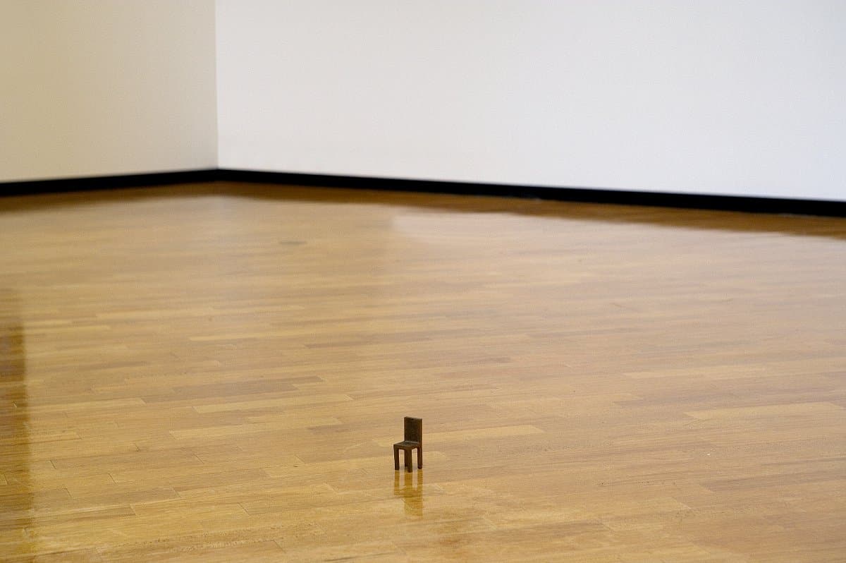
Joel Shapiro
Learn moreUntitled (chair) 1974
© Joel Shapiro. ARS/Copyright Agency Purchased 1974
More detail | PermalinkJoel Shapiro’s Untitled (chair) 1974 and Robert Wilson’s Freud hanging chair 1977 both exhibit the familiar features of a chair. Yet they, along with Wilson’s Nijinsky hanging table 1977[i], critique their respective forms through the implausibility of functioning as items of furniture. These works, moreover, create a theatrical presence in the gallery. Shapiro’s minute object (only 7.9 cm tall) and Wilson’s hanging sculptures commandeer the spaces they inhabit while challenging viewers’ expectations and responses.
Shapiro’s work is critical of, and dependent on, the relationship between the spectator, the work of art and the context of display space. The placement of Untitled (chair) directly onto the gallery floor is crucial for the desired effect, without the usual barriers, plinths or ropes that separate the audience and work in a gallery. At first the object is easily overlooked or swamped by the surrounding expanse of floor, at odds with the usual points of reference—the height of the human figure and the size of an ordinary chair. A perceptual paradox is established whereby the diminutive size of the work enforces a physical distance, yet for the spectator there is an inherent familiarity with the object that allows it to defiantly occupy the shared space. As Shapiro explained:
Our bodies and our experience become condensed. The chair evokes physical memory … there was no need to make it any bigger. The scale of a piece is its viability in that size, not the size itself. Viability has to do with the fact that it functions as a sculpture.[ii]
[i] Wilson’s Freud hanging chair 1977 and ‘companion’ Nijinsky hanging table 1977 were both issued in edition by Multiples Inc and exhibited in Further furniture at Marian Goodman Gallery, New York in 1980.
[ii] Joel Shapiro, interviewed by Richard Marshall, May 1982, in ‘Commentaries’, Joel Shapiro, Whitney Museum of American Art, New York, 1982, p 96.

Donald Judd
Learn moreUntitled 1974
© Donald Judd. VAGA/Copyright Agency Purchased 1975
More detail | PermalinkDonald Judd’s sculpture Untitled 1974 comprises six box units of highly-polished brass, fabricated to the artist’s specifications by Berstein Brothers in Long Island City, New York. The box is one of Judd’s most used forms, either closed, semi-hollow or transparent. His first ‘stack’ dates from 1965 but he continued to develop this form throughout his career. Vertically, the stacks usually consist of 10 units, alternating solids and voids of equal size, attached to the wall in a precisely-ordered configuration; fewer are used if the given space has a low ceiling. When free-standing, Judd intended his boxes to be placed directly on the ground, refuting the base or plinth of traditional sculpture. Whether mounted in a vertical or horizontal progression of uniform visual rhythms, or placed in a straight line across a surface, his boxes present as neutral while making subtle reference to their surrounds.
Judd’s works embody seriality, either as repetition of a standard unit or a simple mathematical progression. Developing his style in New York in the 1950s and 60s, he overcame a conflict between two- and three-dimensional form by including relief objects in painting, and it was these early experiments that encouraged the evolution of his box sculptures. Judd credited this development in his work to Jackson Pollock, who realised the element of the self-contained unit in different manifestations. Polarisation emerges from the conjunction of two dissimilar materials or colours, the opulence of the polished surface and the extreme restraint of the form, the enclosed volume and open interiors or the negative space between objects. The formality of Judd’s ‘specific objects’ reduces the viewer to accepting the pieces as units in which measurements and even rhythms, as well as surface, are the instruments of his language.[1] In Untitled the large size of the boxes is as important as their number and spacing.
Like so many of his generation, Judd ignored traditional craft skills in deference to an overriding system or idea. In order to obtain a perfect finish without having to rework the material, he had his works made in a factory. His favoured metals were painted steel, aluminium or galvanised iron, sometimes in combination with another industrial material, perspex. Subsequently he used unpolished laminated wood and, for his outdoor sculptures, concrete. In all his work Judd exploits the properties of his materials: the effect of the brass in Untitled is to reflect and project the setting into which the sculpture has been placed. In isolation, the six boxes merge into the floor space of a gallery; surrounded by people, the sculpture becomes irresistibly attractive to visitors―a factor that means that the surface of the work must be constantly maintained and is vulnerable to damage by touch.
Lucina Ward
[1] Judd’s equally influential work as a theoretician, especially his ideas about the nature of objects, seriality and minimalism, were first elaborated in his article, ‘Specific Objects’, published in Contemporary Sculpture: Arts Yearbook 8, The Art Digest, New York, 1965, pp 74–82.

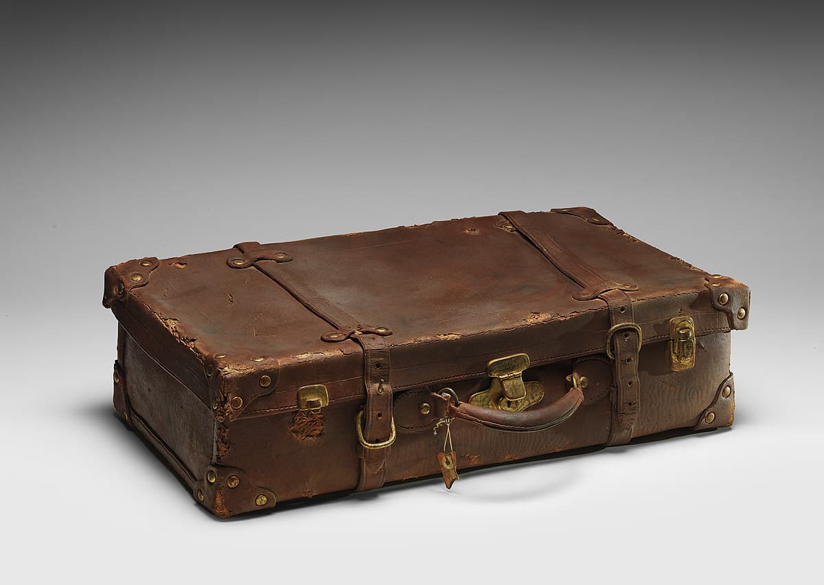
Marilyn Levine
Learn moreWaldo suitcase 1975
Purchased 1975
More detail | PermalinkMarilyn Levine’s clay sculptures, which persuasively imitate the appearance of leather objects in a super-realist style, brought her prominence in the 1970s. Her training as a scientist—she earnt a Master’s degree in Chemistry from the University of Alberta, Edmonton—informs her practice as an artist. She extends the possibilities of her material, manipulating clay to imitate other substances; the colours and textures are so accurate it is almost impossible to distinguish her works from the items they depict. Levine’s interest in metonymical objects—bags, jackets, belts and boots that stand in for an absent body—is ambiguous: ‘My work neither ignores human subject matter nor deals with it directly. Rather there is an implication of human absence which I like better.’[1]
Waldo’s suitcase, Johnston satchel and Sole leather (all 1975) are depicted with a minute, almost impersonal, exactitude. The objects are stained and partially glazed ceramic, modelled by hand, without the assistance of casting techniques. Levine achieves startling textural facsimiles, exploiting the qualities of clay and making works that are clever, witty and masterfully crafted.[2] There are holes, missing or damaged fittings, and handles shiny with human touch. Creases, folds and scratches record the object’s use over time, recalling the body and its presence.[3] The artist explained the attraction of leather:
more than any other material, it forms a record of its own history. It develops permanent wrinkles, it takes on the shape of the wearer, it records areas of abrasion and it records areas of soil. It therefore becomes an expression of time.[4]
In reproducing the appearance of worn rather than new leather objects, emphasising the scuffs and abrasions caused by everyday usage and wear, Levine creates a representation of human experience and activity.
Some of Levine’s works were inspired by items she was given by various family and friends. Waldo’s suitcase, for example, is probably titled after the artist’s younger brother, Robert Waldo Hayes.[5] As Maija Bismanis points out, by adding names to her titles, Levine’s works become ambiguously biographical.[6] We may be led to wonder how Waldo came to own this case. Where did Waldo travel with it and what was carried within? How did he lose the lower section of the brass clasp and what happened to the missing strap carrier? The commonality of human experiences, the act of owning and using objects, invites broader autobiographical readings.
The illusion of reality, and an inordinate attention to detail in Levine’s work, paradoxically creates an unreality that makes viewers question their own perceptions. The artist pushes us to examine these objects, not for their use, but for their form, texture and presence in reality. They in turn challenge us and bring about a heightened awareness of recorded history and experience.
Laura Webster and Robert Bell
[1] Levine, Norman Mackenzie Art Gallery, Regina, 1974, p 6.
[2] See Carol Donnell-Kotrozo, ‘Material illusions’, Journal of Aesthetics and Art Criticism, vol. 42, no. 3, March 1984, pp 277–82.
[3] Maija Bismanis, ‘Some fragmented thoughts about clay …’, in Marilyn Levine: A retrospective, Mackenzie Art Gallery, Regina, 1998, pp 11–25, at p 24.
[4] Levine, p 7.
[5] Waldo was Levine’s mother’s maiden name. Several other works of the period are associated with individuals, including Sid’s suitcase 1972 (Virginia Museum of Art, Richmond), John’s Mountie boots 1973 (Mackenzie Art Gallery, University of Regina collection) and Dufour backpack 1973 (then collection of the artist); the final work, as Gary Dufour advises, was based on his bag when he was Levine’s studio assistant in Regina; see NGA file 75/2610, folio139; see also http://www.marilynlevine.com/index.html, accessed 5 April 2018.
[6] Marilyn Levine, p 24.
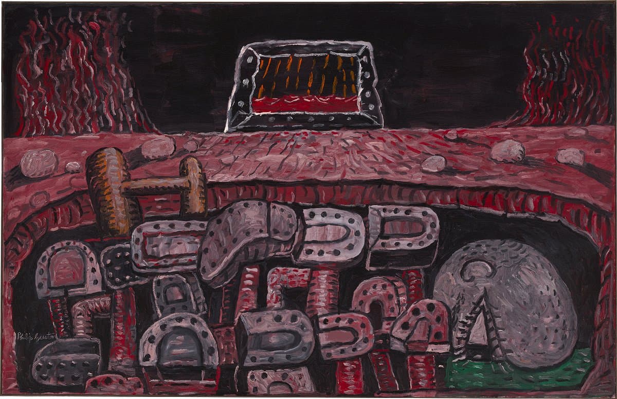
Philip Guston
Learn morePit 1976
Purchased 1980
More detail | PermalinkCommenting on his return to figurative painting, Guston explained that after his show at the Jewish Museum in 1966, which included paintings such as Prospects 1964, he knew that wanted to deal with ‘concrete objects’. As he further explained, the visible world is ‘abstract and mysterious enough [and] I don’t think one needs to depart from it in order to make art’.[i] Although initially disparaged by critics, Guston’s late works can be seen as a precursor to the revival of expressive figurative painting in the 1980s and are now often considered his most significant contribution to twentieth-century American art. The hooded characters gradually dispersed, replaced by, as Dore Ashton observed, a disembodied ‘naked eye’, which, along with images of a hand holding a cigarette or paintbrush, are the clearest statements of the artist’s ‘self’.[ii]
Pit 1976 features this ‘naked eye’ and is one of Guston’s most powerful paintings from the mid 1970s. The work negotiates dualities through a complex layering of images and metaphors, implying that for any artist, his or her dedication to art is analogous to that of a religious belief. In Pit, the viewer’s eye is drawn toward a painting within the painting in the upper centre of the work, depicting orange rain and red water, from which a ‘light’ is emitted that parts the elemental sea of flames. In the gaping abyss below the barren surface, Guston’s ‘naked eye’ is drawn down with the tangled web of dismembered legs, which acts as a powerful metaphor for society.
The painting draws together parallel concerns of his late work, exposing his private world, a solitary existence in his studio at Woodstock, New York, to the wider social and political events impacting upon America through the 1960s and 70s. As Guston conceded:
So when the 1960s came along I was feeling split, schizophrenic. The war, what was happening to America, the brutality of the world. What kind of man am I, sitting at home, reading magazines, going into a frustrated fury about everything―and then going into my studio to adjust a red to a blue … I thought there must be some way I could do something about it.[iii]
A later drawing, Key 1980, made in the months before his death from a heart attack, captures some of this sentiment: the painter works on a canvas with his back turned on a scene of jumbled, degraded humanity. Key employs similar iconography to Pit and other works of this period, in the hellish piles of rubbish and disembodied limbs, and shares an ambiguity that defies attempts to pin down a clear interpretation of the composition.
Both Pit and Key seem to reject many of the tenets underpinning Guston’s Abstract Expressionist work of the 1950s as well as the rhetoric surrounding Modernism. By acknowledging that the artist is tied to, and therefore must engage with, the wider community, Guston vindicates the radical shift of his work and the incisive social commentary that surfaces in his late figurative paintings.
Michael Lloyd and Michael Desmond[iv]
[i] Philip Guston, quoted in McKee, pp 54–5.
[ii] Dore Ashton, Yes, but … a critical study of Philip Guston, The Viking Press, New York, 1976, p 173.
[iii] Philip Guston, quoted in Jerry Talmer, ‘”Creation” is for beauty parlors’, New York Post, 9 April 1977, reproduced in Robert Storr, Philip Guston, Abbeville Press, New York, 1986, p 53.
[iv] Adapted and updated from Michael Lloyd and Michael Desmond, European and American Paintings and Sculptures 1870–1970 in the Australian National Gallery, Australian National Gallery, Canberra, 1992 by Steven Tonkin.
David Gilhooly
Learn moreMao Tse Toad II 1976
Purchased 1978
More detail | PermalinkDavid Gilhooly was a leading figure in the San Francisco Bay area Funk movement of the mid 1960s and instrumental in establishing ceramics as a significant medium in contemporary art of the period. The son of a veterinarian, he initially enrolled in biology at the University of California, Davis, before switching to anthropology, and finally ceramics. These experiences informed his whimsical and irreverent animal ceramics. Gilhooly challenged the seriousness of the art world, parodying ancient civilisations, religion, politics and culture through the absurd imagery of his alternative universe known as FrogWorld. His work investigates notions of nationalism and the hero worship of historic figures though monuments and sculpture.
If you make things out of clay, and if you are interested in the history of clay, art, or even just the world, it is hard to escape doing a bust of a hero. You’re worshipping him and, at the same time, controlling him by cutting off at the chest and mounting him on a base.[i]
These works, including Mao Tse Toad II 1976, reflect history while also seeking to reimagine it by reworking it in clay.
Simeran Maxwell
[i] David Gilhooly, quoted in Kenneth Baker, David Gilhooly, John Natsoulas Press, Davis, 1992, p 29.

David Gilhooly
Learn moreTurned on by confiscated erotic moose pottery 1976
Purchased 1978
More detail | PermalinkDavid Gilhooly was a leading figure in the San Francisco Bay area Funk movement of the mid 1960s and instrumental in establishing ceramics as a significant medium in contemporary art of the period. The son of a veterinarian, he initially enrolled in biology at the University of California, Davis, before switching to anthropology, and finally ceramics. These experiences informed his whimsical and irreverent animal ceramics. Gilhooly challenged the seriousness of the art world, parodying ancient civilisations, religion, politics and culture through the absurd imagery of his alternative universe known as FrogWorld. His work investigates notions of nationalism and the hero worship of historic figures though monuments and sculpture.
Turned on by confiscated erotic moose pottery 1977 shows a frog wearing the distinctive flaming red jacket and hat of the Royal Canadian Mounted Police seated at one end of a dug-out canoe being paddled feverishly by a beaver, surrounded by Native American pots. This work also sits within a group of Gilhooly’s ceramics that explore arks: ‘I find the image of arks compelling; this container, sea going, and filled with lots of wonderful small things.’[i] These vessels take a number of forms—from Native American canoes and Christian arks, to more ubiquitous vessels such as bath tubs, coffins and wheelbarrows. Gilhooly liked the possibilities of hoarding and filling that an ark presented, as seen with the erotic moose pottery surrounding the Mountie.
Simeran Maxwell
[i] Gilhooly in Baker, p 43.
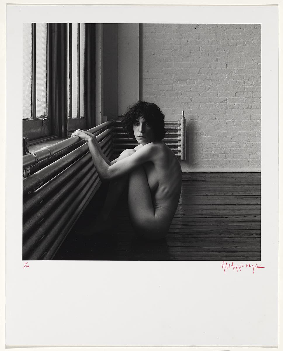
Robert Mapplethorpe
Learn morePatti Smith 1976
© Robert Mapplethorpe Estate Purchased 1980
More detail | PermalinkDuring the late 1960s, Robert Mapplethorpe made jewellery as well as boxed assemblages and collages that often featured found images, usually pornographic or religious. Around 1971, he started using his own photographs, taken with a Polaroid camera. While he never intended to become a photographer, the medium’s relative immediacy and expediency suited his disposition.[i] His first solo exhibition at New York’s prestigious Light Gallery featured Polaroids of flowers, portraits and erotic scenes. From the start, Mapplethorpe worked across a range of subjects: flower, penis and portrait were considered by him to be, formally at least, ‘the same’, with the same photographic temperament.[ii]
Mapplethorpe’s most significant work was made during the 1970s and early 80s, and his photographs engaged a very singular, direct mode with little in the way of secondary or extraneous information. The frontalism, integral to his style, brought together the flatness of his assemblages and Christian icons and the approach of American documentary photography, notably that of Walker Evans. The significance of this work, however, arises not so much from its formalism or classicism, but from the sense of intimacy that is folded into each picture. Mapplethorpe spoke about the photographic moment for him being imbued with the characteristics of a fleeting, intimate encounter, even if before or after the event there was no emotional connection: ‘I think you have to love when you are taking pictures,’ he said.[iii]
Shaune Lakin
[i] Robert Mapplethorpe, interview with Janet Kardon, in Janet Kardon (ed), Robert Mapplethorpe: The perfect moment, Institute of Contemporary Art University of Pennsylvania, Philadelphia, 1988, p 23.
[ii] As above, p 25.
[iii] As above, p 26.
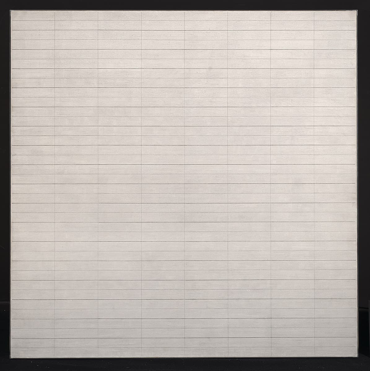
Agnes Martin
Learn moreUntitled # 4 1977
© Agnes Martin. ARS/Copyright Agency Purchased 1977
More detail | PermalinkIn the late 1950s, after painting portraits, still lifes and landscapes and teaching in Oregon and New Mexico, Agnes Martin began to produce paintings in highly simplified geometric forms. Her work became progressively more symmetrical and culminated in an ‘intense fixation on grids’, which became Martin’s signature.[1]
Untitled #4 1977 is an almost two-metre square canvas covered in gesso and an uneven ink wash. Over this surface Martin has drawn a series of vertical and horizontal pencil lines parallel with the edges of the painting, which form a geometric grid pattern. However, the work has few of the logical, machine-like elements of a regular matrix. On close inspection the hand-drawn pencil marks are uneven and their thickness varies considerably. We witness the record left by the pencil as it was dragged across the surface, including the jumps that occurred as the instrument encountered the small irregularities of the fibre and gesso. As the artist commented:
I’ve been doing these grids for years, but I never thought ‘Structure’. Structure is not the process of composition. Why, even musical compositions, which are very formally structured, are not about structure.[2]
The artist wants us to see the specific character of the painting’s composition, which is not an abstract system but rather a series of individual, drawn, lines. While the horizontal and vertical orientation of the lines in Martin’s work echo the edges of the canvas boundary and draw attention to the painting’s quadrangular format, she deliberately works against the physical properties of the canvas shape:
My formats are square, but the grids never are absolutely square; they are rectangles, a little bit off the square, making a sort of contradiction, a dissonance … When I cover the square surface with rectangles, it lightens the weight of the square, destroys its power.[3]
The strong impact of the overall square format is therefore diminished by Martin’s rectangular composition. Adding to this sense of ‘lightness’ is the fact that the pencil lines do not go all the way to the edge of the canvas. This prevents the composition from being locked down to the edges of the picture; the entire pattern of lines appears to float slightly off the canvas surface.
No portion of the canvas has been privileged over another. In his drip paintings of the early 1950s Jackson Pollock laid down paint skeins in every area of the canvas producing an ‘all-over’ composition. Similarly, Martin’s lines cover almost the entire canvas. As we stand before it, our focus wanders about, seeking in vain something to latch on to. Discussing one of her ‘grid’ works, Martin noted: ‘it’s not empty, but … nobody thinks of space or shapes or anything like that.’[4] If we persevere, groupings of rectangles do emerge momentarily as forms, but they soon dissolve. Longer contemplation induces the eye to relax focus and we ultimately abandon the attempt to see any concrete form. Just as Martin forces us to discard the usual connotations of the concept ‘grid’, we are also compelled to surrender our normal expectations of viewing a picture, of finding a figure or a form that would bring our immediate experience of the work to a conclusion.
Anthony White
[1] John Gruen, ‘Agnes Martin: “Everything, everything is about feeling … feeling and recognition”’, ArtNews, vol 75, no 7, September 1976, p 92, see http://www.artnews.com/2015/07/31/what-we-make-is-what-we-feel-agnes-martin-on-her-meditative-practice-in-1976/, accessed 2 March 2018.
[2] As above, p 94.
[3] Dieter Schwarz (ed), Writings, by Agnes Martin. Cantz, Ostfildern, 1991, p 29.
[4] Kate Horsfield, ‘On art and artists: Agnes Martin’, Profile 1, March 1981, p 7.
[Office1]I’ve added in an intro here as this is the earliest of Agnes Martin’s three works

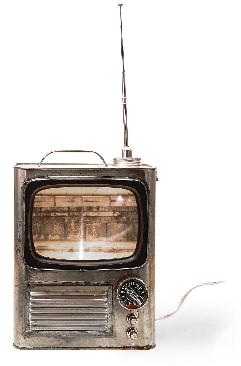
Edward Kienholz
Learn moreThe Opti-can royale 1977
© Nancy Reddin Kienholz Purchased 1978
More detail | PermalinkAfter an early itinerant lifestyle, Edward Kienholz became a somewhat notorious figure within the West Coast art scene of the 1960s, particularly following the public outrage surrounding his now-classic sculpture Back seat Dodge ’38 1964[1], which the Los Angeles County Board of Supervisors tried to ban from exhibition at the Los Angeles County Museum of Art in 1966. Kienholz’s early work, and that undertaken in collaboration with his wife Nancy Reddin Kienholz from 1972 onwards, consists of assemblages of ‘found’ objects, transformed into art objects, installations and environmental ‘rooms’ or tableaux. These offer an incisive critique of American society, notably The portable War Memorial 1968[2], with its vivid antiwar sentiment realised at the height of the American involvement in Vietnam through a large tableau depicting flag-raising soldiers, a hotdog stand and a memorial plaque among other things both poignant and absurd.
During the late 1970s and 80s and beginning with the trio of works, The billionaire deluxe, The opti-can royale and The econo-can (all 1977), Kienholz produced a number of multiples and ‘unique’ sculptures published by Gemini GEL in Los Angeles. Their domestic scale establishes parallels between the art object and its commercial source, the television set, one of the twentieth century’s ubiquitous inventions. It is a subject that consistently appears in Kienholz’s oeuvre as an element within his tableaux, as for example the central focus of the living room in The eleventh hour final 1968, or as a single art object, with early examples being Instant on 1964 and Cement TV 1969.[3] As Robert Hughes so eloquently observed, ‘To Kienholz, the TV set was both America’s anus and its oracle’,[4] spouting shit and salvation.
Although The billionaire deluxe, The opti-can royale and The econo-can form a modest representation of Kienholz’s art, they do characterise the social and political comment that pervades the artist’s work. There is a metamorphosis of ‘found’ materials into the final object, yet Kienholz does not disguise their origins. The tin can was, presumably, initially used to store engine oil, perhaps then recycled to carry spare fuel, which alludes to the energy and industrial foundations driving the might of the US economy―the reason for many international conflicts. As a group of objects they also present a comment on American society, a class system built on economic wealth, from the deluxe model, an electronic second counter ‘timing’ the increasing proportion of wealth held by the privileged minority, down to The econo-can, its blank screen a metaphor for not being ‘plugged-in’ to postwar economic prosperity and the elusive American dream, as seen on TV.
Steven Tonkin
[1] Los Angeles County Museum of Art.
[2] Museum Ludwig, Cologne.
[3] The eleventh hour final 1968, private collection; Instant on 1964, Betty and Monte Factor Family Collection; Cement TV 1969, Collection of Nancy Reddin Kienholz.
[4] Robert Hughes, American visions: The epic history of art in America, Harvill Press, London, 1997, p 607.
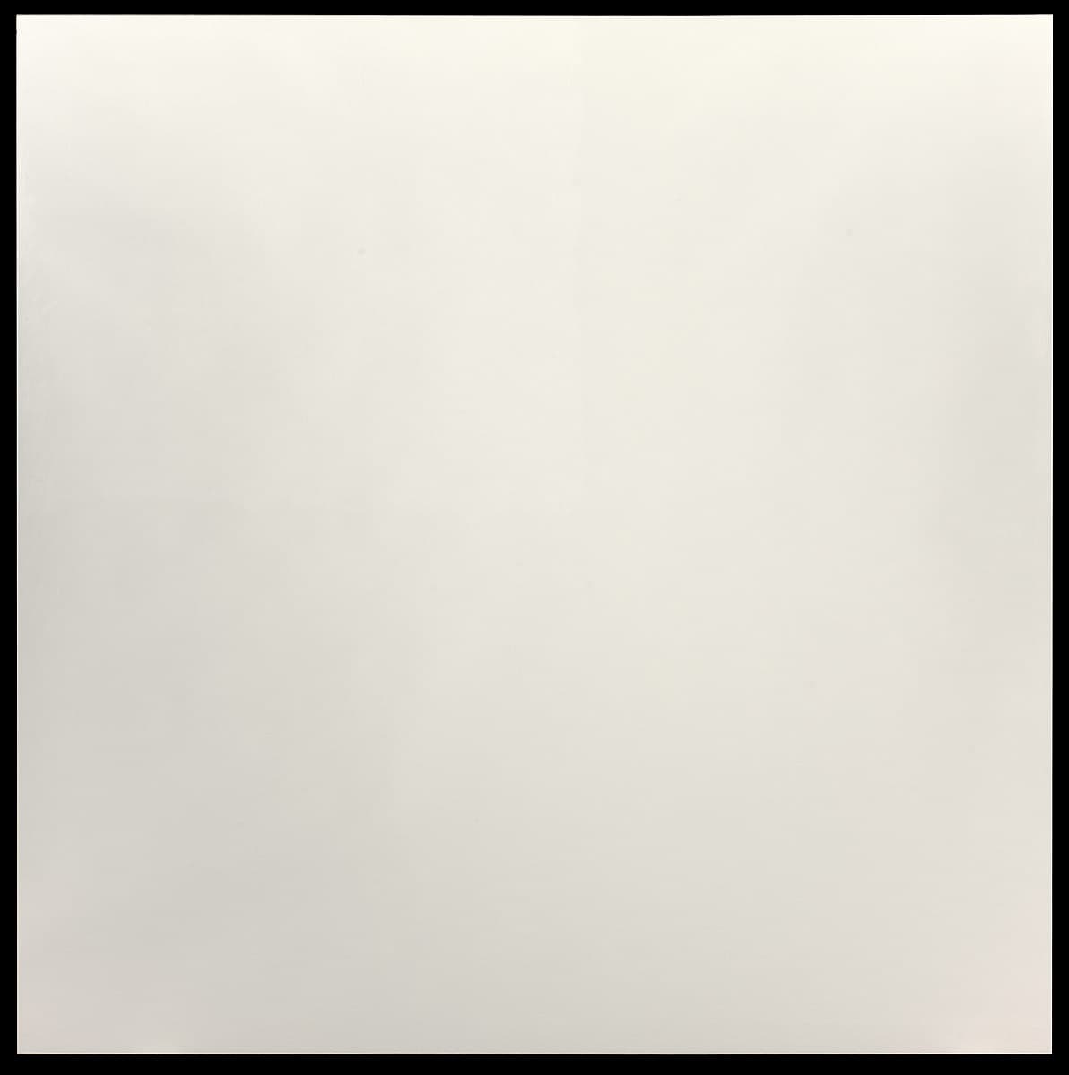
Robert Ryman
Learn moreArena 1977
Purchased 1978
More detail | PermalinkAs well as being concerned with ‘how to paint’, Robert Ryman also defines his ambition as ‘to paint the paint’.[1] From his initial attempts to understand the act of painting in the mid 1950s, his work has continued to be defined by his attention to surface and space. ‘The basic problem is what to do with the paint. What is done with the paint is the essence of all painting.’[2] Ryman restricts himself to the fundamentals of painting, a square format and one colour, and for this reason is free to concentrate on manipulating scale and texture. He makes use of a range of media, and all sorts of supports. Looking at a mural of about 300 photographs of Ryman’s paintings since the 1950s in the artist’s studio, Robert Storr detected no obvious succession of technique or variance in his work. Storr noted that Ryman’s preoccupation with the act of making a painting has produced ‘an ever-increasing number of similarly concise statements about what paint can do’. The work ‘hasn’t progressed so much as elaborated itself under the artist’s close watch’.[3]
It is the physical presence of the paint on a surface, and the relation between the canvas (or support) and the wall, that interests Ryman. Influenced by Mark Rothko’s approach to the canvas as object―rather than a conventionally flat screen onto which the artist places lights or shapes or marks―Ryman paints around the edge of the stretcher and presents his work as unframed. By severely limiting the palette and format of his work, the artist stresses the absolute importance of the application of pigment to surface. Ryman’s is a highly refined examination of the optical and material properties of the discipline of painting. Subtle variations in surface, brushwork and materials heighten the viewer’s sensitivity. His ‘whites’ may be crusty or suave, opaque or sheer, as warm as fresh cream or as cool as ceramic tiles. Arena 1977 is characterised by an extremely depersonalised and evenly-painted surface. The artist has used an air-drying polyurethane coating material, varathane, which imparts sheen to the wax-like surface. In the late 1970s he produced relatively few paintings, but these were undergoing immense development, and he later gradually returned to a more spontaneous style.
In 1976 Ryman introduced visible custom-made fasteners to connect his paintings directly to the wall. Appearing for the first time on his pastel drawings on plexiglass, these fasteners are in some respects a further development of the adhesive strips of 1968, but without their practical purpose. The devices are designed by the artist and have both functional and compositional roles, taking into account scale and shape, colour and light reflectiveness; some are steel, some cadmium and others black oxide.[4] With Arena the fasteners serve to angle the work so it appears larger and seems to intrude into the viewer’s space. Ryman steadily and increasingly varied the possibilities, and until 1980 no paintings were made without fasteners. Pictorial complexity, as Alfred Pacquement points out, is achieved with an ‘extremely restricted vocabulary’.[5]
Lucina Ward
[1] Ryman, statements 1969 and 1979, in Art in process: the visual development of a collage, Finch College Museum of Art, New York, 1967 and interview with Barbaralee Diamonstein in Inside New York’s art world, Rizzoli, New York, 1979, p 332, quoted in Robert Storr, Robert Ryman, Tate Gallery, London, 1993, p 18.
[2] Robert Ryman, Stedelijk Museum, Amsterdam, 1974, quoted in Robert Ryman, Dia Art Foundation, New York, 1988, p 24.
[3] Storr, pp 9–10.
[4] Embassy I 1976 is oil and acrylic on acrylic sheet. Ryman drilled into the plexiglass, using black oxide steel fasteners to attach it to the wall; Crex Collection, Hallen für neue Kunst, Schaffhausen. In another related work, Advance 1976―oil on blue Acrylivin with vinyl, Elvacite and sanded plexiglass fasteners with cadmium bolts―strips of plastic sheet strap the work to the wall, while providing a subtle framing device; Collection Franz Meyer.
[5] Alfred Pacquement, ‘Robert Ryman’ in Dr Judith Rodenbeck (ed), Grove Art Online, http://www.oxfordartonline.com/groveart, accessed 14 February 2018.

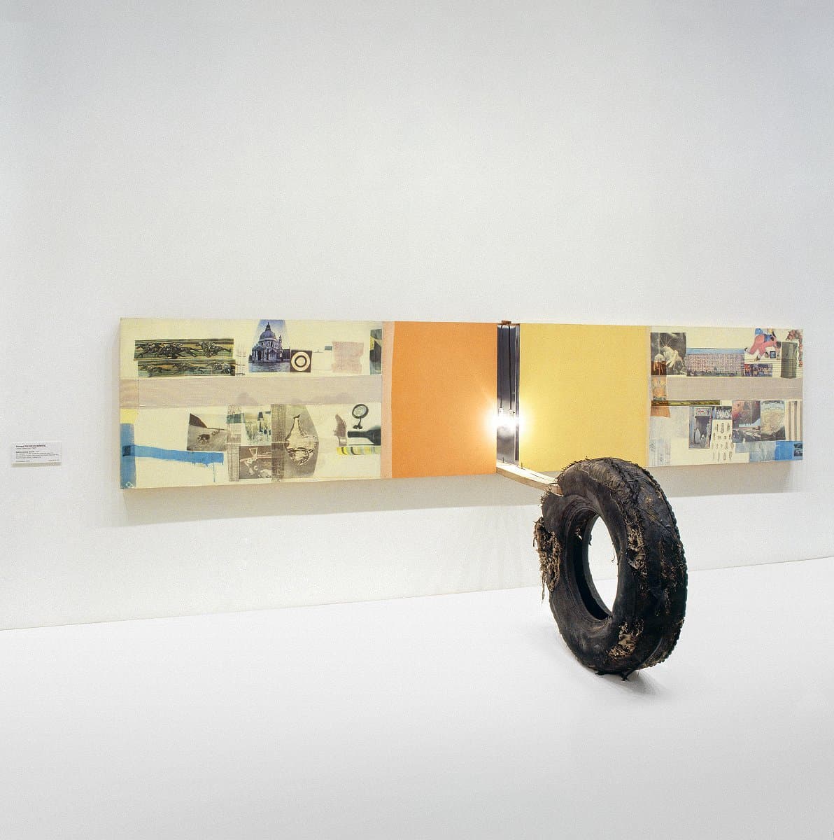
Robert Rauschenberg
Learn moreAlbino cactus (scale) 1977
© Robert Rauschenberg. VAGA/Copyright Agency Purchased 1978
More detail | PermalinkThroughout his career Robert Rauschenberg has experimented with various art forms. During the 1950s he designed windows for department stores while continuing to paint and experiment with blueprints. His early works included white paintings, black paintings and sculptures using materials such as wood, rocks and rope. In 1953 he produced his first Combines, in which found objects were incorporated into his paintings. From the 1960s he made experimental prints using lithography and screenprinting techniques. While his art is so diverse that it eludes categorisation in any movement, Rauschenberg provides a link between Abstract Expressionism and Pop art.
Albino cactus (scale) is one of a series of sculptures, Scale, produced by Rauschenberg between 1977 and 1981. He transferred images from magazines and newspapers, affixing them to large wood or foam-core panels, often with additional objects or electric lights attached. Following the direction indicated by Rodeo Palace 1975–76, a three-door collage, Rauschenberg produced several extensive summarising works, as if retracting to the spareness and nonchalance of the Jammers 1975–79, a series of large, bold fabric works. Joan Young proposes that this phase in his work draws on features from his earlier career such as the Combine paintings of the 1950s, perhaps prompted by the major retrospective of his work organised by the Smithsonian Institution, Washington DC, in 1976.[1] All the works in the Scale series assume a more sculptural form, some freestanding while others―such as Albino cactus―are mounted on the wall with larger objects protruding from their surfaces. The series recalls the use of found imagery in Rauschenberg’s screenprinted paintings and transfer drawings.
Albino cactus evokes the early Combines, uniting two- and three-dimensional objects. Tyres were also used in the early Combine works, and recur elsewhere in Rauschenberg’s oeuvre. The configuration of the tyre jutting from the coloured panels evokes life in the city, both in its human scale and because of the inclusion of such homely artefacts as a light bulb and bright fabrics. Between November 1976 and March 1977, Rauschenberg visited the exhibition Treasures of Tutankhamun at the National Gallery of Art, Washington DC, which he later acknowledged as having a significant impact on the Scale series:
I was so moved by it I was afraid I’d never be able to paint again―so I went to Florida and started right in … Seeing the Tut show was very close, for me, to the surprise of walking down a New York street … to me it was as foreign and titillating as walking in New York and seeing the changes―the marvelous catalogue of trash.[2]
While Rauschenberg intended found objects in his works to produce new and unlikely associations, he rejects allegorical interpretations. When looking at Albino cactus nonetheless, one can imagine walking or perhaps driving through New York City, with its collection of colour and trash being the beauty of the experience.
Madeleine McClelland
[1] Joan Young, ‘Large scale paintings and sculpture, 1975 to the present’, in Robert Rauschenberg: A retrospective, Guggenheim Museum, New York, 1998, p 392.
[2] As above, p 574.
Edward Kienholz
Learn moreThe econo-can 1977
© Nancy Reddin Kienholz Purchased 1978
More detail | PermalinkAfter an early itinerant lifestyle, Edward Kienholz became a somewhat notorious figure within the West Coast art scene of the 1960s, particularly following the public outrage surrounding his now-classic sculpture Back seat Dodge ’38 1964[1], which the Los Angeles County Board of Supervisors tried to ban from exhibition at the Los Angeles County Museum of Art in 1966. Kienholz’s early work, and that undertaken in collaboration with his wife Nancy Reddin Kienholz from 1972 onwards, consists of assemblages of ‘found’ objects, transformed into art objects, installations and environmental ‘rooms’ or tableaux. These offer an incisive critique of American society, notably The portable War Memorial 1968[2], with its vivid antiwar sentiment realised at the height of the American involvement in Vietnam through a large tableau depicting flag-raising soldiers, a hotdog stand and a memorial plaque among other things both poignant and absurd.
During the late 1970s and 80s and beginning with the trio of works, The billionaire deluxe, The opti-can royale and The econo-can (all 1977), Kienholz produced a number of multiples and ‘unique’ sculptures published by Gemini GEL in Los Angeles. Their domestic scale establishes parallels between the art object and its commercial source, the television set, one of the twentieth century’s ubiquitous inventions. It is a subject that consistently appears in Kienholz’s oeuvre as an element within his tableaux, as for example the central focus of the living room in The eleventh hour final 1968, or as a single art object, with early examples being Instant on 1964 and Cement TV 1969.[3] As Robert Hughes so eloquently observed, ‘To Kienholz, the TV set was both America’s anus and its oracle’,[4] spouting shit and salvation.
Although The billionaire deluxe, The opti-can royale and The econo-can form a modest representation of Kienholz’s art, they do characterise the social and political comment that pervades the artist’s work. There is a metamorphosis of ‘found’ materials into the final object, yet Kienholz does not disguise their origins. The tin can was, presumably, initially used to store engine oil, perhaps then recycled to carry spare fuel, which alludes to the energy and industrial foundations driving the might of the US economy―the reason for many international conflicts. As a group of objects they also present a comment on American society, a class system built on economic wealth, from the deluxe model, an electronic second counter ‘timing’ the increasing proportion of wealth held by the privileged minority, down to The econo-can, its blank screen a metaphor for not being ‘plugged-in’ to postwar economic prosperity and the elusive American dream, as seen on TV.
Steven Tonkin
[1] Los Angeles County Museum of Art.
[2] Museum Ludwig, Cologne.
[3] The eleventh hour final 1968, private collection; Instant on 1964, Betty and Monte Factor Family Collection; Cement TV 1969, Collection of Nancy Reddin Kienholz.
[4] Robert Hughes, American visions: The epic history of art in America, Harvill Press, London, 1997, p 607.

Edward Kienholz
Learn moreThe billionaire deluxe 1977
© Nancy Reddin Kienholz Purchased 1978
More detail | PermalinkAfter an early itinerant lifestyle, Edward Kienholz became a somewhat notorious figure within the West Coast art scene of the 1960s, particularly following the public outrage surrounding his now-classic sculpture Back seat Dodge ’38 1964[1], which the Los Angeles County Board of Supervisors tried to ban from exhibition at the Los Angeles County Museum of Art in 1966. Kienholz’s early work, and that undertaken in collaboration with his wife Nancy Reddin Kienholz from 1972 onwards, consists of assemblages of ‘found’ objects, transformed into art objects, installations and environmental ‘rooms’ or tableaux. These offer an incisive critique of American society, notably The portable War Memorial 1968[2], with its vivid antiwar sentiment realised at the height of the American involvement in Vietnam through a large tableau depicting flag-raising soldiers, a hotdog stand and a memorial plaque among other things both poignant and absurd.
During the late 1970s and 80s and beginning with the trio of works, The billionaire deluxe, The opti-can royale and The econo-can (all 1977), Kienholz produced a number of multiples and ‘unique’ sculptures published by Gemini GEL in Los Angeles. Their domestic scale establishes parallels between the art object and its commercial source, the television set, one of the twentieth century’s ubiquitous inventions. It is a subject that consistently appears in Kienholz’s oeuvre as an element within his tableaux, as for example the central focus of the living room in The eleventh hour final 1968, or as a single art object, with early examples being Instant on 1964 and Cement TV 1969.[3] As Robert Hughes so eloquently observed, ‘To Kienholz, the TV set was both America’s anus and its oracle’,[4] spouting shit and salvation.
Although The billionaire deluxe, The opti-can royale and The econo-can form a modest representation of Kienholz’s art, they do characterise the social and political comment that pervades the artist’s work. There is a metamorphosis of ‘found’ materials into the final object, yet Kienholz does not disguise their origins. The tin can was, presumably, initially used to store engine oil, perhaps then recycled to carry spare fuel, which alludes to the energy and industrial foundations driving the might of the US economy―the reason for many international conflicts. As a group of objects they also present a comment on American society, a class system built on economic wealth, from the deluxe model, an electronic second counter ‘timing’ the increasing proportion of wealth held by the privileged minority, down to The econo-can, its blank screen a metaphor for not being ‘plugged-in’ to postwar economic prosperity and the elusive American dream, as seen on TV.
Steven Tonkin
[1] Los Angeles County Museum of Art.
[2] Museum Ludwig, Cologne.
[3] The eleventh hour final 1968, private collection; Instant on 1964, Betty and Monte Factor Family Collection; Cement TV 1969, Collection of Nancy Reddin Kienholz.
[4] Robert Hughes, American visions: The epic history of art in America, Harvill Press, London, 1997, p 607.

Rosemarie Castoro
Learn more... trap 1977
1977 Rosemarie Castoro Purchased 1979
More detail | PermalinkRosemarie Castoro emerged in the mid 1960s as an abstract painter. Her move to sculpture a decade later was prompted by frustrations with the limitations of the canvas. A choreographer and dancer, she became concerned with expressing the physicality and energy of line beyond the two-dimensional plane, and explored many media: performance and the written word, painting, sculpture, Land art, audio-visual works and installations. Just as the artist’s long career and fluid movement between media defy categorisation, …trap 1977 defies confident interpretation, remaining as enigmatic as the ellipses in its title suggest.[1]
…trap consists of six single branches standing upright, arranged to form a small oval enclosure. Each branch varies in height, with the longest standing almost two metres high. The branches are tapered at the ends, like long canine teeth growing from the ground. Castoro’s evocative choice of title reflects the ambiguity of the work, prompting the audience to ponder what prey the trap is designed to catch. It is slightly larger than human size, with the effect that the viewer is drawn to step through the gaps, yet the enclosure is too small to contain a person and the gaps are too wide to trap anything smaller.
The artist started using natural materials in Georgia bush dance 1974. This temporary outdoor installation at Mount Berry, Georgia consisted of tree branches that metamorphosed into outstretched limbs and free-flowing bodies in a circular formation. Castoro explored the inherent expressive qualities of the branches as a way of capturing subtle shades of meaning. While Georgia bush dance consisted of a very large, loosely-populated ring of rough, twiggy branches that captured the freedom and ebullience of a traditional circle dance, the branches used in …trap have been carefully chosen, finished and positioned to create a deliberate, almost menacing air of separation.
Although never overt, Castoro’s art is sexually charged. Lucy Lippard described it as ‘too fast to be sensuous, too controlled to release all of its energy; it exists in a state of extremely structured tension’, and the artist herself saw her work as an extension of her own body.[2] Against this background, the question as to the type of trap the work evokes may be reconsidered: the title calls to mind the gynephobically-named Venus Flytrap and also relates the work to Beaver’s trap 1977–78,[3] a larger, square, variation on the theme, the title of which alludes to the meaning in Italian of the artist’s surname and is, of course, a euphemism for female genitalia.
Although Castoro did not characterise herself as a feminist, she was frustrated by the imbalance in recognition between male and female artists, as exemplified by an interaction she related to Art News in January 1971: ‘“Castoro, Castoro, I saw your paintings at Johnny’s. I liked them very much, I thought you were a boy.”’[4] While the title …trap may hint at her frustration in her professional life, and while her work in many ways is a manifestation of her own body, Castoro’s art, and her view of the world, was balanced, characterised in her journals as the masculine animus and feminine anima of Jungian psychology.[5]
Bronwyn Campbell[6]
[1] Michael Wardell, ‘Rosemarie Castoro’, in Landscape–Art: Two way reaction, Australian National Gallery, Canberra, 1980, p [7].
[2] Lucy R Lippard, ‘Rosemarie Castoro: Working out’, Artforum, vol 13, no 10, Summer 1975, p 60.
[3] Written to MACBA to find out who owns it – on display until 15 April – WAITING ON ARRIVAL OF CATALOGUE AT LIBRARY
[4] Rosemarie Castoro, ‘Artists Transgress All Boundaries’ from ‘Eight Artists Reply: Why There Have Been No Great Women Artists’, ArtNews, vol 69, January 1971, p 45.
[5] Artist’s journal entry, reprinted in exhibition catalogue, Rosemarie Castoro: Suspensions, Syracuse University Lubin House, New York, 1973.
[6] See also Angela Silk, ‘...trap’, unpublished manuscript, National Gallery of Australia, 2004.
Robert Wilson
Learn moreFreud hanging chair 1977
Courtesy RW Work Ltd. Purchased 1979
More detail | PermalinkEarly in his multi-faceted career Wilson began to produce sculptures based on the principal furniture props―most often chairs―from his performance and theatre works. The suspended chair has been a recurring motif in Wilson’s work since he designed his first chair for The life and times of Sigmund Freud in 1969.[i] Freud hanging chair and Nijinsky hanging table, whose titles identify the contradiction that precludes their usual role as furniture, are constructed from wire mesh that defines the outer shell of the pieces. The mesh also gives the works a perceptible airiness that complements their suspension in space, which allows a fine elongated shadow to be cast on the gallery wall. As Michael Desmond and Ahmad Mashadi note, Wilson employs installation strategies in displaying his work, treating objects and space as a totality:
Through lighting and wall colour, spaces are conditioned to accommodate and accentuate objects and their suggested meanings. The theatrical sensibility in his art negates the neutrality of gallery spaces, allowing intimations of an unscripted psychological play.[ii]
Freud hanging chair and Nijinsky hanging table are thus a material extension of Wilson’s theatre productions, a remnant of past performances, and objects which, by virtue of being artistic works and their placement within a gallery space, have their meaning shifted by their surrounds.
Steven Tonkin
[i] The life and times of Sigmund Freud? premiered in New York in 1969
[ii] Michael Desmond and Ahmad Mashadi, Love Hotel, National Gallery of Australia, Canberra, 1997, p [15].

Robert Wilson
Learn moreNijinsky hanging table -1977
Courtesy RW Work Ltd. Purchased 1979
More detail | PermalinkEarly in his multi-faceted career Wilson began to produce sculptures based on the principal furniture props―most often chairs―from his performance and theatre works. The suspended chair has been a recurring motif in Wilson’s work since he designed his first chair for The life and times of Sigmund Freud in 1969.[i] Freud hanging chair and Nijinsky hanging table, whose titles identify the contradiction that precludes their usual role as furniture, are constructed from wire mesh that defines the outer shell of the pieces. The mesh also gives the works a perceptible airiness that complements their suspension in space, which allows a fine elongated shadow to be cast on the gallery wall. As Michael Desmond and Ahmad Mashadi note, Wilson employs installation strategies in displaying his work, treating objects and space as a totality:
Through lighting and wall colour, spaces are conditioned to accommodate and accentuate objects and their suggested meanings. The theatrical sensibility in his art negates the neutrality of gallery spaces, allowing intimations of an unscripted psychological play.[ii]
Freud hanging chair and Nijinsky hanging table are thus a material extension of Wilson’s theatre productions, a remnant of past performances, and objects which, by virtue of being artistic works and their placement within a gallery space, have their meaning shifted by their surrounds.
Steven Tonkin
[i] The life and times of Sigmund Freud? premiered in New York in 1969
[ii] Michael Desmond and Ahmad Mashadi, Love Hotel, National Gallery of Australia, Canberra, 1997, p [15].


John Baldessari
Learn moreBlasted allegories (Colorful sentence): Arrange... Zone. Adjectival in imperative mood (Cool start / Yellow line / Warm ending) 1978
Purchased 1979
More detail | Permalink
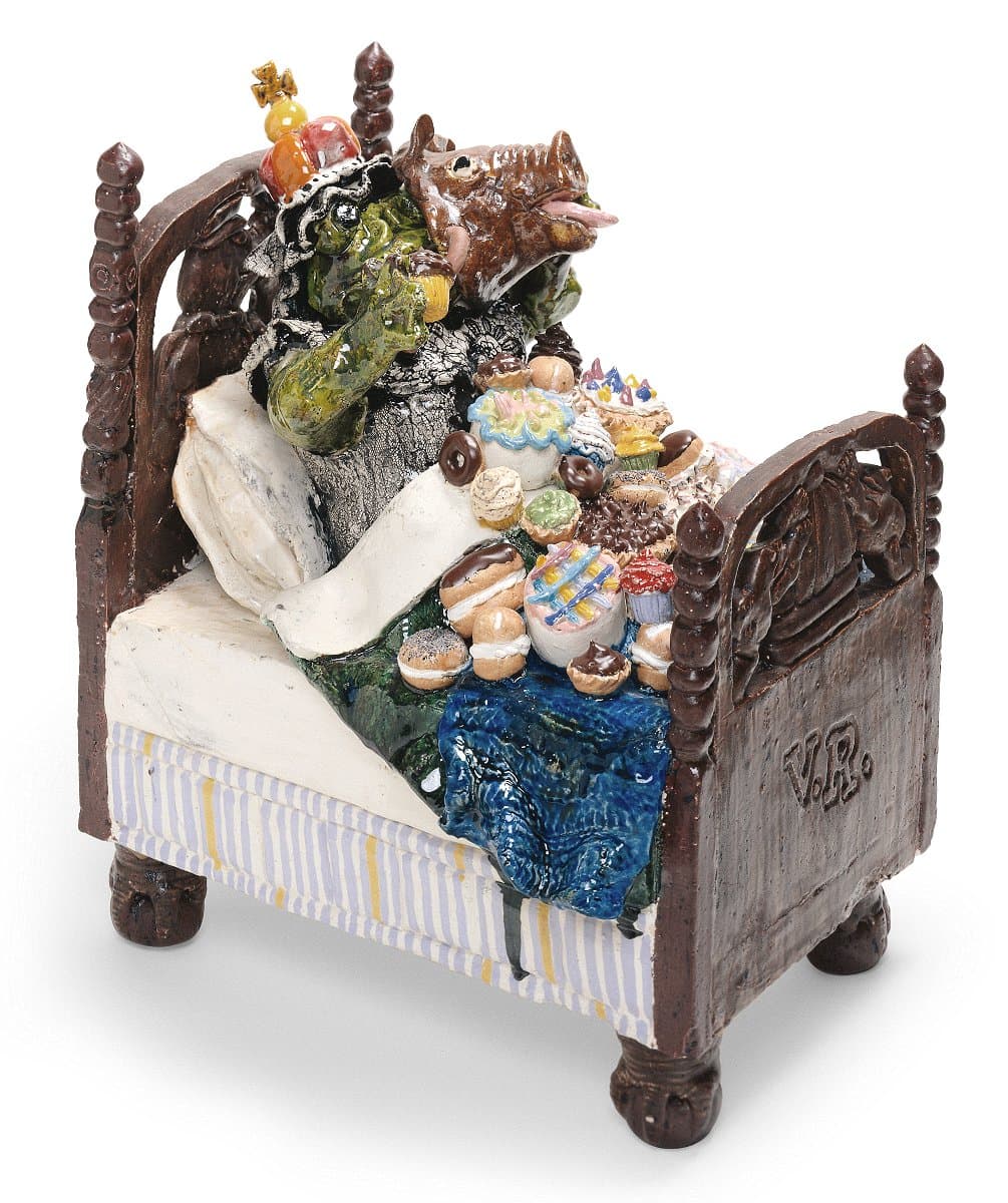
David Gilhooly
Learn moreVictoria's royal snack 1978
Purchased 1978
More detail | PermalinkDavid Gilhooly was a leading figure in the San Francisco Bay area Funk movement of the mid 1960s and instrumental in establishing ceramics as a significant medium in contemporary art of the period. The son of a veterinarian, he initially enrolled in biology at the University of California, Davis, before switching to anthropology, and finally ceramics. These experiences informed his whimsical and irreverent animal ceramics. Gilhooly challenged the seriousness of the art world, parodying ancient civilisations, religion, politics and culture through the absurd imagery of his alternative universe known as FrogWorld. His work investigates notions of nationalism and the hero worship of historic figures though monuments and sculpture.
If you make things out of clay, and if you are interested in the history of clay, art, or even just the world, it is hard to escape doing a bust of a hero. You’re worshipping him and, at the same time, controlling him by cutting off at the chest and mounting him on a base.[i]
These works reflect history while also seeking to reimagine it by reworking it in clay.
As well as contemporary figures like Chinese Communist leader Mao Tse Tung, Gilhooly explored ancient Egypt, Greece and Rome, and the early Christian church, covering both historical and religious ground at once. Queen Victoria featured significantly after his move to Canada in 1969, not only as a frog bust, but also in more playful works such as Victoria’s royal snack 1978, which sees the British monarch in bed surrounded by an assortment of food.
In both Two toad sloth 1978 and Victoria’s royal snack, Gilhooly fills brass beds with slovenly frogs and piles of food, another key theme from the early 1970s. Not unlike humans, frogs are gluttonous and risk overeating. By combining the two themes Gilhooly examines food as pleasure rather than simply a means of survival, a point reinforced by the quantity of food he includes in his sculptures.[ii]
Simeran Maxwell
[i] David Gilhooly, quoted in Kenneth Baker, David Gilhooly, John Natsoulas Press, Davis, 1992, p 29.
[ii] See also Laura Webster and Robert Bell, ‘David Gilhooly’, unpublished manuscript, NGA, 2002; Lucina Ward, ‘Art Current (1972–1984)’, in Pauline Green (ed), Building the Collection, National Gallery of Australia, Canberra, 2003, pp 140–63, at pp 156, 158; and Australian National Gallery Association News, May/June 1992, p 15.

Nan Goldin
Learn moreMark tattooing Mark, Boston 1978
© Nan Goldin, Courtesy Matthew Marks Gallery Purchased 1994
More detail | Permalink
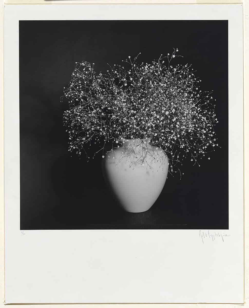
Robert Mapplethorpe
Learn moreBaby's breath. 1978
© Robert Mapplethorpe Estate Purchased 1980
More detail | PermalinkDuring the late 1960s, Robert Mapplethorpe made jewellery as well as boxed assemblages and collages that often featured found images, usually pornographic or religious. Around 1971, he started using his own photographs, taken with a Polaroid camera. While he never intended to become a photographer, the medium’s relative immediacy and expediency suited his disposition.[i] His first solo exhibition at New York’s prestigious Light Gallery featured Polaroids of flowers, portraits and erotic scenes. From the start, Mapplethorpe worked across a range of subjects: flower, penis and portrait were considered by him to be, formally at least, ‘the same’, with the same photographic temperament.[ii]
Mapplethorpe’s most significant work was made during the 1970s and early 80s, and his photographs engaged a very singular, direct mode with little in the way of secondary or extraneous information. The frontalism, integral to his style, brought together the flatness of his assemblages and Christian icons and the approach of American documentary photography, notably that of Walker Evans. The significance of this work, however, arises not so much from its formalism or classicism, but from the sense of intimacy that is folded into each picture. Mapplethorpe spoke about the photographic moment for him being imbued with the characteristics of a fleeting, intimate encounter, even if before or after the event there was no emotional connection: ‘I think you have to love when you are taking pictures,’ he said.[iii]
Shaune Lakin
[i] Robert Mapplethorpe, interview with Janet Kardon, in Janet Kardon (ed), Robert Mapplethorpe: The perfect moment, Institute of Contemporary Art University of Pennsylvania, Philadelphia, 1988, p 23.
[ii] As above, p 25.
[iii] As above, p 26.
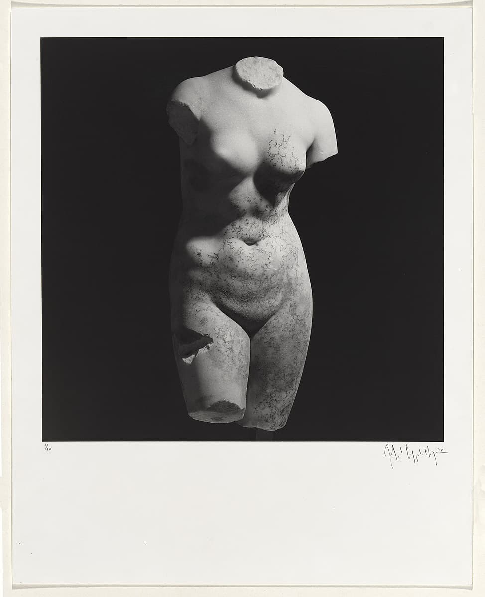
Robert Mapplethorpe
Learn moreFemale torso 1978
© Robert Mapplethorpe Estate Purchased 1980
More detail | PermalinkDuring the late 1960s, Robert Mapplethorpe made jewellery as well as boxed assemblages and collages that often featured found images, usually pornographic or religious. Around 1971, he started using his own photographs, taken with a Polaroid camera. While he never intended to become a photographer, the medium’s relative immediacy and expediency suited his disposition.[i] His first solo exhibition at New York’s prestigious Light Gallery featured Polaroids of flowers, portraits and erotic scenes. From the start, Mapplethorpe worked across a range of subjects: flower, penis and portrait were considered by him to be, formally at least, ‘the same’, with the same photographic temperament.[ii]
Mapplethorpe’s most significant work was made during the 1970s and early 80s, and his photographs engaged a very singular, direct mode with little in the way of secondary or extraneous information. The frontalism, integral to his style, brought together the flatness of his assemblages and Christian icons and the approach of American documentary photography, notably that of Walker Evans. The significance of this work, however, arises not so much from its formalism or classicism, but from the sense of intimacy that is folded into each picture. Mapplethorpe spoke about the photographic moment for him being imbued with the characteristics of a fleeting, intimate encounter, even if before or after the event there was no emotional connection: ‘I think you have to love when you are taking pictures,’ he said.[iii]
Shaune Lakin
[i] Robert Mapplethorpe, interview with Janet Kardon, in Janet Kardon (ed), Robert Mapplethorpe: The perfect moment, Institute of Contemporary Art University of Pennsylvania, Philadelphia, 1988, p 23.
[ii] As above, p 25.
[iii] As above, p 26.
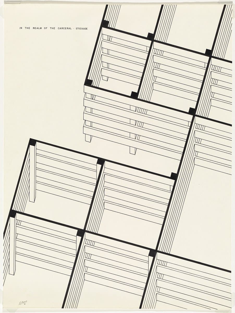
Robert Morris
Learn moreIn the realm of the carceral. Stockade 1978
Purchased 1980
More detail | PermalinkRobert Morris, one of the foremost American Minimalist artists, is best known for his geometric plywood sculptures. In December 1964, for his solo show at Green Gallery, New York, Morris exhibited a series of sculptures that were startlingly architectural in effect. Placed directly on the floor, across the corners of the space or suspended from the ceiling, these large, geometric, plywood forms were painted grey to have limited visual appeal and were, as Donald Judd commented at the time, ‘only barely present’.[1] Untitled (Corner beam), for example, was installed above a doorway and diagonally reached between two walls like a lintel, while Untitled (Corner piece) was set into the corner. These interconnected ‘units’ were, as Michael Desmond and Christine Dixon observe, ‘austere to the point of being aggressively abstract, and were plainly sculpture—architectural, yet distinct from architecture’.[2]
Two large drawings, part of a series of twelve and purchased at the time of Morris’ sculptures, indicate his broader interest in architectural issues. The use of axometric projection encourages the viewer to peer into the spaces and, perhaps, to question their purpose.[3] The ‘carceral’ of the title signals the artist’s concern with nexus between art and politics, a joining of formalism, mystical and historical allusion.[4] Further identified as a stockade and an ‘inmate work project’, Morris’ drawings are highly sculptural and, like Slab (platform) and Slab (cloud), seem to oscillate between two- and three-dimensions.
Lucina Ward
[1] Donald Judd, ‘Hartford,’ Arts Magazine 38, no 6, March 1964, and reprinted in Donald Judd: Complete writings 1959–1975, Press of the Novia Scotia College of Art and Design, Halifax, New York University Press, New York, 1975, p 117.
[2] Michael Desmond and Christine Dixon, 1968, National Gallery of Australia, Canberra, 1995, p 55.
[3] Morris’ use of carceral links his work to that of Michel Foucault: in Discipline and punish (1975), the French theorist's discussion of surveillance systems and their technologies includes the notion of a carceral archipelago or island prisons. A portfolio of ten etching and aquatints was issued by S & A Lithographic Plates, New York, in 1978-79.
[4] Stephen F Eisenmann, ‘The space of the self: Robert Morris, In the realm of the carceral’, Arts Magazine, September 1980, pp 104–109; see also Anaël Lejeune, ‘In the realm of the carceral. Robert Morris et le pouvoir disciplinaire,’ Marges vol 20, 2015, pp 29–43.
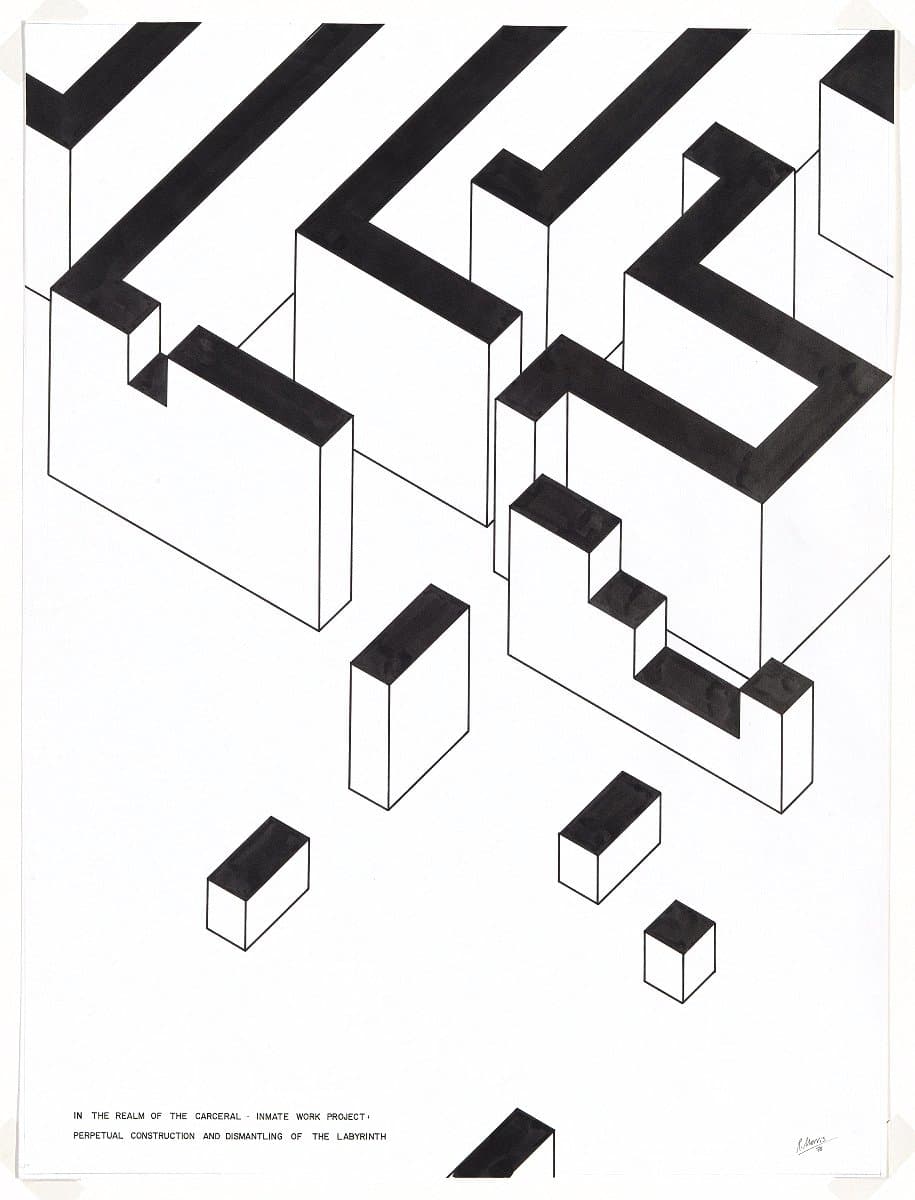
Robert Morris
Learn moreIn the realm of the carceral. Inmate work project: perpetual construction and dismantling of the labyrinth 1978
Purchased 1980
More detail | PermalinkRobert Morris, one of the foremost American Minimalist artists, is best known for his geometric plywood sculptures. In December 1964, for his solo show at Green Gallery, New York, Morris exhibited a series of sculptures that were startlingly architectural in effect. Placed directly on the floor, across the corners of the space or suspended from the ceiling, these large, geometric, plywood forms were painted grey to have limited visual appeal and were, as Donald Judd commented at the time, ‘only barely present’.[1] Untitled (Corner beam), for example, was installed above a doorway and diagonally reached between two walls like a lintel, while Untitled (Corner piece) was set into the corner. These interconnected ‘units’ were, as Michael Desmond and Christine Dixon observe, ‘austere to the point of being aggressively abstract, and were plainly sculpture—architectural, yet distinct from architecture’.[2]
Two large drawings, part of a series of twelve and purchased at the time of Morris’ sculptures, indicate his broader interest in architectural issues. The use of axometric projection encourages the viewer to peer into the spaces and, perhaps, to question their purpose.[3] The ‘carceral’ of the title signals the artist’s concern with nexus between art and politics, a joining of formalism, mystical and historical allusion.[4] Further identified as a stockade and an ‘inmate work project’, Morris’ drawings are highly sculptural and, like Slab (platform) and Slab (cloud), seem to oscillate between two- and three-dimensions.
Lucina Ward
[1] Donald Judd, ‘Hartford,’ Arts Magazine 38, no 6, March 1964, and reprinted in Donald Judd: Complete writings 1959–1975, Press of the Novia Scotia College of Art and Design, Halifax, New York University Press, New York, 1975, p 117.
[2] Michael Desmond and Christine Dixon, 1968, National Gallery of Australia, Canberra, 1995, p 55.
[3] Morris’ use of carceral links his work to that of Michel Foucault: in Discipline and punish (1975), the French theorist's discussion of surveillance systems and their technologies includes the notion of a carceral archipelago or island prisons. A portfolio of ten etching and aquatints was issued by S & A Lithographic Plates, New York, in 1978-79.
[4] Stephen F Eisenmann, ‘The space of the self: Robert Morris, In the realm of the carceral’, Arts Magazine, September 1980, pp 104–109; see also Anaël Lejeune, ‘In the realm of the carceral. Robert Morris et le pouvoir disciplinaire,’ Marges vol 20, 2015, pp 29–43.
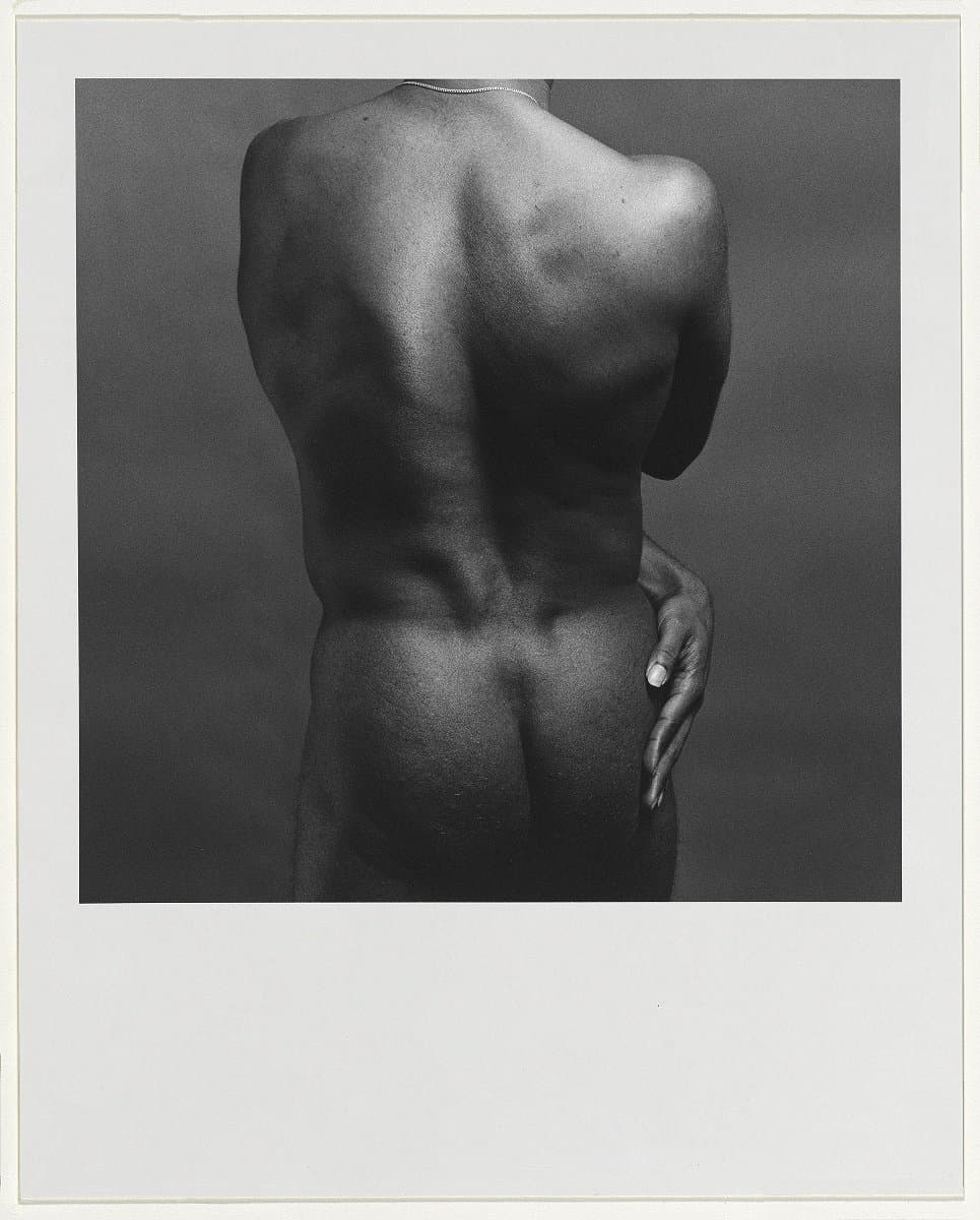
Robert Mapplethorpe
Learn moreGeorge Bussey, number 1 1979
© Robert Mapplethorpe Estate Purchased 1980
More detail | PermalinkDuring the late 1960s, Robert Mapplethorpe made jewellery as well as boxed assemblages and collages that often featured found images, usually pornographic or religious. Around 1971, he started using his own photographs, taken with a Polaroid camera. While he never intended to become a photographer, the medium’s relative immediacy and expediency suited his disposition.[i] His first solo exhibition at New York’s prestigious Light Gallery featured Polaroids of flowers, portraits and erotic scenes. From the start, Mapplethorpe worked across a range of subjects: flower, penis and portrait were considered by him to be, formally at least, ‘the same’, with the same photographic temperament.[ii]
Mapplethorpe’s most significant work was made during the 1970s and early 80s, and his photographs engaged a very singular, direct mode with little in the way of secondary or extraneous information. The frontalism, integral to his style, brought together the flatness of his assemblages and Christian icons and the approach of American documentary photography, notably that of Walker Evans. The significance of this work, however, arises not so much from its formalism or classicism, but from the sense of intimacy that is folded into each picture. Mapplethorpe spoke about the photographic moment for him being imbued with the characteristics of a fleeting, intimate encounter, even if before or after the event there was no emotional connection: ‘I think you have to love when you are taking pictures,’ he said.[iii]
Mapplethorpe’s pictures of intimacy and desire from the 1970s and early 80s serve an important social historical function in the history of gay male sexuality and the way it was represented, recording a relatively short-lived moment of sexual freedom for gay men, one that by the early 1980s was being subject to increased control and regulation following the first reports of men with AIDS.
Shaune Lakin
[i] Robert Mapplethorpe, interview with Janet Kardon, in Janet Kardon (ed), Robert Mapplethorpe: The perfect moment, Institute of Contemporary Art University of Pennsylvania, Philadelphia, 1988, p 23.
[ii] As above, p 25.
[iii] As above, p 26.
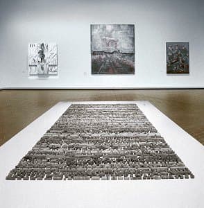
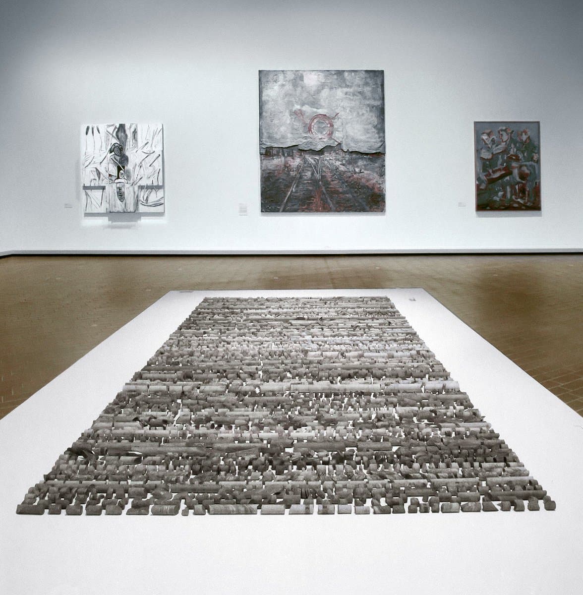
Alan Sonfist
Learn moreEarth monument to New York -1979
Purchased 1980
More detail | PermalinkAlan Sonfist is recognised as one of the leading figures of the Land art movement. Unlike the monumental ‘interventionist’ works by artists such as Robert Smithson, Sonfist’s approach is more concerned with minimal disruption of the natural environment: he is as much a conservationist or natural historian as a land or environmental artist. Indeed, this environmental consciousness is rooted in his childhood fascination with nature and, in particular, a hemlock forest in the South Bronx, New York, where Sonfist spent much of his youth.
Earth monument to New York 1979 is a work that presents a summation of two decades of the artist’s practice. Sonfist collected core samples of stratified stone that were drilled from between 1.5 and 40 metres below ground level in different locations across New York City. When installed, these core samples are laid out on the floor in a specified order, 109 rows in all, within a predefined rectangular ‘frame’. The order reflects the increasing depth from which they were extracted—the texture of the stone providing a gradation of millions of years of the earth’s history. While the work is a ‘monument’ to the specific earth strata beneath New York City, it nevertheless presents a universal statement of the minute duration of human civilisation in comparison to that of the earth upon which it is built.
The artist consciously blurs the boundaries between his own life and the manifestation of his work, seeing them as inextricably interconnected.[1] His autobiographical approach means that the dating does not indicate the time of production but rather a sequence towards realisation.[2] The NGA has dated Earth monument to New York according to the year it was first exhibited in its ‘completed’ form at Marian Goodman Gallery, New York, in 1979. The artist, on the other hand, sees all his work as dating from 1946, the year of his birth. He wanted his first solo exhibition in 1970 to be titled as a ‘retrospective’, indicating that even though it was his first exhibition recognised by the ‘art world’, it was nevertheless a compendium of his life and work up to that point. Sonfist previously dated Earth monument to New York from 1965—the year of its conceptual beginnings in the artist’s ‘land exchange’ between Macomb in Illinois and Levittown, Long Island, undertaken while he was a student at Western Illinois University in 1965. The artist also included parts, or fragments, of the earth core samples in Earth monument to New York in three exhibitions prior to its completion.
When asked by one commentator about the role of museums in preserving objects from changes wrought by time and the apparent conflict with the artist’s own preoccupation with time and change, Sonfist described how placement in a museum can make people look anew at familiar objects. His work therefore functions to highlight this intent: ‘I am trying to bring forth meaningful metaphors [to show] we are one of many internal structures that exist in nature, and this is something that people can observe and study.’[3]
Steven Tonkin
[1] Alan Sonfist, ‘Statement’, in ‘Alan Sonfist’, Flash Art, nos 50–51, December 1974–January 1975, p 46.
[2] Lawrence Alloway, ‘Introduction’, in Autobiography of Alan Sonfist, Herbert F Johnson Museum of Art, Cornell University, Ithaca, 1975, np.
[3] Alan Sonfist, quoted in ‘Interview with the artist’, in Alan Sonfist / Trees, Smithsonian Institution Press, Washington DC, 1978, np.

Robert Stackhouse
Learn moreSailings; drawing of the sculpture 'Sailings', constructed at the Hudson River Museum, NY, 1978 1979
Purchased 1983
More detail | PermalinkSculptor Robert Stackhouse creates large-scale works modelled on the structures of wooden boats, which are designed to sit within specific landscapes and environments, parklands and gardens. An essential part of his sculptural practice is drawing. He makes preliminary working drawings for proposed sculptures, schematic drawings for construction and finished drawings of his completed sculptures. Both the preliminary and finished drawings are carefully considered in their scale, painterly style and execution. Functioning as part of the concept and documentation of the sculptor’s working method, Stackhouse’s watercolour, pencil and charcoal drawings are equally implicit expressions of the artist’s ongoing adherence to a notion of hands-on making and craftsmanship. Signed and dated, they were designed to be viewed as works of art in their own right, and as such were exhibited and collected along with or independently from the large site-specific sculptures they directly relate to—the four drawings acquired by the Gallery prior to the commissioning of the sculpture On the beach again in 1983 all directly relate to sculptures made between 1978 and 1980, which were installed in the grounds of cultural institutions in New York and Wisconsin.[1]
Due largely to the number of significant artists whose practices contributed to the fields of Minimalism, Land and Conceptual art from the mid 1960s, the working, schematic and finished drawings of sculptors became the subject of special collection areas of interest for international art museums and galleries from the 1970s. In a concerted effort to build such a group of works for the Gallery, from 1972 drawings for sculptures, installations and earthworks by artists such as Stackhouse, Christo, Robert Smithson, Carl Andre, Robert Morris, Richard Long and Michael Singer were actively sought and acquired. It was in this context that the drawings Eau Claire sailings 1979 and Two pale ships passing 1980 were purchased from the artist’s dealer Max Hutchinson in New York in 1982. Two more drawings, both titled Sailings, were added to the group in 1983.[2] Stackhouse’s drawings form a significant part of the artist’s working practice while concurrently recording his creative process and work from the late 1970s, but equally they belong to a larger group that signify fundamental changes to international artist’s working methods—and in turn institutional collecting practices—which occurred from the 1960s.
Sally Foster
[1] See chapter 5, ‘New York and Washington’, in J Richard Gruber, Stackhouse, Morris Museum of Art, Augusta, 1999, pp 75–105.
[2] Purchased following the 1983 exhibition Robert Stackhouse: watercolour, drawing, sculpture at the Max Hutchinson Gallery, New York.
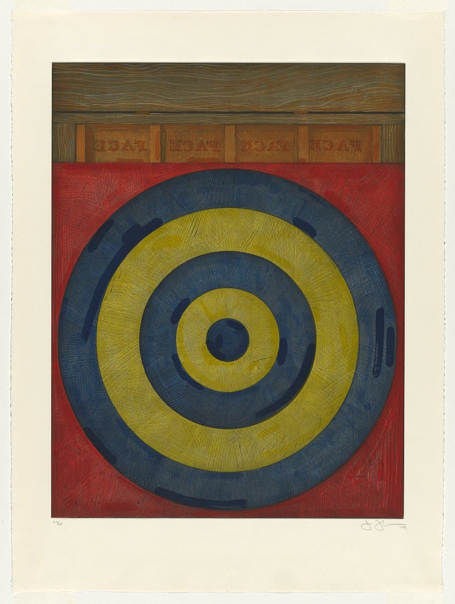
Jasper Johns
Learn moreTarget with four faces 1979
© Jasper Johns. VAGA/Copyright Agency Purchased 1981
More detail | PermalinkAt a time when the emotionally-charged paintings of Abstract Expressionism dominated the American avant-garde, Jasper Johns began to reframe everyday objects and symbols as valid subjects for fine art. Drawing influence from the traditions of Dada—particularly the absurdist humour and use of ready-made subject matter—his work was identified with the Neo-Dada movement and became a foundation for American Pop art.
Targets—specifically targets composed of five concentric circles in alternating rings of blue and yellow, on a red background—are another motif repeated in Johns’ paintings and prints. In a play on words, the print Target with four faces 1979 swaps object with signifier by substituting the four plaster ‘faces’ of the 1955 painting of the same name with the word ‘FACE’.[i]
Alice Desmond
[i] Collection Museum of Modern Art, New York, at https://www.moma.org/collection/works/78393, accessed 3 April 2018.
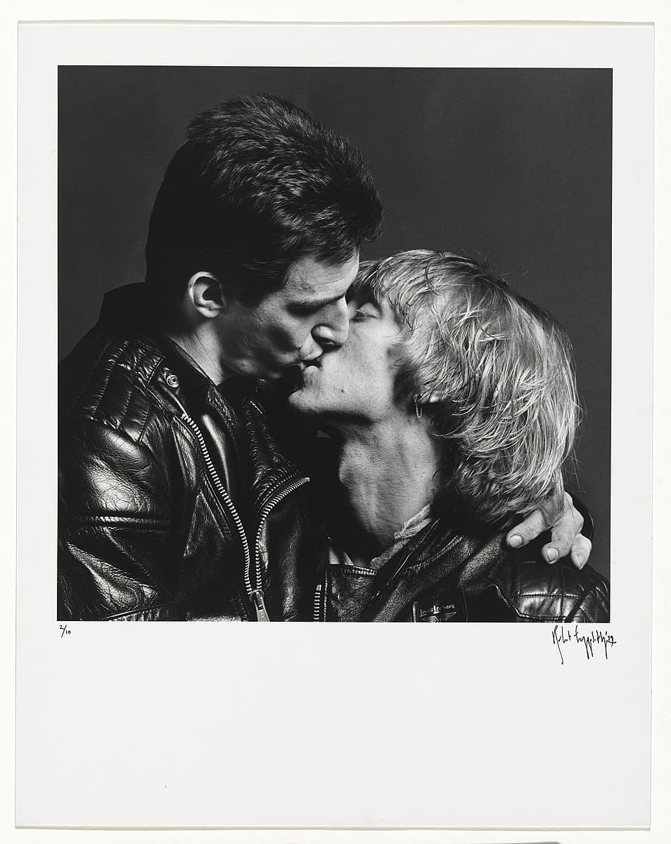
Robert Mapplethorpe
Learn moreLarry and Bobby, NYC 1979
© Robert Mapplethorpe Estate Purchased 1980
More detail | PermalinkDuring the late 1960s, Robert Mapplethorpe made jewellery as well as boxed assemblages and collages that often featured found images, usually pornographic or religious. Around 1971, he started using his own photographs, taken with a Polaroid camera. While he never intended to become a photographer, the medium’s relative immediacy and expediency suited his disposition.[1] His first solo exhibition at New York’s prestigious Light Gallery featured Polaroids of flowers, portraits and erotic scenes. From the start, Mapplethorpe worked across a range of subjects: flower, penis and portrait were considered by him to be, formally at least, ‘the same’, with the same photographic temperament.[2]
Mapplethorpe’s most significant work was made during the 1970s and early 80s, and his photographs engaged a very singular, direct mode with little in the way of secondary or extraneous information. The frontalism, integral to his style, brought together the flatness of his assemblages and Christian icons and the approach of American documentary photography, notably that of Walker Evans. The significance of this work, however, arises not so much from its formalism or classicism, but from the sense of intimacy that is folded into each picture. Mapplethorpe spoke about the photographic moment for him being imbued with the characteristics of a fleeting, intimate encounter, even if before or after the event there was no emotional connection: ‘I think you have to love when you are taking pictures,’ he said.[3]
Larry and Bobby, NYC 1979 is one of many powerful, intimate images of gay lovers embracing, kissing or engaged in sex acts. Although his work was published in gay magazines,[4] from the early 1970s Mapplethorpe generally intended his images for a wide audience, to circulate as ‘contemporary art’.[5] Their importance emerges from their frankness and their representation of gay identity, one that neither relied on nor parodied conventional male/female relations. Their power rests in the apparent trust—and love—that permeates the relationship of photographer, subject and photographic form.[6]
Mapplethorpe’s pictures of intimacy and desire from the 1970s and early 80s serve an important social historical function in the history of gay male sexuality and the way it was represented, recording a relatively short-lived moment of sexual freedom for gay men, one that by the early 1980s was being subject to increased control and regulation following the first reports of men with AIDS.
Shaune Lakin
[1] Robert Mapplethorpe, interview with Janet Kardon, in Janet Kardon (ed), Robert Mapplethorpe: The perfect moment, Institute of Contemporary Art University of Pennsylvania, Philadelphia, 1988, p 23.
[2] As above, p 25.
[3] As above, p 26.
[4] Robert Mapplethorpe, cover, Drummer: American review of gay popular culture 24, September 1978.
[5] See Richard Meyer, ‘Imagining sadomasochism: Robert Mapplethorpe and the masquerade of photography’, Qui Parle, 4.1, Fall 1990, esp p 64. For a sense of Mapplethorpe’s performative relationship to ‘wider audiences’, see Dominick Dunne’s terribly homophobic account of the photographer’s final days, ‘Robert Mapplethorpe’s proud finale’, Vanity Fair, February 1989, pp 124–33, 183–7. The gay photographer and contemporary of Mapplethorpe, Hal Fischer—probably anonymously quoted in Dunne’s essay—was highly critical of Mapplethorpe’s ‘commercialism’, and the way he packaged gay male sexuality for the consumption of people ‘on the Upper East Side … [who thought] that they were being really daring’; see his interview with Julia Bryan-Wilson, ‘Gay semiotics revisited’, Aperture 218, Spring 2015, p 39.
[6] ‘It was all about trust’, Mapplethorpe said of sadomasochistic relationships, in a phrase which no doubt speaks of his own relationship to his subjects; quoted in Dunne, p 186.
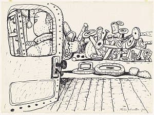
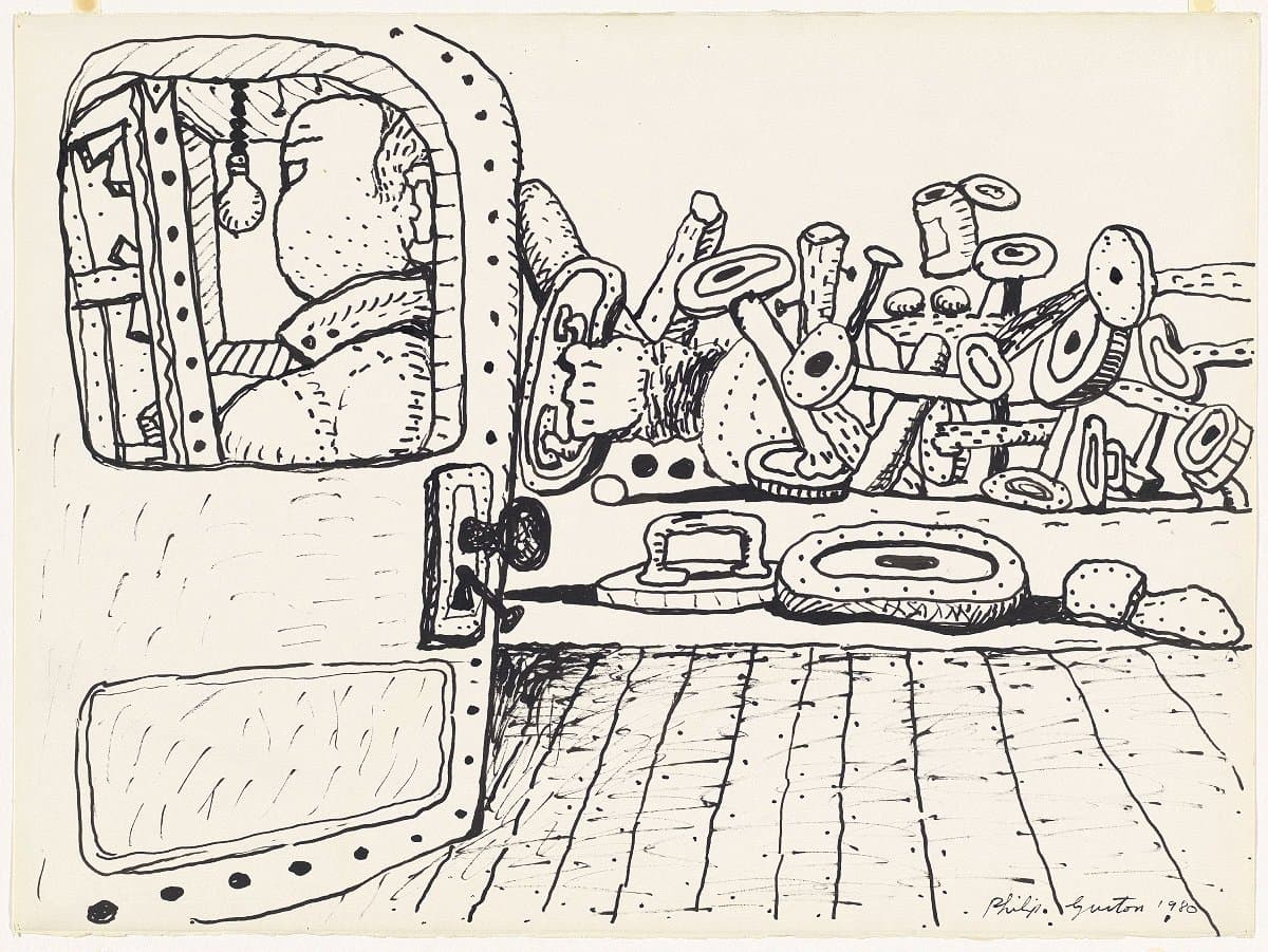
Philip Guston
Learn moreKey 1980
Purchased 1980
More detail | PermalinkPhillip Guston’s later work exposes his private world, a solitary existence in his studio at Woodstock, New York, to the wider social and political events impacting upon America through the 1960s and 70s. As Guston conceded:
So when the 1960s came along I was feeling split, schizophrenic. The war, what was happening to America, the brutality of the world. What kind of man am I, sitting at home, reading magazines, going into a frustrated fury about everything―and then going into my studio to adjust a red to a blue … I thought there must be some way I could do something about it.[i]
Key 1980, made in the months before his death from a heart attack, captures some of this sentiment: the painter works on a canvas with his back turned on a scene of jumbled, degraded humanity. Key employs similar iconography to Pit 1976 and other works of this period, in the hellish piles of rubbish and disembodied limbs, and shares an ambiguity that defies attempts to pin down a clear interpretation of the composition.
Both Pit and Key seem to reject many of the tenets underpinning Guston’s Abstract Expressionist work of the 1950s as well as the rhetoric surrounding Modernism. By acknowledging that the artist is tied to, and therefore must engage with, the wider community, Guston vindicates the radical shift of his work and the incisive social commentary that surfaces in his late figurative paintings.
Michael Lloyd and Michael Desmond[ii]
[i] Philip Guston, quoted in Jerry Talmer, ‘”Creation” is for beauty parlors’, New York Post, 9 April 1977, reproduced in Robert Storr, Philip Guston, Abbeville Press, New York, 1986, p 53.
[ii] Adapted and updated from Michael Lloyd and Michael Desmond, European and American Paintings and Sculptures 1870–1970 in the Australian National Gallery, Australian National Gallery, Canberra, 1992 by Steven Tonkin.

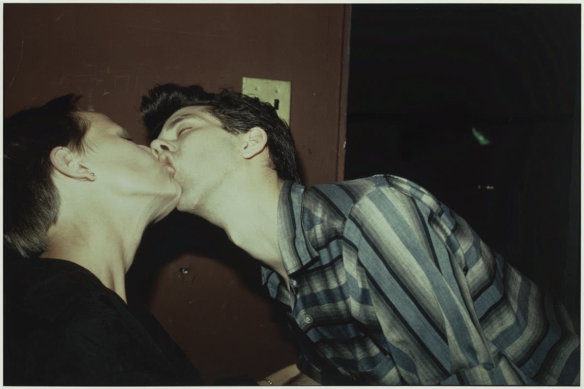
Nan Goldin
Learn morePhilippe H. and Suzanne kissing at Euthanasia, NYC 1981
© Nan Goldin, Courtesy Matthew Marks Gallery Purchased 1994
More detail | Permalink
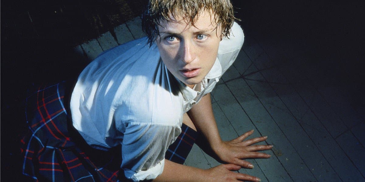
Cindy Sherman
Learn moreUntitled #92 1981
Courtesy the artist and Metro Pictures Gallery Purchased 1983
More detail | PermalinkUntitled #92 and Untitled #93 are from a series of 12 Centerfolds made by Cindy Sherman in 1981. Sherman herself poses in a range of situations, each suggesting heightened emotional states and violent narratives. The Centerfolds continued the investigations into female identity that Sherman began in the mid 1970s. After studying painting at Buffalo State College in New York, she started to explore issues that interested her by dressing up and photographing herself performing in imaginary scenarios.
This led to the breakthrough series Untitled Film Stills 1977–80, printed as small black and white images. Sherman cast herself playing archetypal roles constructed for women in popular culture—the femme fatale, the housewife, the office worker. She has described her way of finding her ‘characters’, who she has stated are not biographical but reflections of ourselves: ‘I guess it’s a memory or an image or something, but something clicks.’[1] Becoming aware of the artifice and constructed nature of Sherman’s photography, viewers could then apply this critical thinking to the way that women are portrayed in popular culture.
In the early 1980s Sherman went big and embraced colour. The Centerfolds images impacted audiences with their size and panoramic format, and are obvious references to the centrefolds in men’s erotic magazines such as Playboy, where women’s bodies are objectified. The women Sherman is playing often look frightened or upset, suspicious, anxious or threatened—though it is characteristic of the artist that she is able to create ambiguous, hard-to-pin-down images over which the viewer can project their own narratives and fantasies. In each of the works the woman is seen from above in a high angle shot, recumbent, supine and passive, reacting to something unspecific that has happened to her. Vulnerable to the gaze of the viewer, the audience is cast into the role of voyeur. The emotional power of the figures is augmented by the uncomfortably tight framing: Sherman wanted her viewers to feel uneasy in their presence—critic Andy Grundberg found them to be, for example, ‘embarrassingly intimate’.[2]
In other work Sherman shows the constructed nature of her imagery more blatantly, such as the Untitled Film Stills, where the shutter release cable was often visible in Sherman’s hand, and in later series she often uses the grotesque to heighten the effect—false breasts and noses for example—trying at times to be ‘as ugly as I can possibly be’.[3] The relative subtly of the Centerfolds gives them an immediate emotional power and appeal that drags the viewer in, with interesting consequences. Initially commissioned by Artforum, the Centerfolds were never published in the art magazine. The editor felt that they would be misunderstood—that readers would be unable to distinguish between a critique of the genre and the genre itself. With their apparently voyeuristic point of view, it was thought that they would be interpreted as reaffirming misogynistic views of women.
Anne O’Hehir
[1] Gerald Marzorati, ‘Imitation of life’, ARTnews, vol. 82 no. 7, September 1983, p 81.
[2] Quoted by Lisa Phillips in ‘Cindy Sherman’s Cindy Shermans’, Cindy Sherman, Whitney Museum of American Art, New York, 1987, p 15.
[3] Quoted in Cindy Sherman, Queensland Art Gallery/Gallery of Modern Art, Brisbane, 2016, p 9.
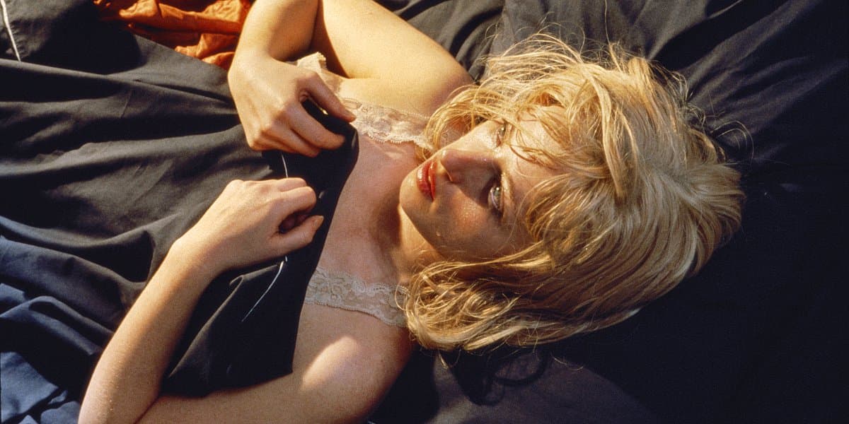
Cindy Sherman
Learn moreUntitled #93 1981
Courtesy the artist and Metro Pictures Gallery Purchased 1983
More detail | PermalinkUntitled #92 and Untitled #93 are from a series of 12 Centerfolds made by Cindy Sherman in 1981. Sherman herself poses in a range of situations, each suggesting heightened emotional states and violent narratives. The Centerfolds continued the investigations into female identity that Sherman began in the mid 1970s. After studying painting at Buffalo State College in New York, she started to explore issues that interested her by dressing up and photographing herself performing in imaginary scenarios.
This led to the breakthrough series Untitled Film Stills 1977–80, printed as small black and white images. Sherman cast herself playing archetypal roles constructed for women in popular culture—the femme fatale, the housewife, the office worker. She has described her way of finding her ‘characters’, who she has stated are not biographical but reflections of ourselves: ‘I guess it’s a memory or an image or something, but something clicks.’[1] Becoming aware of the artifice and constructed nature of Sherman’s photography, viewers could then apply this critical thinking to the way that women are portrayed in popular culture.
In the early 1980s Sherman went big and embraced colour. The Centerfolds images impacted audiences with their size and panoramic format, and are obvious references to the centrefolds in men’s erotic magazines such as Playboy, where women’s bodies are objectified. The women Sherman is playing often look frightened or upset, suspicious, anxious or threatened—though it is characteristic of the artist that she is able to create ambiguous, hard-to-pin-down images over which the viewer can project their own narratives and fantasies. In each of the works the woman is seen from above in a high angle shot, recumbent, supine and passive, reacting to something unspecific that has happened to her. Vulnerable to the gaze of the viewer, the audience is cast into the role of voyeur. The emotional power of the figures is augmented by the uncomfortably tight framing: Sherman wanted her viewers to feel uneasy in their presence—critic Andy Grundberg found them to be, for example, ‘embarrassingly intimate’.[2]
In other work Sherman shows the constructed nature of her imagery more blatantly, such as the Untitled Film Stills, where the shutter release cable was often visible in Sherman’s hand, and in later series she often uses the grotesque to heighten the effect—false breasts and noses for example—trying at times to be ‘as ugly as I can possibly be’.[3] The relative subtly of the Centerfolds gives them an immediate emotional power and appeal that drags the viewer in, with interesting consequences. Initially commissioned by Artforum, the Centerfolds were never published in the art magazine. The editor felt that they would be misunderstood—that readers would be unable to distinguish between a critique of the genre and the genre itself. With their apparently voyeuristic point of view, it was thought that they would be interpreted as reaffirming misogynistic views of women.
Anne O’Hehir
[1] Gerald Marzorati, ‘Imitation of life’, ARTnews, vol. 82 no. 7, September 1983, p 81.
[2] Quoted by Lisa Phillips in ‘Cindy Sherman’s Cindy Shermans’, Cindy Sherman, Whitney Museum of American Art, New York, 1987, p 15.
[3] Quoted in Cindy Sherman, Queensland Art Gallery/Gallery of Modern Art, Brisbane, 2016, p 9.


Sol Lewitt
Learn moreWall drawing no.380 a-d 1982
© Sol Lewitt Purchased 1987
More detail | PermalinkA major exponent of Conceptual art, Sol LeWitt helped define the movement with his now seminal ‘sentences’ and ‘paragraphs’ published in the late 1960s.[1] His prolific output over four decades includes three-dimensional ‘structures’, drawings, prints, photographs and artist’s books, as well as nearly 1000 wall drawings. LeWitt is credited with reintroducing the wall drawing to contemporary art, a form that he described, rather frivolously, as having its origins with ‘the cave men’.[2] In wanting to make a work of art that was as ‘two-dimensional as possible’, he said it seemed ‘more natural’ to work directly on the wall than to make a construction on which to work and then put it the wall.[3]
LeWitt’s first wall drawing, an excerpt from his Drawing series II 1968, was exhibited in a group show at the Paula Cooper Gallery, New York, in October 1968. By the 1970s the artist had refined his method for realising the drawings, methods to which he adhered in the ensuing decades while exploring various kinds of lines, geometric and isometric figures, stars and continuous forms, as well as other motifs. Wall drawing no. 380 a–d 1982 consists of four isometric figures derived from a cube—the cube, a truncated pyramid (or trapezoid), a parallelepiped and a rectangle.[4] It is one of a number of wall drawings that marked a distinct shift in LeWitt’s practice, in which he drew explicit attention to the tradition of Western art since the Renaissance and to the inherent contradiction in representing three-dimensional ‘objects’ on a flat surface.
In Wall drawing no. 380 a–d the isometric figures are first drawn in pencil, over which India ink and colour ink washes are applied to define the ‘surfaces’ of the figures against a light grey background. The work is unusual in that the isometric figures are ‘framed’ by a six-inch dark grey border. In 1982, at the time of its first installation at the John Weber Gallery, New York, LeWitt responded to a question about the borders by explaining that he used darker grey to isolate the drawing from its location.[5] The ‘frame’ encourages the viewer to look into the wall drawing, accentuating the illusion of solidity of the isometric figures, yet highlighting the incongruity of the viewer’s perception, the visual deception and the flatness of the wall.
In his early writings LeWitt outlined his approach to making Conceptual art. ‘The idea or concept is the most important aspect of the work … all of the planning and decisions are made beforehand … the idea becomes a machine that makes the art.’[6] In a role analogous to an architect, LeWitt separates the conception of his wall drawings from their execution. While financial necessity meant that he, with the assistance of friends and fellow artists, undertook the installation of his early wall drawings, it was never a prerequisite.[7] Each wall drawing can be realised at different times and in different locations, then ‘de-installed’ by simply repainting the wall on which it has been drawn. As LeWitt wryly observed, ‘The wall drawing is a permanent installation, until destroyed’.[8] Or, more accurately in this case, remains an idea until installed again.
Steven Tonkin
[1] See Sol LeWitt, ‘Paragraphs on Conceptual Art’, Artforum, vol 5, no 10, Summer 1967, pp 79–84 and Sol LeWitt, ‘Sentences on Conceptual Art’, 0 to 9, no. 5, January 1969, pp 3–5.
[2] LeWitt, quoted in Andrea Miller-Keller and Sol LeWitt, ‘Excerpts from a correspondence, 1981–1983’, in Susanna Singer (ed), Sol LeWitt Wall Drawings 1968–1984, Stedelijk Museum, Amsterdam, 1984, p 21.
[3] LeWitt, quoted in Lawrence Weiner, Daniel Buren, Sol LeWitt and Mel Bochner, ‘Documentation in Conceptual Art’, Arts Magazine, vol 44, no 6, April 1970, p 43.
[4] The certificate of authenticity for Wall drawing no. 380 1982 lists the figures as a cube, rectangular prism, trapezoid and parallelogram.
[5] LeWitt went on to explain: ‘It wasn’t absolutely necessary, but some inner urge (esthetic frivolity I suppose) caused me to use it.’ Quoted in Singer, p 23.
[6] LeWitt, ‘Paragraphs on Conceptual Art’, p 80.
[7] As he explains, the artist ‘conceives and plans’ the drawing and it is realised by draftsmen: the artist can act as his own draftsman or the plan (written, spoken or a drawing) can be interpreted by the draftsman; thus ‘the artist and the draftsman become collaborators in making the art’. Sol LeWitt, ‘Doing wall drawings’, Art Now: New York, no 2, June 1971, np.
[8] LeWitt, quoted in ‘Documentation in Conceptual Art’, p 43.

Nan Goldin
Learn moreNan and Brian in bed, NYC 1983
© Nan Goldin, Courtesy Matthew Marks Gallery Purchased 1994
More detail | Permalink
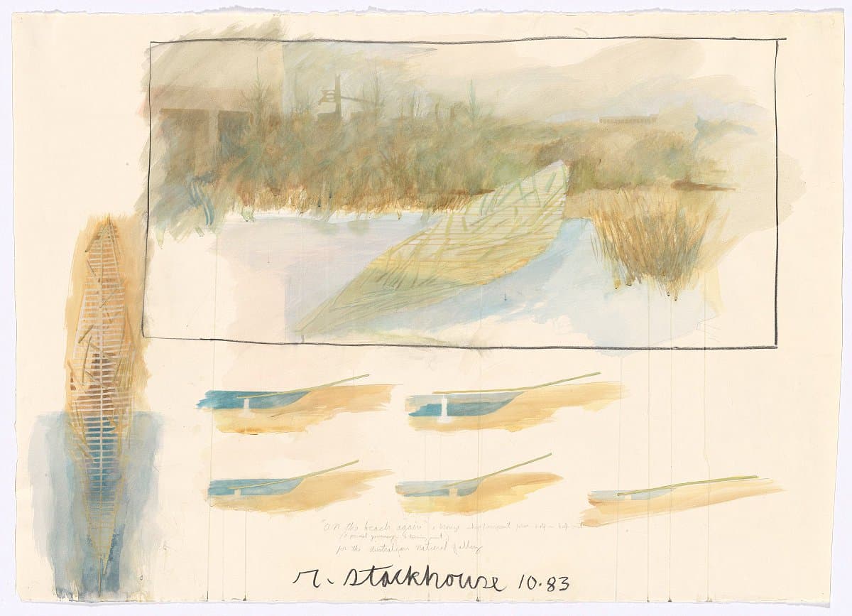
Robert Stackhouse
Learn moreMountain climber - On the beach again; preliminary drawing for the sculpture 'On the beach again', constructed at the Australian National Gallery, Canberra, 1983 1983
Purchased 1983
More detail | PermalinkRobert Stackhouse’s On the beach again 1984 is located in the Gallery’s Sculpture Garden. Nestled among the rushes, Stackhouse’s sculpture rests on the shore of the Marsh Pond within the Summer Garden, which was conceived as a respite from the blazing sun and heat of an Australian summer’s day. The work appears to be the flattened hull of a boat, or a raft, resembling an unearthed Viking burial ship, sitting half in, half out, of the water. Whether the boat has just arrived or is ready to depart on a journey is ambiguous.
On the beach again was commissioned from the artist specifically for the garden. While the form of the work is related to earlier pieces, the way in which the work was to be installed―the first of Stackhouse’s ‘boats’ to actually touch the water―meant that On the beach again was also the first time the artist had a work cast in bronze. It was cast in Taiwan from a full-size model constructed of recycled timber and driftwood, then shipped to Australia and installed in 1984.
Recalling the work, Stackhouse outlined:
For On the beach again, I used the lozenge shape, the eye/boat shape of my work, and it had this random, overlapping, serpentine element. At first, I did not know for sure if it was an object, or a being. In fact, I learned, it was both … a structure but one with this sense of an organic quality to it … This is about ending a journey. It is where I try to deal with the architectural and the organic at the same time … The title, On The Beach Again, was an escape clause for me. Because, I recall, I was once asked by Jack Burnham if I ever thought about beaching my boat. And I replied that all my art was about the journey. There was no destination. If I ended the journey then I might not make art anymore. I was required to put one of my sculptures half on land and half in water. By calling it On The Beach Again I meant to suggest that it had already been there. I could resolve the issue for me, because it was not the end. It was like the ferry to nowhere; it can’t be resolved. And, of course, On the Beach Again [sic] was the well-known book about the end of the world.[1]
At the time the sculpture was commissioned, the Sculpture Garden was in its early stages of growth and it basked on the bank under the summer sun in an expansive setting, which is evident in photographs taken at the time and suggested in a number of the artist’s drawings for the work.[2] The casuarinas around the small lake have grown over the past three decades, so that On the beach again now occupies a cool shaded spot as was first envisaged―a ‘journey’ for the work itself and its shifting dialogue with the environment it inhabits.
Steven Tonkin
[1] Robert Stackhouse, quoted in J Richard Gruber, Stackhouse, Morris Museum of Art, Augusta, 1999, pp 86, 87–9.
[2] See early photographs of On the beach again in the Sculpture Garden in J Richard Gruber, Stackhouse, Morris Museum of Art, Augusta, 1999, p 87.
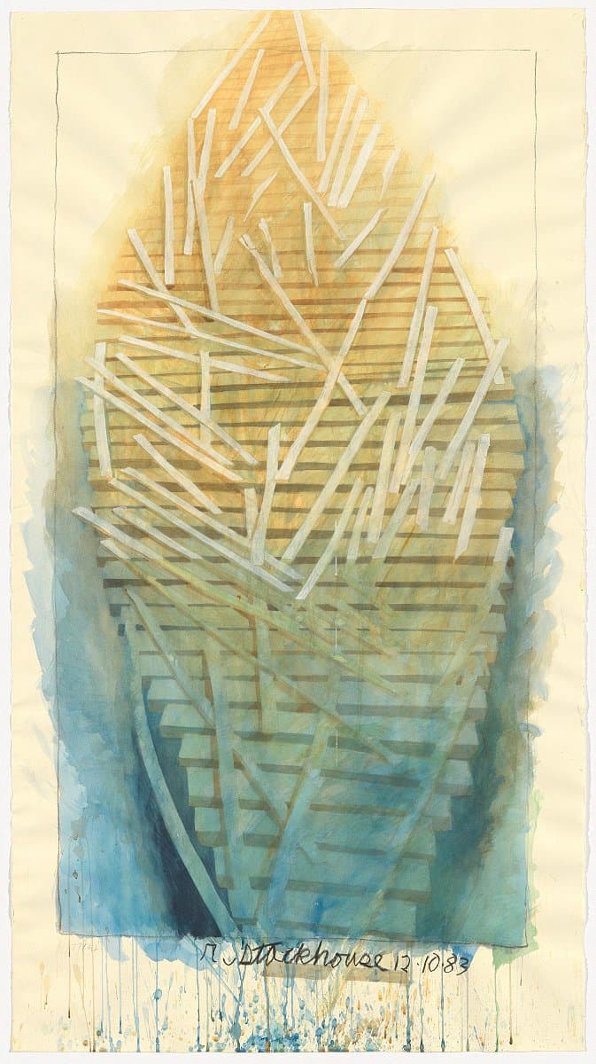
Robert Stackhouse
Learn moreOn the beach again; drawing of the sculpture 'On the beach again', constructed at the Australian National Gallery, Canberra, 1983 1983
Purchased 1985
More detail | PermalinkRobert Stackhouse’s On the beach again 1984 is located in the Gallery’s Sculpture Garden. Nestled among the rushes, Stackhouse’s sculpture rests on the shore of the Marsh Pond within the Summer Garden, which was conceived as a respite from the blazing sun and heat of an Australian summer’s day. The work appears to be the flattened hull of a boat, or a raft, resembling an unearthed Viking burial ship, sitting half in, half out, of the water. Whether the boat has just arrived or is ready to depart on a journey is ambiguous.
On the beach again was commissioned from the artist specifically for the garden. While the form of the work is related to earlier pieces, the way in which the work was to be installed―the first of Stackhouse’s ‘boats’ to actually touch the water―meant that On the beach again was also the first time the artist had a work cast in bronze. It was cast in Taiwan from a full-size model constructed of recycled timber and driftwood, then shipped to Australia and installed in 1984.
Recalling the work, Stackhouse outlined:
For On the beach again, I used the lozenge shape, the eye/boat shape of my work, and it had this random, overlapping, serpentine element. At first, I did not know for sure if it was an object, or a being. In fact, I learned, it was both … a structure but one with this sense of an organic quality to it … This is about ending a journey. It is where I try to deal with the architectural and the organic at the same time … The title, On The Beach Again, was an escape clause for me. Because, I recall, I was once asked by Jack Burnham if I ever thought about beaching my boat. And I replied that all my art was about the journey. There was no destination. If I ended the journey then I might not make art anymore. I was required to put one of my sculptures half on land and half in water. By calling it On The Beach Again I meant to suggest that it had already been there. I could resolve the issue for me, because it was not the end. It was like the ferry to nowhere; it can’t be resolved. And, of course, On the Beach Again [sic] was the well-known book about the end of the world.[1]
At the time the sculpture was commissioned, the Sculpture Garden was in its early stages of growth and it basked on the bank under the summer sun in an expansive setting, which is evident in photographs taken at the time and suggested in a number of the artist’s drawings for the work.[2] The casuarinas around the small lake have grown over the past three decades, so that On the beach again now occupies a cool shaded spot as was first envisaged―a ‘journey’ for the work itself and its shifting dialogue with the environment it inhabits.
Steven Tonkin
[1] Robert Stackhouse, quoted in J Richard Gruber, Stackhouse, Morris Museum of Art, Augusta, 1999, pp 86, 87–9.
[2] See early photographs of On the beach again in the Sculpture Garden in J Richard Gruber, Stackhouse, Morris Museum of Art, Augusta, 1999, p 87.


Nan Goldin
Learn moreNan one month after being battered 1984
© Nan Goldin, Courtesy Matthew Marks Gallery Purchased 1994
More detail | PermalinkNan Goldin’s diaristic photographs recording the deeply personal experiences of her friends and lovers—her chosen family—are marked by an often moving sense of intimacy. This is suggested in the way her camera intrudes into the physical, emotional and psychic space of her subject—giving rise to an uncomfortable viewing experience that can walk the line between voyeurism and empathy.
Nan after being battered 1984 comes from Goldin’s series The ballad of sexual dependency, a title borrowed from a song in Kurt Weill and Bertolt Brecht’s Die Dreigroschenoper [Threepenny opera] (1928). The series is best known as a slide presentation that developed through improvised performances staged by Goldin at venues across New York City. Friends helped prepare an accompanying soundtrack—one that could shift from Maria Callas to The Velvet Underground. The slide show was edited down to 127 images for a now-classic photobook released in 1986[1], and the images were also circulated as lush Cibachrome prints. This self-portrait was taken after Goldin was beaten and almost blinded by her abusive partner Brian—an image that curator Elisabeth Sussman describes as ‘the emotional climax’ of The ballad of sexual dependency.[2]
Goldin was raised in an intellectual Jewish family in Maryland. Her older sister, Barbara, was intermittently institutionalised as a teenager and committed suicide when Goldin was 11. Three years later she left home, living in communes and foster homes, and attended an alternate school in Lincoln, Massachusetts. At this time, she became interested in photography, initially using a Polaroid camera. Goldin took courses at the New England School of Photography, where she was introduced to and inspired by the work of Larry Clark, who had documented himself and his friends shooting up and having sex in the 1960s. In 1974 she enrolled at the School of the Museum of Fine Arts in Boston where she started working with a Pentax, using a wide-angle lens, a flash and slide film to produce work that had a distinct feel: seemingly intimate and ad hoc, with lighting, focus and a sense of colour that was closer to the aesthetic of snapshots than ‘art photography’.
Goldin has spoken many times of the central and essential role that these images have played in her life. They are powerful markers of the subcultures of which she was part and a particular historical moment: the period between 1976 and 1985, when heroin was cheap and widely available in New York, and just before many of her friends and community were ravaged by the AIDS virus. ‘The ballad of sexual dependency is the diary I let people read,’ Goldin wrote. ‘The diary is my form of control over my life. It allows me to obsessively record every detail. It enables me to remember.’[3] This body of work stands as testament to the powerful role that photography can play in our lives, at its most basic—its most raw and authentic—a testament that no one, she believed, ‘could rewrite or deny’.[4]
Anne O’Hehir
[1] Nan Goldin, The ballad of sexual dependency, Aperture Foundation, New York, 1986.
[2] Elisabeth Sussman, ‘In/Of her time: Nan Goldin’s photographs’, Nan Goldin: I’ll be your mirror, Whitney Museum of America Art, New York / Scalo, Zurich, Berlin, New York, 1996, p 36.
[3] Goldin, p 6.
[4] As above, p 145.

Nan Goldin
Learn moreSuzanne crying, NYC 1985
© Nan Goldin, Courtesy Matthew Marks Gallery Purchased 1994
More detail | Permalink

Nan Goldin
Learn moreSiobhan in the shower, NYC 1991
© Nan Goldin, Courtesy Matthew Marks Gallery Purchased 1994
More detail | Permalink
