
Roy Lichtenstein
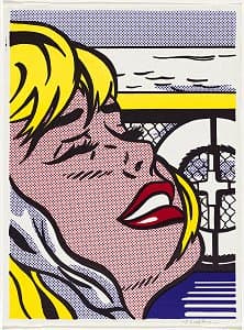
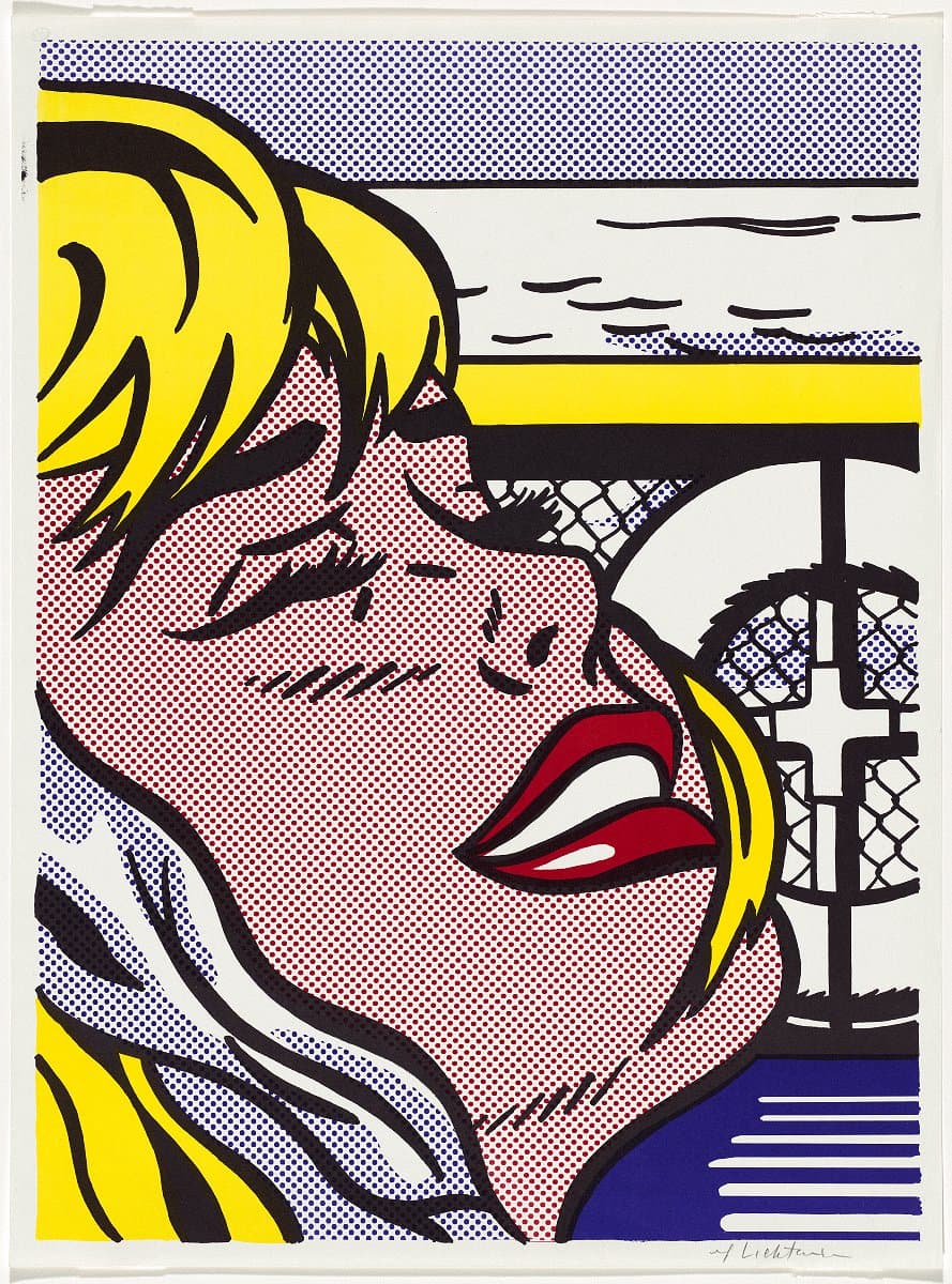
Learn moreShipboard girl 1965
© Estate of Roy Lichtenstein/Copyright Agency Felix Man Collection, Special Government Grant 1972
More detail | PermalinkMaking prints was always an important, interconnected part of Roy Lichtenstein’s art practice. As an art student he hand-printed woodcuts, lithographs and etchings; during the 1960s he designed commercially-produced screenprints and offset lithographs as promotional ephemera; and for over 30 years he worked across all print mediums on technically complex and visually sophisticated projects at master printer Kenneth Tyler’s workshops.
Lichtenstein’s exhibitions at Leo Castelli Gallery, New York from 1962–67 propelled the artist to fame. With the content and themes of his work at this time appropriated from print advertisements and pulpy comic books, it was fitting he concurrently used commercial printing methods to create invitations and posters that were themselves conceived as ‘cheap prints’, often sold for $5 or $10 at exhibition openings.[1] Shipboard girl 1965 and Crak! 1963–64 were both created for this purpose and are characteristic of the instantly recognisable themes, motifs and iconography that Lichtenstein built his reputation on in this era. In compositions unmistakably sourced from the pages of romance and war comics, the long-lashed ladies of the two prints are suspended in decontextualised moments of narrative climax, rendered in strong black outlines that are filled in with flat blocks of colour and areas of Lichtenstein’s signature overblown Ben Day dots. Shipboard girl’s anguished blonde is one among many of Lichtenstein’s beautiful damsels in distress.
These commercially-printed works replicate the stylised renditions of popular print iconography that are seen in Lichtenstein’s paintings, but here in his prints the artist’s own distinct visual language is translated through the method of production that they refer to. It is somewhat ironic, then, that when Lichtenstein’s designs were fed back through commercial printing machines, they did not simply duplicate the original source material—the work is distinctively the artist’s own.
The characteristic visual elements of the popular printed material that Lichtenstein adopted and adapted were often by-products of quick and economical tricks of the printing process, including dots that blur together the limited range of printing inks to create tertiary colour tones, and thick black outlines that were overprinted to conceal the misalignment of the different layers of ink. Lichtenstein simplified such elements even further to reduce the composition to its most graphically striking forms. By meticulously resizing and positioning every dot, and restricting his palette to the three primary colours and black, he created his own style that refers to rather than repeats the source material. This could even be understood as turning the practices of commercial artists—converting real-world subject matter into a simplified graphic language—inward on the popular art form itself.
Alice Desmond
[1] Jaklyn Babington, Roy Lichtenstein: Pop remix, National Gallery of Australia, Canberra, 2012, p 29.
